

The 6 November Frontend tips about a11y and UX
source link: https://dev.to/melnik909/the-6-november-frontend-tips-about-a11y-and-ux-1i9l
Go to the source link to view the article. You can view the picture content, updated content and better typesetting reading experience. If the link is broken, please click the button below to view the snapshot at that time.
Focus moving is underestimated
We don't think about what to do with focus when we design elements that appear after user actions. Or, more specifically, we just do nothing. Therefore there are 2 problems.
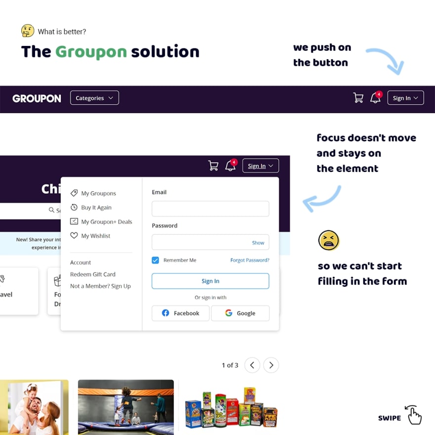
Firstly, we cut off the possibility of more quick interaction. For example, when we log in on Groupon we have to focus on the input field to start filling in the form.
Instead, when we go through the same case on Pinterest focus moves to the first input field automatically. So we can start filling in the form without additional actions.
Secondly, if users have vestibular disabilities login becomes an impossible task because in this case, they lost the possibility of using a keyboard. For example, when we push on the sign in button on Groupon focus doesn't move inside of the form. It's lost just.
For these reasons, we have to design our interfaces with the thought of how focus should move. In this case, our interfaces will be accessible for more users.

Thinking about a main and additional goal when we work with focus
Did you think sometimes about how better to move focus when users open elements such as modals or dialogs?
I think there is a main and additional goal when we work with focus. The main goal is what users want to do after moving focus for reaching their goals using a minimal number of actions. An additional is what they can do something else.
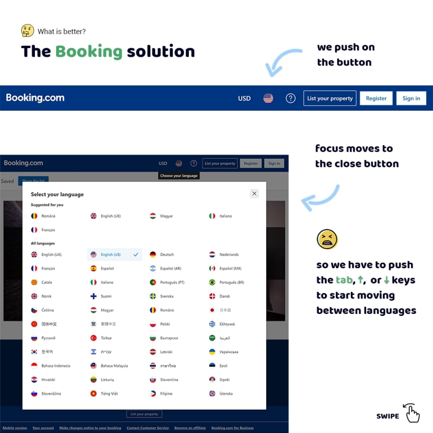
Let's consider what I mean using the case of selecting a language on Booking. If we push the button of selecting a language we'll see modal with languages.
Focus will move on the close button. Nice what we can close modal by pushing the enter key. But is that why we open the modal? No, we wanted to select a language. That's the main goal. And closing a modal is an additional goal.
Now let's look at what Booking suggests for selecting a language. If we use only a keyboard we have to use the tab, ↑ or ↓ keys to start moving between languages.
Then we push the same keys again until we find the necessary option. If we push the enter key we'll select a language. Well, that's a nice solution but I want to suggest another.
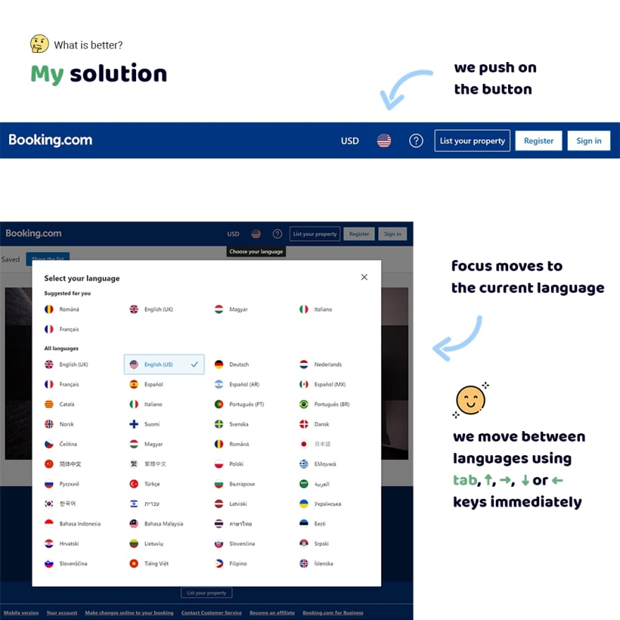
We have already identified that users open the modal because they want to select a language. It's the main goal. So we should give that to them. I think we can do that if we move focus on the current language.
Then we should make the possibility of moving between languages using tab, ↑, →, ↓ or ← keys immediately. The selection of a language we'll make using the enter key. Also, we'll save the possibility of closing the modal using the Esc key like Booking made.
I hope I was able to pass on the importance of defining a main and additional goal when you work with focus. Please, think about it and your interfaces will be user-friendly.
The button role isn't enough for an accessible interface
There is a practice of overriding the button's default role. It's a bad practice already because authors of the ARIA in HTML standard prohibit overriding of default roles in section 2.1.
But in addition, people think if they define role="button" this element becomes accessible. Yes, it's true for screen readers. But that's only one case!
This "button" isn't accessible for a keyboard. Users can't focus on this element using the tab key. Also, this "button" isn't accessible for interaction using the enter or space keys.
So if you want to define role="button" don't do that. Just use the button element.
don't do this
<div role="button">Go</div>

<!-- or -->

<span role="button">Go</span>
you can use it instead
<button>Go</button>
The bigger clickable area the better user-friendly interactive elements
When we design interactive elements we have to think about how users will interact with them, in particular, a clickable area.
That is important because users use different kinds of interactions. I often see designers and developers make a clickable area that is equal sizes of the element.
It's nice for users who use a mouse. But that's a big problem for other users. If users have a motor disability click on such an element is a nearly impossible task,
Sometimes I can't hit on such elements when I tap on them using a finger. Also outline around elements has not enough contrast, if I focused on them using a keyboard,
But we can solve these problems easily. Just we should design more largest clickable area that will not conflict with other elements around.

The aria-labelledby simplify navigation for users of screen readers
Any web interface has a lot of sections that help users without vision disabilities orient at the page. We just see headings and understand that is a section and also its sense.
But some users can't see. They use the special quick navigation mode known as "Regions list" in screen readers. In this mode screen readers display all regions on the page. So users can go to any by some taps.
Unfortunately, there is a problem that is section elements aren't displayed in this mode until we associate section heading with a section using the aria-labelledby attribute.
So we have to add the id to the heading and add this as a value to the aria-labelledby attribute that is defined for the section element. As a result, this section will be added to the regions list and users will know about it.
don't do this
<section>
  <h2>About me</h2>
  <p>Lorem ipsum, dolor sit amet consectetur...</p>
</section>
you can use it instead
<section aria-labelledby="about-me">
  <h2 id="about-me">About me</h2>
  <p>Lorem ipsum, dolor sit amet consectetur...</p>
</section>
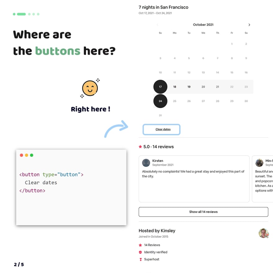
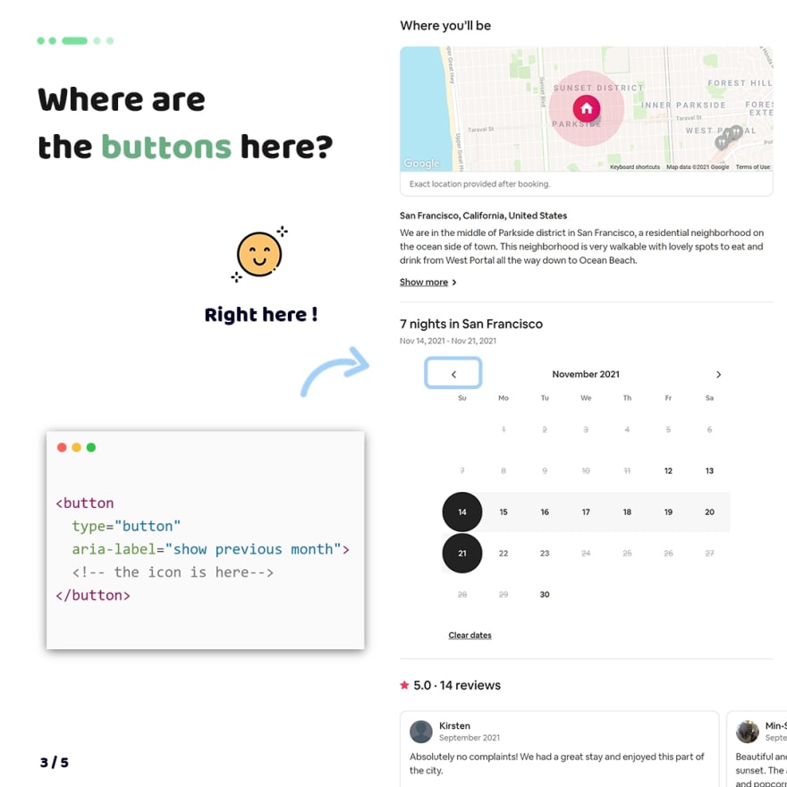
Where are the buttons here?
Unfortunately, designers and developers don't know the importance of using the button element for any elements for which users can click. So why is that important?
Yes, by default click applies on any elements. But not all users use a mouse for interaction with UI. For example, some users want to use tab, enter and space keys for interaction with UI.
If we think about users of screen readers they can't interact with UI if button elements aren't on the page.
So if you want to create an element by which users will click, please, make it is a button.
For inspiration, I collected a few examples where the button element will be helpful. As a result, users will get a more user-friendly web interface.

P.S.
Folks, I love to share my tips with you. I do that with the help of donations from my sponsors since content creating is my full-time job.
For this reason I ask you to join my sponsors if you like what I do
❤ Thank you so much, my sponsors: Ben Rinehart, Sergio Kagiema, Jesse Willard, Tanya Ten, Spiridon Konofaos.
👀 Also I tell stories from my career on Substack. Join my free newsletter, if you're interested in my background
Recommend
About Joyk
Aggregate valuable and interesting links.
Joyk means Joy of geeK