

Readable & Stylish: The 15 Best Fonts for Reading
source link: https://www.designyourway.net/blog/best-fonts-for-reading/
Go to the source link to view the article. You can view the picture content, updated content and better typesetting reading experience. If the link is broken, please click the button below to view the snapshot at that time.

Readable & Stylish: The 15 Best Fonts for Reading
Imagine this: You’re cozily nestled in your favorite reading nook, but the words on the screen start to blur and dance. Frustrating, right? It’s not just you; it’s the font. Fonts can make or break your reading experience, especially in our digital world.
As a web designer, I’ve seen how the right font transforms content from mundane to magnetic. This article dives into the best fonts for reading. We’re not just talking pretty letters here.
It’s about legibility, the subtle art of making text comfortably readable. Think about it – when was the last time you noticed the font on your favorite blog? Probably never, because it was just that good.
You’ll learn the secrets behind choosing fonts that are easy on the eyes. From the classic charm of serif fonts like Georgia to the sleek simplicity of sans-serif options like Arial, each font has its own personality and purpose.
We’ll explore readable typefaces, dive into font legibility factors, and even touch on digital typography standards. Get ready to transform your reading experience with fonts that don’t just look good but feel good to read!
Top Recommended Fonts for Online Reading
Classic and Timeless Fonts
When we dive into the best fonts for reading online, there’s a charm in the classics. They’re like the denim jeans of the font world – always in style.

This one’s a chameleon. Fits almost anywhere, from your quick email to a deep-dive article. It’s versatile and contemporary, like that one friend who’s good in any social setting.
Here’s the neutral player. It doesn’t scream for attention, just does its job well. It’s unobtrusive, which in font language, means it lets your content shine.

Oh, Georgia! It takes you back, right? Classy with an old-timey feel, it’s like reading from an elegant book. But here’s the kicker – it’s super legible online.
The OG of fonts. Traditional, familiar, and you’ve probably written a dozen essays in it. It’s the comfort food of fonts.
Born for the screen. It was literally designed for clarity on digital platforms. Those letters stand out, no squinting required.
Modern and Digital-Optimized Fonts
Now, let’s jazz it up with some modern flair. These fonts are like the latest smartphone models – sleek, efficient, and oh-so-smooth.
Friendly and welcoming, like a warm smile in font form. It’s readable and easy-going, perfect for websites that want to feel approachable.
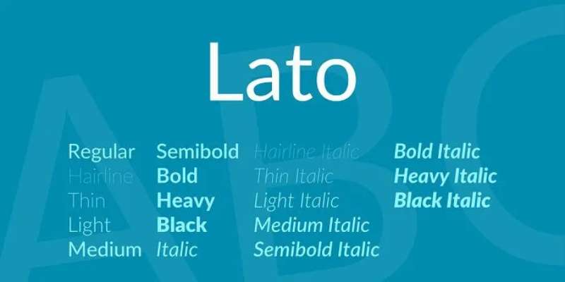
Sleek and professional. If your website was a person, Lato would make it the sharply dressed one at the party.
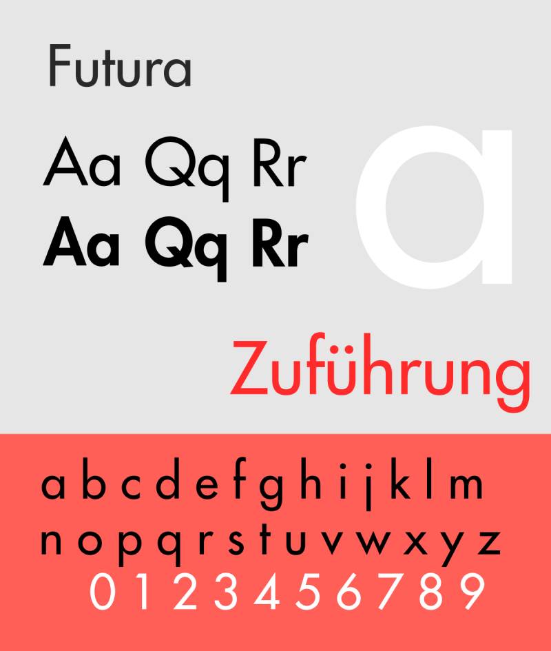
Geometry isn’t just for math class. Futura brings those clean lines and shapes right to your content, giving it a modern, geometric vibe.
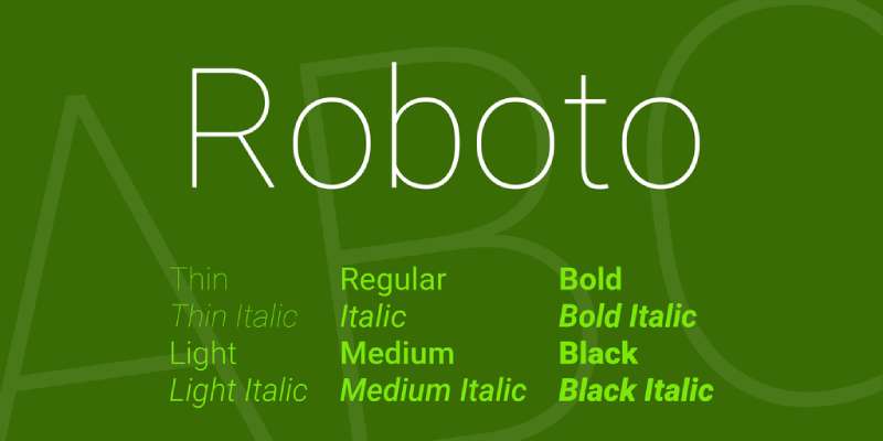
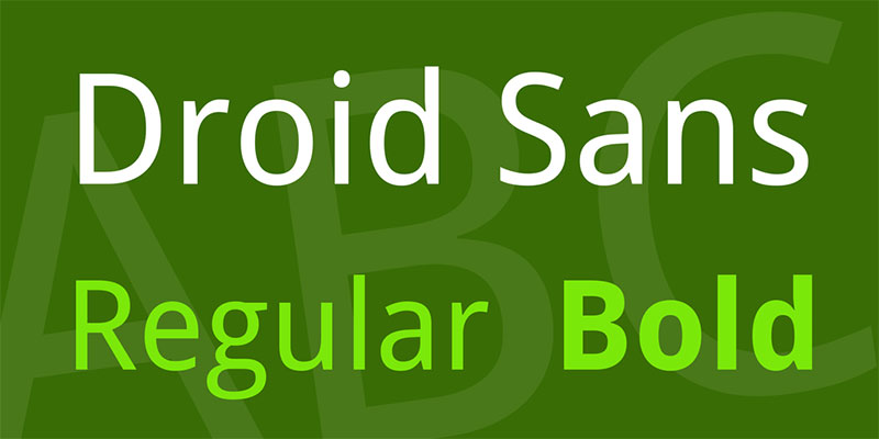
Google made this one, so you know it’s good for screens. It’s modern, approachable, and tailored for digital interfaces.

This one’s got a bit of flair. Inspired by humanist styles and calligraphy, it adds a personal touch to your site.
Unique and Characterful Fonts
Sometimes, you need a font with a bit of personality. These are not your everyday fonts; they’re the conversation starters.

Slightly condensed, this font is like a good espresso – strong and to the point. It’s designed for high legibility.

Inspired by urban signage, it’s bold and attention-grabbing. Perfect for headings that need to pop.
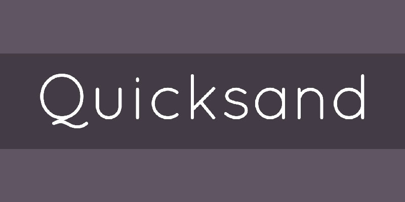
This one’s fun and quirky. Mobile-optimized, it’s great for sites that want to feel laid-back and playful.
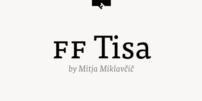
Adaptable and distinct, Tisa’s serifs make it stand out. It’s versatile for various contexts, from blogs to e-commerce.
Designed for those tiny mobile screens, it stays clear and readable, no matter the size.
Characteristics of Easy-to-Read Fonts
Serif vs. Sans-Serif Fonts
Hey, ever noticed how some texts just feel easier to read? Well, that’s often down to the font. In the world of best fonts for reading, there’s this ongoing debate: serif or sans-serif?
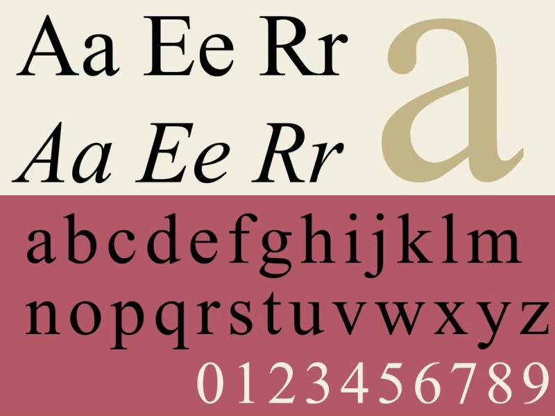
Serif fonts, think Times New Roman, have these little feet at the end of letters. They’re like old friends, familiar and traditional. Great for print, they bring a classic vibe. But, here’s the twist: they’re not always the go-to for screens.
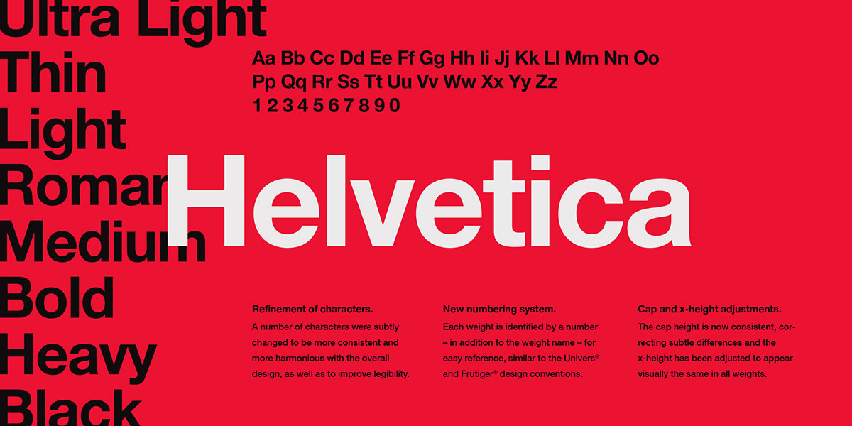
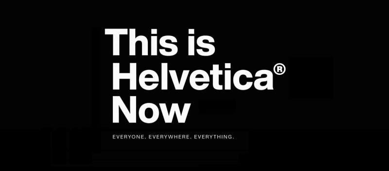
Enter sans-serif fonts. Arial and Helvetica? Pure sans-serif. No feet, just straight-up simplicity. They’re the modern crowd’s choice, especially on digital platforms. Clean, straightforward, they cut through the digital noise.
Key Aspects for Legibility
Now, let’s talk legibility. It’s not just about picking a font; it’s about making it work for your eyes. Here’s what to look for:
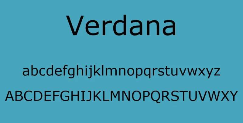
- Tall x-height: This means the height of lowercase letters. A taller x-height equals better readability. Fonts like Verdana nail this.
- Distinguishable characters: Ever confused a ‘0’ (zero) with an ‘O’ (capital o)? Fonts need clear character distinction. Think about Arial, where every character stands out.
- Adequate letter spacing: Squished letters? Hard pass. Fonts like Helvetica ensure each letter breathes, making reading a breeze.
- Avoid thin weights and narrow-width fonts: Thin fonts might look sleek, but they’re a strain on the eyes. Same with super narrow fonts. You want a font that stands out, even from a distance.
- Block capitals, the occasional guest: While block capitals grab attention, they’re not ideal for the whole party. Use them sparingly, like for headings.
Combining Fonts for Enhanced Readability
Pairing Techniques
So, you’ve got a sweet selection of the best fonts for reading, but how do you mix and match them like a pro? It’s like a culinary art – finding that perfect flavor combo.
- Mixing serif and sans-serif fonts: This is like pairing a classic wine with a modern dish. The contrast between these font types adds depth to your content. Imagine Georgia (serif) for your body text, providing that classic, readable feel, and then bam! Arial (sans-serif) for your headings, giving it a crisp, modern edge.
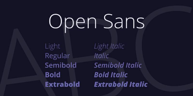
- Balancing bold and subtle typefaces: It’s all about the balance. You don’t want your page looking like a weightlifting contest. Pair a bold font for headings, like Montserrat, with a more subtle, softer font like Open Sans for the body. It’s like having a strong lead singer with a mellow background band.
Examples of Effective Font Pairings
Alright, let’s put this into action. Here are some combos that are like peanut butter and jelly – they just work.
- Georgia with a sans-serif for headings: Georgia brings that old-school charm, while a sans-serif like Helvetica for headings cuts in with a modern, clean look. It’s a classic meets contemporary vibe.
- Merriweather with Montserrat or Open Sans: Merriweather is strong but approachable, perfect for extended reading. Pair it with Montserrat for bold headings or Open Sans for something more laid-back.
Additional Considerations in Font Selection
Accessibility and Inclusivity
Okay, so picking the best fonts for reading isn’t just about looking good. It’s about being good – good for everyone. We’re talking inclusivity.
- Fonts matter big time for folks with visual impairments or dyslexia. A font like Open Sans isn’t just a pretty face; it’s clear and easy to read, making it a champion for accessibility.
- Details like clear apostrophes and quotation marks might seem small, but they’re huge in making text more readable for everyone.
Font Color and Background Contrast
Ever tried reading light grey text on a white background? Yeah, not fun. Contrast is key.
- High contrast, like dark text on a light background, is your best friend. It makes reading smoother and less of a strain.
- Think about your color blind pals too. Color choices in fonts and backgrounds should be accessible to them as well.
FAQ On The Best Fonts For Reading
What makes a font easy to read?
It’s a mix of things, really. A font that’s easy on the eyes usually has a decent x-height, that’s the height of lowercase letters. Then, there’s letter spacing – not too squished, not too spaced out.
Clarity is key, especially for digital reading. Fonts like Arial or Verdana? They get it right.
How do serif and sans-serif fonts differ in readability?
Serif fonts, like Times New Roman, have these tiny feet at the letter’s end, giving them a traditional feel. Great for print. Sans-serif fonts, like Helvetica, ditch the feet for a cleaner look, which often works better on screens.
It’s like choosing between a classic car and a modern one – both have their perks.
Are there specific fonts recommended for dyslexic readers?
Absolutely! Fonts like Open Dyslexic are designed with heavier bottomed letters, helping prevent the letters from flipping and turning in a dyslexic reader’s mind. It’s all about making each character distinct and easier to focus on. It’s like giving each letter its own spotlight.
What is the best font size for online reading?
Rule of thumb? Stick to 16px for body text. It’s the sweet spot for most readers online. Anything smaller can be a strain, and bigger might feel like it’s shouting at you. It’s like finding the right volume for your favorite song – not too loud, not too soft.
How does color contrast affect font readability?
Big time! High contrast, like dark text on a light background, makes reading easier. Low contrast can turn reading into a squint fest. Imagine trying to read with sunglasses on indoors – not ideal. Keep it clear and easy.
What are some good font pairings for websites?
Pairing a serif with a sans-serif can create a nice balance. Like Georgia for your body text and Arial for headings. It’s like a well-coordinated outfit – each piece complements the other without clashing.
Is it better to use multiple fonts on a website?
Keep it to two or three max. More than that, and your site starts to look like a font zoo. Consistency is key. It’s like spices in cooking – a little variety adds flavor, but too much can overwhelm the dish.
How does letter spacing impact readability?
Letter spacing, or tracking, is crucial. Too tight, and the text becomes a blob. Too loose, and it’s like trying to read clouds. Just right, and it flows smoothly. It’s like the spacing between steps on a staircase – too far or too close, and you trip.
Why is font choice important for branding?
Fonts convey personality. A bold, modern font screams innovation, while a classic serif might whisper elegance. It’s like choosing the right outfit for an interview – it sets the first impression.
Can the wrong font affect website usability?
Oh, absolutely. A hard-to-read font can frustrate users and drive them away. Your content might be gold, but if it’s in a font like Comic Sans, it might not be taken seriously. It’s like trying to enjoy a gourmet meal in a noisy restaurant – the setting matters.
Conclusion
Wrapping up our journey through the world of best fonts for reading, it’s clear that the right font can turn a scrolling session into a smooth, enjoyable experience. Whether it’s the classic serenity of serif fonts or the crisp clarity of sans-serifs, each font brings its own flavor to the table.
We’ve explored everything from the legibility of tall x-heights to the accessibility of dyslexia-friendly typefaces. The key takeaway? It’s all about matching the font to the vibe and purpose of your content. Like picking the perfect outfit for an occasion, choosing the right font sets the tone for your message.
Remember, the best fonts for reading aren’t just about aesthetics. They’re about creating a seamless bridge between the words and the reader’s understanding. So, next time you’re choosing a font, think of it as more than just a style choice. It’s an essential tool in your kit to make your content not just seen, but felt and understood. Here’s to fonts that don’t just look good, but do good for your readers!
If you enjoyed reading this article on best fonts for reading, you should check out these articles also:
Renowned for his expertise in logo design and visual branding, Bogdan has developed a multitude of logos for various clients.
His skills extend to creating posters, vector illustrations, business cards, and brochures. Additionally, Bogdan's UI kits were featured on marketplaces like Visual Hierarchy and UI8.
Recommend
About Joyk
Aggregate valuable and interesting links.
Joyk means Joy of geeK