

太强了!CSS 文字效果还能这样玩
source link: https://www.51cto.com/article/780664.html
Go to the source link to view the article. You can view the picture content, updated content and better typesetting reading experience. If the link is broken, please click the button below to view the snapshot at that time.


在 CSS 中,文字算是我们天天会打交道的一大类了,有了文字,则必不可少一些文字装饰。
本文将讲讲两个比较新的文字装饰的概念 text-decoration 与 text-emphasis,在最后,还会讲解使用 background 模拟文字下划线的一些有趣的动效。
text-decoration 文字装饰
text-decoration 意为文字装饰,在很早的规范 CSS Level 2 (Revision 1) -- text-decoration[1] 就已经存在了。譬如我们非常熟知的下划线 text-decoration: underline。
p {
    text-decoration: underline;
}
而到了比较新的 CSS Text Decoration Module Level 3 - text-decoration[2],text-decoration 得到了比较大的丰富更新,演化出了:
- text-decoration-line
- text-decoration-color
- text-decoration-style
- 和还未成为标准的 text-decoration-thickness 等属性。
如今,text-decoration 是上述 4 个属性的的缩写。
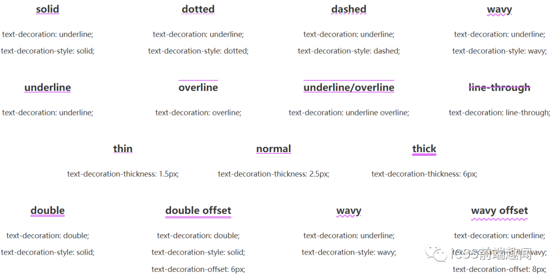
- text-decoration-line:控制用于设置元素中的文本的修饰类型,是在文本下方、上方还是贯穿文本
- text-decoration-style:不仅仅是实线 solid,类似于 border-style,还支持双实线 double、点划线 dotted、虚线 dashed 以及非常有意思的 wavy 波浪线
- text-decoration-color:这个好理解,控制颜色
- text-decoration-thickness:控制修饰线的粗细
这里有张非常好的图,帮助大家快速理解:
CodePen Demo -- Text-decoration Demo[3]
text-decoration-line 可以同时设置
有意思的一点是,text-decoration-line 可以同时设置。
p {
    text-decoration-line: overline underline line-through;
}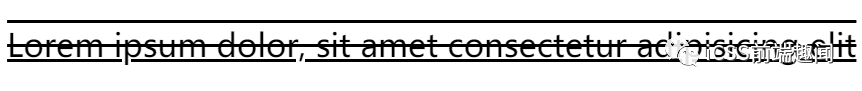
我们可以得到上中下三条线。
text-decoration 可以进行过渡与动画
text-decoration 的每个值都是可以进行过渡与动画的。合理利用,在一些文本强调的地方,非常有用。
<p class="transition">Lorem ipsum dolor</p>.transition {
text-decoration-line: underline;
text-decoration-color: transparent;
text-decoration-thickness: 0.1em;
cursor: pointer;
transition: .5s;
&:hover {
text-decoration-color: pink;
text-decoration-thickness: 0.15em;
color: pink;
}
}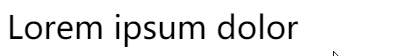
配合另外一个属性 text-underline-offset,我们还可以实现如下图这样有趣的效果:

当然,上述的例子中使用了 text-underline-offset 的变换,但是本身 CSS 是不支持 text-underline-offset 的过渡动画的,这里借助了 CSS @property 巧妙的实现了 text-underline-offset 的过渡动画,感兴趣的可以具体了解下 CSS @property 的用法。
CodePen Demo -- 文字下划线过渡动画效果[4]
text-decoration-color 与 color 分离
text-decoration-color 与 color 是可以不一样的,类似于这样。
.color {
    text-decoration-style: wavy;
    cursor: pointer;
    transition: .5s;

    &:hover {
        color: transparent;
        text-decoration-color: pink;
    }
}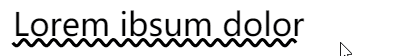
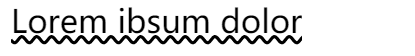
有意思,经过这样,我们其实得到了一条波浪线。
如果我们把 wavy 下划线加给元素的伪元素,然后在 hover 的时候添加一个动画,让波浪线动起来,得到一个非常好的强调 hover 效果:
<p class="animation" data-cnotallow="Lorem ibsum dolor Lorem ibsum dolor">Lorem ibsum dolor</p>.animation {
position: relative;
text-decoration: none;
overflow: hidden;
cursor: pointer;
line-height: 2;
&::before {
content: attr(data-content);
position: absolute;
top: 0;
left: 0;
color: transparent;
white-space: nowrap;
text-decoration-line: underline;
text-decoration-style: wavy;
text-decoration-color: #000;
z-index: -1;
}
&:hover::before {
animation: move 3s infinite linear;
}
}
@keyframes move {
100% {
transform: translate(-209px, 0);
}
}
我们利用伪元素添加了一段长于文本本身的文本,并且颜色为透明,但是设置了波浪线的颜色,然后 hover 的时候,通过运动伪元素的 translate 进行波浪线的位移,稍微调试一下 translate 的值,可以做到动画的首尾相连,实现运动的波浪线的效果。
CodePen Demo -- text-decoration Demo[5]
text-emphasis 文字强调
text-emphasis 意为文字强调,是 CSS Text Decoration Module Level 3[6] 才新增的一个属性,用于增强文字强调的效果。
在早些时候,我们如果要强调几个字,可能更多是使用加粗,斜体这种较为常规的文字样式类型:
{
    font-weight: bold;   // 加粗
    font-style: italic;  // 斜体
}
现在,多了一种有意思的强调方式 -- text-emphasis。
text-emphasis 语法
text-emphasis 包含了 text-emphasis 和 text-emphasis-position,允许我们在文字上方或者下方添加不同的强调装饰以及不同的颜色。
看个简单的 Demo:
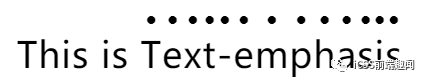
<p>
   This is <span>Text-emphasis</span>.
</p>
p span{
text-emphasis: circle;
}text-emphasis: circle 的效果是给包裹的文字,在其上方,添加 circle 图形,也就是圆圈图形,效果如下:
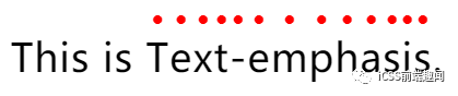
当然,默认是黑色的,我们可以在 circle 后面补充颜色:
p span{
    text-emphasis: circle #f00;
}
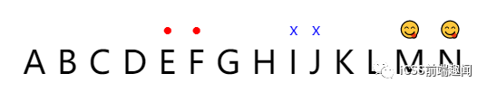
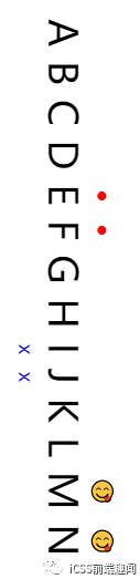
除了 circle,还提供非常多种图形可以选择,也可以自定义传入字符,甚至是 emoji 表情:
<p>
    A B C D
    <span class="keyword">E F</span>
    G H
    <span class="word">I J</span>
    K L
    <span class="emoji">M N</span>
</p>
.keyword {
text-emphasis: circle #f00;
}
.word {
text-emphasis: 'x' blue;
}
.emoji {
text-emphasis: '😋';
}
text-emphasis-position 语法
除了在文字上方,还可以在一定范围内改变强调图形的位置,选择放置在文字的上方或者下方,利用 text-emphasis-position。
这个属性接受上下与左右两个参数:
text-emphasis-position: [ over | under ] && [ right | left ]?
.keyword {
    text-emphasis: circle #f00;
}
.word {
    text-emphasis: 'x' blue;
    text-position: over left;
}
.emoji {
    text-emphasis: '😋';
    text-position: under left;
}
当文字的排版的书写顺序是水平排版布局,类似 writing-mode: lr 时,只需要用到 over、under 即可,当文本的排版布局模式是垂直模式时,类似 writing-mode: vertical-lr,才会用到 right 或者 left 关键字。
p {
    writing-mode: vertical-rl;
}
.keyword {
    text-emphasis: circle #f00;
}
.word {
    text-emphasis: 'x' blue;
    text-position: over left;
}
.emoji {
    text-emphasis: '😋';
    text-position: under right;
}
使用 background 模拟下划线
除了 CSS 原生提供的 text-decoration 与 text-emphasis 之外,我们还可以通过其他元素模拟一些文字装饰效果。
最常见的莫过于使用 background 模拟下划线了。
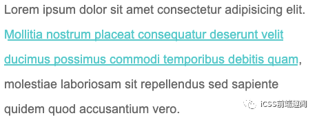
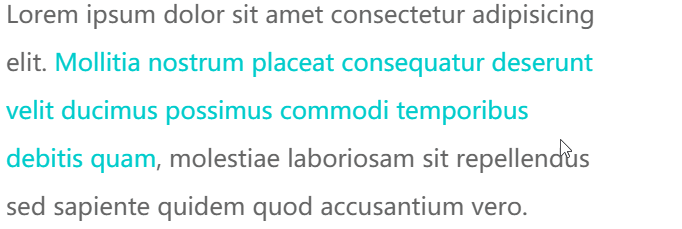
看个简单的 DEMO,使用 background 模拟文字的下划线效果:
<p>Lorem ipsum dolor sit amet consectetur adipisicing elit. <a>Mollitia nostrum placeat consequatur deserunt velit ducimus possimus commodi temporibus debitis quam</a>, molestiae laboriosam sit repellendus sed sapiente quidem quod accusantium vero.</p>p {
width: 600px;
font-size: 24px;
color: #666;
}
a {
background: linear-gradient(90deg, #0cc, #0cc);
background-size: 100% 3px;
background-repeat: no-repeat;
background-position: 100% 100%;
color: #0cc;
}使用 background 模拟文字的下划线效果,效果图如下:
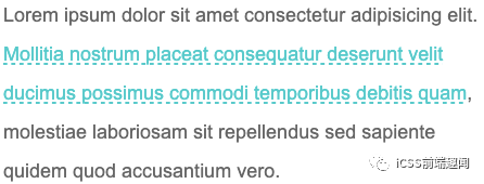
又或者,使用 background 模拟虚线下划线:
a {
    background: linear-gradient(90deg, #0cc 50%, transparent 50%, transparent 1px);
    background-size: 10px 2px;
    background-repeat: repeat-x;
    background-position: 100% 100%;
}
CodePen Demo -- 使用 background 模拟下划线与虚线下划线[7]
当然这个是最基础的,巧妙的运用 background 的各种属性,我们实现各种有意思的效果。
巧妙改变 background-size 与 background-position 实现文字 hover 动效
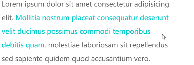
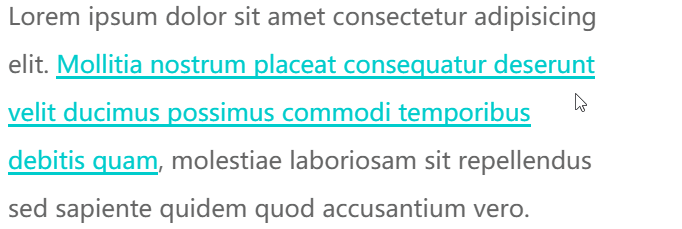
这里,通过巧妙改变 background-size 与 background-position 属性,我们可以实现一些非常有意思的文字 hover 效果。
先看这样一个 Demo,核心代码作用于被 <p> 标签包裹的 <a> 标签之上:
<p>Lorem ipsum dolor sit amet consectetur adipisicing elit. <a>Mollitia nostrum placeat consequatur deserunt velit ducimus possimus commodi temporibus debitis quam</a>, molestiae laboriosam sit repellendus sed sapiente quidem quod accusantium vero.</p>a {
background: linear-gradient(90deg, #ff3c41, #fc0, #0ebeff);
background-size: 0 3px;
background-repeat: no-repeat;
background-position: 0 100%;
transition: 1s all;
color: #0cc;
}
a:hover {
background-size: 100% 3px;
color: #000;
}我们虽然,设定了 background: linear-gradient(90deg, #ff3c41, #fc0, #0ebeff),但是一开始默认它的 background-size: 0 3px,也就是一开始是看不到下划线的,当 hover 的时候,改变 background-size: 100% 3px,这个时候,就会有一个 0 3px 到 100% 3px 的变换,也就是一个从无到有的伸展效果。
看看最后的效果:
由于设定的 background-position 是 0 100%,如果,设定的 background-position 是 100% 100%,我们可以得到一个反向的效果:
// 其他都保持一致,只改变 background-position,从 0 100% 改为 100% 100%
a {
    ...
    background-position: 100% 100%;
    ...
}
再看看效果,你可以对比着上面的动图看看具体的差异点在哪:
CodePen Demo -- background underline animation[8]
OK,如果我们使用 background 实现两条重叠的下划线,再利用上述的两个不同的 background-position 值,我们就可以得到一个更有意思的下划线 hover 效果。
CSS 代码示意,注意看两条使用 background 模拟的下划线的 background-position 的值是不一样的:
a {
    background:
        linear-gradient(90deg, #0cc, #0cc),
        linear-gradient(90deg, #ff3c41, #fc0, #8500d8);
    background-size: 100% 3px, 0 3px;
    background-repeat: no-repeat;
    background-position: 100% 100%, 0 100%;
    transition: 0.5s all;
    color: #0cc;
}
a:hover {
    background-size: 0 3px, 100% 3px;
    color: #000;
}
可以得到这样一种效果,其实每次 hover, 都有两条下划线在移动:
CodePen Demo -- background underline animation[9]
好了,本文到此结束,介绍了关于文字装饰的一些有意思的属性及动效,希望对你有帮助 :)
[1]CSS Level 2 (Revision 1) -- text-decoration: https://www.w3.org/TR/CSS2/text.html#lining-striking-props。
[2]CSS Text Decoration Module Level 3 - text-decoration: https://drafts.csswg.org/css-text-decor-3/#text-decoration-property。
[3]CodePen Demo -- Text-decoration Demo: https://codepen.io/Chokcoco/pen/VwmEpqj。
[4]CodePen Demo -- 文字下划线过渡动画效果: https://codepen.io/Chokcoco/pen/jOymJZR。
[5]CodePen Demo -- text-decoration Demo: https://codepen.io/Chokcoco/pen/poNQBye。
[6]CSS Text Decoration Module Level 3: https://drafts.csswg.org/css-text-decor-3/#text-emphasis-property。
[7]CodePen Demo -- 使用 background 模拟下划线与虚线下划线: https://codepen.io/Chokcoco/pen/YzNQKwm。
[8]CodePen Demo -- background underline animation: https://codepen.io/Chokcoco/pen/QWdgLwp。
[9]CodePen Demo -- background underline animation: https://codepen.io/Chokcoco/pen/MWJogjQ。
[10]Github -- iCSS: https://github.com/chokcoco/iCSS。
Recommend
About Joyk
Aggregate valuable and interesting links.
Joyk means Joy of geeK