
The Taco Bell Logo History, Colors, Font, and Meaning
source link: https://www.designyourway.net/blog/taco-bell-logo/
Go to the source link to view the article. You can view the picture content, updated content and better typesetting reading experience. If the link is broken, please click the button below to view the snapshot at that time.

The Taco Bell Logo History, Colors, Font, and Meaning
- BY Bogdan Sandu

The Taco Bell logo. It’s more than just a picture, right? It’s a sizzling spectacle of bold colors, fiery design, and dynamic shapes. It’s like a spicy salsa dance, capturing the spirit of the brand and driving our taste buds wild.
Imagine this,
You’re scrolling down your phone, and bam! That vibrant purple logo pops up. It’s unmistakable. That’s Taco Bell, amigo! Like a seasoned chef, the logo mixes the right ingredients, creating a visual feast that’s oh-so-yum.
But, hey, here’s the thing.
It’s not just a logo. It’s a story. A story of mouth-watering tacos, late-night cravings, and joyful meals shared with friends. You see that bell in the logo? That’s not just a bell. It’s the dinner bell calling us home to a warm, delicious meal.
So, let’s dive deep into this tasty tale of design and branding, shall we? Let’s unwrap the Taco Bell logo and see what makes it tick. Let’s find out how a simple logo can make us crave a cheesy, crunchy taco. Because, after all, that’s the magic of graphic design, isn’t it?
The Meaning Behind the Taco Bell Logo

Symbolic Significance
In the world of logos, the Taco Bell symbol is a classic. You might think it’s just a bell, but there’s a whole lot more to it.
The bell, you see, is a representation of the restaurant’s name, which was inspired by the founder, Glen Bell. That bell is an emblem of the unique, flavorful, and quickly served food that the establishment is known for.
Aesthetic Appeal
The logo’s design is more than just a fancy bell. It’s got that sleek, modern vibe that makes it pop on billboards, screens, and storefronts alike. The bell is simple, but it’s also visually striking.
It draws the eye and makes a statement. It’s a testament to the power of minimalist design, really.
The History of the Taco Bell Logo

Humble Beginnings
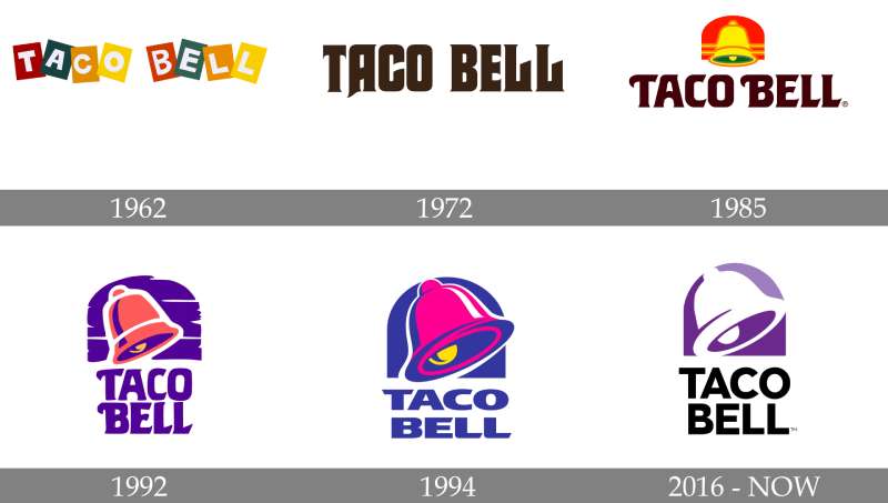
Back in the day, the Taco Bell logo was a lot different. It started off as a quaint, rather rustic sign that was full of charm.
It had the words “Taco Bell” printed in a funky font with a sombrero hovering above it. It gave off a festive, Mexican vibe that was a nod to the cuisine they served.
Evolution and Modernization
Over time, the logo evolved. The sombrero was replaced with a bell in the ’80s. The bell symbol became prominent and the font was streamlined, giving it a more modern appeal.
Then in 2016, it underwent another transformation. The bell was stylized and the color palette was switched up, giving us the purple logo we know today.
Get 300+ freebies in your inbox!
Subscribe to our newsletter and receive 300+ design resources in your first 5 minutes as a subscriber.
The Colors of the Taco Bell Logo

The Power of Purple
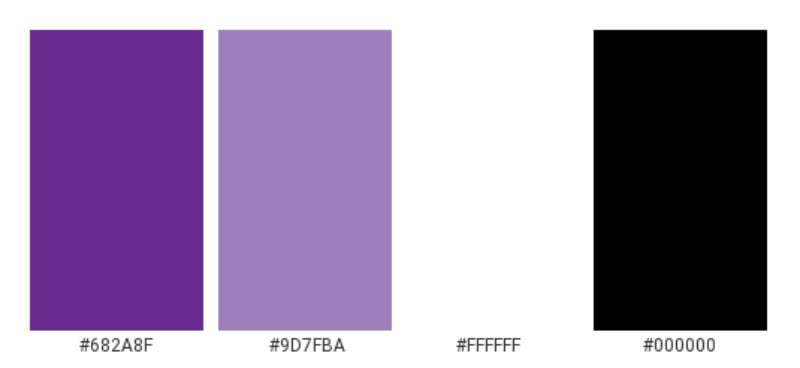
The logo today is dominated by a bright, vibrant purple. This color is all about uniqueness, creativity, and extravagance. It’s bold, it’s different, and it’s eye-catching. It speaks to the brand’s personality and it definitely sets Taco Bell apart from the crowd.
The Font Used in the Taco Bell Logo

A Sleek Typeface
When it comes to the font, the Taco Bell logo keeps it clean and simple. It’s a sans-serif typeface that’s all about clarity and legibility. It’s straightforward and no-nonsense, just like the brand.
Balancing Tradition and Modernity
The font balances the traditional with the modern. It’s got a timeless feel to it, but it’s also fresh and contemporary. It complements the bell symbol and ties the whole logo together.
Subliminal Messages in the Taco Bell Logo
Hidden in Plain Sight
Now, here’s a fun fact. If you look closely at the bell in the logo, you’ll notice that it kind of, sort of, looks like a snake’s tongue. Is this intentional? Who knows. But it’s a nifty little detail that adds a layer of intrigue to the logo.
Intention or Coincidence?
Whether this was a deliberate design choice or just a happy accident, it’s one of those things that once you see it, you can’t unsee it. It’s a testament to the complexity of logo design, and how even the simplest of logos can have hidden depths.
Impact of the Taco Bell Logo on Branding
Instant Recognition
One of the key functions of a logo is to make a brand instantly recognizable. And the logo does just that. Its distinct bell symbol and bright color palette make it immediately identifiable, whether it’s on a restaurant sign, a takeout bag, or a TV ad.
A Memorable Impression
The logo leaves a lasting impression on viewers. It’s bold, it’s unique, and it’s hard to forget. This makes it an essential part of Taco Bell’s branding strategy. It’s the visual representation of the brand, and it plays a crucial role in shaping public perception of the company.
Taco Bell Logo’s Influence on Pop Culture
Ubiquitous Presence
It’s not just in the realm of fast food that the Taco Bell logo has made its mark. Its influence extends into pop culture as well.
It’s featured in movies, TV shows, and music videos. It’s printed on merchandise like t-shirts, hats, and phone cases. It’s a symbol that’s become a part of our everyday visual landscape.

Iconic Status
The logo’s design, coupled with the brand’s widespread popularity, has elevated it to iconic status. It’s more than just a brand symbol; it’s a cultural icon that’s synonymous with fast food and American consumer culture.
In the grand scheme of things, the Taco Bell logo is a brilliant piece of design work. It’s simple yet memorable, modern yet timeless. It communicates the essence of the brand and resonates with its target audience. It’s a testament to the power of good design and effective branding.
FAQ on the Taco Bell logo
What’s the history of the Taco Bell logo?
Well, the story kicks off in 1962. Glen Bell, the founder, introduced a simplistic logo to represent his fast-food chain. This design was a combo of a colorful bell and the brand’s name in brown.
Fast forward to 1985, a more modern and simplistic logo was adopted, which lasted until 1994.
The logo we know today, that snazzy purple bell, was introduced in 1995 and has remained pretty much unchanged since then.
What does the Taco Bell logo represent?
Get this – the Taco Bell logo is super symbolic! The bell in the logo is a nod to the founder, Glen Bell. It’s like a pun, you know? “Bell’s” tacos. Also, the color scheme is quite meaningful.
The purple colors are bold and eye-catching, which is pretty much the vibe Taco Bell aims to achieve in their outlets. It’s all about creating a fun and energetic atmosphere for the customers.
Has the Taco Bell logo changed over time?
Oh, you bet! The logo has evolved quite a bit since its inception. The original logo was quite rudimentary and had this old western vibe. By the mid-80s, they switched to a more minimalist design.
And in 1995, they adopted the current logo, which is a lot more vibrant and exciting. Each change reflected the brand’s aim to keep up with the times and stay fresh in the market.
Why did Taco Bell change its logo?
Like many businesses, Taco Bell has changed its logo to stay relevant. It’s all about maintaining a fresh and appealing image to attract new customers and keep the old ones coming back.
Each logo change has been a step towards creating a more modern and dynamic brand image. It’s a subtle way of saying, “Hey, we’re growing, we’re evolving, just like you!”
What colors are in the Taco Bell logo?
The logo sports a lively purple. These colors are meant to grab your attention, making the brand stand out in the sea of fast-food chains. Also, the choice of these vibrant colors is meant to represent the brand’s energetic and youthful vibe.
They’re all about creating a fun and relaxed atmosphere, and the colors in their logo perfectly echo this sentiment.
Is the Taco Bell logo trademarked?
Absolutely, it is! Taco Bell, like any smart business, has their logo trademarked. This move protects the brand’s identity and prevents other businesses from using a similar logo.
Trademarking is a crucial step for any business, ensuring their unique brand image stays, well, unique.
How has the Taco Bell logo influenced its brand identity?
The logo has played a massive role in shaping the brand’s identity. It’s the face of the brand, the first thing customers see, so it’s gotta make an impact, right?
The vibrant colors and bold design embody the brand’s lively and youthful energy. It’s a visual representation of what the brand stands for – fun, energy, and a fresh take on fast food.
What is the font used in the Taco Bell logo?
The Taco Bell logo uses a custom typeface, which isn’t available for public use. But don’t let that get you down. If you’re looking for a similar vibe, fonts like Helvetica Black or Arial Black might do the trick.
They have that bold, sans-serif look that’s quite close to the Taco Bell logo font.
Who designed the Taco Bell logo?
The current logo was designed by Lippincott, a renowned brand strategy and design consultancy. They’re the folks behind the design of many famous logos. So, it’s safe to say, the Taco Bell logo was crafted by some seriously talented hands.
Their design has stood the test of time, remaining largely unchanged since its introduction in 1995.
Can I use the Taco Bell logo for personal use?
Technically, no. The logo is a trademarked image, and using it for personal purposes could land you in hot water. Trademark laws protect the logo, and unauthorized use could be considered infringement.
It’s always best to respect these laws and seek permission if you want to use the logo. It’s the right thing to do, you know?
Ending thoughts on the Taco Bell logo
Taco Bell’s logo, right? That’s the real deal! Bursting with color, oozing energy, and hinting at a fiesta of flavors. Sure, it’s got that bell, but it’s more than just a chime.
It’s a shout-out to the world, saying, “Hey, we’ve got your cravings sorted!”
Now, let’s do a breakdown.
- Boldness: The purple hue? Pure audacity, strutting its stuff.
- Simplicity: No intricate details. Just a bell. But it’s got a punch.
- Recognition: See it once, remember it forever. That’s the power of design.
Oh, and the curve? It’s like a smile, warming you up for the deliciousness to come.
And just like that, Taco Bell isn’t merely a pit stop. It’s an experience. An adventure of flavors wrapped up in a logo. It’s a silent promise of a good time.
The Taco Bell logo? It’s not just a brand sign, it’s a brand statement.
A logo can be a game changer, folks, and Taco Bell sure knows how to play.
If you enjoyed reading this article about the Taco Bell logo, you should read these as well:
Recommend
About Joyk
Aggregate valuable and interesting links.
Joyk means Joy of geeK