

What font does Uber use in the UI and logo?
source link: https://www.designyourway.net/blog/what-font-does-uber-use/
Go to the source link to view the article. You can view the picture content, updated content and better typesetting reading experience. If the link is broken, please click the button below to view the snapshot at that time.
What font does Uber use in the UI and logo?
Uber Technologies Inc. or simply Uber is one of the most successful ride-hailing companies in the world. Originally founded in America, it has quickly expanded into countless other nations across the globe. Apart from ride-hailing, the company also offers services such as food delivery. It also manages a micro-mobility system in the form of electric bikes and scooters.
Initially called UberCap, the idea behind the company was formed by Garrett Camp and Travis Kalanick. They came up with Uber in 2008, when they couldn’t find a taxi while in Paris.
This prompted them to imagine a ride-hailing app that would be accessible on their phone. Believing they were onto something, they founded the company in 2009. The Uber app was first tested in 2010 and launched worldwide the following year.
One of the most famous unicorn startups, Uber embodies the unstoppable advancement of technology of the last decade. With a valuation of sixty-one billion dollars, hardly any other tech company can match its success.
But what font does Uber use? An integral part of brand recognition is a witty and memorable logo. Uber decided to go all out and created a custom font named ‘Uber Move’.
As part of the sans serif font family, Uber created it to resemble other transportation fonts. The idea to come up with their own logo also saved the company license expenses.
The idea of creating your own logo is something of a trend among Silicon Valley businesses. Apple, Google, and Netflix all use their own fonts.
The origins of Uber’s bespoke sans serif typeface
At first glance, you may think that fonts should be among the lowest priorities for a ride-hailing app. But this isn’t true. A unique font can help a brand stand among the competition. Uber is no stranger to this knowledge.
Uber’s logo witnessed several changes during its 10-year-long existence. It has evolved gradually over the years. When Uber first came to be, the design studio chose to add a big red magnet under its name. However, they removed it in 2011.
Uber has been using its current logo since 2018. Compared to the previous ones, it looks much friendlier and more memorable. Many new companies use custom typefaces and Uber is no exception. It uses a custom-made sans-serif font that makes it simple yet elegant.
The original Uber logo (2009-2010)
In its early stages, the company was called UberCab. The logo featured the word ‘Uber’ with a red magnet positioned right under it. It symbolized your ability to call a cab within a few seconds. The earliest logo was sometimes abbreviated as UC.
It used a sans-serif font and featured only black lowercase letters. The company soon realized that shorter logos were trendier and decided to remove the word ‘Cab’.
The 2012 Uber logo
Get 300+ freebies in your inbox!
Subscribe to our newsletter and receive 300+ design resources in your first 5 minutes as a subscriber.
In 2012, Uber decided to scrap the red magnet under its name. The company also transitioned from lowercase letters to uppercase ones. They also changed the bold font to a sleeker one. The updated logo remained in use until 2016.
The 2016 Uber logo

Uber’s in-house design team changed the logo again in 2016. They once again transitioned to a bolder sans-serif font. The lack of serifs made it look smoother and more modern.
The most notable part of the 2016 logo was the letter ‘E’. The horizontal strokes were cut diagonally instead of vertically. As a result, the logo looked much more dynamic and elegant.
The contemporary Uber logo (2018-present)

As of 2023, Uber‘s logo underwent the final change in 2018. As the company’s success grew, it decided to branch out to offer other services. These included scooters, bikes, and even forms of air transport. It wanted to create a new logo that would match this expansion.
Advertisement
Uber started its rebranding process in 2018 as it continued to expand across the globe. To create the perfect logo, the design studio came up with a sans-serif typeface known as Uber Move. It then rebranded all its products using this new font.|
The logo features elongated letters that are lowercase, apart from the ‘U’. It uses a bold font that makes it stand out on light backgrounds.
The app itself instead uses a white font set against a black background. Uber designed this final version of its logo to match other transportation companies’ sans-serif fonts.
What font family does Uber use?
The company has been using its custom-made font called Uber Move ever since 2018.
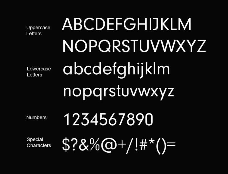
Designed by Jeremy Mickel from the MCKL design studio, it belongs to the sans-serif font family. Uber’s own design team and the branding agency Wolff Olins also contributed to Uber Move.
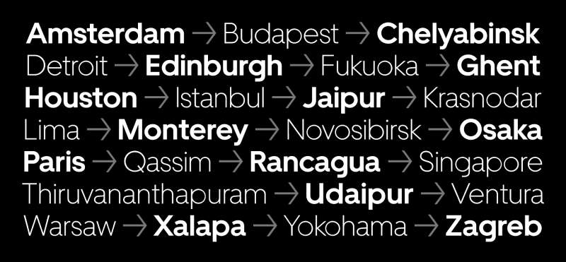
The font uses geometric letter shapes. However, its lowercase letters lean more toward the grotesque style. Uber Move comes both in a display and text version, making it suitable for screens of all sizes.
The custom font draws inspiration from sans serif styles such as Futura and Neuzeit Grotesk. The company decided to add elements from transportation fonts to these styles, resulting in Uber Move. The fonts came in four weights and two optical sizes, Their letters were slightly condensed and features geometric letter shapes.
The logo represents ambition, safety, and friendliness. Its font belongs to Uber, making it unavailable for public use.
What fonts similar to Uber Move can you use?
Although Uber Move belongs to the company, you can use other fonts that look similar. Here’s a list of 4 fonts resembling Uber Move.
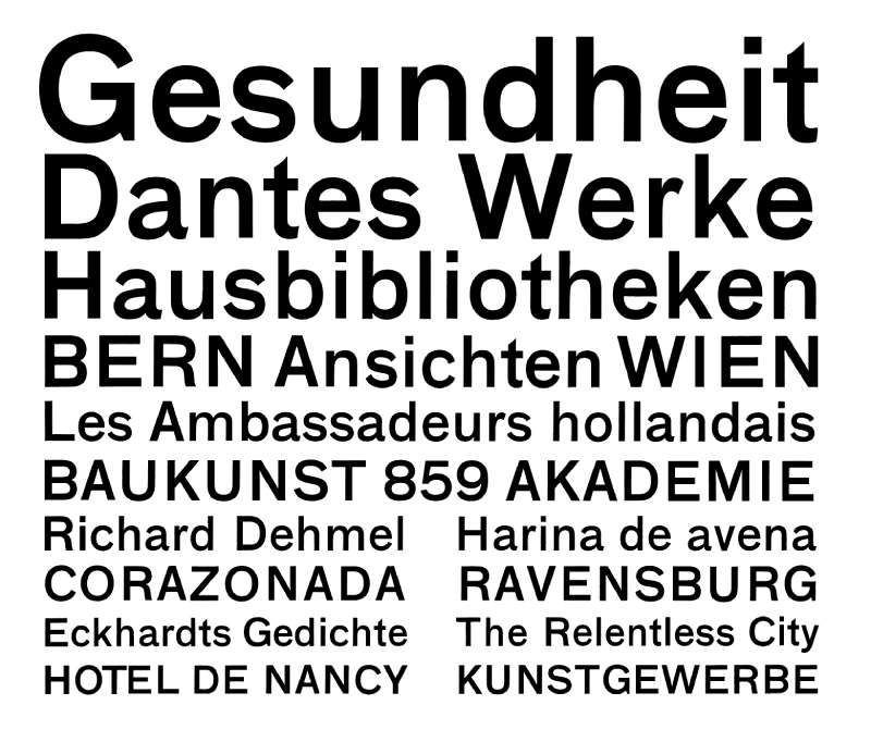
Neuzeit font
Created by Wilhelm Pischner in 1928, the Neuzeit font belongs to the sans serif family. Since Uber Move draws inspiration from Neuzeit, it’s only natural the two fonts look similar.
Futura font
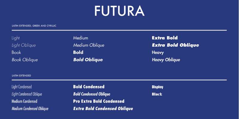
Designed by Paul Renner, Futura entered the scene in 1927. It emphasizes geometric shapes such as circles, resembling the Bauhaus design style. This is the second font that inspired Uber Move, which is why they look so alike.
Programme font
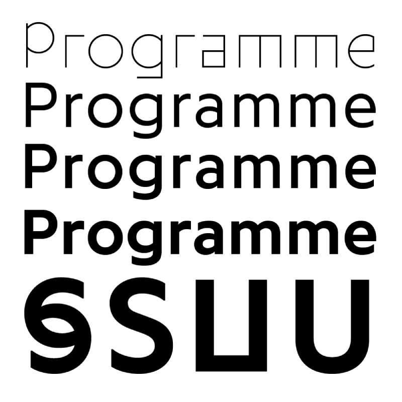
Released by Optimo in 2013, Programme is a sans serif font with roots in a computer program. That’s where it got its name. Though a designer later improved it, it still features some of the original qualities. The font comes in three weights and features rotated styles. These styles make the letters lean to one side.
Regular font
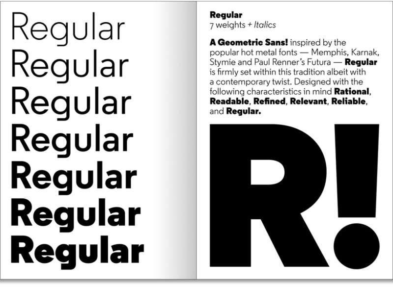
Designed by Henrik Kubel, this sans-serif font was released in 2013 by the A2-Type foundry. The creator decided to design this font after he saw a unique letter ‘g’ on a faded wall sign. It comes in seven weights ranging from light to black.
Other fonts that resemble Uber Move
Breite Grotesk
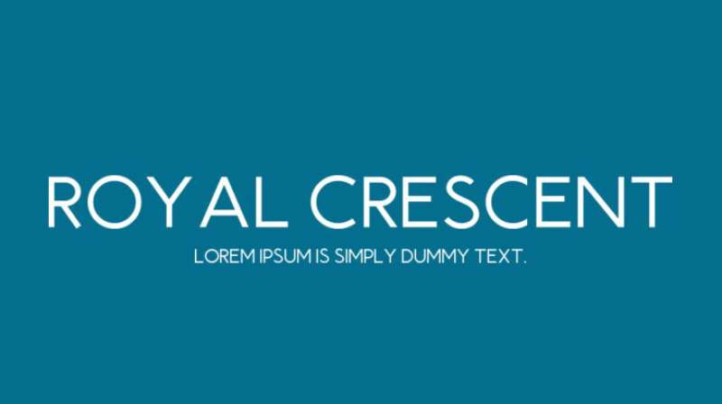
Royal Crescent
JMH Ava
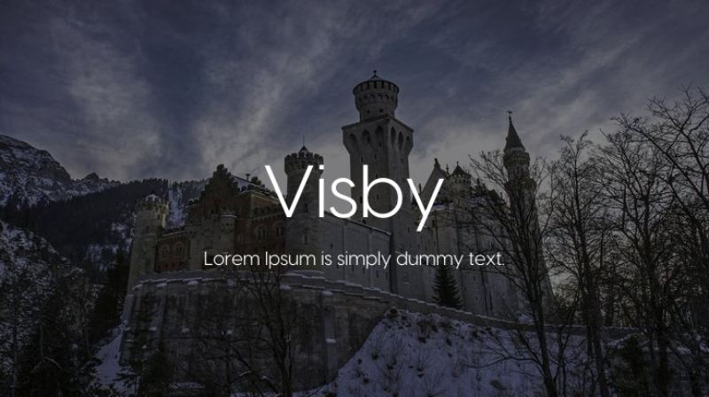
Visby
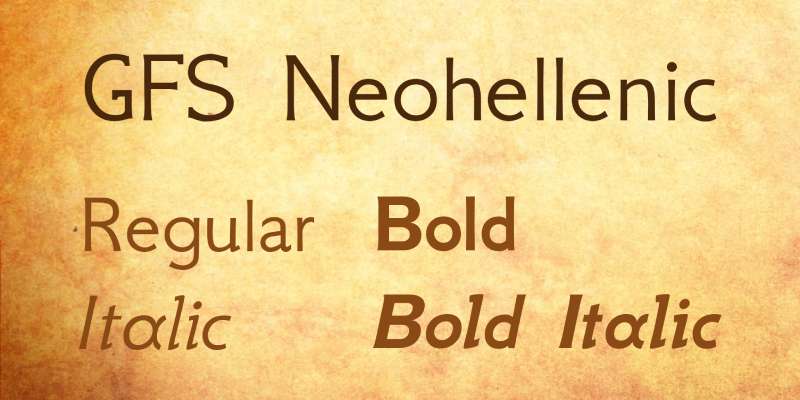
GFS Neohellenic
FAQ on the Uber font
What’s the name of the font Uber uses?
So you’re digging Uber’s typography, eh? They use their own custom font called “Uber Move.” It’s sleek, modern, and was designed to represent speed and efficiency, just like their services.
Where can I download the Uber font?
Hold up there! Uber Move is a proprietary font, which means it was created specifically for Uber and isn’t publicly available. They’ve got it locked down tighter than a super-secret recipe. So, unfortunately, you can’t legally download it.
Why does Uber use Uber Move in its branding?
Uber’s all about seamless mobility, right? They wanted a font that reflects this. Uber Move, with its rounded, flowing letterforms, gives off a sense of speed and efficiency. It’s a visual representation of what Uber stands for.
Can I use the Uber font in my designs?
Wishful thinking, but no can do. Uber Move is proprietary, remember? It’s exclusive to Uber. If you’re looking for something similar though, consider fonts like Circular or FF Clan. They might just do the trick!
Is Uber Move a web-safe font?
Since Uber Move is a proprietary font, it’s not considered web-safe. It’s not universally installed on all devices. But don’t fret, web design is all about problem-solving. You can always find other sans-serif fonts that are web-safe!
How can I use a font like Uber Move effectively in my designs?
If you’re into the clean and modern look of Uber Move, consider using a similar font for your headers or other large text. Pair it with lots of white space for a sleek, modern design. Remember, balance and simplicity are key here.
Does Uber Move support non-English characters?
Uber has global ambitions, so you bet it does! Uber Move was designed with multiple language support in mind. Just remember, you should always test with your specific characters before you dive headfirst into any design.
Is there a similar font to Uber Move?
Yes, there are similar fonts out there. Try taking Circular or FF Clan for a spin. They have a similar vibe – modern and clean, yet friendly. Remember, your font choice should reflect your brand’s personality.
How can I style a font to resemble Uber Move?
To mimic the look of Uber Move, use a similar sans-serif font and play around with letter spacing and line height. Keep things clean, streamlined, and easy to read. And remember, your color choice can also make a big difference!
Is a font like Uber Move accessible?
A well-designed sans-serif font like Uber Move can be highly accessible thanks to its clean and clear letterforms. Just remember to keep your text size generous and your color contrast high. Good design should always be inclusive. It’s not just about looking good, it’s about being good too.
What font does Uber use? Our final thoughts.
Uber’s current logo is the product of the company’s exhaustive rebranding strategy managed by Wolff Olins. The new logo looks modern and inviting, which has helped the brand stand out from its competitors.
When you design your own logo, you can draw inspiration from Uber. The company originally used a red magnet that made it noticeable. Later, it simplified the logo to a simple word written in black font. Uber then perfected it and created the iconic logo you can see today.
The key lesson from Uber’s journey is betting on simplicity. Fancy and complex patterns look confusing, making them unsuitable for modern logos. To succeed, make sure your design is elegant but simple.
If you enjoyed reading this article on what font Uber uses, you should read these as well:
Recommend
About Joyk
Aggregate valuable and interesting links.
Joyk means Joy of geeK