

Maps Distort How We See the World
source link: https://unchartedterritories.tomaspueyo.com/p/maps-distort-how-we-see-the-world
Go to the source link to view the article. You can view the picture content, updated content and better typesetting reading experience. If the link is broken, please click the button below to view the snapshot at that time.
Maps Distort How We See the World
30 Maps to Rethink the World
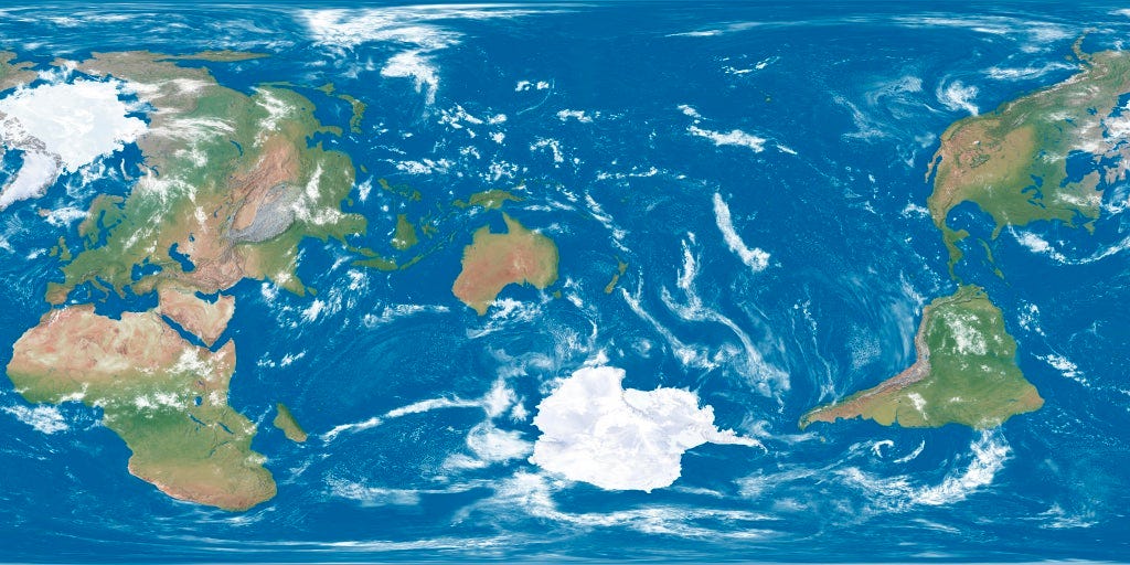
Maps twist our perception of the world.
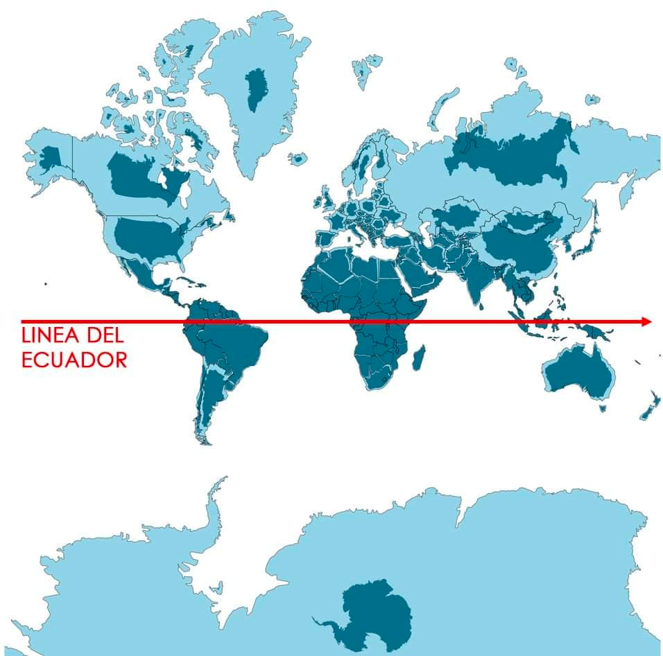
Countries closer to the equator—which happen to be poorer
—seem smaller than they are.
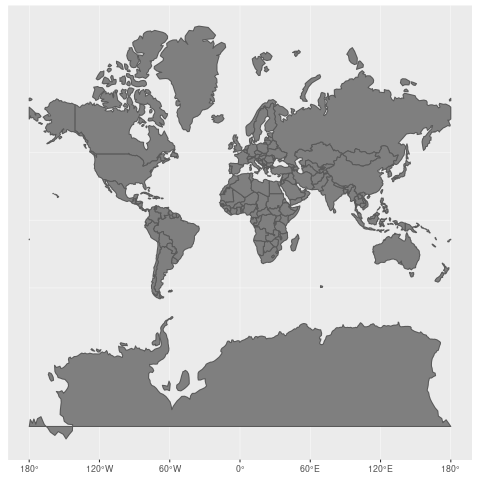
This is because the world is a 3D sphere, but maps are 2D projections on a plane. That means distortion!
Here is a static version showing the equator, to compare more easily and see how much the projection differs from reality as you move away from it:
We should be wary of flattening balls!
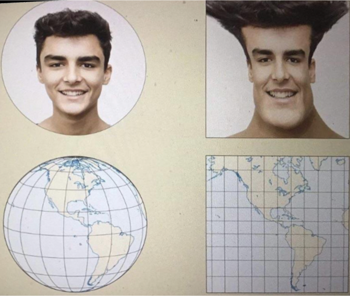
So we develop a poor intuition for comparative region sizes.
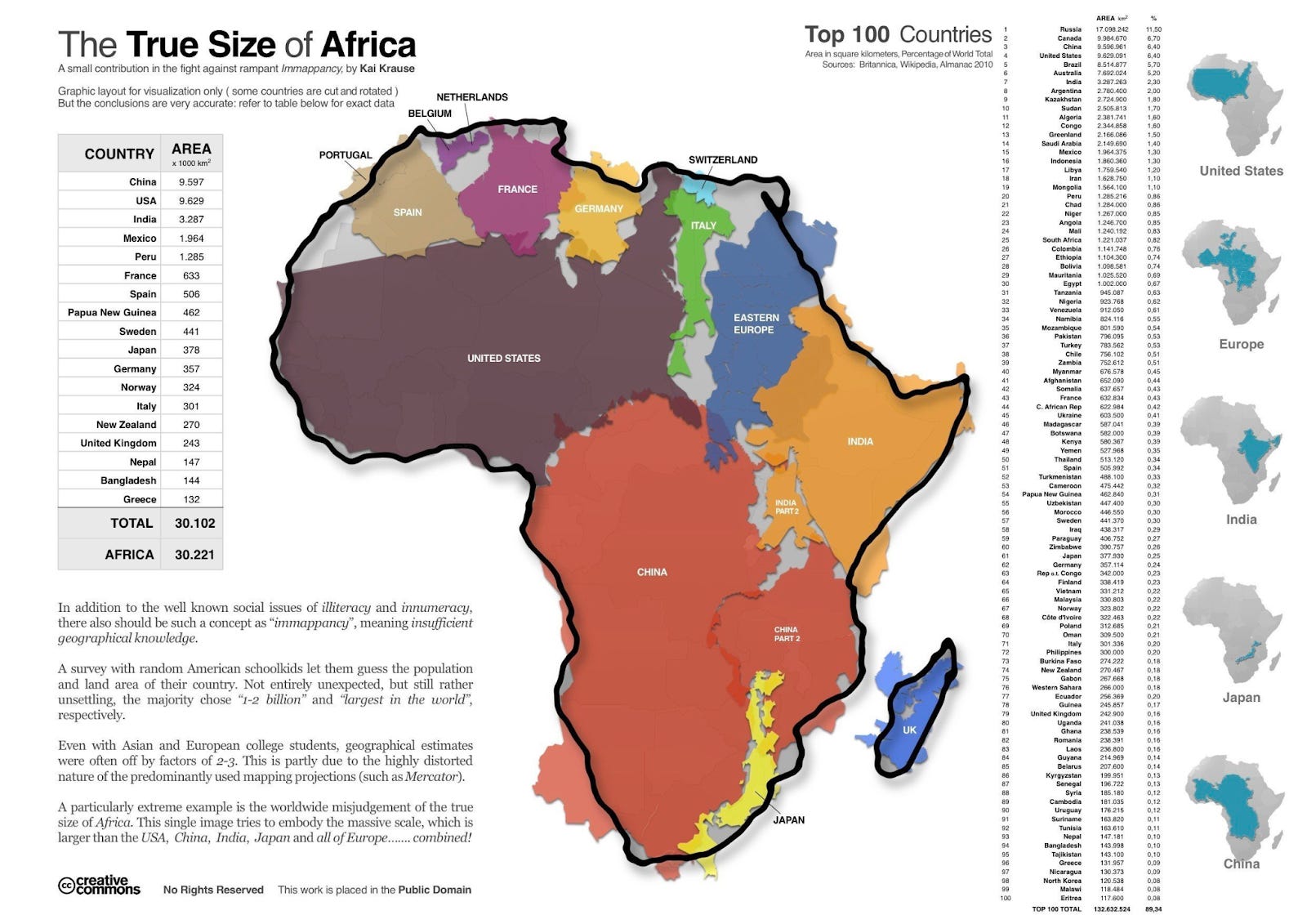
The biggest loser is Africa, which is humongous:
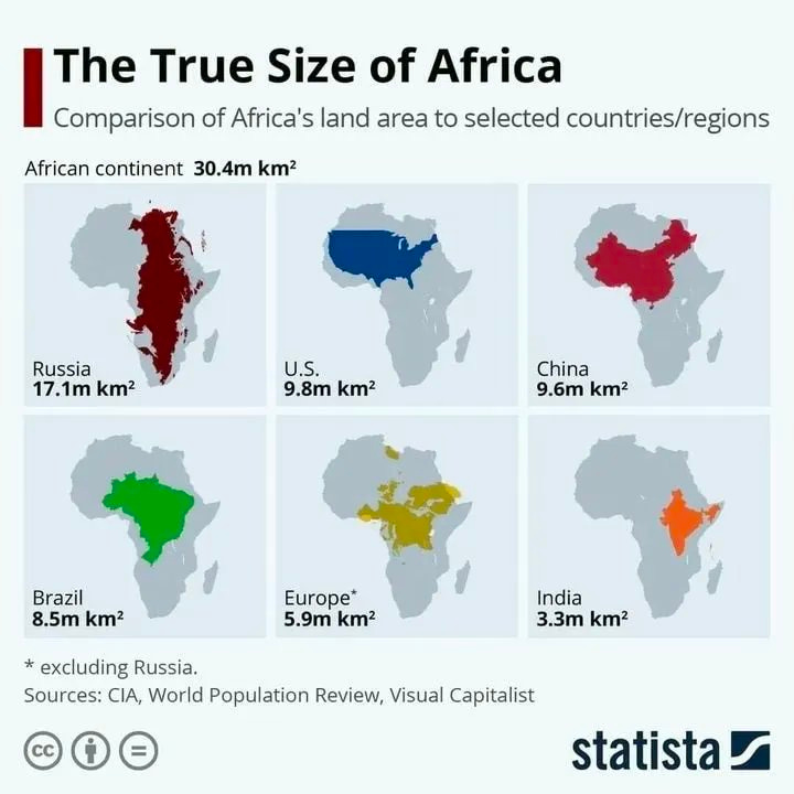
Here’s another take on it, to drive the point home.
If you compare the most affected regions
, you realize that Africa is about as wide as Russia!
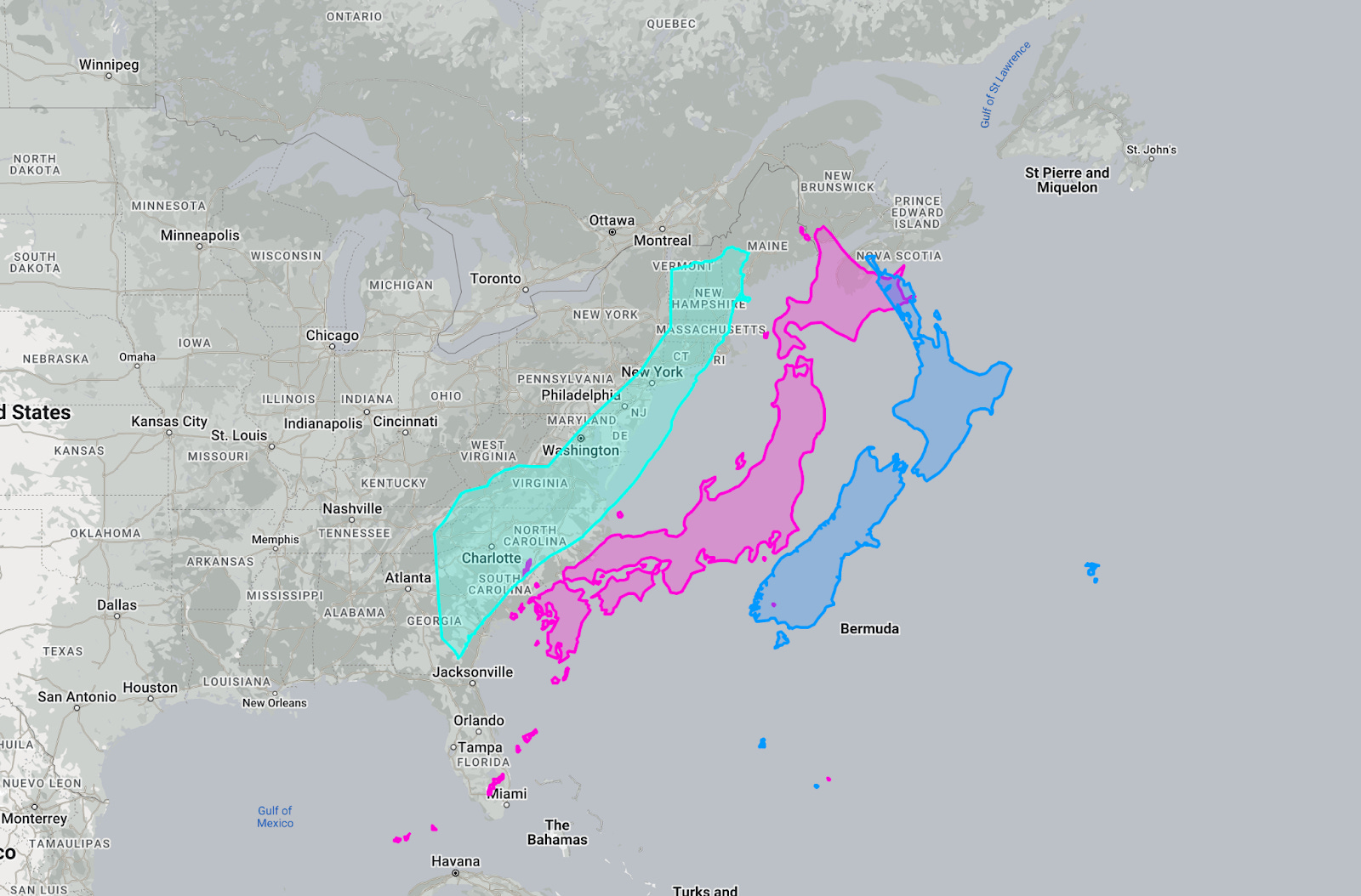
Somalia, Japan, and New Zealand are all approximately the same size as the US East Coast.
Brazil is the most short-changed country, as it’s right on the equator and huge. Here it is compared to Europe.
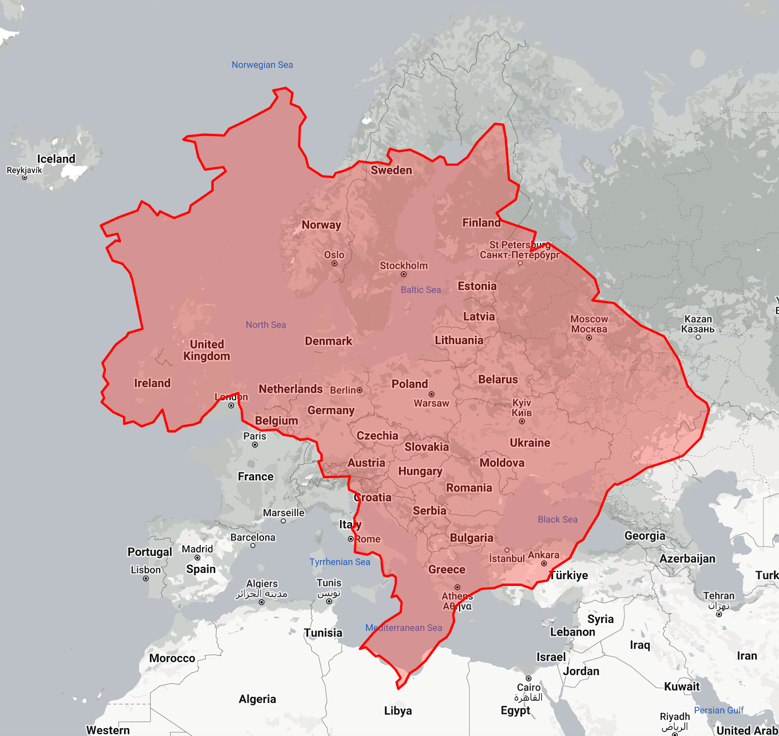
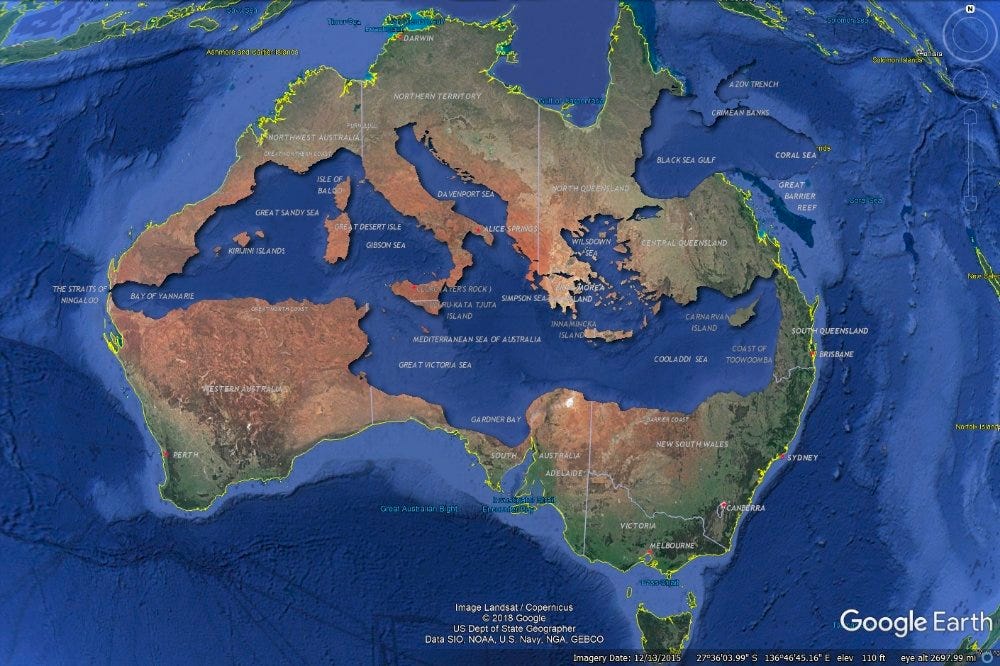
Broadly speaking, many regions of the world are of a similar size. Here is Europe compared to Australia and the US contiguous 48:
Here’s a beautiful way to put it:
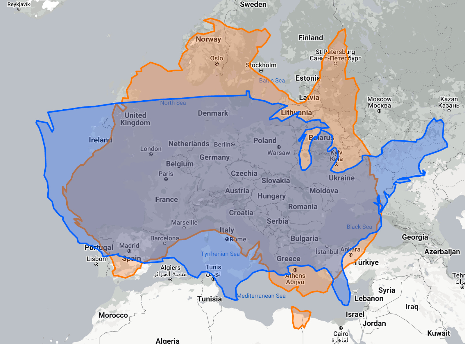
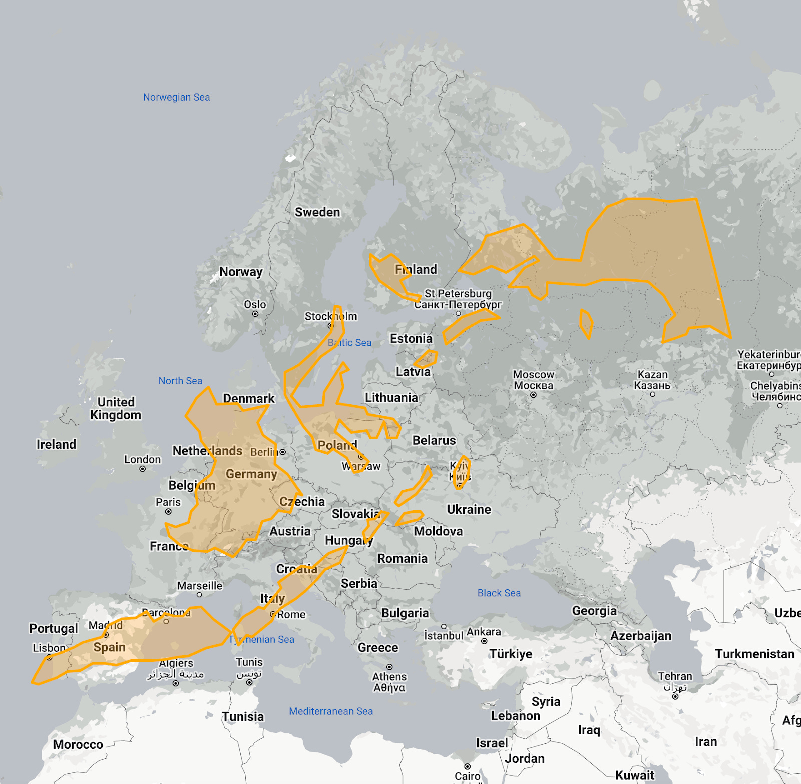
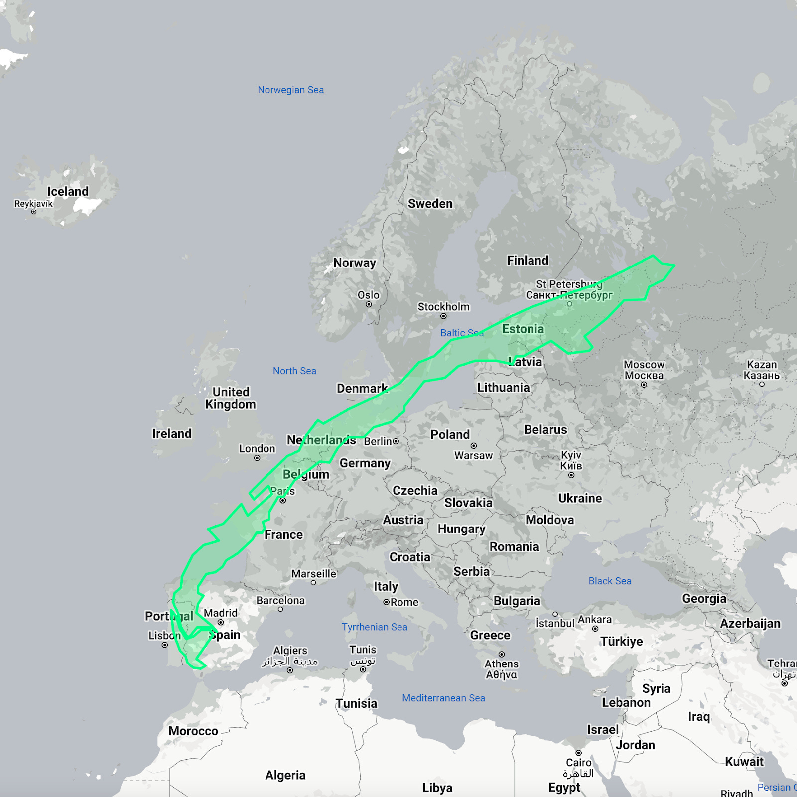
Now Europe compared to Canada, India, and China:

Indonesia’s span is longer than the EU’s!
Chile is ridiculously long:
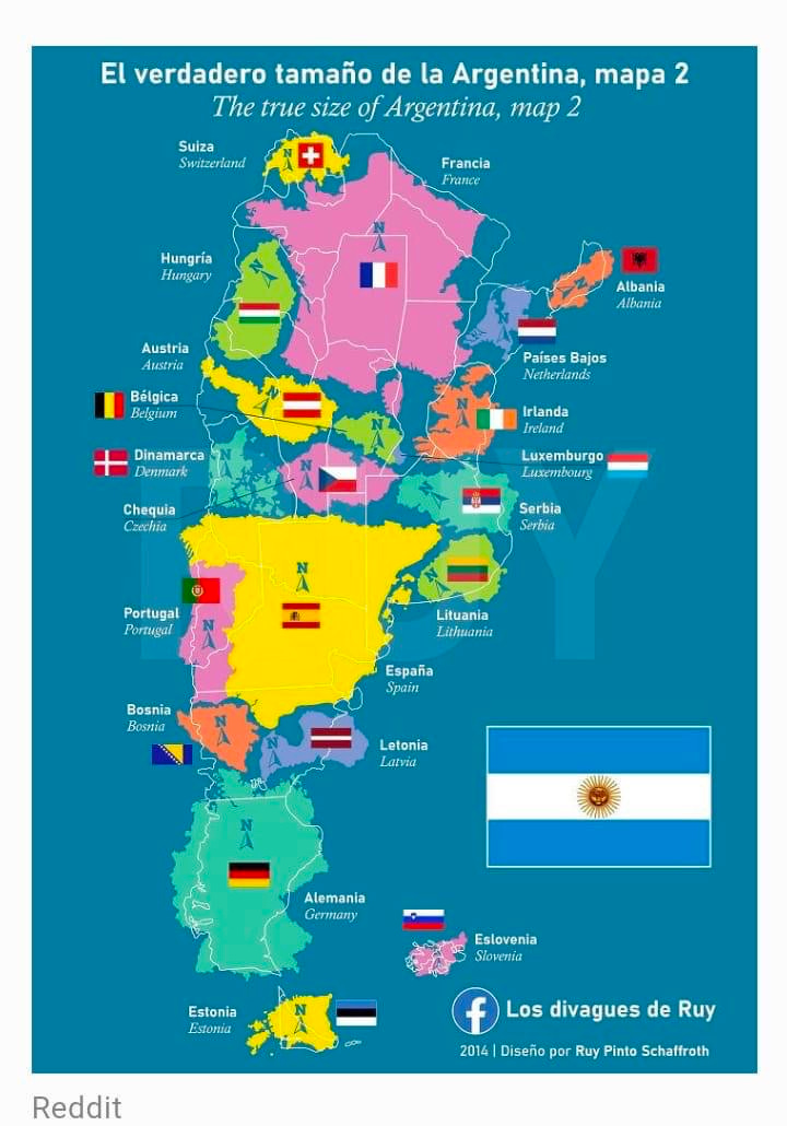
Argentina fits a handful of European countries inside its borders.
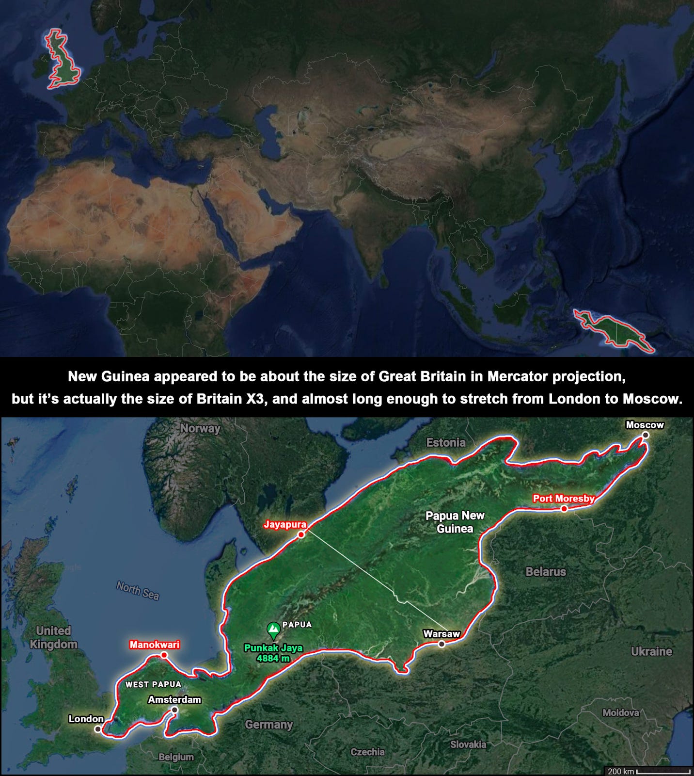
The island of New Guinea, which appears to be about the size of Great Britain, reaches in fact from London to Moscow.
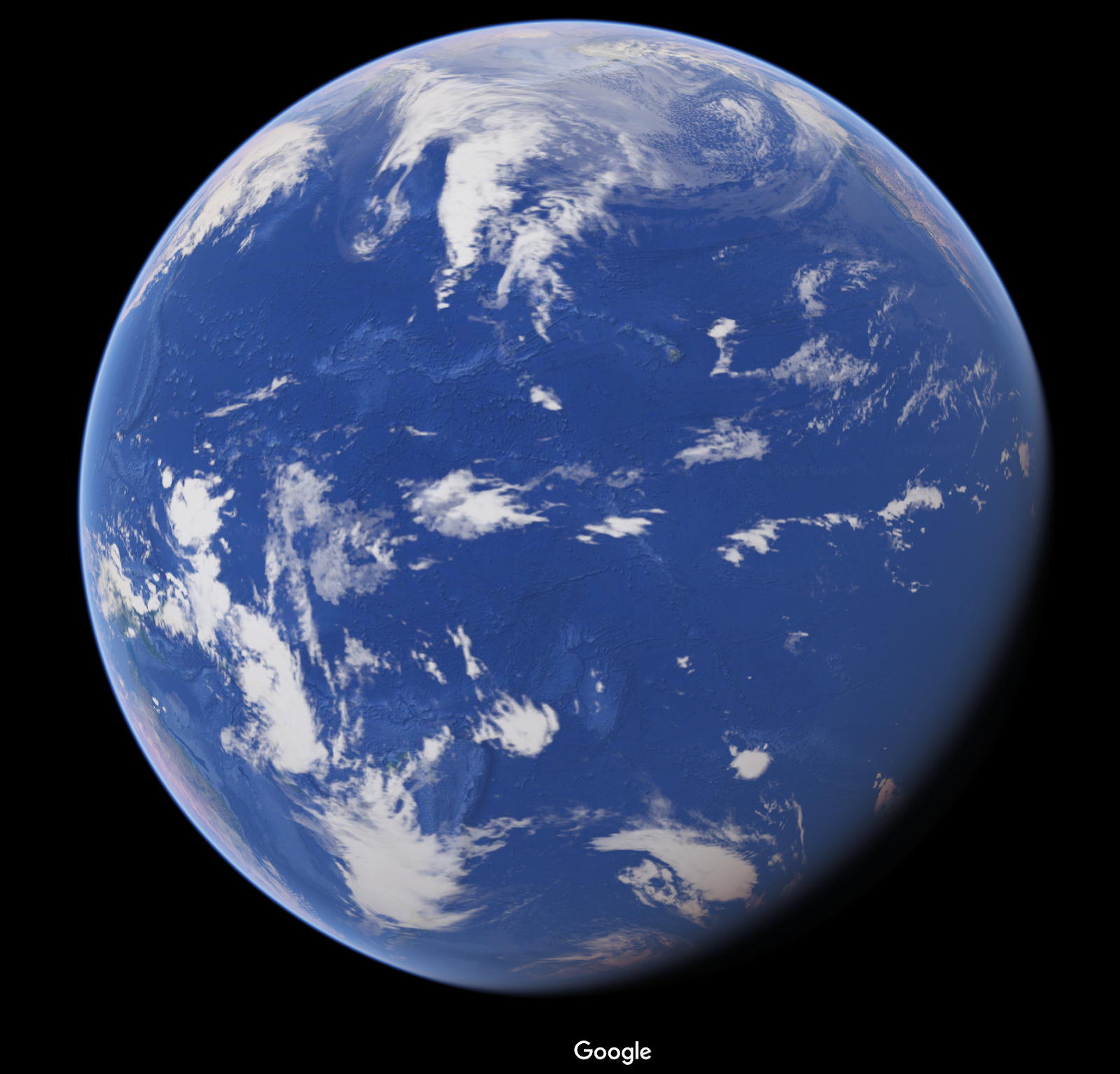
And the biggest of all, the Pacific Ocean. It is so humongous it could contain the entire landmass of Earth
!
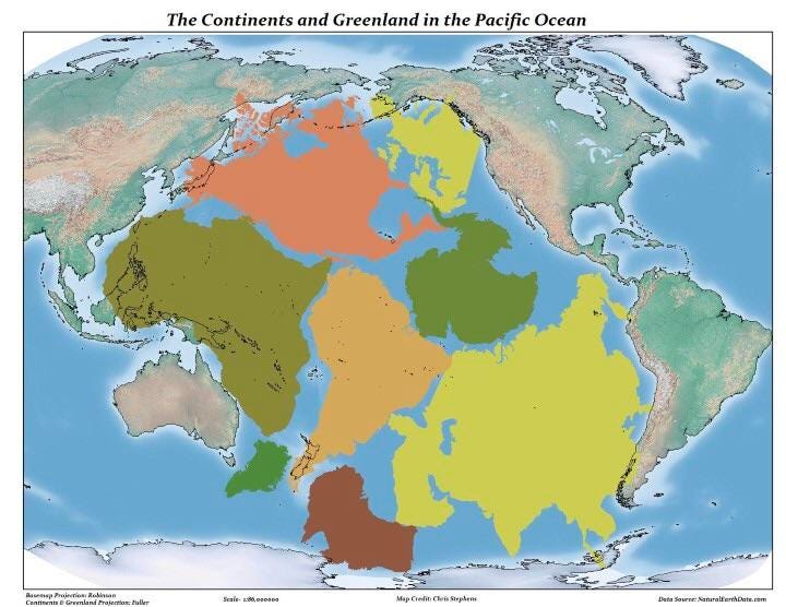
This is why, if you look straight at the Pacific Ocean on a globe, you only see water.
So the Mercator projection clearly distorts our perception of the world. But it’s not the only way it’s distorted.
We center our map around the equator and the reference meridian, which goes through London.
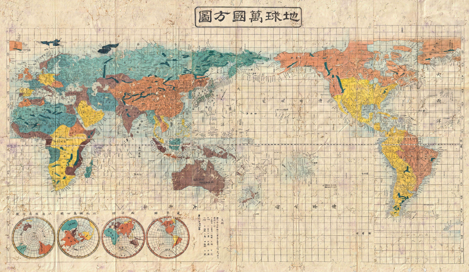
Here’s an old Japanese map centered around Japan instead.
What happens if you center it on Argentina instead?

Or New Zealand?
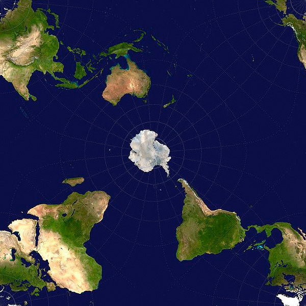
Antarctica feels very lonely:
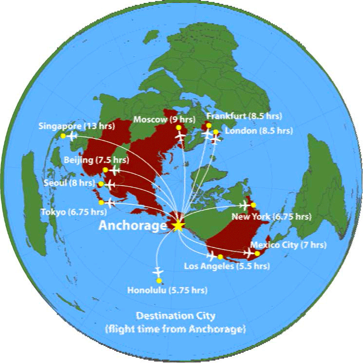
Conversely, if you center the map around Alaska, you can see why it has the 3rd biggest airport in the world in terms of cargo: it’s the most central point to all the big markets in the northern hemisphere.
These projections make us miss lots of quite striking relations between regions. For example:
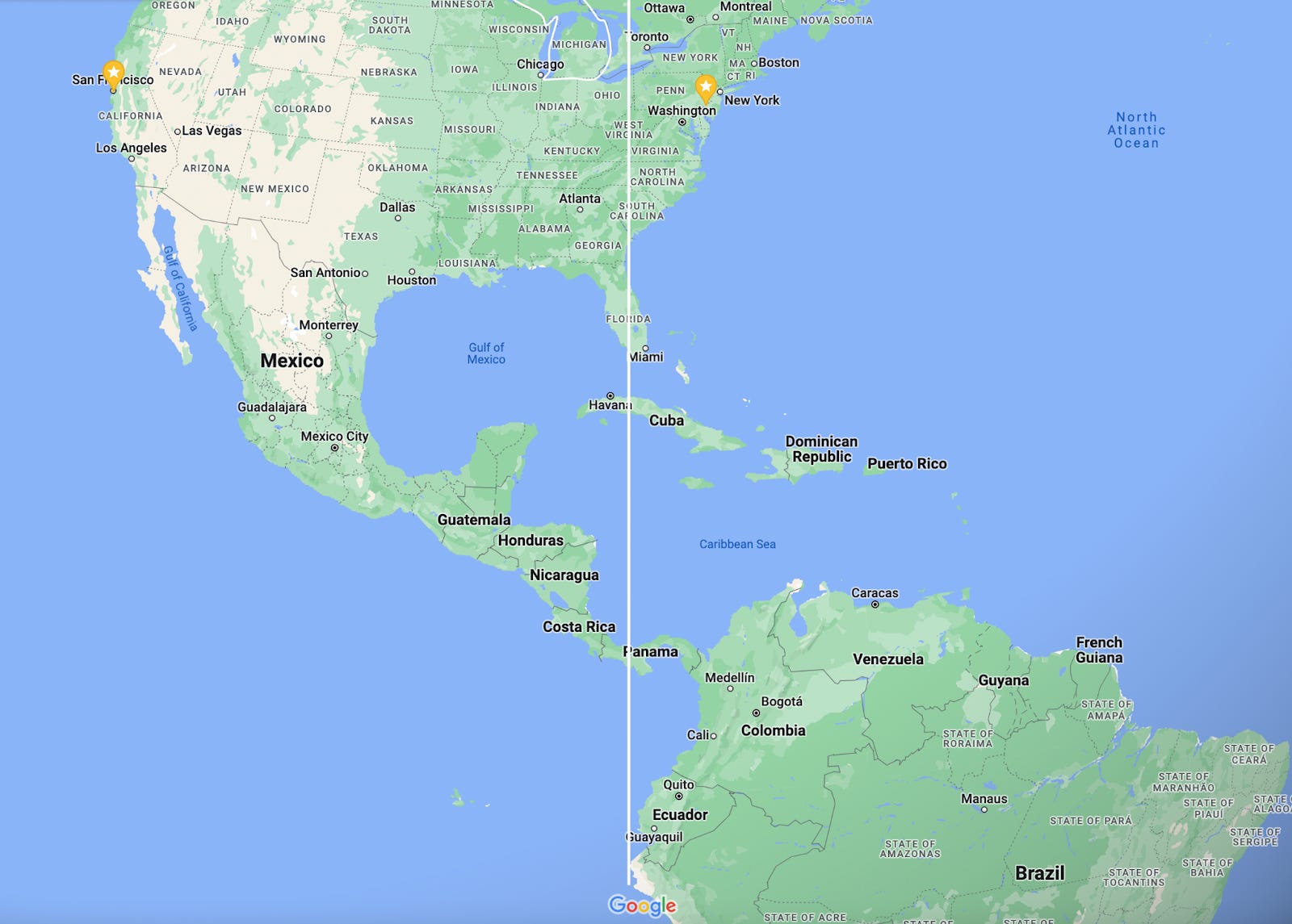
ALL of continental South America lies east of the state of Michigan.
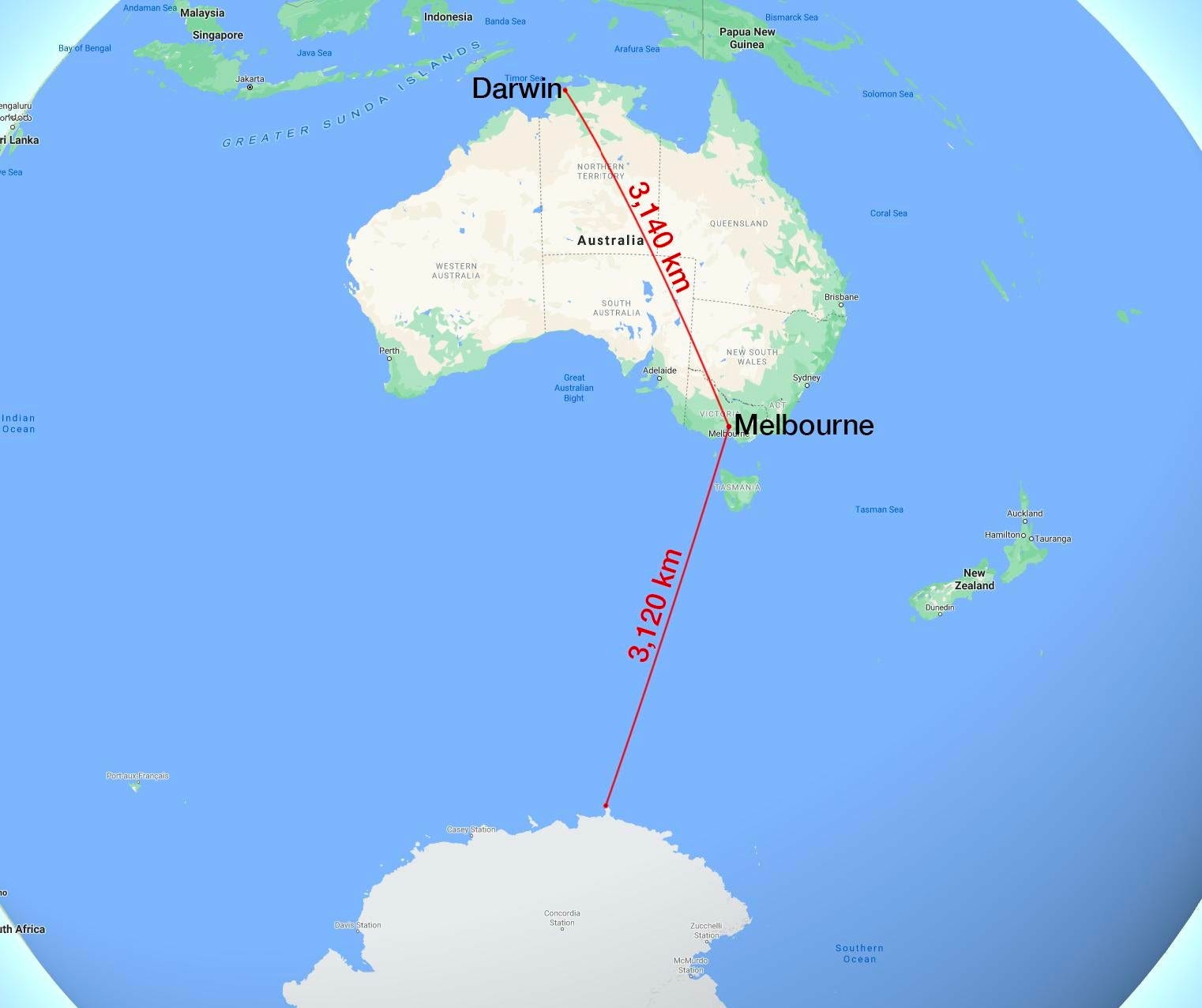
Melbourne is closer to Antarctica than to Darwin.
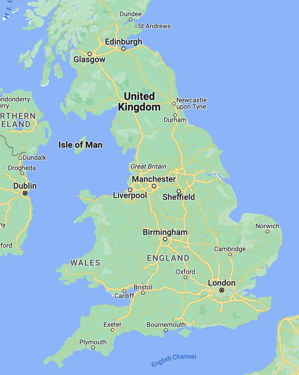
Edinburgh is west of Liverpool and Bristol!
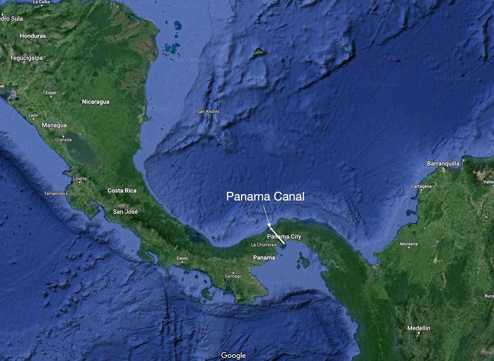
The Panama Canal runs north-south, and ships enter in the west and leave in the east:
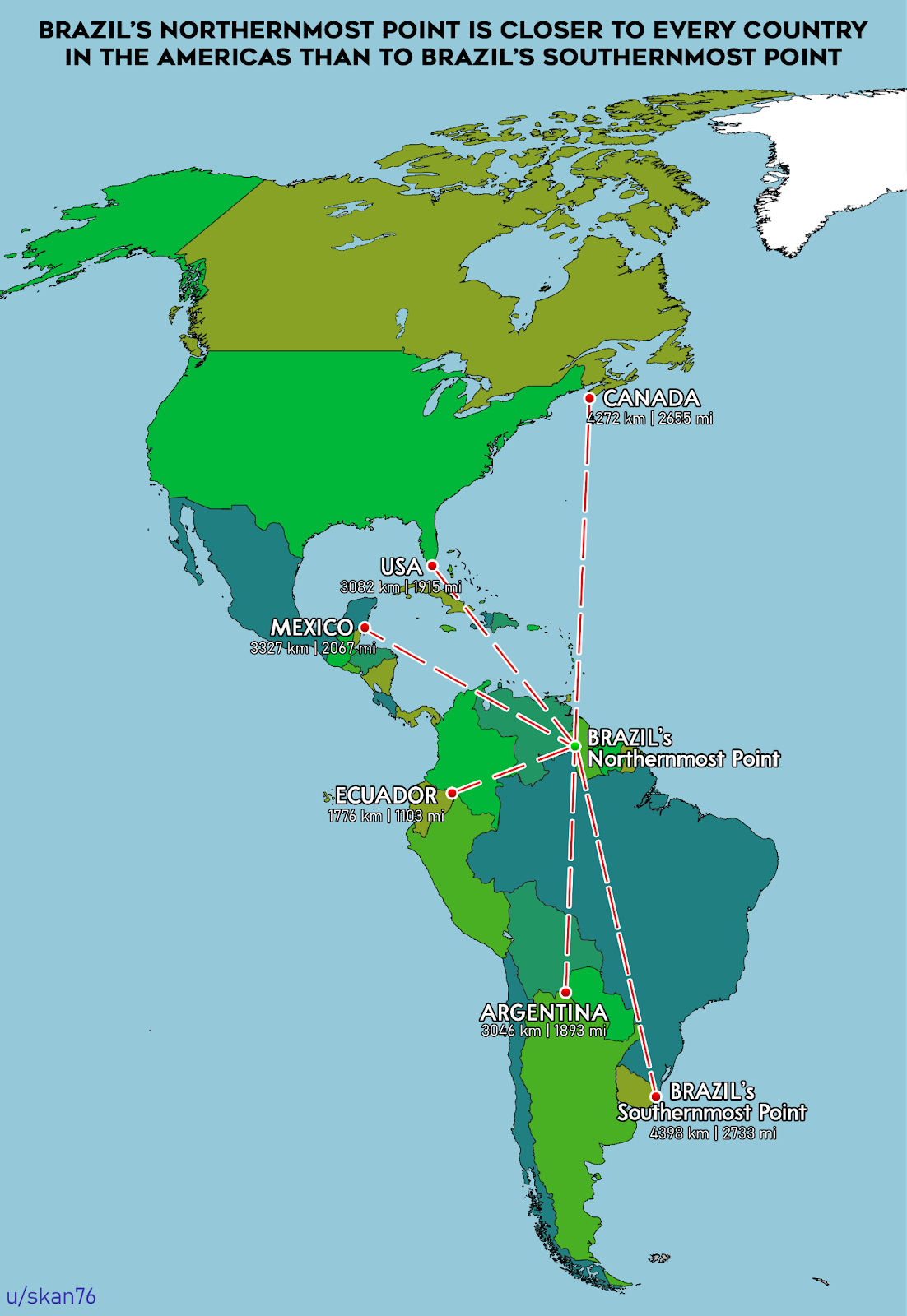
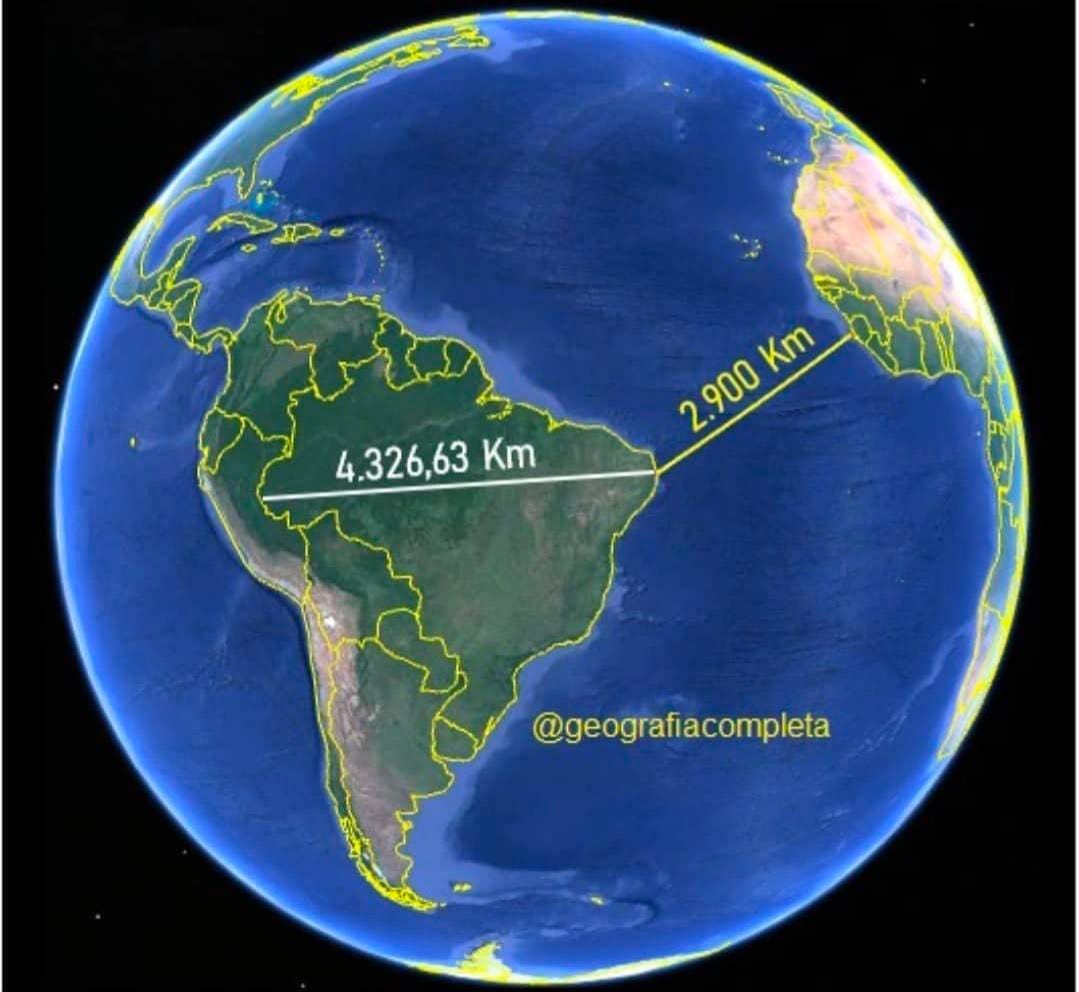
Brazil is brutally big. Its northernmost point is closer to Canada than to its southernmost point! In fact, its northernmost point is closer to any American country than to its southernmost point!
It’s so big that its easternmost point is much closer to Africa than to its westernmost point.
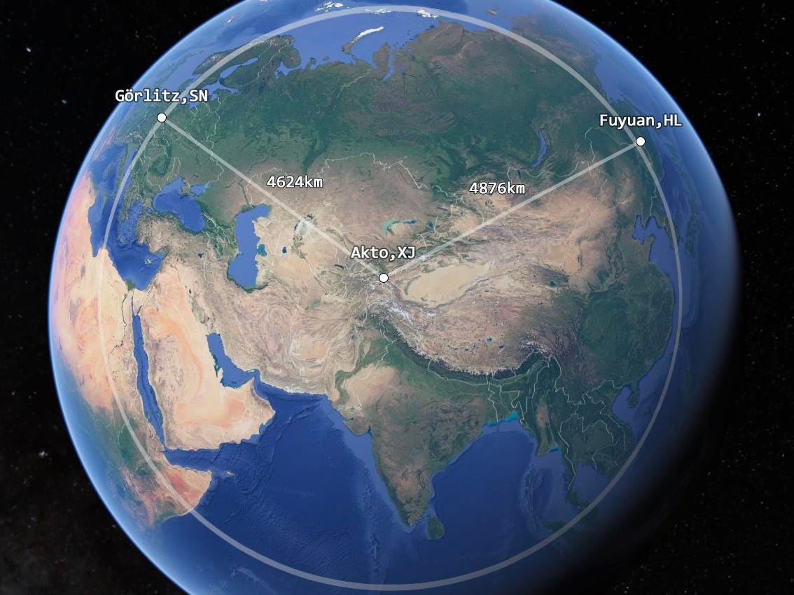
Here’s one that broke my head: China’s westernmost point is closer to Germany than to its easternmost point!
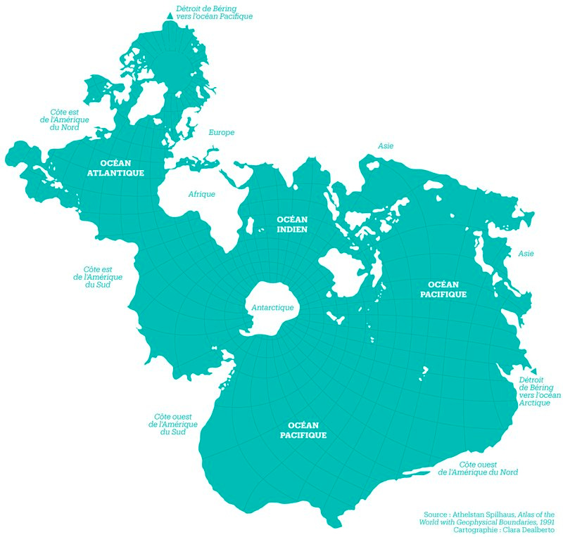
OK and what if we completely change the emphasis? How would fish draw a map?
If all these maps follow so many conventions, and they distort the perception of the world to such an extreme, why does the international community keep using them?
The “international community”:
Over 20 million people saw a similar thread I put on Twitter. I’m sure you know somebody who would be interested in seeing this article. Share it with them, and they’ll appreciate. It’s also the best way to grow Uncharted Territories!
Are these maps chosen for good reasons and these distortions are a side-effect, or are they purposefully deceitful? Are there better maps we could choose? I’ll explore this in the premium article this week. Subscribe to read it!
I’ll talk more about this in a future article.
Those most reduced and most aggrandized by the change.
It’s 12% bigger than all the landmass on Earth, actually.
Recommend
About Joyk
Aggregate valuable and interesting links.
Joyk means Joy of geeK