

Heuristic Evaluation in UX Design
source link: https://uxplanet.org/heuristic-evaluation-in-ux-design-9a72a1355480
Go to the source link to view the article. You can view the picture content, updated content and better typesetting reading experience. If the link is broken, please click the button below to view the snapshot at that time.

Heuristic Evaluation in UX Design

Years ago, when I had first heard “Heuristic Evaluation in UX Design” I was like “Whoa! That sounds cool and complex at the same time! What is that??” It sounded like something out of a medical journal. Then began the digging. And what came out of that digging was so simple that I started wondering if I were a fool to be scared by the phrase.
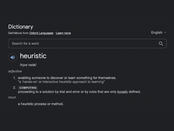
Oxford dictionary says that “Heuristic” means “proceeding to a solution by trial and error or by rules that are only loosely defined.”
UX experts simply define it as:
“Rule of Thumb while designing UX/UI”
Yes, it’s that simple! But no matter how simple it may sound it is important to make sure that these rules are properly implemented in design.
Why? What are these rules, and why are they so important?
To be honest, these are not really “rules” but a set of “guidelines” for designing good UX. Here we list down Jakob Nielsen’s 10 heuristics for interaction design, and take a shot at explaining them all in our own way.
1. Visibility of System Status
Never leave the user in a state of “What’s happening here??”
- Whenever a user gives an input, the system should acknowledge it.
- Whenever a function is going on in the background, the system should convey it to the user.
- Whatever is going to happen next, the user should be able to get a glimpse of the upcoming event.
This is where user interaction comes in. Without proper knowledge of what’s going on in the system, a user might feel lost.
Say, you tap or click on a CTA, and the application is in the process of loading the next screen. But what you are seeing is the exact same screen that you had tapped or clicked on. There is no loader or message to convey that something is going on in the background.
The average user would tap or click multiple times thinking that the input hasn’t been processed yet, thus slowing the system down.

It is also good to introduce a subtle interaction in the area where the user taps or clicks so that they know that there wasn’t any accidental tapping or clicking (or maybe there was one).
And then there is the anticipation of upcoming events. While conversing with a new application, the user is in unknown waters, and it always feels safe if there is a guide to rely on, to make sure that nothing comes as an unwelcoming surprise.
It is actually quite easy to give the user a brief overview of the upcoming steps. An onboarding process is a recommended way. Apart from this, the text on CTAs can be a hint of the next screen. In case of forms or processes that involve more than one screen, a progress bar can be a good inclusion.
2. Match Between System and the Real World
“I know all those words, but that sentence makes no sense to me.”
Matt Groening’s popular dialogue in The Simpsons is exactly what people might say if you punch in several simple words into a long, complex sentence.
You may also come up with some brilliant, innovative set of icons of your own. But since not everyone shares the same wavelength as yours, they might not understand what you are trying to convey.
Hence it is essential to speak the same language as people speak in the real world — no complex instructions and no new icons.

Keep the content in the same tone as one would use while interacting with someone in person. As for icons, you are free to use your creativity but stick to the usual symbols people are accustomed with.
Additionally, make sure that the CTAs and any accompanying messages are well-positioned with the elements that they represent.
3. User Control and Freedom
This is as simple as having “Undo” and “Redo” options.
Users often make one or more unintentional clicks. Some other times a user is curious to know what’s on the other end of a particular CTA. These clicks do not always result in what the user was expecting.

It is essential to keep an option for getting the user out of this unwanted state through a simple click. Make sure that the user is never stuck in a maze or they will certainly be willing to escape through the cross (X) button on the browser window or through the “uninstall” option on their device.
4. Consistency and Standards
Break conventions but not those for usability and recognition.
When we are habituated to seeing or using something in a specific way across several platforms, our brains get wired to that method. Any other process might seem not-so-easy to use.

For example, we are used to finding the main menu on websites either spread across the top or compressed inside a hamburger menu on the top right. If someday, some designer decides to place the hamburger menu on the top left or maybe as a floating menu on the bottom right of the screen, most people would find it difficult to discover and use it.
Basically, it challenges the psychology of the average user. Hence for certain things that concern usability, it’s better not to break the rules. We can always bring in revolution with UI, by the way.
5. Error Prevention
In case the user slips, make sure that they don’t roll off the cliff.
Humans are prone to making mistakes. From novices to experts, everyone is bound to make a wrong move some time or the other. It is essential to see that these accidents do not result in heavy losses for the user. Or even better, save the user from making such perilous mistakes.
Take the example of a checkout page. I would desperately need a double prompt on confirmation before placing the order and making the payment.

UI design by Namika Haiji Hamasaki
Similarly, if I’m working on something very important, say, filling a form, and I accidentally hit the back or close button or use a similar gesture on the keypad, I would surely be relieved if the system asks for confirmation on whether I would really wish to leave the page or not.
Not having such an option might not only result in loss on the user’s end but on your end, too. A user frustrated is a user lost.
6. Recognition Rather than Recall
Make the design intuitive.
How delighted we are when we type in a few letters and our browser’s cache fills in the rest for us! Think of the joy that we feel when Google apparently reads our minds and spares us the effort of typing our search query!
Reviving pages and queries from cache is a simple example of what the 6th guideline implies. In websites and applications, this is translated into having the most common CTA’s and information in the same position as is usually seen. Additionally, make important information clearly visible.

The user should not be loaded with trying to do the math in mind. Having everything on screen makes it easy for the user to know exactly what’s going on, and thus having a stress-free experience.
7. Flexibility and Efficiency of Use
Make it simple for novices and simpler for experts.
Given any specific application, a new user would take time to know his/her way around and learn all the shortcuts for getting the work done faster. At this stage, it is essential to make the application intuitive and very easy for use for this newbie.
However, when an expert uses the same application, s/he tends to use the available shortcuts, thus getting the work done a lot faster than a newbie.
So, while designing any application or website, it is important to keep both a novice and an expert user in mind.
8. Aesthetic and Minimalist Design
Just KISS (Keep It Simple, Stupid).
Including too much information, be it text or graphics or CTA’s, subdues the main information or CTA. It might also overwhelm the user who is new to the platform and doesn’t know what would take her/him to the desired page.

No one likes a mess. A simple, clean and eye-soothing layout attracts the ever-busy and ever-impatient user, and also helps her/him to find the way to the best part — the conversion page.
9. Help Users Recognise, Diagnose, and Recover from Errors
Let the user understand at one go, “Okay, so that’s what went wrong!”
Have you ever encountered the dreaded blue screen? As a student, I used to. Several times. Most parts of the information displayed is generic. But the main technical information at the bottom of the screen looks alien to me. I wish it would convey the problem in an understandable language so that maybe I could at least know what’s wrong!
In an application or website, whenever any error occurs — whether it is by the user or by the system — it should be clearly displayed in plain and simple language. Introducing codes or too technical languages might be difficult to interpret. Well, too quirky language also can result in the same outcome.

Once the user knows what is happening, it will help her/him to correct it or find a suitable solution.
10. Help and documentation
Keep help ready at hand, just in case…!
Help and documentation may or may not be required by a user. But in case they need it, it won’t be feasible to contact the developer, right? Some people may not have the time or may not be comfortable to contact the customer service either.
For them, the easier option would be to quit the application or website and find another that offers better assistance.
Alternatively, we can provide FAQ and other necessary documentation on the platform itself, and save the user from all the hassle. While it is not possible to include solutions to every imaginable problem, the most common ones should be included.

These documentations should also be easy to find.
Remember, the end-user can be anybody from a novice to an expert, from a farmer to a tech geek and from a teenager to a grandma. So, the platform should be designed to accommodate everyone comfortably.
Recommend
About Joyk
Aggregate valuable and interesting links.
Joyk means Joy of geeK