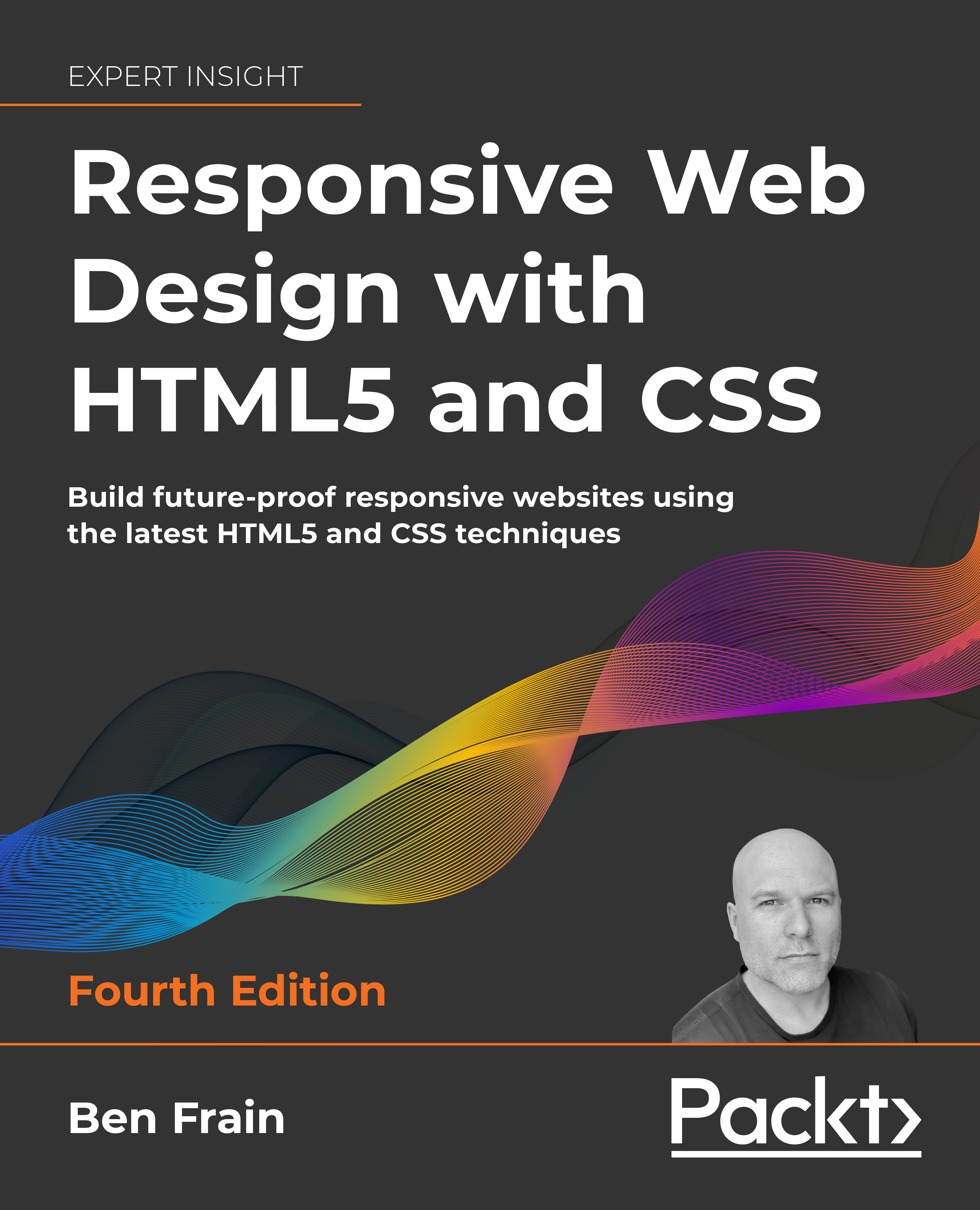

New book, Responsive Web Design with HTML5 and CSS, 4th Edition – out now!
source link: https://benfrain.com/new-book-responsive-web-design-with-html5-and-css-4th-edition-out-now/
Go to the source link to view the article. You can view the picture content, updated content and better typesetting reading experience. If the link is broken, please click the button below to view the snapshot at that time.

New book, Responsive Web Design with HTML5 and CSS, 4th Edition – out now!
For the last year I’ve been hard at work writing the latest, 4th edition, of the best-selling Responsive Web Design with HTML5 and CSS. I’m proud to tell you it’s available from all good book stores now!

Buy it now!
If you haven’t read a previous version, you should know this is a book that gives you a complete understanding of Responsive Web Design and then moves quickly on to cover all the essential CSS and HTML features to build responsive designs in the real world.
Cascade Layers
There are some big new topics covered in this version, such as CSS Cascade Layers, which give you the ability to organise your CSS codebase, particularly the nasty stuff from frameworks and such, with incredible control. If you find yourself wrestling with specificity from some one else’s CSS file, you’ll definitely want to look at this.
New Color Chapter
There is a whole new chapter dedicated to CSS color, specifically all the new formats and functions you can already use in the latest Safari, and hopefully other browsers soon. I’m talking about things like display-p3, so you can express in code, colors you literally will have never seen in a browser, as well as color formats like LCH and color functions like color-mix and color-contrast. Just amazing new additions to the web-platform.
Container Queries
People have been clamouring for container queries for yonks (that’s a technical term meaning ‘quite some time’) and now we have them. But how do you use them? What are the limitations and practical use-cases. All in here my friend.
The dialog element
Wouldn’t it be great if there was a native way of producing pop-ups? You know, modals and the like which minimised the JavaScript and still took care of all the accessibility considerations and keyboard support. The new dialog element is just that. We cover how to write it, control it and even how to target the background area with CSS and do some funky styling.
Selectors like :has()
We got new selectors to think about and play with. If you thought the new where() and is() selectors were interesting enough, wait until you get your head around what has() can do for you. Then there are newer math functions like clamp, min and max that greatly simplify a lot of the media query patterns you will be used to.
AVIF and WebP images
We also take a good look at new image formats like AVIF and WebP, and understand how we can create, optimise and serve them as well as providing a legacy fallback image for older browsers.
Subgrid, nesting, and heaps more
And lots of other stuff like native CSS nesting, subgrid and tonnes more besides.
In short there is a LOT of new stuff in here. Just as importantly I have tried to make it as accessible as possible with plenty of reduced examples to help you understand all the key concepts.
Visit the site
If you want to learn more, and I hope you do, you can head to the dedicated website for the book at https://rwd.education and you can find more detail about what’s in each chapter or head over to Packt or Amazon and pick up a copy.
We even have a Discord server setup this time so you should have some extra support from myself and other users as you go.
I hope you find it useful in your responsive quests.
If this post was useful, Say thanks with a coffee. Every donation helps keep me going!
Recommend
About Joyk
Aggregate valuable and interesting links.
Joyk means Joy of geeK
