

The importance of design in Studio Ghibli’s filmography (Vol. 3, 2005–2013)
source link: https://uxdesign.cc/ghibli-design-vol3-361422943d76
Go to the source link to view the article. You can view the picture content, updated content and better typesetting reading experience. If the link is broken, please click the button below to view the snapshot at that time.

Vol. 3, 2005–2013
The importance of design in Studio Ghibli’s filmography (Vol. 3, 2005–2013)
How the Japanese Studio describes, narrates, and informs through objects of design and design of objects.

The Importance of Design in Studio Ghibli’s Filmography (Vol. 2, 1992–2001)
How the Japanese Studio describes, narrates and informs through objects of design and the design of objects.
Real masterpieces are hard to find, but when one happens to find one, a mixed feeling of satisfaction and pleasure makes one realize that it could be watched a hundred times still with the same amazement and joy. Studio Ghibli films are some of these rare, pure gems, total works of art that leave a trace in every day’s sea of sh*t and triviality.
Total works of art are total for a reason: they could be analyzed on multiple levels, finding several interpretations and attention to detail at each of these levels.
There are hundreds of details and finesses to spot, and dozen new come out at each rewatch. Each of those details belongs to a specific narrative or informative level. Watching Studio Ghibli (and Miyazaki’s films in particular), it is amazing to find out how a narration that feels smooth and natural, actually passes through design objects to define its fundamental ideas. One of the key techniques that put Ghibli films one notch above the average animation movies, is the quantity (and quality) of information it leaves in a short time. The films are dense and leave a lot of room of interpretation, to continue to appreciate the pictures and its meaning even after the film itself. To achieve that density, the films object of the study say a lot with fast symbolic, metaphoric, and immediate images, rather than slow-pacing dialogs. In the long run, the iteration of this technique produces meaningful, and at the same time enjoyable (relatively short) plays, which can fit nearly any taste and attention.
Analyzing Studio Ghibli’s brilliant ability to narrate through design enables designers to get crucial insights to design artifacts that not only look and feel good but also convey a particular message, idea, or philosophy, which is what makes a good piece of design a masterpiece. To do so, the designer has to narrate through a common base of understandable images and symbols, parts of a wide, global, collective imagination.
Howl’s Moving Castle (2005)
In Howl’s Moving Castle, classic thematics regarding environmentalism, pacifism, and heritage of traditions polarize into two very different aesthetically lodgings in the middle of which war stands. War is actually an active protagonist of the film and, even if its reasons are deliberately left unknown, it sanctions who are the good and the evil. This deeply influences the whole imaginary around whoever is good or bad, generating the two opposite aesthetic poles. If it is true that in Studio Ghibli’s films villains are never deliberately declared so, the authors usually disseminate a series of clues throughout the film to hint at the distinction.
The dichotomy of visual choices operated by Miyazaki can be initially interpreted with the same devices as seen in the analysis of Spirited Away (2001, dir Hayao Miyazaki). Indeed the two different esthetics of Yubaba and Zeniba find in this film and hybridization, but each of those still carries the typical arguments previously described. Furthermore, on one hand, there is a pompous, post-industrial aesthetics that, in its coarseness and roughness stands for a confusional society in which everyone wants to overwhelm the other. On the other, an archaic, vernacular vision which, for the first time, includes some European historical (mostly architectural) elements. A sign that Miyazaki’s and Ghibli’s vision is timeless and aspatial, and not just related to Japan. At this point, it should not be surprising that the places of power belonging to war supporters remind closely Zeniba’s office from Spirited Away and the interiors of the Moving Castle are closer to Yubaba’s House. That’s because they carry the same system of meanings, so they are consistently treated in the same way.
Since the castle is in the middle of these two clear aesthetics, it is an evocative, hard-to-analyze object. To deconstruct it, the analysis should start from the end of the film, when it is crucially revealed that the castle corresponds to Howl’s soul. This introduces the main theme of the film: the relationship between exteriority and interiority. This set of relationships generates a series of doubles referring to a set of binary meanings.
Another important step to take to dissect the castle is to recognize the value of theriomorphism (the ascription of animal characteristics to humans or objects), which in Howl’s Moving Castle is stronger than in any other Ghibli Film. In this sense, many objects assume animalistic treats. The clearest examples are the belligerent spaceships, causes of the unexplained war, which move in the air just like whales slowly crossing the oceans. Here theriomorphism is functional to generate a collision between the natural world their shapes come from, and the same naturality they are destroying through war.

Once made these premises, jumping back to the previous point, complicated relationships between interiority and exteriority generate ambiguity. If it is true that good or evil characters are never directly declared in Studio Ghibli’s films, it is likewise true that somehow Howl’s ambiguous behaviors are terrifying, and the viewer will find a hard time trying to figure out Howl’s real nature.
In the Ghibli Aesthetics, the rough and frightening exterior shape of the castle reflects the inept, negative and terrifying side of the protagonist. The aesthetic result is sensational: the castle is iconic, hard to forget, but impossible to remember and recognize in detail. Theriomorphism, ambiguity, and post-industrialization intersect and collide, generating a monochromatic mass of junk, devoid of a structure or a visual hierarchy. To the eye, the whole picture is a shapeless mass, but in the detail, many animal forms can be disclosed. On the whole, the shape might evocate a snail or a turtle, or a hippo from some angles, with the legs of a bird of prey (Howl’s animalistic form).
This turns out to be the perfect form for a castle that constantly moves through different zones. It is so weird to be a-spatial, felt out of context in basically every context. That is a Miyazaki gift, as the one described is a very unique visual quality. The interwinding of shapes is because the castle is a vector of at least two additional classical Ghibli themes: flight and growth. Indeed it changes its shape two times around the end of the film. At first, it shrinks down, still keeping its distinctive characters (look at the sort of cannons/eyes and the legs, the bare minimum to recognize a living being). Then it evolves, (bat?) wings rotate and the castle can fly, which, according to the typical Ghibli rhetoric, means that the plot has been resolved. Howl’s soul got light once free from Calcifer’s curse and its castle changed accordingly. The castle is no longer moving because Howl is free from its previous ineptitude, it is no longer moving because it found its place in the world. The castle and Howl found Sophie, a reason to live.

In a strict relationship with Sophie, the hat is another catalyst object of the film. Every citizen seems to wear a hat, which becomes an aesthetic quirk, an object that goes beyond its function and becomes an accessory. It is a tangible sign of human vanity, so human that the witch’s thugs wear nothing but a hat; a sign of the last bit of humanity they kept before turning into demons.
Anyways, this technique is not new if compared to Lady Eboshi’s fellowship in Princess Mononoke (1992). In this rhetoric mechanism, Miyazaki inserts Sophie, a craftswoman of headdresses, who becomes a sort of humanity dispenser. The importance of craftsmanship, as opposed to industrialization horrors, is a well-known Ghibli theme, as The Whispers of the Heart (1998, dir. Hayao Miyazaki) testifies.
The pre-industrial object and the “relics” are thin threads that bind Howl and Sophie. These kind of objects possess such high semantic power, to be often considered magic, cursed or human. This is all because of the uniqueness property, as it would feel weird to attribute a magic power to industrial products, which are produced in series and exist in thousands (if not millions) copies.
As shown many times so far, in every film, objects have some crucial role in defining and hinting at key relationships and meanings. Again, Studio Ghibli’s master in untangling objects’ meanings beyond their functionalism is unsurpassed in this field.
Ponyo On The Cliff By The Sea (2008)
The wide variety of films and situations crafted by the Studio over the years is transposed in a modulated use of the design and/or meaningful objects, in both tone and intensity. That is to say that the element of design is not the same in every Ghibli film, both from a quantitative and a qualitative point of view. Design is crucial and effective in some films, like Porco Rosso, Howl’s Moving Castle, or The Wind Rises, while is more subtle in others, including Ponyo On the Cliff By The Sea, where it is hard to identify a catalyst or recognizable historical object. It is not a demerit, rather it is the result of a choice of themes and settings.
In Ponyo, Design is not the object of the narration, still, it is a device supporting it. The complex sentiment connecting Ponyo and Sosuke, which might even be called love, is more than once manifested through objects. Thus the little bucket becomes the bond of their affinity. If personifies Sosuke when it is left of the fence, waiting for Ponyo, almost meaning its spiritual presence as its physical one could not have been there.

Another design lesson that can be learned from the film is that the object’s perception and its use mode are strictly dependent on its users’ age and culture. Children indeed, tend to relate some objects to others, inheriting their perception and use modes. Due to their early, “reduced” knowledge, they tend to force associations between objects, and so a car front becomes a face, and the borders between an entity and its reproduction blur. This is the case where the toy boat becomes a working boat in the middle of the film, becoming another matter of the bond between the two kinds, but also the means to survive an apocalypse. Ponyo after all is just a child who is able, thanks to her magical powers, to turn kids’ fantasies into reality. She practically shows adults how children perceive objects and, in general, the world and its entity.
Practically, even from a film where design is not central, we can learn important insights about the fact that different ages, cultures, and groups tend to approach objects (whether they are tangible or not) differently. A designer must identify, understand and control those differences, to achieve the project’s goals.
The Secret World Of Arrietty (2010)
The Secret World of Arrietty contains harsh criticism of consumerism, delivered through the small human-like creatures living under the house. They live by “stealing” a ridiculous amount of food from “full-size” humans. The amount is so small that humans never notice the existence of the small creatures until something useless misses: a doll (and some piece of furniture from a doll house). The metaphor perfectly suits depicting the world’s inequality: the amount of goods the poor would need to live an acceptable life is so small that the rich would not even notice its lack. Furthermore, in Miyazaki’s and Ghibli’s rhetoric, consumerism not only makes society greedy but also shifts the attention to vain topics and quirks. Objects are in this sense not only fast visual vectors of the goods and their quantities and proportions but also of wider global issues.
In addition, the Studio sets up another sophisticated question about the way of using objects. Essentially, the fact that the same objects can be used in very different ways by different entities (e.g. a needle is a sword for Arrietty and her fellows) implies a separation between the “plastic” and the functional qualities of an object. In other words, following a mechanism already seen in Ponyo, when we interface with an object, our mind can recognize on one hand its plastic qualities (dissecting the pure shape in just a series of sub-shapes) and on the other, it can connect the same object with a class of known entities, whose functional and structural qualities are known.

This distinction is crucial whether designing a tangible piece of design, some visuals, or even some UI/UX. Our mind reacts instinctively to affordances and ergonomic qualities, but at the same time, it tries to understand an object’s mechanism by looking for a well-known suitable, compatible model. These responses change based on a series of variables, mostly cultural, psychological, and physiological. Miyazaki, thus, extremities this theory, depicting how two dramatically different “humans” can unlock different use modes of the same objects.
The Wind Rises (2013)
The Wind Rises should have been the very start of this long collection of analysis, as it was the first title that suggested to me how important objects of design and design of objects are in Miyazaki films. Instead, because of the chronological arrangement of these articles, this is the very last film of the analysis. Not bad, as there is no better title to wrap up and sublimate the disparate instances coming from these articles.
If in previous films Design was a catalyst for narration and a way to enhance it in the finest ways. This time, in The Wind Rises, Design is the actual narration.
The plot is around Jiro Horikoshi and how he came up with one of the greatest pieces of design and engineering in the whole Japanese history: the Mitsubishi Zero. The film should have been the last one directed by Hayao Miyazaki, so it had the heavy role of conveying his very last vision and message, and lastly his heritage. This burden results in a series of bibliographical references, including the fact that his father worked in airplane manufacturing during the Second World War. Anyways. Besides the curiosity and the life facts, the strong bibliographical link lies in the fact that The Wind Rises is the last film of a great designer and creative, dealing with the story of an equally great designer and creative. It seems that Miyazaki itself figures in the film, in the guise of Gianni Caproni.

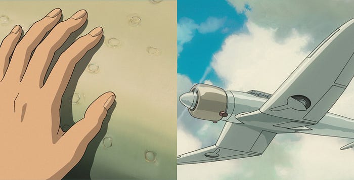
The Wind Rises acts in the usual strong renovation and reinterpretation, from film to film, of the classical Ghibli Themes. The movie opens with a very young Jiro, dreaming to fly on a seagull-shaped aircraft. Immediately, the theme of the flight and the theriomorphic treatment of objects stand out. Here, objects are designed to resemble animal shapes for a quite different reason if compared to the same theme in Howl’s Moving Castle. In this film Miyazaki does not use theriomorphic shapes to give forms to its post-industrial monsters, instead, almost in the opposite way, uses them to elevate nature to a state of a perfect balance between forms and functions, as a reference by which designers should be inspired. This is consistent with a scene later in the film: Jiro got struck by a revolutionary idea for the design of the Zero’s wings just by looking at some fish’s spines while eating.
After all, Jiro will arrive to surpass nature, in its perfection, thanks to technology. Anyways, surprisingly, this is not the point of the film.
In reality, the relationship between design, nature, and technology sneaks into a much more complex cultural dilemma, very felt by Miyazaki after the Second World War. Nonetheless, the parallelism between the lively flock of birds opening the film, and the decaying Zero fleet before the final credits should not be felt as a mushy metaphor. It should not even surprise that Caproni’s transatlantic aircraft don’t make it while lifting off. These are instead the moments when the cultural dilemma underlying the film resolves.
Proceeding gradually to discern these design topics, post-war Japan was trying to detach from western philosophies and methodologies, questioning the relationship between tradition (vernacular Japanese craftsmanship innately had the organic minimal qualities Western Modernists were looking for), form, and technology. In its reprise, Japan was limiting imports, maximizing exports, subordinating the form/shape question to the identification of a working market “model”, just able to understand and satisfy “the modern taste”. The shapes generated from this process (which after all found their place in the collective imagination) were after all just a market strategy. This historical insight could be one of the reasons behind the aesthetic configuration of the post-industrial, hyper-technological machines the director used us to see in almost all Ghibli’s films. Miyazaki certainly knows this historical condition, and aims to propose a modern Japanese design model: the Mitsubishi Zero, that should be able to overcome the technical limit (ed. shape only defined by technique/technology) and recover some key traditional craftsmanship ideals, including the strict relationship with nature.
Notwithstanding, Miyazaki’s view is even more mature and elevates the final to the state of sensational. For the first time, the Japanese director misaligns with traditional Ghibli’s happy endings. Jiro makes it to complete the project, but Nahoko (his wife) dies and Jiro is not even able to enjoy her last days and, surprisingly, not a single perfect Zero airplane makes it to come back from war. “Airplanes are a splendid but cursed dream” Caproni will say at the end of the film. The Italian master will eventually coincide with the figure and the vision of Miyazaki, arriving late to the sad awareness that neither beauty would be able to save the world from its horrors.

Conclusions
“Design will save the world” once wrote David Carson about Graphic Design. It actually saved many of the worlds objects of the analyses, from Nausicaa, to Porco Rosso, Princess Mononoke, Spirited Away, and Howl’s Moving Castle. They have all been saved by the beauty and by the long debated Ghibli Ideals, sublimated and crystalized into original or historical objects. The design has been the genesis of a series of rhetorical mechanisms, so well oiled to be imperceptible, at their finest, and yet perfectly effective. Here the greatness of the studio lays, immensely poetic and synthetic: total.
From reaffirming specific social and economical positions to defining the philosophical status of a character, or the semiotic one of an object, Ghibli’s filmography offers an immense collection of narrative devices and good practices. Analyzing, studying, and trying to reproduce them could be the first step for designing artifacts able to articulate a discourse and to dialog with their users, even in multiple and never trivial use modes. The plurality of interpretation level, a typical feature in animation movies (in particular Miyazaki’s ones at the state of the art), suits to study how the director’s idea evolves from 1984 to 2013, that is the year his spiritual will come out: The Wind Rises.
However, can the design change the world? The answer is a mature, resounding, unsettling no. It can certainly save Howl’s, Porco’s, Totoro’s, Ponyo’s, or Sosuke’s fictional worlds, but when the narrative is set in 1944–1945 Japan, it seems that nothing, neither the highest form of beauty, could save the world from its horrors. Not even the same design and creativity that gave shape to some of the worlds making the history of the motion picture. We cannot know whether the message is a pessimist or optimist. Perhaps it is, or maybe Miyazaki’s message is rather an invite, not a surrender. It could be a call to do better, pushing design and creativity far beyond his limits, unsurpassed and maybe unsurpassable.
Thus, the series of three articles leaves one last doubt: is it really possible to do better than Miyazaki?
Recommend
About Joyk
Aggregate valuable and interesting links.
Joyk means Joy of geeK