

6 testing methods for binary classification models
source link: https://www.neuraldesigner.com/blog/methods-binary-classification
Go to the source link to view the article. You can view the picture content, updated content and better typesetting reading experience. If the link is broken, please click the button below to view the snapshot at that time.

6 testing methods for binary classification models
6 testing methods for binary classification models
By Pablo Martin, Artelnics.

Once a machine learning model has been built, it is needed to evaluate its generalization capabilities.
The purpose of the testing analysis is to compare the model's responses against data that it has never seen before.
This process simulates what would happen in a real-world situation. In this regard, the testing results determine if the model is good enough to be moved into the deployment phase.
The testing methods to be used depends on the type of model with which we are working. Indeed, testing methods for approximation are different from those for classification.
Moreover, different testing methods are used for binary classification and multiple classifications.
In this post, we focus on testing analysis methods for binary classification problems.
Contents:
Neural Designer implements all those testing methods. To try them in practice, you can download this data science and machine learning platform here.
Testing data
To illustrate those testing methods for binary classification, we generate the following testing data.
| Instance | Target | Output | Instance | Target | Output | |
|---|---|---|---|---|---|---|
| 1 | 1 | 0.99 | 11 | 1 | 0.41 | |
| 2 | 1 | 0.85 | 12 | 0 | 0.40 | |
| 3 | 1 | 0.70 | 13 | 0 | 0.28 | |
| 4 | 1 | 0.60 | 14 | 0 | 0.27 | |
| 5 | 0 | 0.55 | 15 | 0 | 0.26 | |
| 6 | 1 | 0.54 | 16 | 0 | 0.25 | |
| 7 | 0 | 0.53 | 17 | 0 | 0.24 | |
| 8 | 1 | 0.52 | 18 | 0 | 0.23 | |
| 9 | 0 | 0.51 | 19 | 0 | 0.20 | |
| 10 | 1 | 0.49 | 20 | 0 | 0.10 |
The target column determines whether an instance is negative (0) or positive (1).
The output column is the corresponding score given by the model, i.e., the probability that the corresponding instance is positive.
1. Confusion matrix
The confusion matrix is a visual aid to depict the performance of a binary classifier.
The first step is to choose a decision threshold τ to label the instances as positives or negatives. If the probability assigned to the instance by the classifier is higher than &tau, it is labeled as positive; lower, it is labeled as negative. The default value for the decision threshold is τ = 0.5.
Once all the testing instances are classified, the output labels are compared against the target labels. This gives us four numbers:
- True positives (TP): Number of instances that are positive and are classified as positive.
- False positives (FP): Number of instances that are negative and are classified as positive.
- False negatives (FN): Number of instances that are positive and are classified as negative.
- True negatives (TN): Number of instances that are negative and are classified as negative.
The confusion matrix then takes the following form:
| Predicted positive | Predicted negative | |
|---|---|---|
| Real positive | true positives | false negatives |
| Real negative | false positives | false negatives |
As we can see, the rows represent the target classes while the columns represent the output classes.
The diagonal cells show the number of correctly classified cases, and the off-diagonal cells show the misclassified instances.
Back to our example, let us choose a decision threshold τ = 0.5.
After labeling the outputs, the number of true positives is 6, the number of false positives is 3, the number of false negatives is 2, and the number of true negatives is 9.
This information is arranged in the confusion matrix as follows.
| Predicted positive | Predicted negative | |
|---|---|---|
| Real positive | 6 | 2 |
| Real negative | 3 | 9 |
As we can see, the model classifies most of the cases correctly. However, we need to perform a more exhaustive testing analysis to get a complete vision of its generalization capabilities.
2. Binary classification tests
The binary classification tests are parameters derived from the confusion matrix, which can help to understand the information that it provides.
Some of the most important binary classification tests are parameters are the following:
Classification accuracy, which is the ratio of instances correctly classified,
classification_accuracy=true_positives+true_negativestotal_instancesclassification_accuracy=true_positives+true_negativestotal_instances
Error rate, which is the ratio of instances misclassified,
error_rate=false_positives+false_negativestotal_instanceserror_rate=false_positives+false_negativestotal_instances
Sensitivity, which is the portion of actual positives which are predicted as positives,
sensitivity=true_positivespositive_instancessensitivity=true_positivespositive_instances
Specificity, which is the portion of actual negatives predicted as negative, is calculated as follows:
specificity=true_negativesnegative_instancesspecificity=true_negativesnegative_instances
In our examle, the accuracy is 0.75 (75%) and the error rate is 0.25 (25%), so the model can correctly label a high percentage of the instances.
The sensitivity is 0.75 (75%), which means that the model has a good capacity to detect the positives instances.
Finally, the specificity is 0.75 (75%), which shows that the model correctly labels most negative instances.
4. ROC curve
The receiver operating characteristic, or ROC curve, is one of the most useful testing analysis methods for binary classification problems. Indeed, it provides a comprehensive and visual way to summarize the accuracy of a classifier.
By varying the value of the decision threshold between 0 and 1, we obtain a set of different classifiers to calculate their specificity and sensitivity.
The ROC curve's points are the representation of the values of those parameters for each value of the decision threshold.
The False Positive rate (or 1-specificity) values are plotted in the x-axis, while the corresponding True Positive Rate (or sensitivity) values are plotted in the y-axis. The ROC curve is illustrated in the next figure.
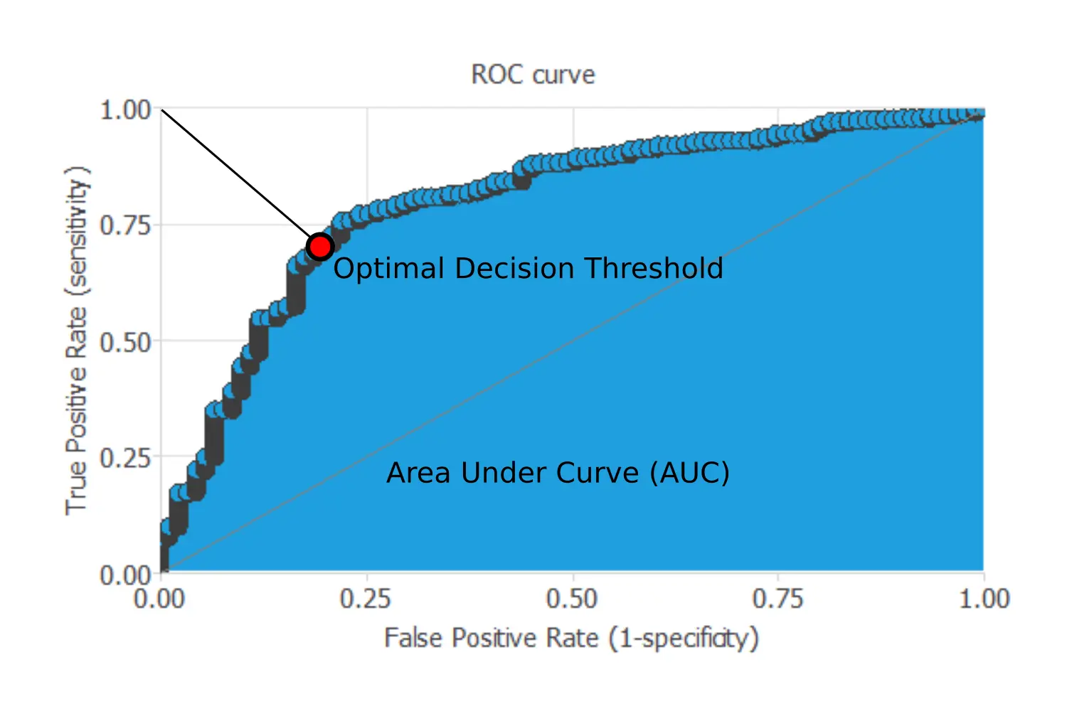
For a perfect model, the ROC curve passes through the upper left corner, which is where the sensitivity and the specificity are 1. Consequently, the closer to the point (0,1) of the ROC curve, the better is the classifier.
The most critical parameter that can be obtained from a ROC curve is the area under the curve (AUC), which is used as a measure of the quality of the classifier. For a perfect model, the area under the curve is 1.
Besides, we can find the optimal decision threshold, which is the threshold that best discriminates between the two different classes as it maximizes the specificity and the sensitivity. Its value will be the threshold's value corresponding to the point of the ROC curve that is closer to the upper left corner.
The next chart shows the ROC curve for our example.

For our example, the area under the curve (AUC) is 0.90, which shows that our classifier has a good performance.
On the other hand, the optimal decision threshold (that best separates the two classes) is 0.4.
3. Positive and negative rates
Positive and negative rates measure the percentage of cases that perform the desired action.
In marketing applications, the positive rate is called the conversion rate. Indeed, it depicts the number of clients that respond positively to our campaign out of the number of contacts.
The best way to illustrate this method is by going back to our example. The following chart shows three rates. The first pair of columns shows the initial rate of positives and negatives in the data set. We have 40% of positives and 60% of negatives in this case.

The pair of columns in the middle shows this rate for the instances that were predicted as positives. Within this group, the percentage of positives is 66.7%, and the percentage of the negative is 33.4%. Lastly, the two columns in the right represent the analogous information for the instances that were predicted as negatives. We have 81.9% of negatives and 18.1% of positives in this case.
Our model then multiplies the positive rates of the actual data by 1.66 and multiplies the negative rates of the actual data by 1.365.
5. Cumulative gain
While the previous methods evaluated the model's performance on the whole population, cumulative gain charts evaluate the classifier's performance on every portion of the data.
This testing method is beneficial in those problems in which the objective is to find a higher amount of positive instances by studying the least amount of them, such as a marketing campaign.
As we have said, the classifier labels each case with a score, which is the probability that the current instance is positive. As a consequence, if the model can correctly rank the instances, by firstly calling those that have the highest scores, we achieve more positive responses as opposite to randomness. Cumulative gain charts visually show this advantage.
The following chart shows the results of the cumulative gain analysis for our example.

The grey line or baseline in the middle represents the cumulative gain for a random classifier, while the blue line is the cumulative gain for our example. Each point represents the percentage of positives found for the corresponding ratio of instances written on the x-axis. Finally, it is also depicted the negative cumulative gain represented by the red line. This one shows the percentage of negatives found for each data portion.
If we have a good classifier, the cumulative gain should be above the baseline, while the negative cumulative gain should be below it as it happens for our example. Supposing that our example was a marketing campaign, the curve shows that we would have gotten all the positive responses by calling only 60% of the population with the highest scores.
Once all the curves are plotted, we can calculate the maximum gain score, which is the maximum distance between the cumulative gain and the negative cumulative gain, as well as the point of maximum gain, which is the percentage of the instances for which the score has been reached. Once all the curves are plotted, we can calculate the maximum gain score, which is the maximum distance between the cumulative gain and the negative cumulative gain. We can also calculate the point of maximum gain, the percentage of instances for which the score has been reached.
| Instances ratio | 0.6 |
|---|---|
| Maximum gain score | 0.667 |
As shown in the table, the maximum distance between both lines is reached by 60% of the population and takes the value of 0.667.
6. Lift chart
The information provided by lift charts is closely related to that provided by the cumulative gain. It represents the actual lift for each population percentage, which is the ratio between positive instances found using and not using the model.
The lift chart for a random classifier is represented by a straight line joining the points (0,1) and (1,1). The lift chart for the current model is constructed by plotting different population percentages in the x-axis against its corresponding actual lift in the y-axis. If the lift chart keeps above the baseline, the model is better than randomness for every point. Back to our example, the lift chart is shown below.
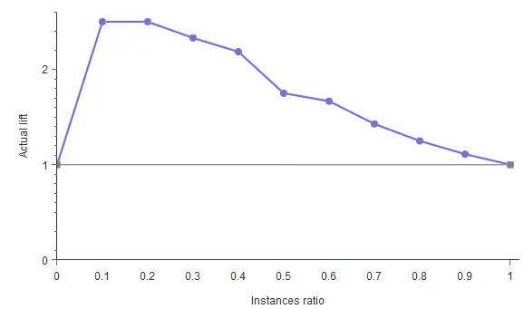
As shown, the lift curve always stays above the grey line, reaching its maximum value of 2.5 for the instances ratios of 0.1 and 0.2. That means that the model multiplies the percentage of positives found by 2.5 for the 10% and 20% of the population.
Conclusions
Testing a model is critical for knowing a model's performance. This article has provided you with six different methods to test your binary models. All these testing methods are available in the machine learning software Neural Designer.
BUILD YOUR OWN
ARTIFICIAL INTELLIGENCE MODELS
BUY NOW >

Do you need help? Contact us | FAQ | Privacy | © 2022, Artificial Intelligence Techniques, Ltd.
Recommend
About Joyk
Aggregate valuable and interesting links.
Joyk means Joy of geeK