
6

一种嵌套式栅栏布局的对齐方式
source link: https://wakzz.cn/2018/11/06/html/%E4%B8%80%E7%A7%8D%E5%B5%8C%E5%A5%97%E5%BC%8F%E6%A0%85%E6%A0%8F%E5%B8%83%E5%B1%80%E7%9A%84%E5%AF%B9%E9%BD%90%E6%96%B9%E5%BC%8F/
Go to the source link to view the article. You can view the picture content, updated content and better typesetting reading experience. If the link is broken, please click the button below to view the snapshot at that time.

一种嵌套式栅栏布局的对齐方式
祈雨的博客
2018-11-06
转载自CSDN本文链接地址: 一种嵌套式栅栏布局的对齐方式
在bootstrap的应用中,经常需要对栅格进行嵌套布局,但也因为如此,很容易出现内容无法对齐的现象。
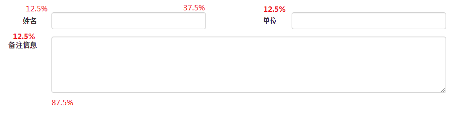
UI给定的要求是两栏表格布局,文字与输入框的占比为1:3,详细布局文件见下图。
几乎不用思考,我们就能很快写出第一行布局,代码如下:
<form action="" class="form-horizontal">
    <div class="form-group">
        <!-- 先将一行划为两列 -->
        <div class="col-xs-6">
            <!-- 四分之一占比 -->
            <label class="col-xs-3 control-label">
                姓名
            </label>
            <!-- 四分之三占比 -->
            <div class="col-xs-9">
                <input type="text" class="form-control"/>
            </div>
        </div>
        <div class="col-xs-6">
            <label class="col-xs-3 control-label">
                单位
            </label>
            <div class="col-xs-9">
                <input type="text" class="form-control"/>
            </div>
        </div>
    </div>
</form>
在充分利用bootstrap的样式下,并能适应各类分辨率,如何布好第二行,却是一个难题,因为栅栏布局的嵌套过程中,涉及到布局元素包括padding与width两方面。
思考分析过程如下:
- 求出label.col-xs-3.control-label元素的宽度;
- 求出一行减去label.col-xs-3.control-label元素的剩余宽度;
- 对齐padding;
按照bootstrap的栅格规则槽(gutter)宽30px,我们可以求出label.col-xs-3.control-label元素的宽度,如下:
//  假定每行的宽度为 w
label的宽度 = (w/2 -30) * 1 / 4
            = w/8 - 7.5
为了保持padding的一致性,我们决定也嵌套一层布局元素col-xs-12,代码如下:
<div class="form-group">
    <div class="col-xs-12">
        <!--需要放入的布局内容-->
    </div>
</div>
在上述的布局方式下,textarea对应的labelpadding已对齐,但宽度需要计算,计算方式如下:
//  假定每行的宽度为 w, 占比为r, 补齐的宽度为x
textarea对应的label宽度 = (w - 30) * r + x
//  将此宽度与label的宽度对比,很容易求出
r = 1 / 8 = 0.125
x = 30/8 - 7.5 = -3.75
// 求出textarea对应的label样式宽度
样式宽度 = calc(12.5% - 3.75px)
textarea的样式宽度 = calc(87.5% + 3.75px)
于是,第二行的布局样式如下:
<div class="form-group">
    <div class="col-xs-12">
        <!-- 添加col-xs-1样式是为了充分利用栅格的默认特性,如浮动与padding -->
        <label class="control-label col-xs-1" style="width:calc(12.5% - 3.75px);">
            备注信息
        </label>
        <div  class="col-xs-1" style="width:calc(87.5% + 3.75px);" >
            <textarea type="text" class="form-control" rows="5">
            </textarea>
        </div>
    </div>
</div>
Recommend
About Joyk
Aggregate valuable and interesting links.
Joyk means Joy of geeK