

How should you name your colors in a Design System?
source link: https://uxdesign.cc/how-should-you-name-your-colors-in-a-design-system-3086513476df
Go to the source link to view the article. You can view the picture content, updated content and better typesetting reading experience. If the link is broken, please click the button below to view the snapshot at that time.

How should you name your colors in a Design System?
Definitive, Semantic, and Contextual naming conventions.
There are only two hard things in Computer Science: cache invalidation and naming things. — Phil Karlton
Colors are the foundation of any Design System, but naming colors can be a struggle even for experienced Designers.
Over six years ago, I created my first Design System and made a color palette to support a mobile survey app called QuickThoughts. I was using Sketch and loved how Zeplin automatically assigned ‘cool’ color names on import so I renamed all of my colors in a similar fashion.
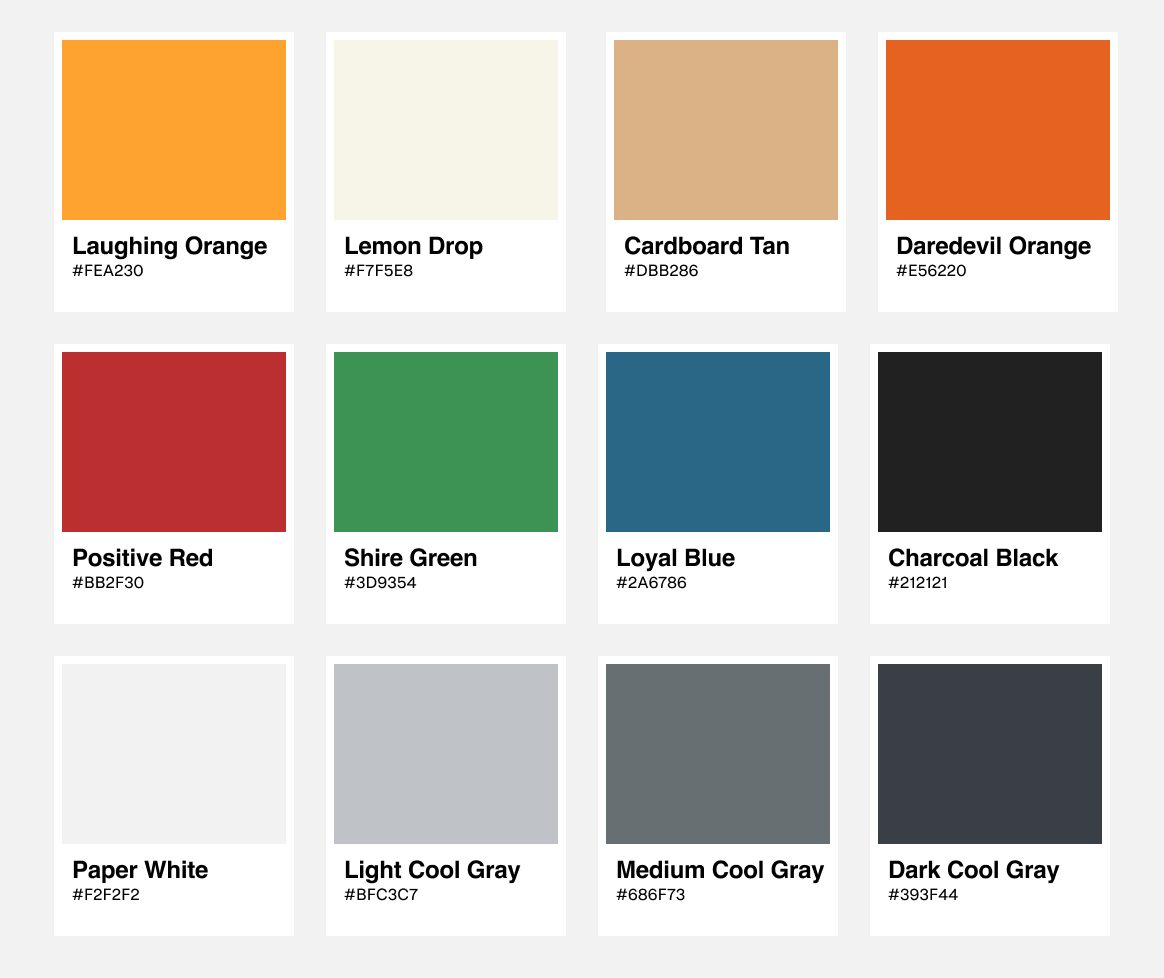
My choice of color names (‘Laughing Orange’, ‘Cardboard Tan’, ‘Shire Green’, etc) seemed reasonable at the time. However, this decision would soon prove to be a mistake when our organization bought another company that had a similar mobile application called ‘iPoll’.
After months of discussing how to include/support iPoll in our organization, the decision was made to deprecate the existing product and integrate its brand into QuickThoughts as a white-label solution.
When I created the color palette, I assumed only Android and iOS would always use a single color theme supporting a single app. Suddenly, we had two themes we needed to support on both platforms. One orange, the other blue.
If I had assigned the color name by its purpose rather than what it was (i.e. naming it ‘Primary’ instead of ‘Laughing Orange’), it would have been easy to change the value rather than the name and the value of the color for both apps. At the time, this foundational change wasn’t possible.
The deadline was tight and the engineering risk of renaming all the colors for both apps was too high, so we suffered the consequences (Both Engineers and Designers saw ‘Laughing Orange’ when the primary color was actually blue) until the newly integrated app was shipped.
Once shipped, we immediately refactored color names to a semantic naming convention (Android, iOS, as well as Sketch). It was a manual process that included full regression testing of all apps (the original app, the new app on both Android and iOS). The refactor represented a significant use of design and engineering resources yet, despite the effort, it soon proved to be worthwhile for the organization.
Less than a year later, we added another app to our roster with a different theme, this time green. With semantic naming, the new theme of green was effortless to support.
Three color naming conventions
There are several ways to approach naming colors, but all methods fall into three basic categories. Some methodologies are brand-centric, whereas others are more engineering-focused.
Definitive naming
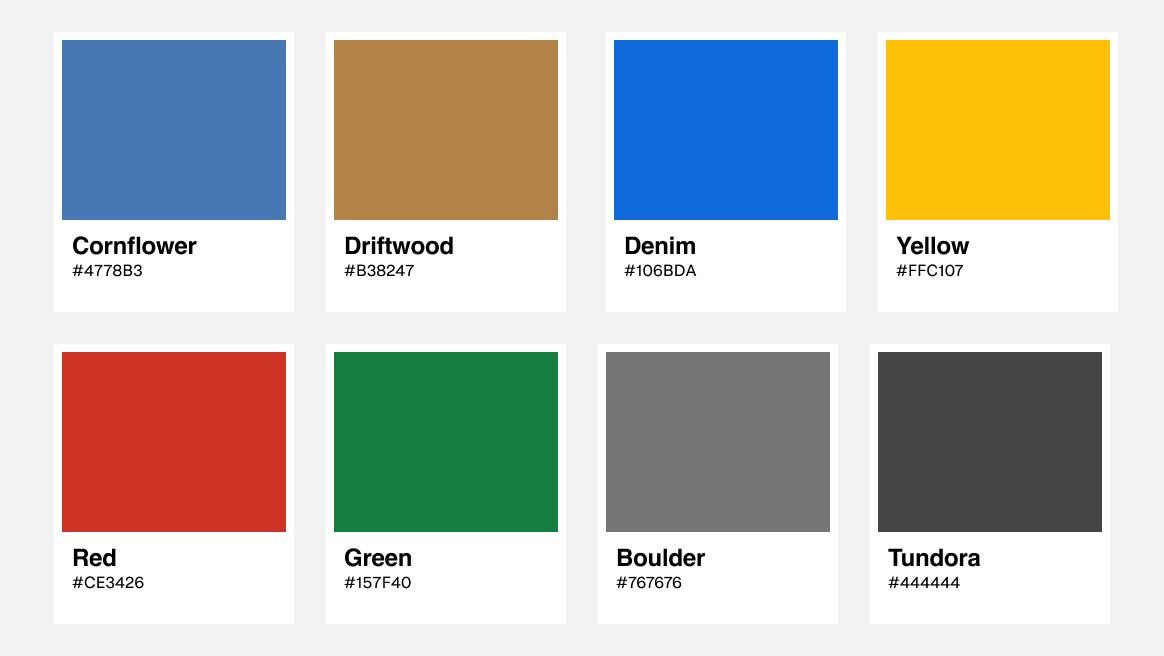
QuickThoughts used a Definitive naming convention. Brand designers often use it when creating palettes for their organization. Names that describe the color itself (“Cornflower”, “Driftwood” “Red”, and “#FFC107”) are all examples of Definitive naming.
Unlike brand designers, Design System creators must think about how to use color to support features such as white-label themes, dark-mode, and defining pseudo-states of interactive controls. Our systems should always be sympathetic to the brand but not limited to the Definitive names that a brand style guide creates for us.
Semantic naming
Names that describe the intent of the color (“Primary”, “Info, “Danger”, “Neutral”, etc.) are Semantically named colors. Many Design Systems and CSS Frameworks use this convention to allow users to globally theme their app as they wish.

Semantic naming allows users to change the value rather than the name and value, making it easy to modify this blue/brown theme to any combination of colors we need. Other examples of Semantic names are Brand, Tertiary, Accent, Caution, Emphasis, Critical, and Promotional just to name a few more.
Contextual naming
Names that define a color for a specific type or category of component (“color-text-brand”, “color-text-icon-default, “color-text-destructive”, etc.) are examples of Contextual naming. Sometimes called ‘CSS Semantic’, this convention is most often used by programmers for fine-grain control of themes and modes for their apps.

Contextual naming gives users the ability to define a different shade of the border of all info dialogs, but not the color of icons.
Semantic naming is great for white-label, but Contextual is essential to support dark mode. In CSS, it’s simple to duplicate the light-mode Contextual names to a new dark-mode file and update the contextual names files accordingly for user preference.
But, with great power comes great responsibility! Contextual naming alone will quickly overwhelm designers with many hundreds of definitions which makes it difficult to find and use colors appropriately. Because it is difficult to resist hyper-defining every color, this naming convention always tends to grow exponentially and unpredictably over time.
However, using the abilities of Semantic for white-label functionality with Contextual naming for supporting modes, we create a scalable solution.
What naming should I use?
When it comes to choosing color naming conventions, there are two ‘personas’ we need to support. One is Programmers and the other is Designers. Each discipline has its own set of challenges but needs to work together to solve problems systemically.
Designers
Semantic naming is the best choice for designers in Figma/Sketch. It keeps the number of colors to a reasonable amount (not too many, or too few) and makes it is easy to support multiple products with different color themes.
Engineers
Contextual naming is best for Engineers, allowing to support light/dark modes and gives granular management of backgrounds, borders, and text colors for application-wide.
Two naming conventions?
Using Semantic with Contextual naming may seem counter-intuitive, however, both naming conventions are complementary and support each other. Some call this a two-tier approach.
EXAMPLE: When the designer uses the Semantic ‘danger-400' forthe color of text on a background, the engineer understands to translate to the Contextual name in code ‘— color-text-destructive’, because it contextually describes the element and the color.

It’s professional for the designer to add swatches to each design in a developer-handoff that shows the desired Semantic and Contextual name. It may seem like an extra step, but Figma inspect mode does not reveal the description of the color (where the Contextual name(s) should be added).
Still, there is the risk that the engineer could directly reference the danger-400 variable defined in the designer handoff, but with a little experience, they know it is not in their best interest to do so.
While danger-400 for “Sure? You’ll lose all your records” works great in light mode, it becomes indistinct in dark.
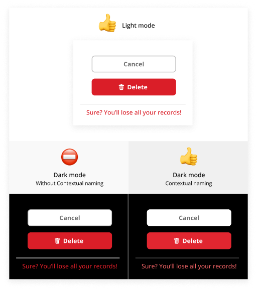
Instead, the color for this text should be much lighter, in this case, danger-100. Combining Semantic with Contextual allows your organization to handle this globally by changing the contextual CSS file.
/* light_mode.css*/
--color-text-destructive: (var--color-palette-danger-400);/* dark_mode.css */
--color-text-destructive: (var--color-palette-danger-100);
Additional considerations
When working with dark-mode (or even high-contrast), certain elements require different treatments to create the right visual effect. For instance, unlike the text example, separator lines need to be much darker (neutral-050 -> neutral-600) and backgrounds of buttons and blocks of colors should be lightened but not nearly as much as the text (danger-400 -> danger-300).
Fortunately, there is a pattern in how to treat different kinds of elements for different modes. The trick is to find the pattern that works best for everything and stick with it for your entire system.
Combining two naming conventions is essential for supporting themes and modes in your design system but it is only effective when we ensure our Semantic colors have a wide range of shades and tints to do the job and they are meaningfully weighted for intent/purpose.
Semantic+weighted
If you’re familiar with font-weights in CSS (400 is normal, and 700 is bold), then you know how weighted naming works. Color weights work in a similar manner.
Many Design Systems rely on weighted colors for their palettes. Here is an example from Material Design.

However, unlike the standardized numeric convention for font weights, there are differences in how major Design Systems name their color weights, the number of steps they offer, and the meaningful values each weight represents.
- Material Design 10 steps, from 900 — 50, with 500 as the base color.
- IBM Carbon 12 steps, uses 100 — 10 and 60 as the base.
- Ant Design 10 steps, 10 — 1 with 6 as the base.
- Salesforce Lightning 11 steps, 95 — 10, 50 as the base.
Meaningful weights
Tints/shades that are aligned with the lightness value (L*) in the device-independent color space from CIE such as Lab or LCH are ‘meaningful weights’. Both IBM Carbon and Salesforce Lightning are aligned to meaningful weights.
The lightness value, L* (also referred to as “Lstar”) defines black at 0 and white at 100 in a linearized scale. Therefore, if we take the hex or RGB value of any color (red, green, blue, black, purple, etc…) and found its L* value in CIELAB was 50, then we know it is perfectly between the value of black and white — or a true mid-tone value, which is a pass for WCAG 4.5:1 contrast ratio on pure black and pure white.
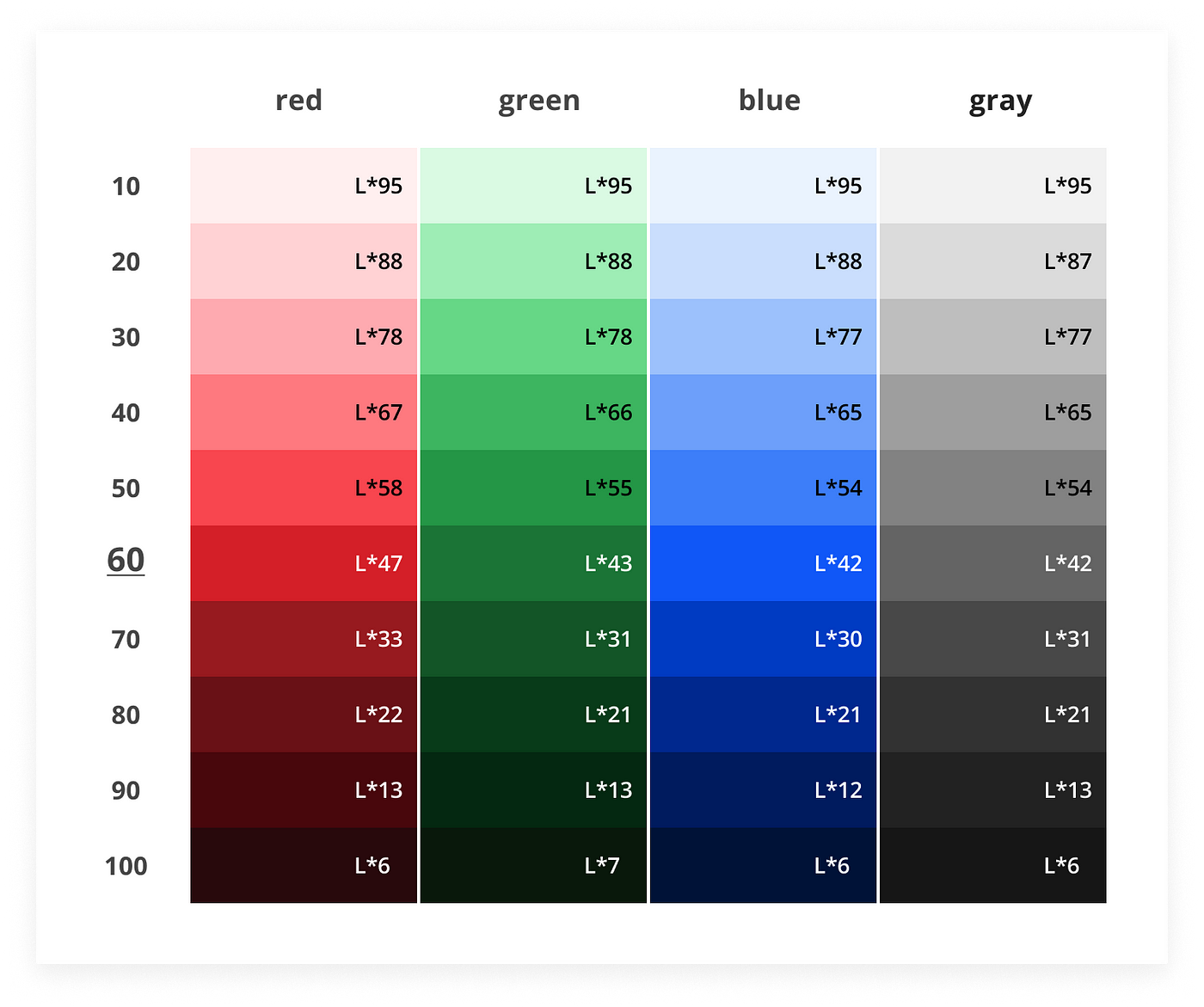
EXAMPLE: Using IBM Carbon, measuring any color of row 60, all values will be between L* 47–42, which is a darker mid-tone. Likewise, tint rows 10, 20, 30 tightly align on L* values 95, 88, and 78 whereas shade rows 70, 80, 90, 100 are aligned on L*33, 22, 13, and 6.
Using the L* value is essential to creating meaningful weights which align with WCAG color contrast specifications. Several designers/engineers have made this discovery, and this list is by no means exhaustive.
- Eugene Fedorenko, Product Designer at Wildbit
- Kevyn Arnott, Staff Product Designer at Lyft (now at Coinbase)
- Kellen Mannion, Designer at Salesforce
Advantages
- Abstracting the hex value to L* values allows freedom to map existing Definitive names to a meaningful semantic+weight.
- Simple and consistent rules for WCAG color contrast. For IBM Carbon, all 60 rows (L*47 or lower) pass WCAG 4.5:1 contrast ratio on whites and row 10s (L*95), no matter the hue of the colors.
- When creating a Design System, it is effortless to define a single primary button and change to success, info, or danger simply by changing the semantic color and keeping the weighted value.
Creating your own Semantic+Weighted
Everybody has their own colors but neither IBM nor Salesforce offers a handy color tool like Material Design to generate your own shades/tints. On the other hand, the color tools of Material Design, Ant Design, and Figma Plug-ins do not generate ‘meaningful weights’ that Carbon and Salesforce offer.
Color Tools
The best tools I’ve seen to generate meaningful weighted palettes are Accessible Palette by Eugene Fedorenko and ColorBox by Kevyn Arnott.
I was a photo-retoucher, so I’m particularly opinioned on color, so I built my own color system which accounts for dark/light mode. The number system I use is designed for any need or organization, but you may want to optimize down for your own particular needs.
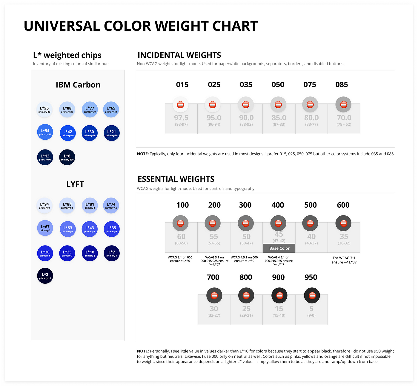
Incidental vs. Essential weights
Any meaningful symantic+weighted system can be divided into two broad categories of usefulness — Incidental vs. Essential weights, which aligns with their use in context and maps to WCAG contrast specifications.
Your choice of numbers is a matter of preference but recommended to abstract the actual value from intent. Where IBM Carbon chooses 60 as the base and Material favors 500, I prefer 400 because it aligns to font-weight naming conventions. I’ll use my color system numbers for reference, but know it’s only the L* value that is meaningful.
INCIDENTAL WEIGHTS
Incidentals are weights between L*60 and L*100. These include tints for paperwhites, separators, border colors, and prototypical disabled controls (non-WCAG). Incidental weights are not used for components that have accessibility requirements.
Most color systems offer 2 background paperwhites (L*95 and L*100), but I prefer at least three (L*95, L*98, and L*100) because that is prototypical for most websites. Some designs use 4 paperwhites by adding an L*90, however, the choice on how many “paperwhites” you include is entirely up to you. I prefer to err on the side of holistic and optimize later if required.

- Weight 075: (L*80) Used for darker separator lines on paperwhites and prototypical disabled states for controls.
- Weight 050: (L*85) Used for lighter separator lines on paperwhites.
- Weights 025, 015, 000: (L*95, L*98, L*0) Common paperwhites, used in almost every design. Use white for knockout treatments on weight-200 and weight-400 and above backgrounds.
ESSENTIAL WEIGHTS
Essential weights are L*60 thru L*0. Typically only four weights are used in Light mode. L*20–15 is the darkest, L*35–30 a bit lighter, L*47–42 is base (passing 4.5:1 contrast ratio on L*95, L*98, and L*100), and L*57-55 for 3:1 contrast on =>L*95 backgrounds.

- Weight 800: (L*15–20) The darkest recommended shade for designs in light mode. Used for typography for emphasis. Resist the urge to use weight-900s and neutral-950 (100% black), but they are valuable in dark-mode. Unlike other systems, this color system handles both modes, so it had a few extra shades/tints than most.
- Weight 600: (L*30–35) The shade for WCAG 7:1 on paperwhites. Used for hover states on button backgrounds and slightly darker text treatments.
- Weight 400: (L*47–42) The base color from which all tints and shades are created. Typically, most brand colors meet this density and are used for primary buttons to support the brand. It should be dark enough to pass WCAG 4.5:1 contrast on three incidental paperwhite tints (000, 015, 025).
- Weight 200: (L*57) Tint for WCAG 3:1 on paperwhites. Commonly used for text-field outlines, hint-text, and the minimum contrast for icons and large text.
Next Steps
If you’re building a new design system from scratch with a new color system, this article should help inform your approach to creating a more systematic way. We’ve covered…
Naming Conventions
- Definitive naming (Avoid!!!)
- Semantic naming (Describe color intent)
- Contextual naming (Describe color use)
Combining Semantic+Contextual
- Semantic for Designers
- Contextual for Engineers
Color weights
- Semantic+weighted (tints/shades with numbers)
- Meaningful/useful weights (Use of L* values)
- Incidental vs. Essential weights (WCAG compliance)
Already have a color system?
If you’ve read this far, you might find your current color system limiting, inflexible for white-label and dark-mode, or difficult to communicate WCAG standards. Maybe you’re wondering how to support multiple color systems.
You have an opportunity to map to Semantic+weighted with meaningful L* values to solve those systemic problems.
Find L* values
The first step is to collect swatches of all colors currently used in your system and label them by their L* values. There are several free online tools to convert hex or RGB into the L* value you need.
Sort L* values
Now that all colors are identified/labeled by L*, sort them by hue and stack them from highest number (lightest) to lowest number (darkest). Then, place the colors on this handy chart.
Do that for every hue, and name each by its semantic use in your designs. If you find nearly all boxes are filled, you might consider using the weighted numbers in the chart — 015–900. If you find fewer colors, say 10, you may decide to ‘fill-in-the-blanks’ with additional weights or choose another numbering system, similar to Material, Ant, or Carbon that more closely matches your intent.
Recommend
About Joyk
Aggregate valuable and interesting links.
Joyk means Joy of geeK