

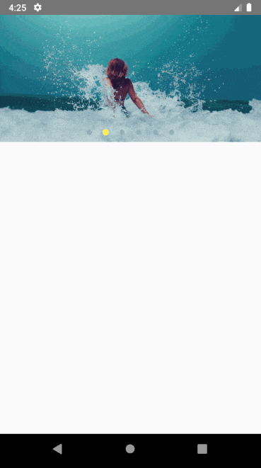
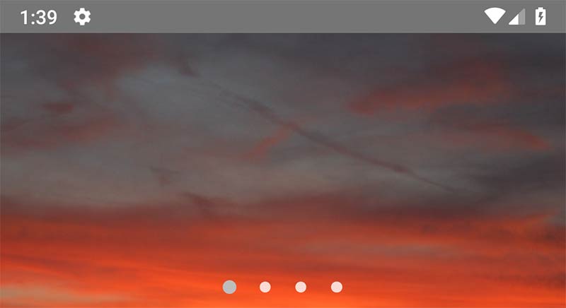
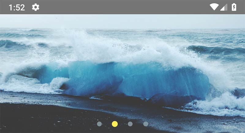
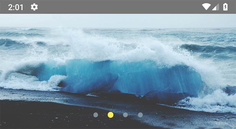
A customizable React Native component that implements an Image Slider UI
source link: https://reactnativeexample.com/a-customizable-react-native-component-that-implements-an-image-slider-ui/
Go to the source link to view the article. You can view the picture content, updated content and better typesetting reading experience. If the link is broken, please click the button below to view the snapshot at that time.

A customizable React Native component that implements an Image Slider UI
react-native-image-slider-box
A simple and fully customizable React Native component that implements an Image Slider UI.
Install
-
First, install our library | use below npm script
npm i react-native-image-slider-box
yarn add react-native-image-slider-box
-
(Optional) : if you want to use third-party image library such as FastImage
npm i react-native-fast-image
yarn add react-native-fast-image
Well-done.
Usage :
list of available props for customization SliderBox:
Props Value Type DescriptionImageComponent
Image component, default as Image
default value is React-native Image, if you use third-party library like FastImage use this property
images
Array of image path(or url) as string
Set array of images path- these paths can contain http url link or local images path using require('./pathOfImage')
onCurrentImagePressed
handler function callback
callback for get pressed image index (index start from 0)
currentImageEmitter
handler function callback
callback for get current image index (index start from 0)
disableOnPress
boolean
if present, then onCurrentImagePressed will be disabled
activeOpacity
number
default value = 0.85, Determines the opacity when touch is active. The value should be between 0 and 1
sliderBoxHeight
int value
default value = 200, you can change height of image slider box
parentWidth
int
default = screen.width ; in advance mode, if parent is smaller, you can change it. best practice is use onLayout handler in parent component or screen.
dotColor
color string code
change color of paging dot
inactiveDotColor
color string code
change color of inactive paging dot
dotStyle
style object
default style is : {width: 10,height: 10,borderRadius: 5,marginHorizontal: 0,padding: 0,margin: 0,} change style of paging dots if you want
paginationBoxVerticalPadding
int value
default = 10 ; change the height of paging dots from bottom of Slider-Box
autoplay
bool value
default = false
circleLoop
boolean - attribute
if set, when user swiped to last image circularly return to the first image again.
paginationBoxStyle
object,default values use lib style
customize pagination box
dotStyle
object,default use lib style
customize dot styles
resizeMethod
string
default is resize
resizeMode
string
default is cover
ImageComponentStyle
object
{} style object for ImageComponent
imageLoadingColor
string
default is #E91E63 , image loading indicator color
ImageLoader
React component, default as ActivityIndicator
default value is React-native ActivityIndicator.
|
| firstItem | number | default is 0 , index of image to display when slider box loads |
1- add below import in your code :
import { SliderBox } from "react-native-image-slider-box";
2- Define your image array source, for below examples i create array in state.
export default class App extends Component {
  constructor(props) {
    super(props);
    this.state = {
      images: [
        "https://source.unsplash.com/1024x768/?nature",
        "https://source.unsplash.com/1024x768/?water",
        "https://source.unsplash.com/1024x768/?girl",
        "https://source.unsplash.com/1024x768/?tree", // Network image
        require('./assets/images/girl.jpg'),          // Local image
      ]
    };
  }
  // other component code ...
}
3- Use SliderBox such as these below examples :
Example 1 : SliderBox without and handler or customization
<SliderBox images={this.state.images} />
Example 2 : SliderBox with image press handler and currentImageEmitter
<SliderBox
  images={this.state.images}
  onCurrentImagePressed={index => console.warn(`image ${index} pressed`)}
  currentImageEmitter={index => console.warn(`current pos is: ${index}`)}
/>
Example 3 : SliderBox with image press handler and change slider height (default is 200)

<SliderBox
  images={this.state.images}
  sliderBoxHeight={400}
  onCurrentImagePressed={index => console.warn(`image ${index} pressed`)}
/>
Example 4 : SliderBox with custom width from parent. use onLayout function by calling it from root View of component.
onLayout = e => {
  this.setState({
    width: e.nativeEvent.layout.width
  });
};
render() {
    return (
        <View style={styles.container} onLayout={this.onLayout}>
            <SliderBox
                images={this.state.images}
                sliderBoxHeight={200}
                onCurrentImagePressed={index =>
                    console.warn(`image ${index} pressed`)
                }
                parentWidth={this.state.width}
            />
        </View>
    );
  }
Example 5 : SliderBox with custom dots color
<SliderBox
  images={this.state.images}
  sliderBoxHeight={200}
  onCurrentImagePressed={index => console.warn(`image ${index} pressed`)}
  dotColor="#FFEE58"
  inactiveDotColor="#90A4AE"
/>
Example 6 : SliderBox with custom dot style

<SliderBox
  images={this.state.images}
  sliderBoxHeight={200}
  onCurrentImagePressed={index => console.warn(`image ${index} pressed`)}
  dotColor="#FFEE58"
  inactiveDotColor="#90A4AE"
  dotStyle={{
    width: 15,
    height: 15,
    borderRadius: 15,
    marginHorizontal: 10,
    padding: 0,
    margin: 0
  }}
/>
Example 7 : SliderBox with change paging box padding (Vertical height from bottom of SliderBox) + add autoplay and circleLoop attribute for jump to the first image after swipe the last one.
<SliderBox
  images={this.state.images}
  sliderBoxHeight={200}
  onCurrentImagePressed={index => console.warn(`image ${index} pressed`)}
  dotColor="#FFEE58"
  inactiveDotColor="#90A4AE"
  paginationBoxVerticalPadding={20}
  autoplay
  circleLoop
/>
Example 8 : use Custom Image Component, customize pagination, image modes and dotStyles:
<SliderBox
  ImageComponent={FastImage}
  images={this.state.images}
  sliderBoxHeight={200}
  onCurrentImagePressed={index => console.warn(`image ${index} pressed`)}
  dotColor="#FFEE58"
  inactiveDotColor="#90A4AE"
  paginationBoxVerticalPadding={20}
  autoplay
  circleLoop
  resizeMethod={'resize'}
  resizeMode={'cover'}
  paginationBoxStyle={{
    position: "absolute",
    bottom: 0,
    padding: 0,
    alignItems: "center",
    alignSelf: "center",
    justifyContent: "center",
    paddingVertical: 10
  }}
  dotStyle={{
    width: 10,
    height: 10,
    borderRadius: 5,
    marginHorizontal: 0,
    padding: 0,
    margin: 0,
    backgroundColor: "rgba(128, 128, 128, 0.92)"
  }}
  ImageComponentStyle={{borderRadius: 15, width: '97%', marginTop: 5}}
  imageLoadingColor="#2196F3"
/>
Example 9 : SliderBox with activeOpacity:
<SliderBox
  images={this.state.images}
  sliderBoxHeight={200}
  activeOpacity={0.5}
/>
Full-Component(Screen) Example:
import React, { Component } from "react";
import { StyleSheet, Text, View } from "react-native";

import { SliderBox } from "react-native-image-slider-box";

export default class App extends Component {
  constructor(props) {
    super(props);
    this.state = {
      images: [
        "https://source.unsplash.com/1024x768/?nature",
        "https://source.unsplash.com/1024x768/?water",
        "https://source.unsplash.com/1024x768/?girl",
        "https://source.unsplash.com/1024x768/?tree",
        require('./assets/images/girl.jpg'),
      ]
    };
  }

  render() {
    return (
      <View style={styles.container}>
        <SliderBox
          images={this.state.images}
          onCurrentImagePressed={index =>
            console.warn(`image ${index} pressed`)
          }
        />
      </View>
    );
  }
}

const styles = StyleSheet.create({
  container: {
    flex: 1
  }
});
Contribute
Note: Please Use example folder to run sample. The sample used components/SliderBox.js file to run. Please after editing this file copy changes to root dist/ folder too. The npm used dist/ folder. Thanks guys.
License MIT
GitHub
https://github.com/intellidev1991/react-native-image-slider-box
Recommend
About Joyk
Aggregate valuable and interesting links.
Joyk means Joy of geeK