

利用 R 语言进行交互数据可视化
source link: https://cosx.org/2016/06/using-r-for-interactive-data-visualization/
Go to the source link to view the article. You can view the picture content, updated content and better typesetting reading experience. If the link is broken, please click the button below to view the snapshot at that time.

上周在中国 R 语言大会北京会场上,给大家分享了如何利用 R 语言交互数据可视化。现场同学对这块内容颇有兴趣,故今天把一些常用的交互可视化的 R 包搬出来与大家分享。
rCharts 包
说起 R 语言的交互包,第一个想到的应该就是 rCharts 包。该包直接在 R 中生成基于 D3 的 Web 界面。
rCharts 包的安装
require(devtools)
install_github('rCharts', 'ramnathv')
rCharts 函数就像 lattice 函数一样,通过 formula、data 指定数据源和绘图方式,并通过 type 指定图表类型。
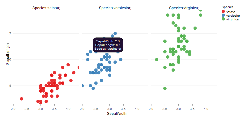
下面通过例子来了解下其工作原理。我们以鸢尾花数据集为例,首先通过 name 函数对列名进行重新赋值(去掉单词间的点),然后利用 rPlot 函数绘制散点图 (type=“point”),并利用颜色进行分组(color=“Species”)。
library(rCharts)
names(iris) = gsub("\\.", "", names(iris))
p1 <- rPlot(SepalLength ~ SepalWidth | Species, data = iris, color = 'Species', type = 'point')
p1
rCharts 支持多个 javascript 图表库, 每个都有自己的长处。每一个图表库有多个定制选项, 其中大部分 rCharts 都支持。
NVD3 是一个旨在建立可复用的图表和组件的 d3.js 项目——它提供了同样强大的功能,但更容易使用。它可以让我们处理复杂的数据集来创建更高级的可视化。在 rCharts 包中提供了 nPlot 函数来实现。
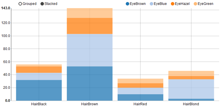
下面以眼睛和头发颜色的数据 (HairEyeColor) 为例说明 nPlot 绘图的基本原理。我们按照眼睛的颜色进行分组(group=“eye”), 对头发颜色人数绘制柱状图,并将类型设置为柱状图组合方式(type=“multiBarChart”),这样可以实现分组和叠加效果。
library(rCharts)
hair_eye_male <- subset(as.data.frame(HairEyeColor), Sex == "Male")
hair_eye_male[,1] <- paste0("Hair",hair_eye_male[,1])
hair_eye_male[,2] <- paste0("Eye",hair_eye_male[,2])
n1 <- nPlot(Freq ~ Hair, group = "Eye", data = hair_eye_male,
type = "multiBarChart")
n1
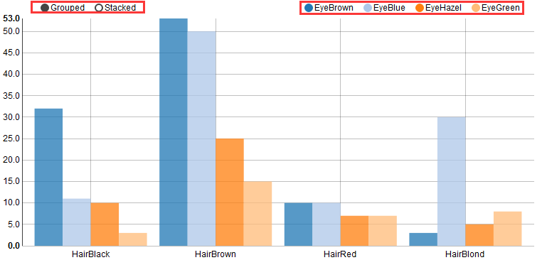
可以通过图形右上角选择需要查看或隐藏的类别(默认是全部类别显示的),也能通过左上角选择柱子是按照分组还是叠加的方式进行摆放(默认是分组方式)。如果选择 Stacked,就会绘制叠加柱状图。
Highcharts 是一个制作图表的纯 Javascript 类库,支持大部分的图表类型:直线图,曲线图、区域图、区域曲线图、柱状图、饼状图、散布图等。在 rCharts 包中提供了 hPlot 函数来实现。
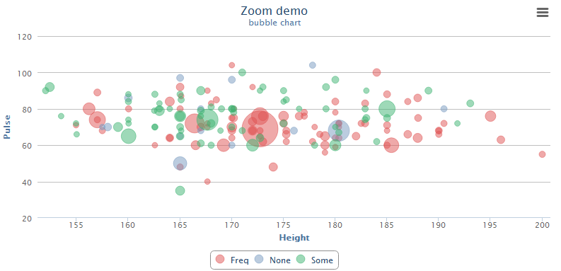
以 MASS 包中的学生调查数据集 survery 为例,说明 hPlot 绘图的基本原理。我们绘制学生身高和每分钟脉搏跳动次数的气泡图,以年龄变量作为调整气泡大小的变量。
library(rCharts)
a <- hPlot(Pulse ~ Height, data = MASS::survey, type = "bubble",
title = "Zoom demo", subtitle = "bubble chart",
size = "Age", group = "Exer")
a$colors('rgba(223, 83, 83, .5)', 'rgba(119, 152, 191, .5)',
'rgba(60, 179, 113, .5)')
a$chart(zoomType = "xy")
a$exporting(enabled = T)
a
rCharts 包可以画出更多漂亮的交互图, http://ramnathv.github.io/rCharts/ 和 https://github.com/ramnathv/rCharts/tree/master/demo 有更多的例子可供大家学习。
recharts 包
学习完 rCharts 包,可能有读者会问,我们有没有国人开发的包实现相似的效果呢?这边给大家推荐一个同样功能强大的 recharts 包。
本包来源于百度开发的国内顶尖水平的开源 d3-js 可视项目 Echarts(Github Repo)。Yang Zhou 和 Taiyun Wei 基于该工具开发了 recharts 包,经 Yihui Xie 修改后,可通过 htmlwidgets 传递 js 参数,大大简化了开发难度。但此包开发仍未完成。为了赶紧上手用,基于该包做了一个函数 echartR(下载至本地,以后通过 source 命令加载),用于制作基础 Echart 交互图。需要 R 版本 >=3.2.0.
安装方式如下:
library(devtools)
install_github('yihui/recharts')
安装完后,需要在 https://github.com/madlogos/recharts/blob/master/R/echartR.R 将 echartR.R 脚本下载到本地。
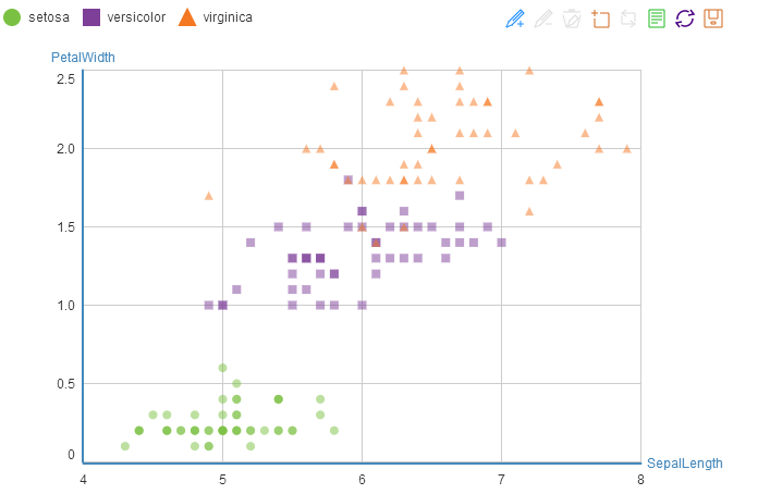
假如想对鸢尾花数据集绘制散点图,可以执行如下代码:
source("~echartR.R")
names(iris) = gsub("\\.", "", names(iris))
echartR(data=iris,x=~SepalLength,y=~PetalWidth,series = ~Species,
type = 'scatter')
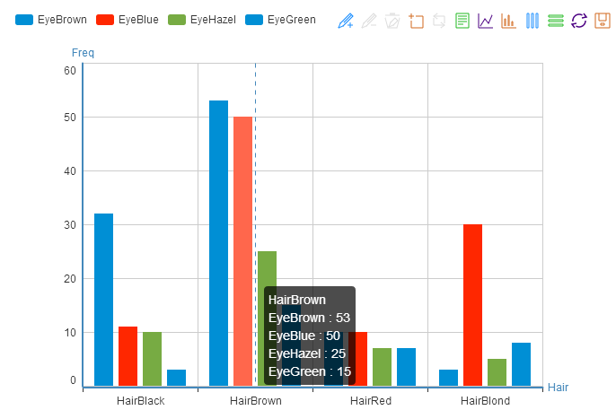
绘制柱状图:
hair_eye_male <- subset(as.data.frame(HairEyeColor), Sex == "Male")
hair_eye_male[,1] <- paste0("Hair",hair_eye_male[,1])
hair_eye_male[,2] <- paste0("Eye",hair_eye_male[,2])
echartR(data = hair_eye_male, x = Hair, y = ~Freq,  series = ~Eye,
type = 'bar', palette='fivethirtyeight',
xlab = 'Hair', ylab = 'Freq')
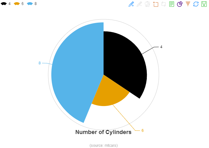
dtcars <- mtcars
dtcars$car <- row.names(dtcars)
dtcars$transmission <- as.factor(dtcars$am)
levels(dtcars$transmission) <- c("Automatic","Manual")
dtcars$cylinder <- as.factor(dtcars$cyl)
dtcars$carburetor <-as.factor(dtcars$carb)
echartR(dtcars, x = ~cylinder,  y = ~car, type='rose',
palette='colorblind', title='Number of Cylinders',
subtitle = '(source: mtcars)')
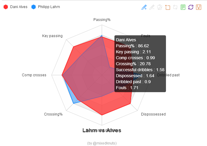
player <- data.frame(name=c(rep("Philipp Lahm",8),rep("Dani Alves",8)),
para=rep(c("Passing%","Key passing","Comp crosses",
"Crossing%","Successful dribbles",
"Dispossessed","Dribbled past","Fouls"),2),
value=c(89.67, 1.51, 0.97, 24.32, 0.83, 0.86, 1.15, 0.47,
86.62, 2.11, 0.99, 20.78, 1.58, 1.64, 0.9, 1.71))
echartR(player, x= ~para, y= ~value, series= ~name, type='radarfill',
symbolList='none', palette=c('firebrick1','dodgerblue'),
title='Lahm vs Alves', subtitle= '(by @mixedknuts)')
plotly 包
接下来要给大家介绍的是另一个功能强大的 plotly 包。它是一个基于浏览器的交互式图表库,它建立在开源的 JavaScript 图表库 plotly.js 之上。
有两种安装方式:
install.packages("plotly")
devtools::install_github("ropensci/plotly")
plotly 包利用函数 plot_ly 函数绘制交互图。
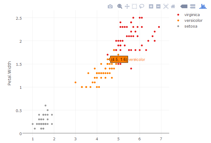
如果相对鸢尾花数据集绘制散点图,需要将 mode 参数设置为 “markers”。
library(plotly)
p <- plot_ly(iris, x = Petal.Length, y = Petal.Width,
color = Species, colors = "Set1", mode = "markers")
p
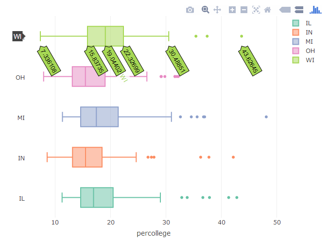
如果想绘制交互箱线图,需要将 type 参数设置为 box。
library(plotly)
plot_ly(midwest, x = percollege, color = state, type = "box")
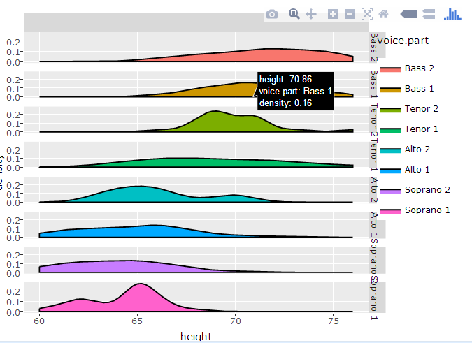
如果你已熟悉 ggplot2 的绘图系统,也可以针对 ggplot2 绘制的对象 p,利用 ggplotly 函数实现交互效果。例如我们想对 ggplot 绘制的密度图实现交互效果,执行以下代码即可。
library(plotly)
p <- ggplot(data=lattice::singer,aes(x=height,fill=voice.part))+
geom_density()+
facet_grid(voice.part~.)
(gg <- ggplotly(p))
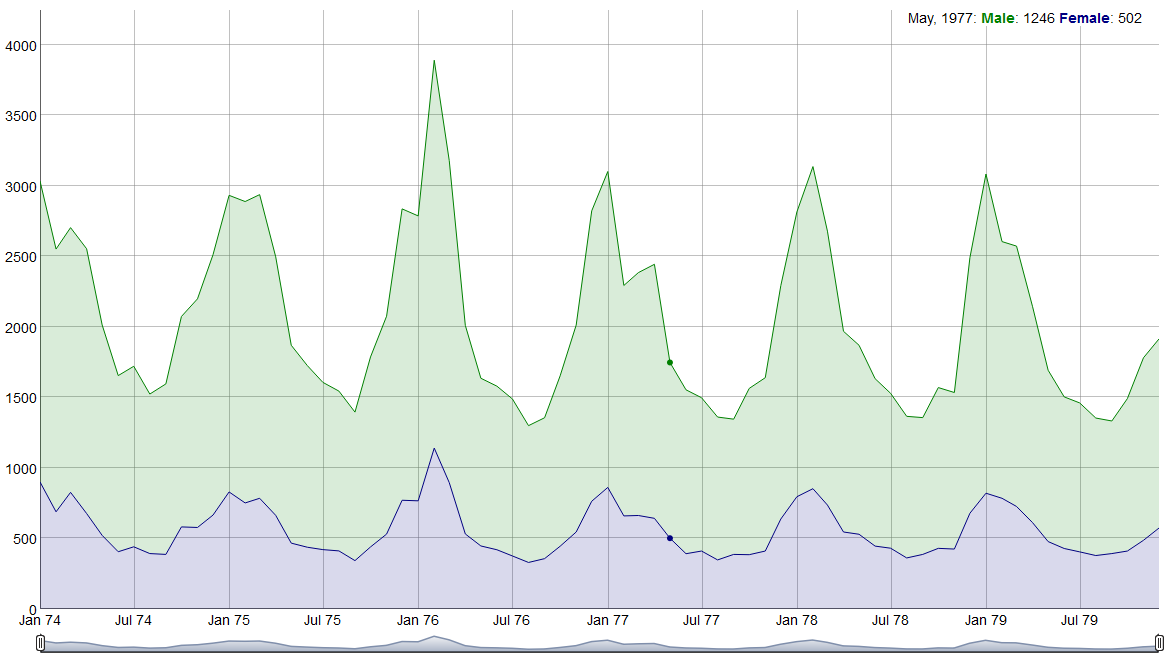
此外还有很多好玩有用的交互包。例如专门用来画交互时序图的 dygraphs 包,可通过 install.packages(“dygraphs”) 安装。
library(dygraphs)
lungDeaths <- cbind(mdeaths, fdeaths)
dygraph(lungDeaths) %>%
dySeries("mdeaths", label = "Male") %>%
dySeries("fdeaths", label = "Female") %>%
dyOptions(stackedGraph = TRUE) %>%
dyRangeSelector(height = 20)
DT 包实现 R 数据对象可以在 HTML 页面中实现过滤、分页、排序以及其他许多功能。通过 install.packages(“DT”) 安装。
以鸢尾花数据集 iris 为例,执行以下代码:
library(DT)
datatable(iris)
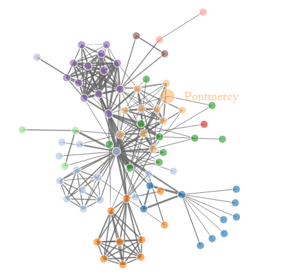
networkD3 包可实现 D3 JavaScript 的网络图,通过 install.packages(“networkD3”) 安装。
下面是绘制一个力导向的网络图的例子。
# 加载数据
data(MisLinks)
data(MisNodes)

# 画图
forceNetwork(Links = MisLinks, Nodes = MisNodes,
Source = "source", Target = "target",
Value = "value", NodeID = "name",
Group = "group", opacity = 0.8)
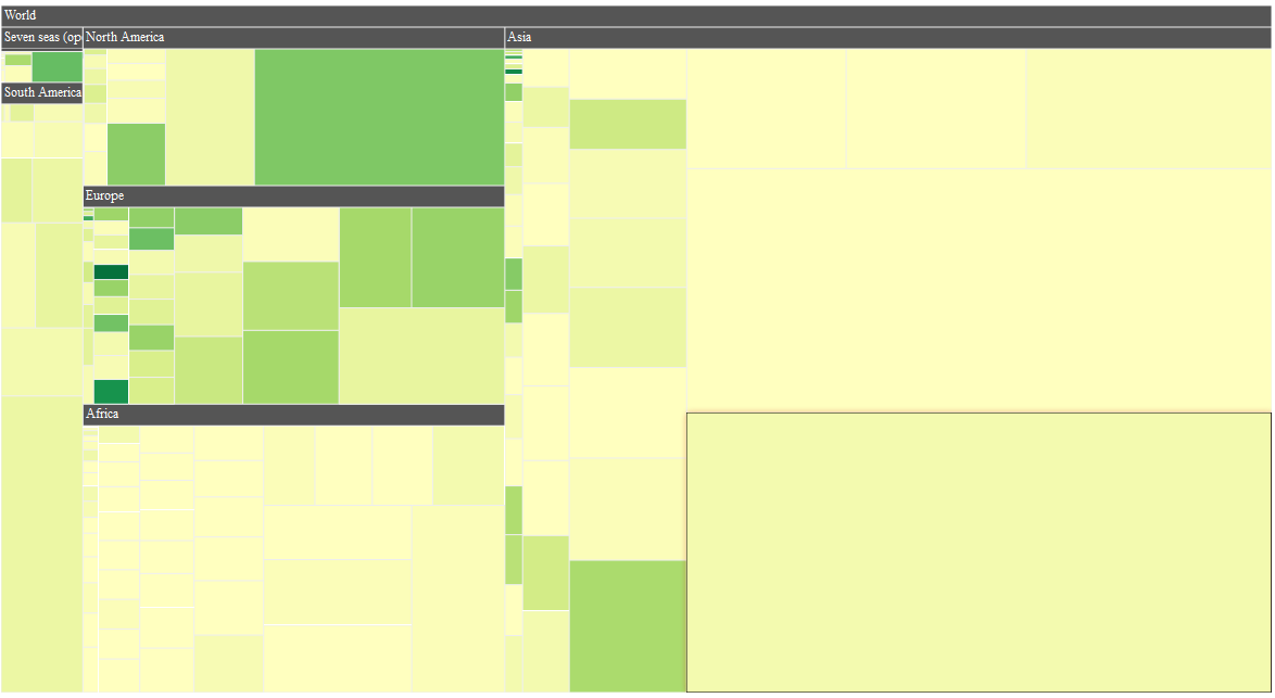
我们可以通过 d3treeR 包绘制交互 treemap 图,利用
devtools::install_github("timelyportfolio/d3treeR")
完成 d3treeR 包安装。
library(treemap)
library(d3treeR)
data("GNI2014")
tm <-  treemap(
GNI2014,
index=c("continent", "iso3"),
vSize="population",
vColor="GNI",
type="value"
)
d3tree( tm,rootname = "World" )
今天主要是介绍了几个 R 常用的交互包。在 R 的环境中,动态交互图形的优势在于能和 knitr、shiny 等框架整合在一起,能迅速建立一套可视化原型系统。希望以后再跟各位分享这部分的内容。
乐逗游戏高级数据分析师,负责大数据挖掘及可视化。资深 R 语言用户,有九年以上数据挖掘工作实战经验,多次在中国 R 语言大会上作主题演讲。与张良均老师、杨坦老师合著的《R 语言与数据挖掘》一书已在 2016 年 7 月出版,新书《R 语言游戏数据分析》一书也即将于 2017 年初出版。
敬告各位友媒,如需转载,请与统计之都小编联系(直接留言或发至邮箱:[email protected]),获准转载的请在显著位置注明作者和出处(转载自:统计之都),并在文章结尾处附上统计之都微信二维码。

Recommend
About Joyk
Aggregate valuable and interesting links.
Joyk means Joy of geeK