

Hardest Problem in Computer Science: Centering Things
source link: https://tonsky.me/blog/centering/?ref=sidebar
Go to the source link to view the article. You can view the picture content, updated content and better typesetting reading experience. If the link is broken, please click the button below to view the snapshot at that time.

Hardest Problem in Computer Science: Centering Things
Translations: Russian
This is my claim: we, as a civilization, forgot how to center things.
I mean, we know how to do it. It has never been simpler:
display: flex;
justify-content: center; /* Horizontal centering */
align-items: center; /* Vertical centering */
(don’t ask why you need to remember four words instead of just horizontal/vertical, it’s still better than before)
Or you can use grids if you want:
display: grid;
justify-items: center; /* Horizontal centering */
align-items: center; /* Vertical centering */
(also don’t ask why justify-content became justify-items)
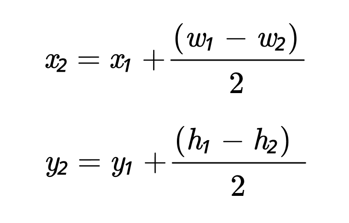
If you feel like school today, we can deduce it from the first principles:
Hey, even ChatGPT knows how to center things:
Okay, maybe not right away, but eventually it gets there.
What I’m saying is: everybody knows how to center things. It’s trivial. And if you are lost, the knowledge is right there.
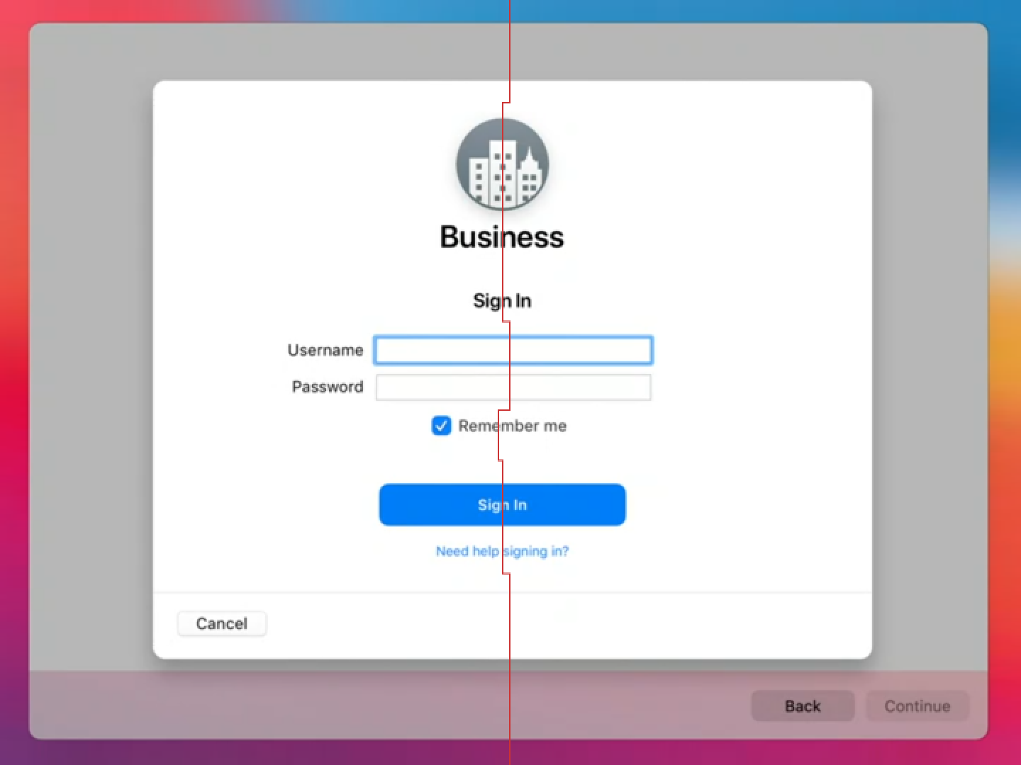
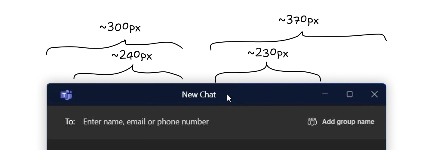
Yet, when we look at actual applications, we see that these methods are not used. We see this:

or this:
or even this:

So something is clearly getting lost between know-how and applying that knowledge.
In theory, there’s no difference between theory and practice. Unfortunately, we live in practice.
So what’s happening? Let’s find out.
Fonts
Fonts are one of the biggest offenders. You can see poorly aligned text everywhere. Let me showcase.
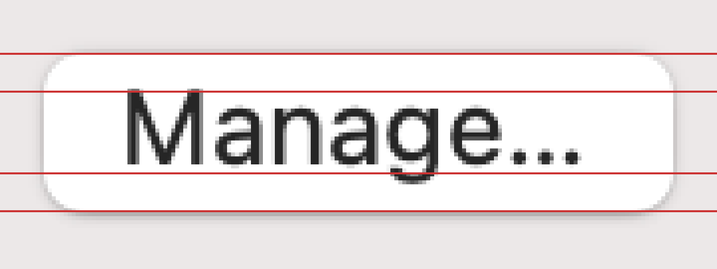
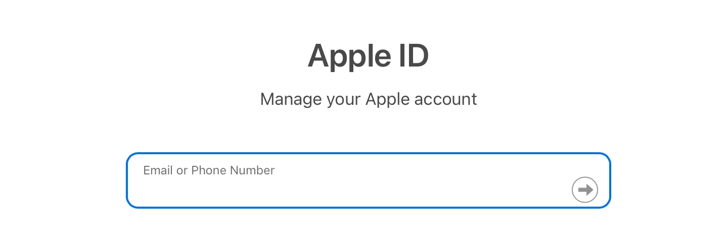
Apple can’t do it:
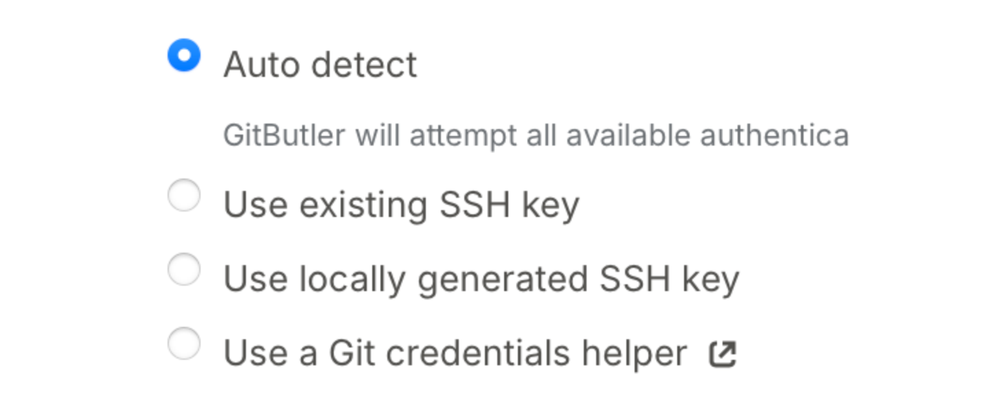
Microsoft can’t do it:

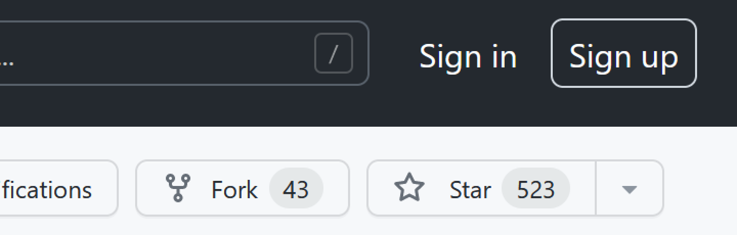
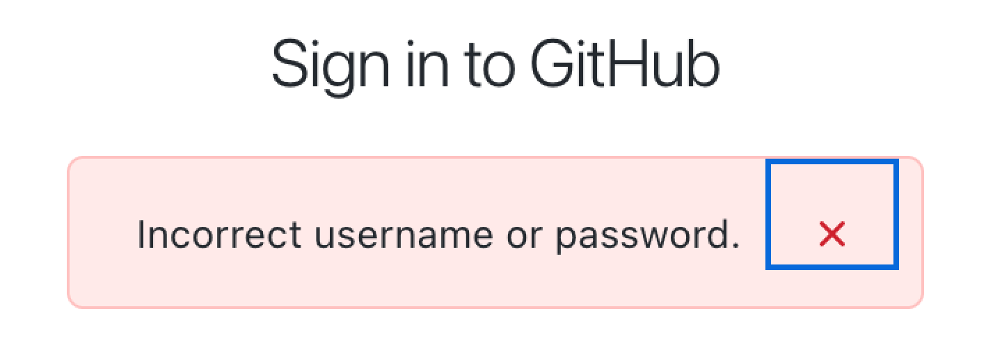
GitHub can’t do it:
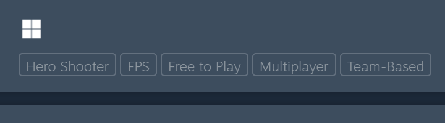
Valve can’t do it:
Slack can’t do it:

Telegram can’t do it:
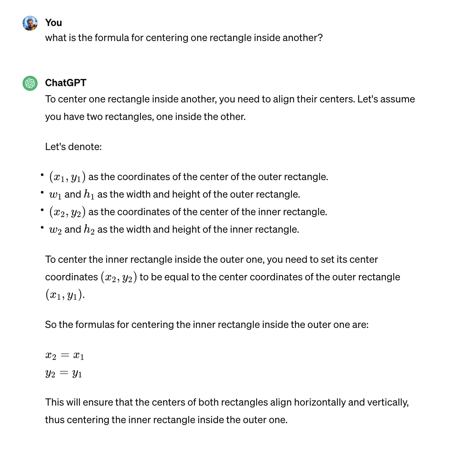
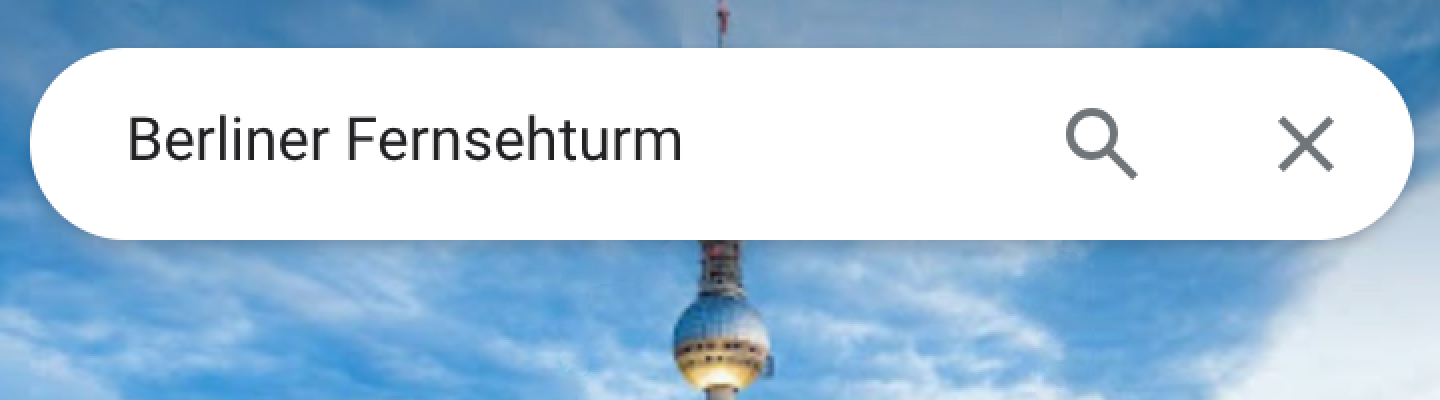
Google Maps can’t do it:
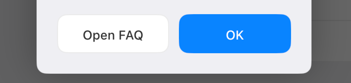
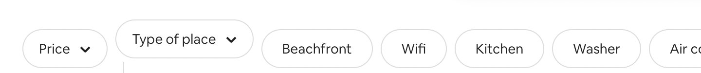
Honestly, I can provide an endless supply of poorly-aligned buttons without even having to look for them:
I think you get the idea. Myriad companies big and small, native or web, and none are safe from text-centering problems.
Line height
If font metrics are not enough, the next problem on our way to perfect centering is line-height.
Line height is... complicated. A canonical article to learn about it is Vincent De Oliveira’s Deep dive CSS: font metrics, line-height and vertical-align.
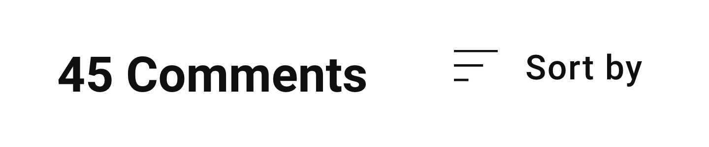
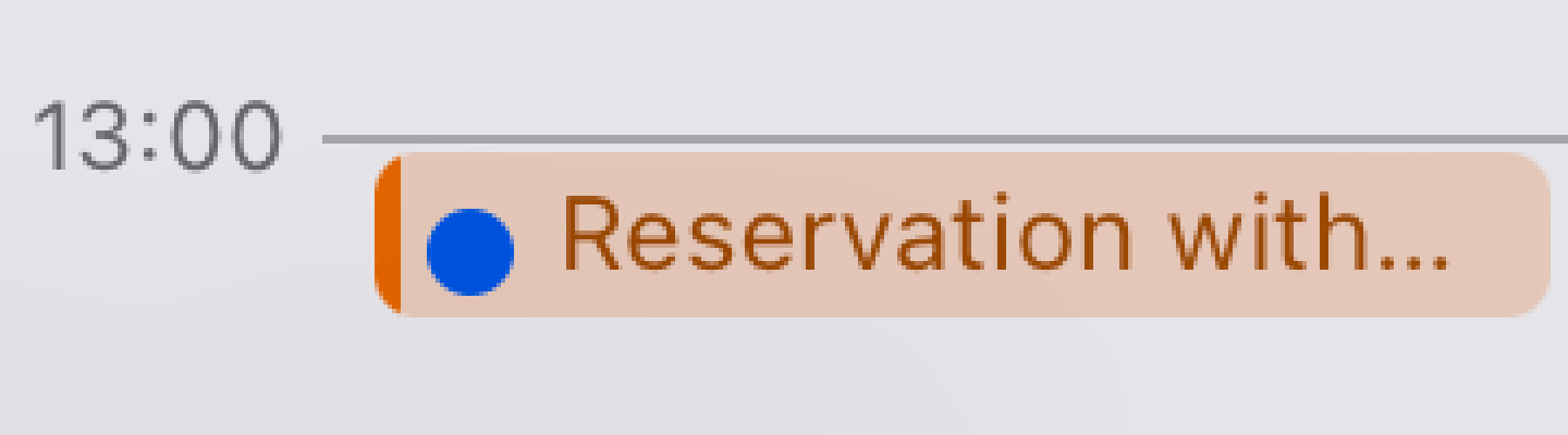
This is how it looks applied in practice. Slack:
Notion:
Airbnb:
YouTube:
Aligning two things in different containers is almost impossible:
Although many have tried:
Not many have succeeded:
CSS might get in the way (different controls having different defaults which you have to undo before even starting trying to align):

No easy solution here, just roll up your sleeves and delve into specifications.
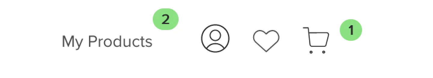
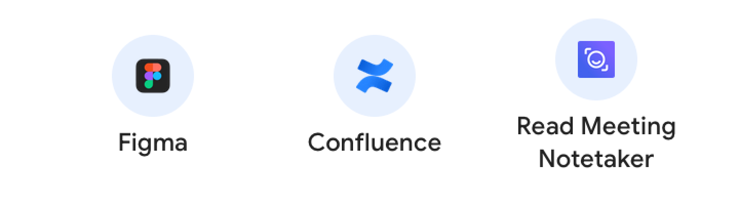
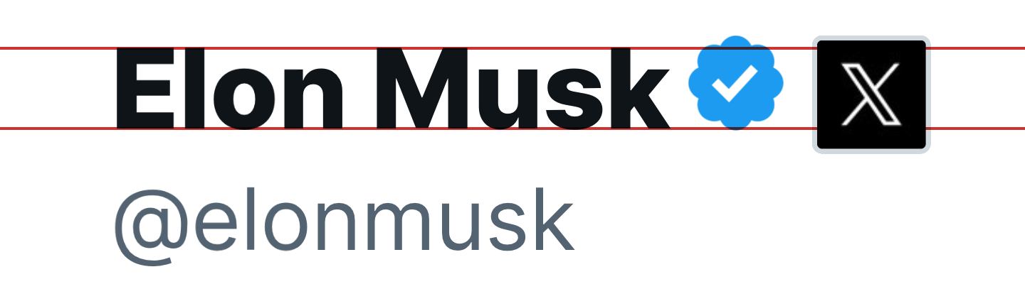
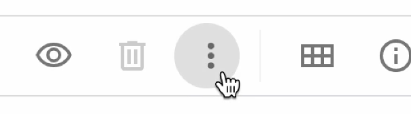
Icons
Icons are like small rectangles put in line with text. Therefore all problems caused by text AND line height apply here. Aligning icons next to text is a notoriously hard task.
Atom:

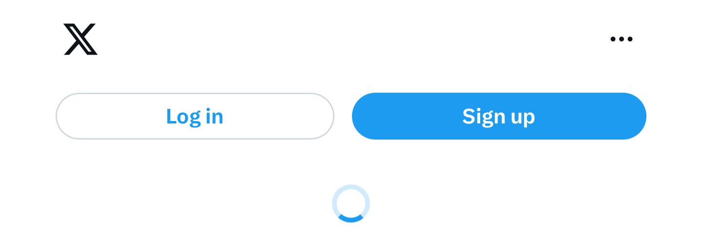
Platform formerly known as Twitter:
Mozilla:

YouTube:
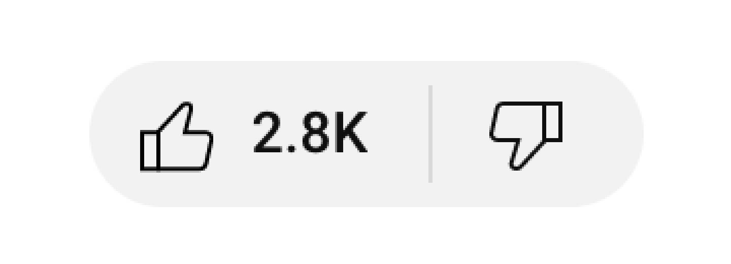
Sometimes icon wins over text:

Sometimes text wins over icon:
Sometimes both lose:

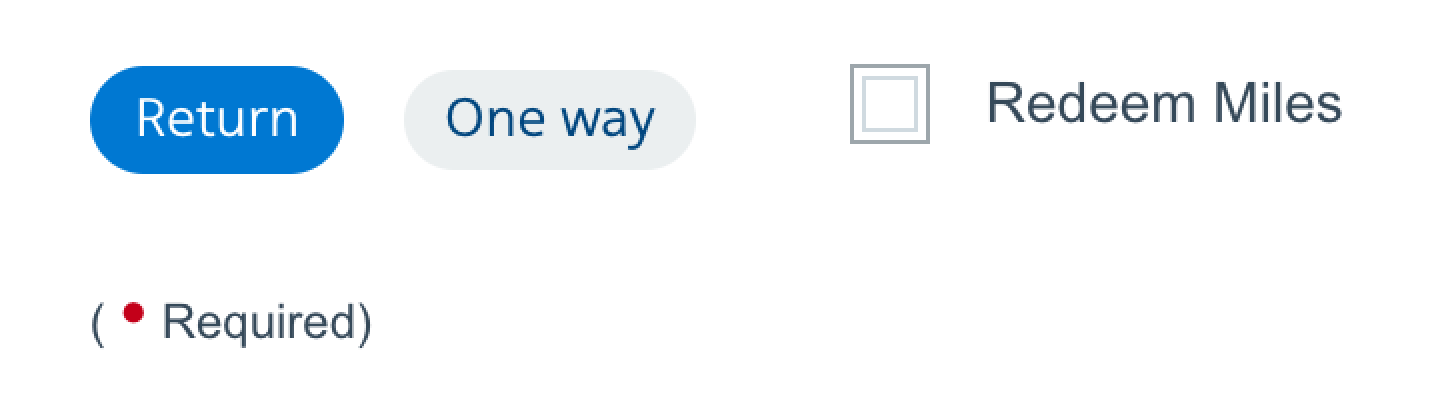
Some icons are just plain old HTML form controls:
Some are stylized:
Thanks @bee for the picture
Sometimes people will get creative to achieve perfect alignment:
But overall it’s a pretty hopeless game:
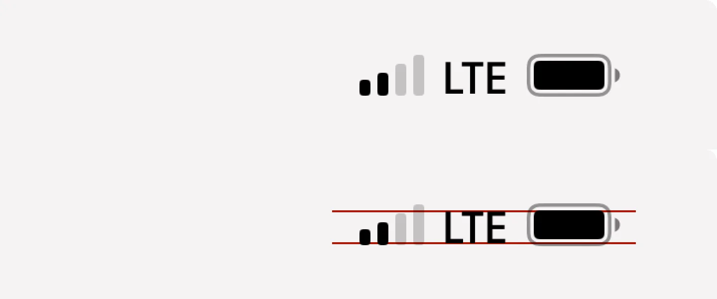
The problem is, CSS doesn’t help us either. There are 13 possible values for the vertical-align property, but none would align the icon in a meaningful way:
text-align: middle comes closest, but it aligns by x-height, not cap-height, which still looks unbalanced:
That’s exactly why people love web programming so much. There’s always a challenge.
Icon fonts
Aligning rectangles is relatively easy. Aligning text is hard. Icons are rectangles. So what if we put icons into a font file?
Now we can’t align anything:
Neither can we set icon size! In the example above, all icons were set to the same font size and line height. As you can see, all of them come out different sizes, with different paddings, and none were properly aligned.
Despite many shortcomings and almost no upsides, companies rushed to add icon fonts everywhere. The result is this:
macOS 10.14 → macOS 10.15
Notice how operators are not vertically aligned anymore and are also blurry. All because of switching to icon font.
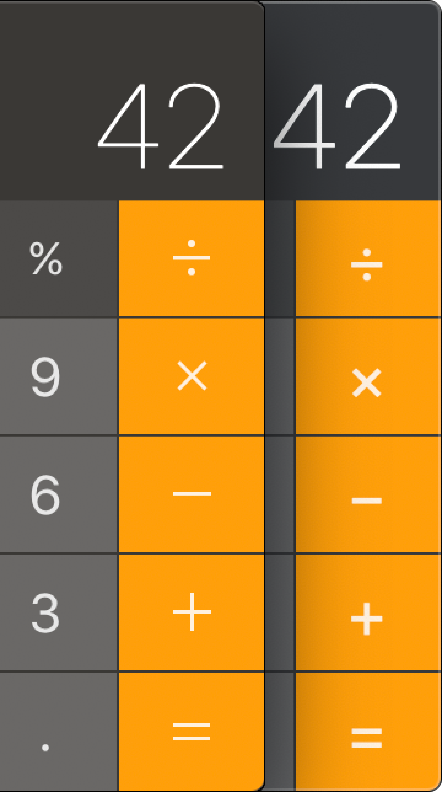
Apple was so committed to icon fonts they even ruined the QuickTime record button:
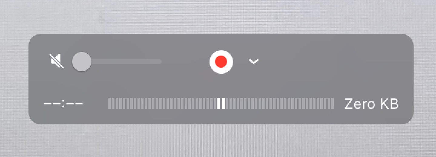
Just look at it:
Yes, it actually looks like this to this day. As does the calculator.
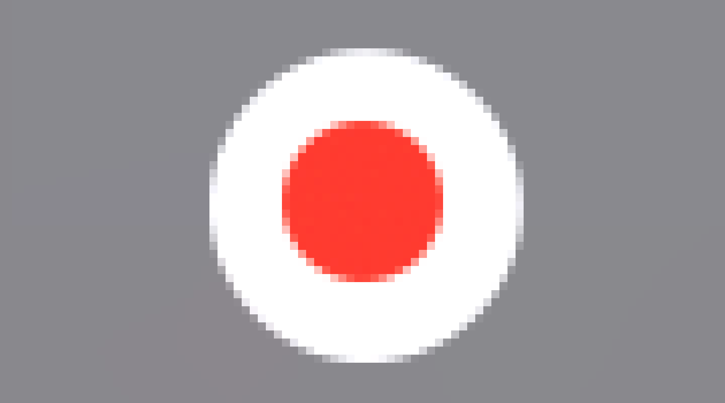
But they are far from being the only ones. One:
Three:
Four:
Five:
Seven:
Same as with text alignment, there’s an endless supply of poorly aligned icons.
Skill issue
Not only programmers fail to center things. Designers do it, too:
Current version / my fix
The problem with icons is that sometimes you have to take their shape into account for things to look good:
Bad centering / good centering
Triangle is notably tricky:

Sometimes it is too far to the left:

Sometimes it’s too far to the right:
It can even be too high up (line-height strikes again):
Horizontal centering
You might think that only centering things vertically is hard. Not only! Horizontal might be hard, too:
I don’t think there’s a deep reason for these, except for people just being sloppy:
Just, come on!
Can this be a deliberate decision?
I don’t know. Icons can suffer from it, too:
As can text:

What can be done: designers
So what is the problem?
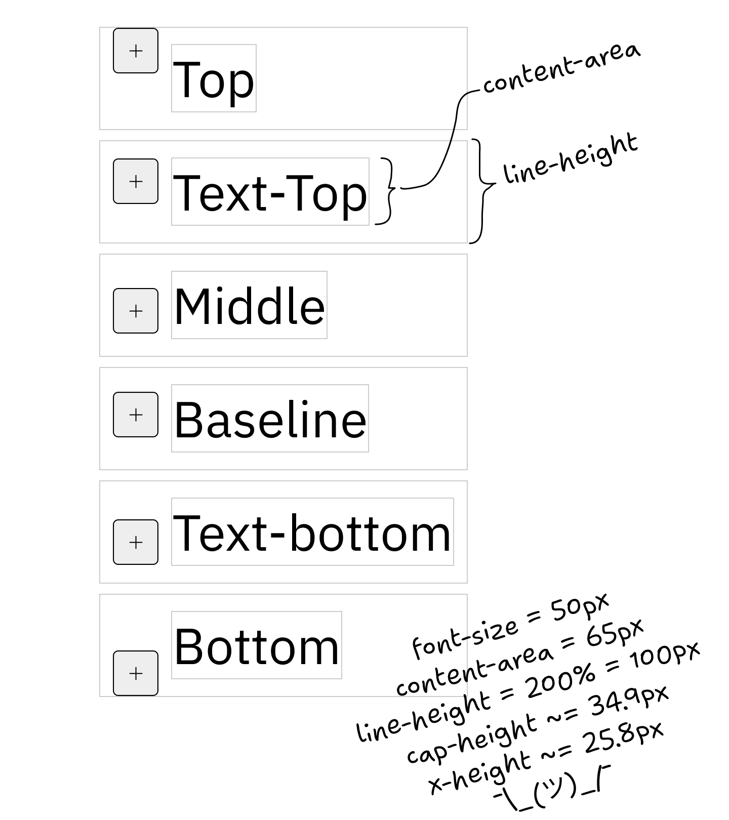
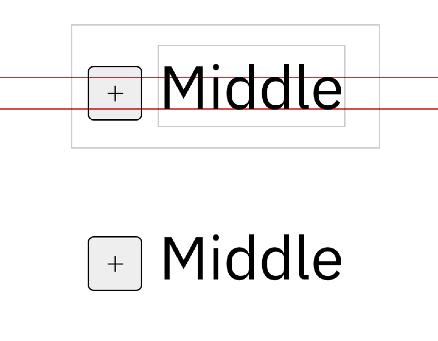
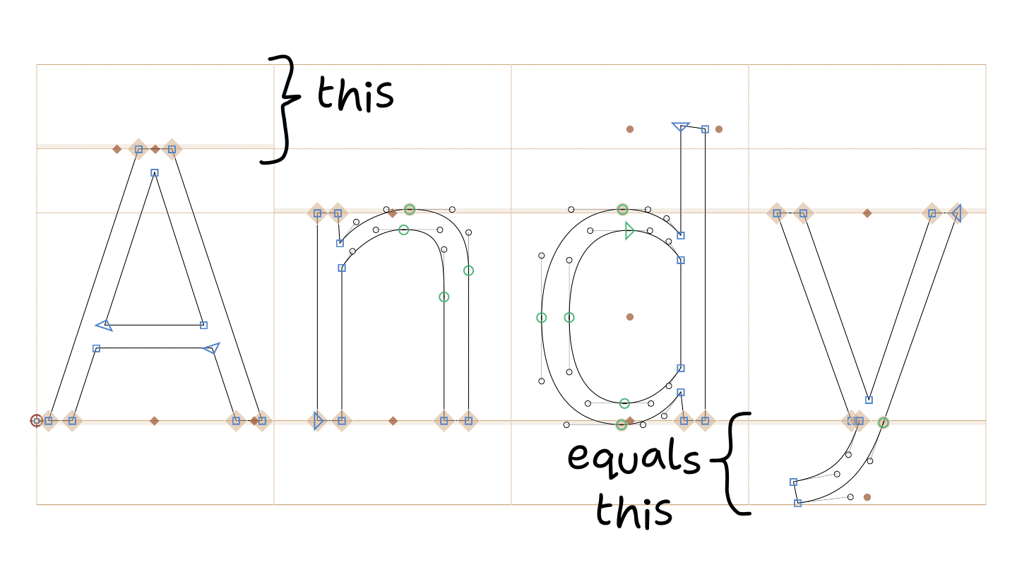
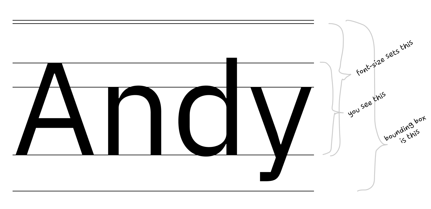
It all starts with the font. Right now, the bounding box of a text block looks like this:
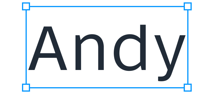
The problem is, it can also look like this:
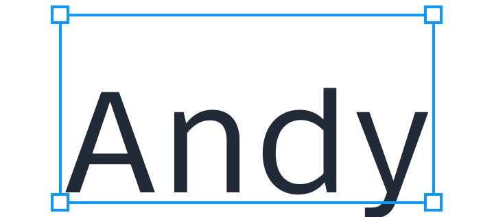
or this:
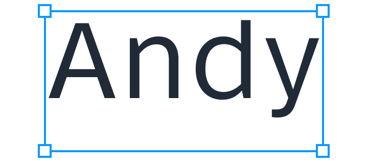
Now, what will happen if you try to center text by centering its bounding box?
The text will be off! Even though rectangles are perfectly centered.
But even if font can have its metrics unbalanced, it doesn’t mean it does. What happens in reality?
In reality, most of the popular fonts have metrics slightly off. Many have it significantly off:
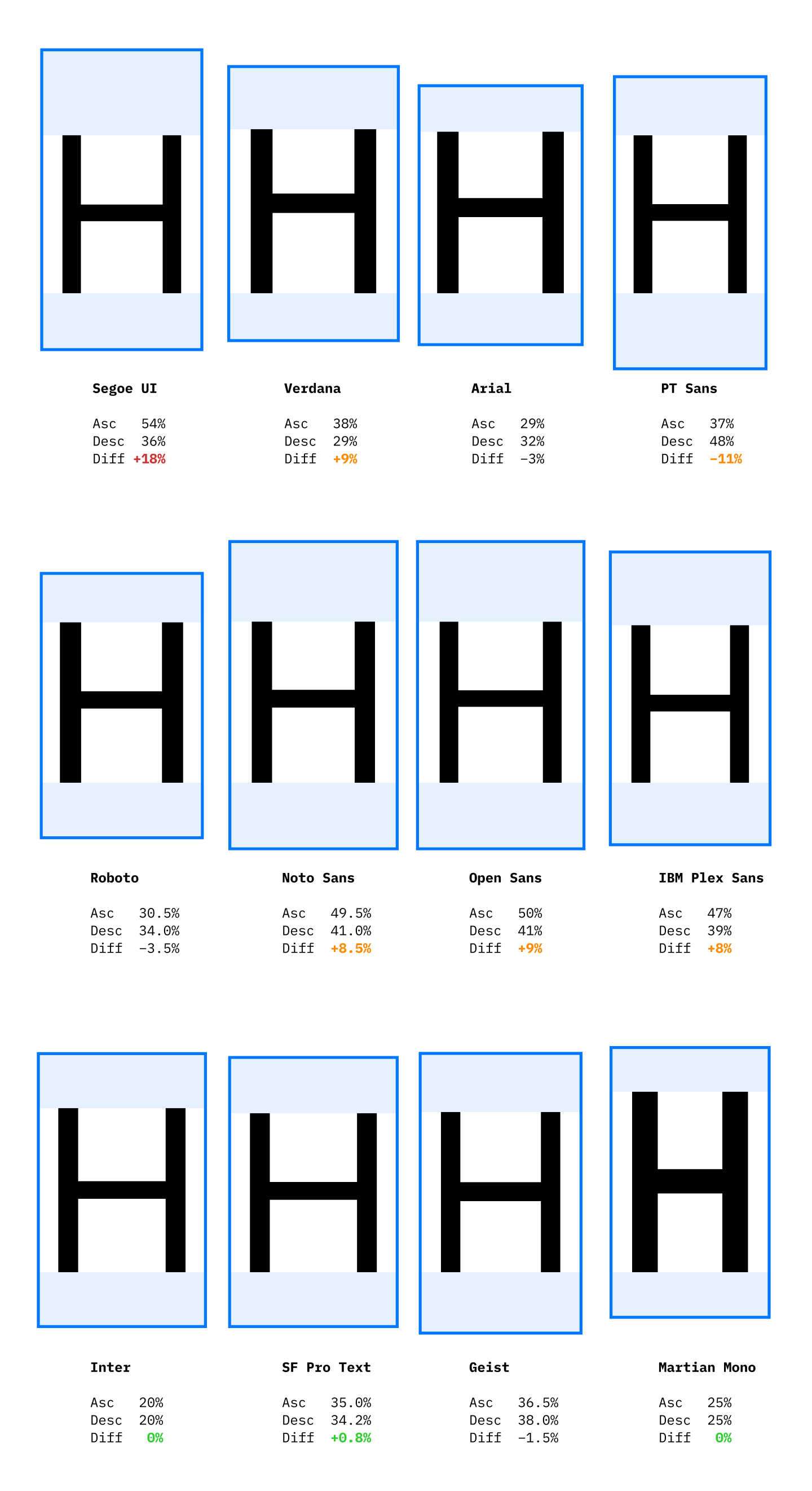
Percentages are of cap-height
10% is not a small number. It’s a whole pixel in font size 13! Two, if you have 2× scaling! It’s easily noticeable.
Basically, Segoe UI is the reason why Github on Windows looks like this:
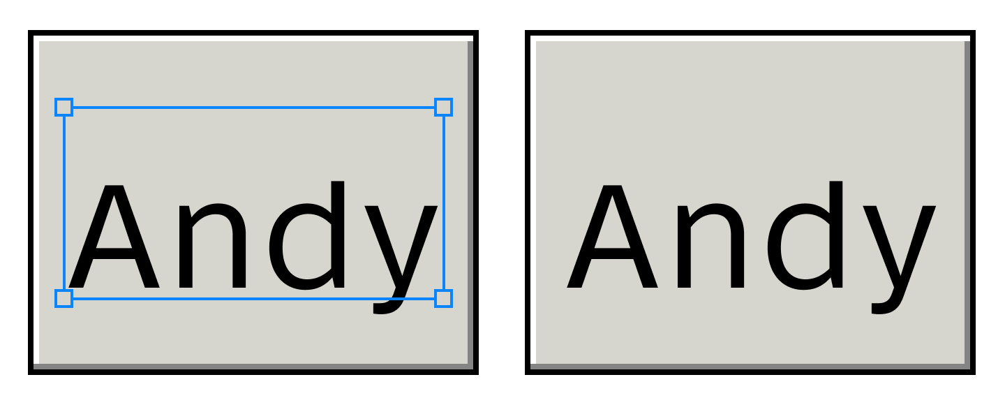
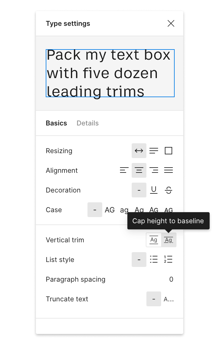
The solution is simple: make tight bounding boxes and centering will become trivial:
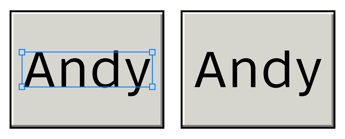
If you use Figma, it already can do this (although it’s not the default):
What can be done: font designers
If you are a font designer, make life easier for everybody by setting your metrics so that ascender − cap-height = descender:
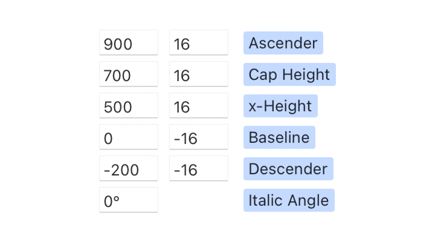
Or the same idea, visually:
Important! You don’t have to actually extend your ascenders/descenders to these boundaries. As you can see in the picture, my ascender space, for example, is way underutilized. Just make the numbers match.
For both web and native, to avoid headaches, choose a font that already follows this rule. SF Pro Text, Inter, and Martian Mono seem to do this already, so they will center perfectly with no extra effort.
See Font size is useless; let’s fix it for more information.
What can be done: web developers
From the developer side, it’s a bit more tricky.
The first thing to understand, you need to know which font you’ll be using. Unfortunately, this doesn’t work if you plan to substitute fonts.
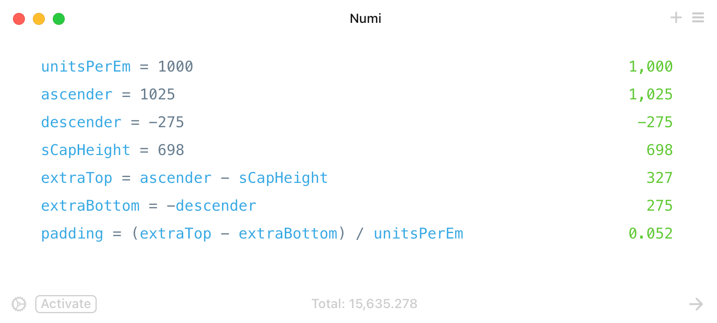
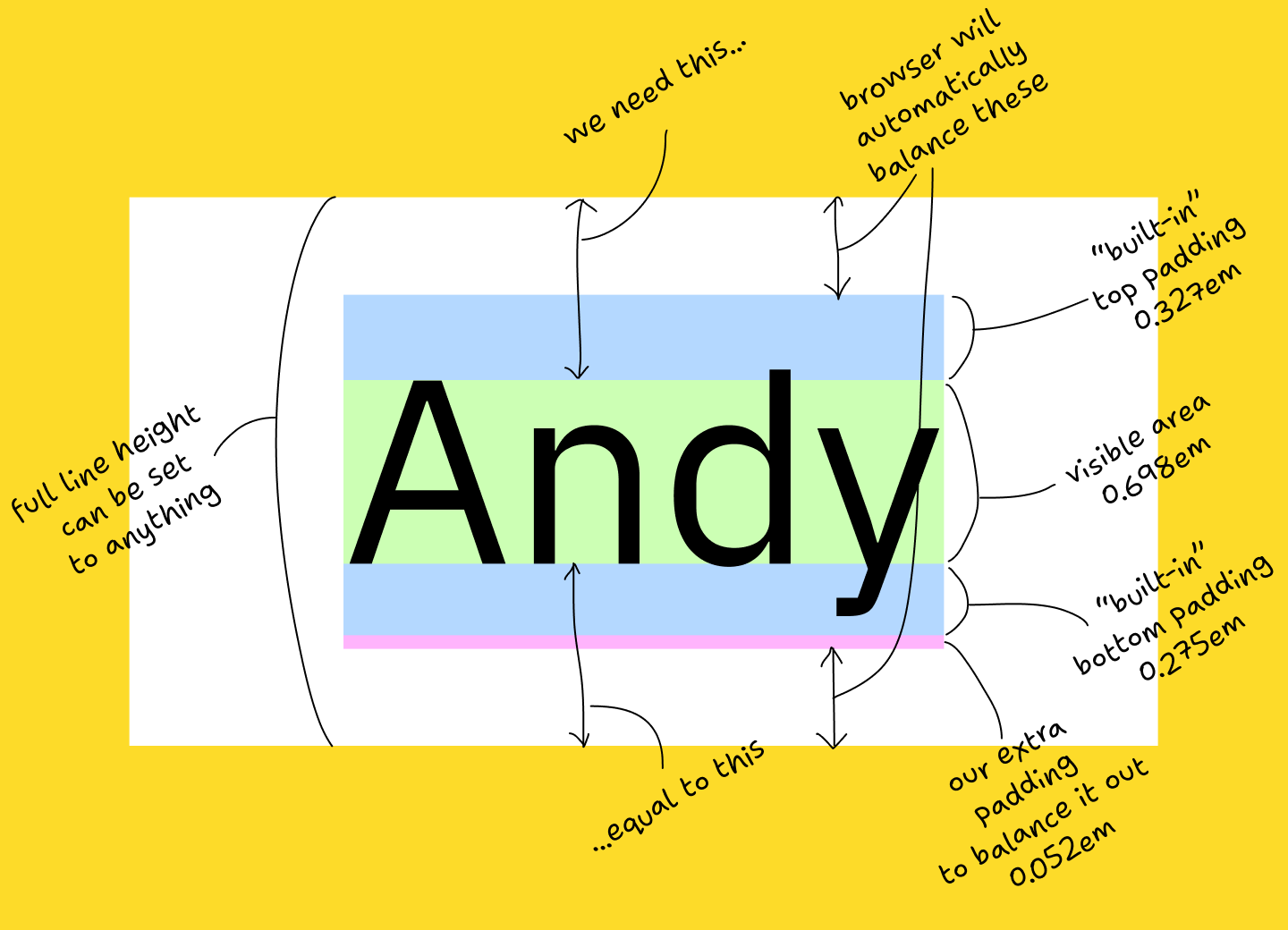
We’ll use IBM Plex Sans, a font used on this very page. IBM Plex Sans has the following metrics:
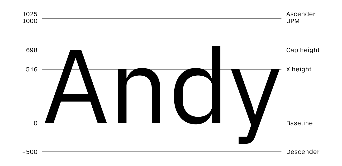
When you set font-size, what you set is UPM (this will also be equal to 1em). However, the actual space occupied by the text block is the space between the ascender and descender.
With a few simple calculations, we get that extra padding-bottom: 0.052em should do the trick:
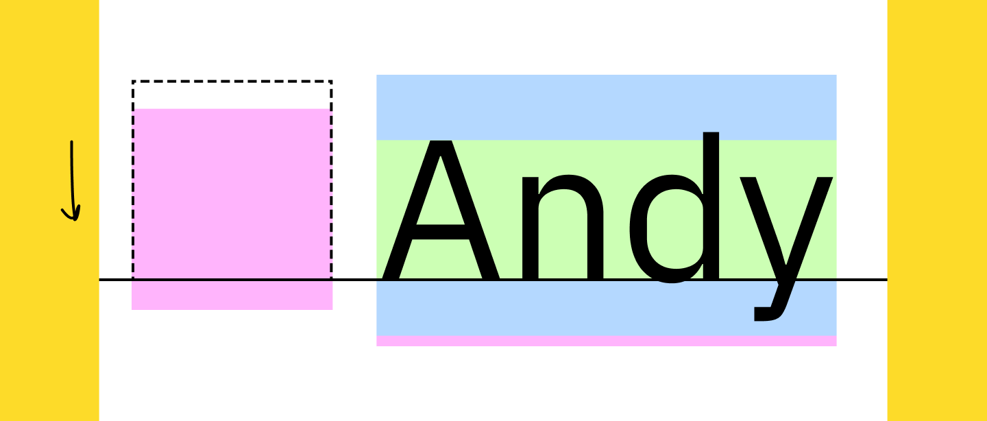
Should work like this:
Or in actual CSS (select text to see default text bounding box):
You can get the required font metrics for your font from opentype.js.org/font-inspector.html (ascender, descender, sCapHeight).
Now that we have that sorted, aligning icons is not that hard too. You set vertical-align: baseline and then move them down by (iconHeight - capHeight) / 2:
This, unfortunately, requires you to know both font metrics and icon size. But hey, at least it works:
Again, select the text above to see how different the browser’s bounding box is from the correct position.
What can be done: icons fonts
STOP.
USING.
FONTS.
ICONS.
Use normal image format. The one with dimensions, you know? Width and height?
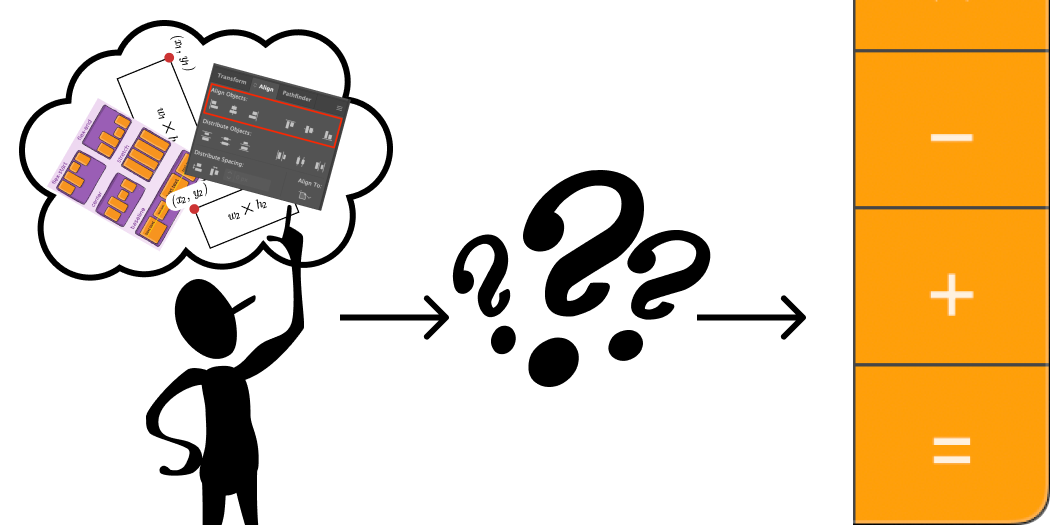
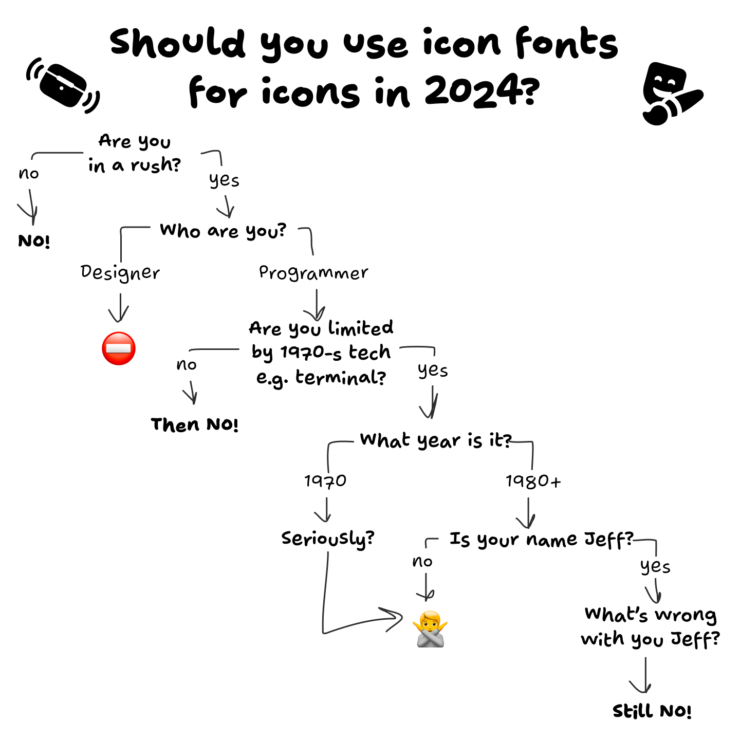
Here, I drew a diagram for you, to help you make a decision:
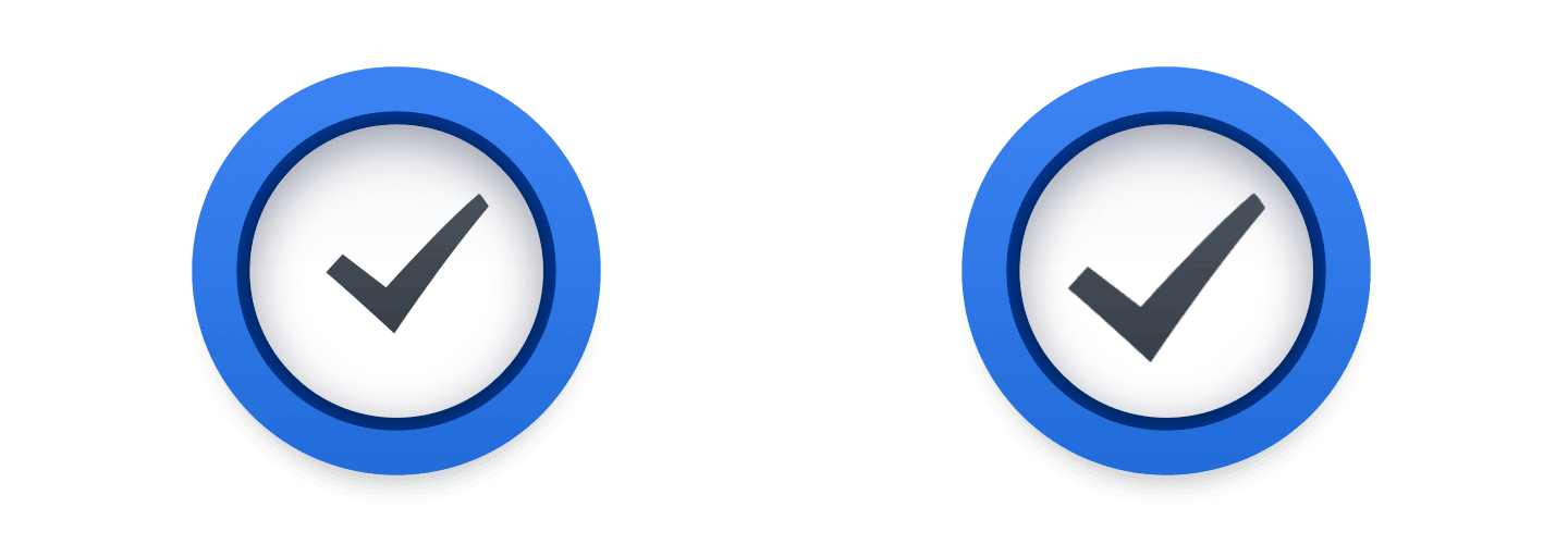
Just look at how hard Apple tries to put the checkmark inside the rectangle, and the rectangle next to the text label:
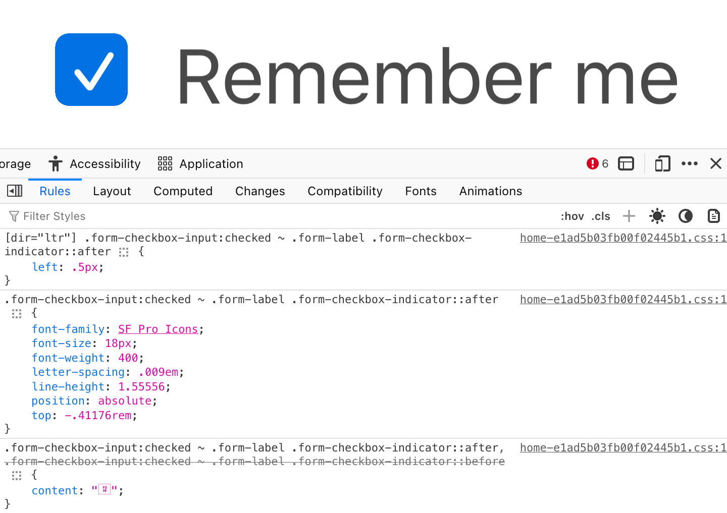
And they still fail!
Nothing is easier than aligning two rectangles. Nothing is harder than trying to align text that has an arbitrary amount of empty space around it.
This is a game that can’t be won.
What can be done: optical compensations
We, developers, can only mathematically align perfect rectangles. So for anything that requires manual compensation, please wrap it in a big enough rectangle and visually balance your icon inside:
What can be done: everyone
Please pay attention. Please care. Bad centering can ruin otherwise decent UI:

But a properly aligned text can make your UI sing:

Even if it’s hard. Even if tools make it inconvenient. Even if you have to search for solutions. Together, I trust, we can find our way back to putting one rectangle inside another rectangle without messing it up.
I, for one, want to live in a world of beautiful well-balanced UIs. I trust that you do, too.
It’s all worth it in the end.
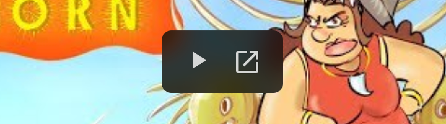
Honorable mention
Our article would be incomplete without this guy:
Take care!
April 16, 2024·Discuss on HackerNews
Recommend
About Joyk
Aggregate valuable and interesting links.
Joyk means Joy of geeK