

How to Upload Multiple Files in an Angular App
source link: https://www.telerik.com/blogs/how-upload-multiple-files-angular-app
Go to the source link to view the article. You can view the picture content, updated content and better typesetting reading experience. If the link is broken, please click the button below to view the snapshot at that time.

How to Upload Multiple Files in an Angular App

Explore a practical example of how to allow users to upload files to an Angular app, with steps like allowing multiple files, restricting file type, showing the successful uploads and adding a drag-and-drop area.
Web applications do more than just show or edit data; sometimes, we need to put files, images or PDFs onto the web. You’ve probably seen web forms where you can pick files from your computer. We’re going to use that feature and a bit of code to let users upload files to our Angular app.
Introduction
At first, it might seem like we can do everything with the file picker in HTML. To find out how easy it is and if it’s the best way to solve real problems, let’s try it out with a practical example. We’ll see what we can do and when it might be better to use a different approach that won’t slow down development or make things harder for users.
Scenario
Imagine a situation where a company wants to make a web page for people to upload photos from their trip to Menorca. We want to keep it simple, so here’s what we need:
- Let users upload one or more pictures.
- Make sure they can only upload images, no videos or other files.
- Show a list of the pictures they uploaded.
- Add a drag-and-drop area to make uploading easier.
Now, let’s get started!
Set Up the Project
In your terminal, run the following command to create a new Angular project named upload-menorca-photos:
ng new upload-menorca-photos
? Which stylesheet format would you like to use? CSS
? Do you want to enable Server-Side Rendering (SSR) and Static Site Generation (SSG/Prerendering)? No

cd upload-menorca-photos
Go to the upload-menorca-photos folder, edit the app.component.html, and remove the default HTML to be ready for our next step.
Now that our Angular project is ready, the next step is to simulate an API call. This will help us mimic real-world behavior when dealing with file uploads and server interactions, without actually connecting to a live server.
Creating a Fake API Call
Because it is an MVP (minimum viable product), we want to create a mock service that simulates the image upload process. We’ll use this service to generate fake image URLs after a simulated delay.
Create a new service called fake-image-upload using the Angular/CLI in the src/app directory by running the following command
ng g s services/fake-image-upload
CREATE src/app/services/fake-image-upload.service.spec.ts (404 bytes)
CREATE src/app/services/fake-image-upload.service.ts (144 bytes)
We won’t delve deeply into how services and RxJS work. Instead, we will create a method called uploadImage with the parameter image of type File. This method returns an observable of type string, simulating a fake API image response with a delay of three seconds.
The final code looks like:
import { Injectable } from '@angular/core';
import { Observable, delay, of, timeout } from 'rxjs';

@Injectable({
  providedIn: 'root',
})
export class FakeImageUploadService {
  uploadImage(image: File): Observable<string> {
    console.log(`we are uploading fake upload ${image.name}`);
    return of('https://random.imagecdn.app/500/150').pipe(delay(3000));
  }
}
Learn more about RxJS and Angular services.
Create the Image Uploader Component
We need to provide a component with an <input type="file"> to upload the image. It will use the fake service. Let’s start by generating a new component named image-upload using the Angular CLI:
ng g c components/image-upload
CREATE src/app/components/image-upload/image-upload.component.html (27 bytes)
CREATE src/app/components/image-upload/image-upload.component.spec.ts (595 bytes)
CREATE src/app/components/image-upload/image-upload.component.ts (225 bytes)
CREATE src/app/components/image-upload/image-upload.component.css (0 bytes)
UPDATE src/app/app.module.ts (429 bytes)
Open the image-upload.component.ts file, inject the FakeImageUploadService by using the inject function. Add a new method upload(). This method will call the fake method from the service.
import { FakeImageUploadService } from './../../services/fake-image-upload.service';
import { Component, inject } from '@angular/core';

@Component({
  selector: 'app-image-upload',
  standalone: true,
  imports: [],
  templateUrl: './image-upload.component.html',
  styleUrl: './image-upload.component.scss',
})
export class ImageUploadComponent {
  fakeImageUploadService = inject(FakeImageUploadService);
}
However, the uploadImage method expects a file. How do we know when the user has selected an image? To solve this, add a new property called selectedImages of type FileList to store the selected image or images. Then, listen for the (change) event and link it to a new method onImageSelected.
In the onImageSelected method, we will validate whether the input has a file selected and set it as the first item in selectedImages.
The final code in the image-upload.component.ts file should look like this:
import { Component, inject } from '@angular/core';
 import { FakeImageUploadService } from './../../services/fake-image-upload.service';

@Component({
  selector: 'app-image-upload',
standalone: true,
imports: [],
  templateUrl: './image-upload.component.html',
  styleUrls: ['./image-upload.component.css'],
})
export class ImageUploadComponent {
 fakeImageUploadService = inject(FakeImageUploadService);

  selectedImages!: FileList;
  onImageSelected(event: Event): void {
    const inputElement = event.target as HTMLInputElement;
    if (inputElement?.files && inputElement.files.length > 0) {
      this.selectedImages = inputElement.files;
    }
  }

  upload(): void {
    this.fakeImageUploadService.uploadImage(this.selectedImages[0]);
  }
}
Next, open and add the input and the button, and bind them to the image-upload.component.html markup. Bind the method and listen to the events. The final markup should look like:
<input type="file" (change)="onImageSelected($event)">
<button (click)="upload()">Upload Image</button>
Learn more about Input File.
Use the Image Upload Component
Before using the ImageUploadComponent, in the app.component, we must import the component in the imports sections.
import { Component } from '@angular/core';
import { CommonModule } from '@angular/common';
import { RouterOutlet } from '@angular/router';
import { ImageUploadComponent } from './components/image-upload/image-upload.component';

@Component({
  selector: 'app-root',
  standalone: true,
  templateUrl: './app.component.html',
  styleUrl: './app.component.scss',
  imports: [CommonModule, RouterOutlet, ImageUploadComponent],
})
export class AppComponent {
  title = 'upload-menorca-photos';
}
Add the ImageUploadComponent to the app.component.html using the selector <app-image-upload>:
<div>
  <h1>Welcome to Image Upload App</h1>
</div>
<app-image-upload/>
Save your changes and run ng serve to launch the app.
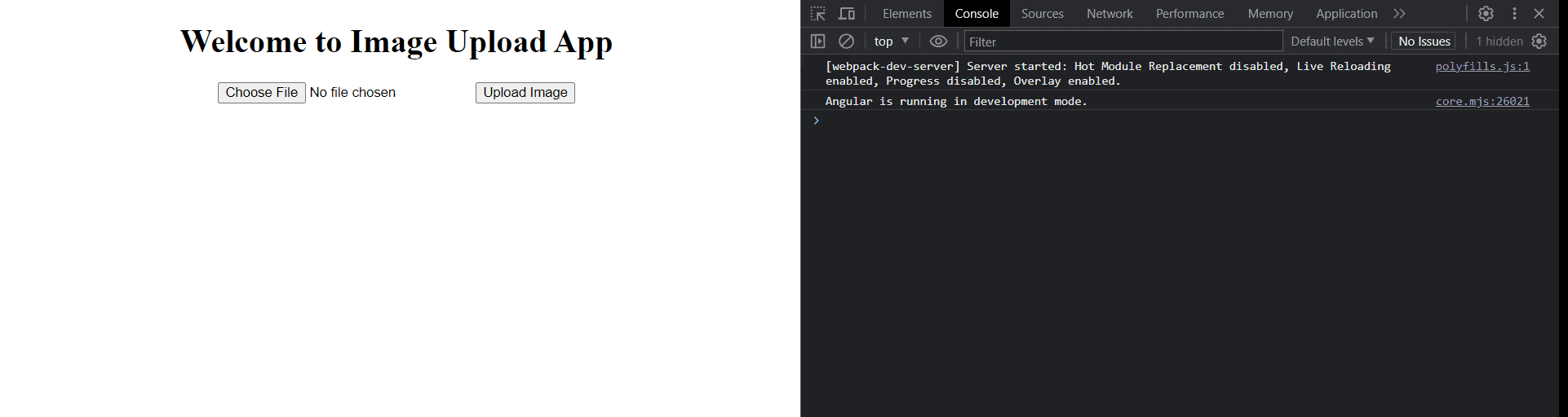
Yes, we now have a very basic upload function calling the fake service!
But is this MVP good enough? Nah, we have a lot of work ahead because we are professionals and must deliver our very best.
Add the MVP Features
This is just the beginning of our adventure. We have some tasks to cover for the MVP. Let’s address them one by one.
- Allow users to upload one or more images.
- Prohibit videos and other file extensions.
- Display the list of saved images.
- Implement a drag-and-drop area for faster uploads.
Allow Users to Upload One or More Files
By default, the file upload feature allows selecting only a single file. However, by adding the multiple boolean attribute, the file input allows users to select multiple files.
To implement this, open the image-upload.component.html file, add the multiple attribute to the input element, save your changes and then reopen the app. The input will now permit the selection of multiple files.
<div class="upload-area">
    <input type="file" multiple="true" (change)="onImageSelected($event)">
	<button (click)="uploadImage()">Upload Image</button>
</div>

Is it as easy as it sounds? Not quite. To enable multiple file selection, we need to take a few additional steps beyond simply altering the HTML input.
We must make some adjustments to our code to facilitate multiple uploads, and these changes will also set the stage for implementing the drag-and-drop area seamlessly.
The Refactor
Let’s refactor our code. Open the generated image-upload.component.ts, and we’re going to make a few changes:
- Add the
uploadFilesmethod. It takes a parameterimagesof type FileList. Use a for loop to iterate over the list of selected images and call theuploadfunction for each image, then print the response usingconsole.log(). - Add a new method called
upload. Before uploading, validate ifselectedImagesare available.
The final code will look like this:
import { Component } from '@angular/core';
import { FakeImageUploadService } from './../../services/fake-image-upload.service';

@Component({
  standalone: true,
  selector: 'app-image-upload',
  templateUrl: './image-upload.component.html',
  styleUrls: ['./image-upload.component.css']
})
export class ImageUploadComponent {
  selectedImages!: FileList;
fakeImageUploadService = inject(FakeImageUploadService);

  onImageSelected(event: Event): void {
    const inputElement = event.target as HTMLInputElement;
      if (inputElement?.files && inputElement.files.length > 0) {
    	this.selectedImages = inputElement.files;
      }
  }

  upload(): void {
    if (this.selectedImages) {
      this.uploadFiles(this.selectedImages);
    }
  }

  private uploadFiles(images: FileList): void {
    for (let index = 0; index < images.length; index++) {
      const element = images[index];
      this.fakeImageUploadService.uploadImage(element).subscribe((p) => {
		console.log(p)
      });
    }
  }
}
Save the changes, and then select multiple files (including a video) and check in the console to see the names of the files.
Don’t Allow Videos or Other Extensions
The next challenge is to disallow videos. We can achieve this by using the accept attribute, which accepts one or more file type specifiers as its value. Open the image-upload.component.html file and add the accept attribute with the value image/*.
When the user clicks on the file explorer, it will only display images, helping to prevent user mistakes when uploading.
<input type="file" multiple="true" (change)="onImageSelected($event)" accept="image/*">
<button (click)="upload()">Upload Image</button>
Save the changes and reload the page to see the following result.
Perfect! Let’s continue with the next feature!
Show the Uploaded Images
We need to display the images from the service response. To achieve this, we need to store each response in an array and iterate over it. Follow these steps in image-upload.component.ts:
- Add a new property:
imagesUrl: Array<string> = []; - Update the
uploadFilesmethod: In the subscribe block, push the response to the imagesUrl array.
   private uploadFiles(images: FileList) {
      for (let index = 0; index < images.length; index++) {
        const element = images[index];
        this.fakeImageUploadService.uploadImage(element)
          .subscribe((p) => {
            //push the response
            this.imagesUrl.push(p)
        });
      }
    }
Open the image-upload.component.html file and using @for to iterate over the imagesUrl array.
<div class="images">
  @for (image of imagesUrl; track image) {
  <img  [src]="image" alt="Uploaded Image">
  }
</div>
Save the changes and you’ll see the fake image responses displayed once we get the fake response.

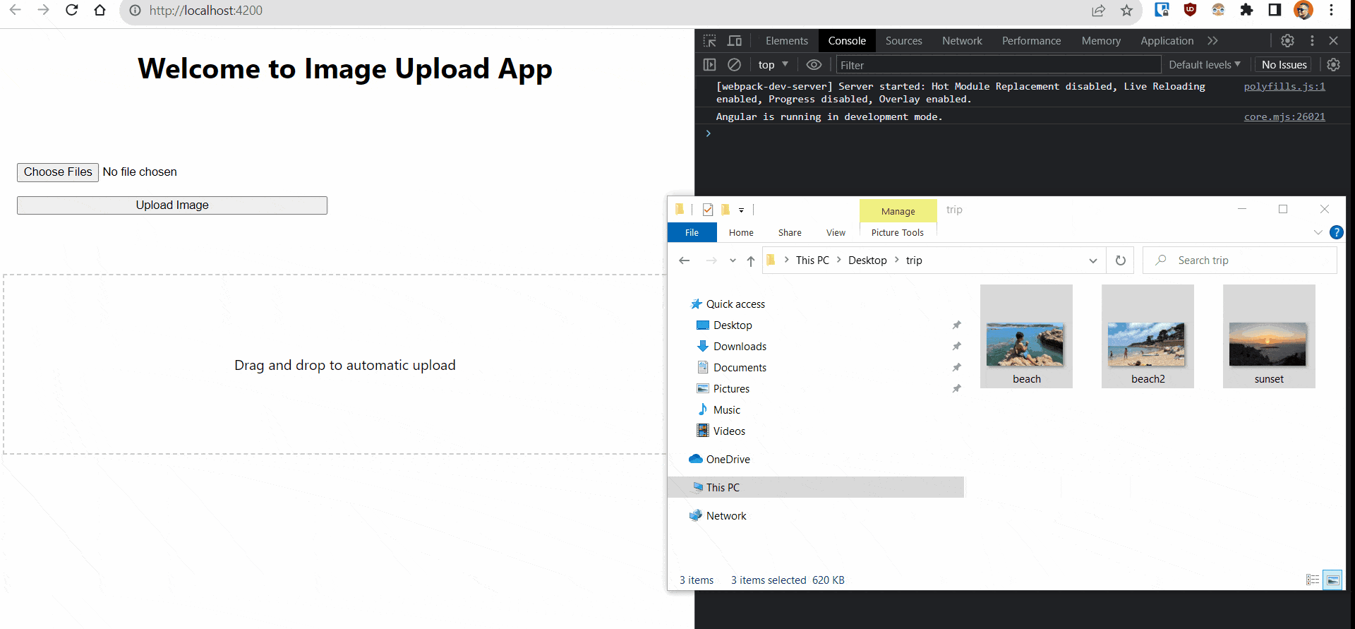
The Drag-and-Drop Area
The final stage is to create the drag-and-drop area with automatic upload. To achieve this, we need to take several steps in the image-upload.component.ts file.
- Add a new property called
uploadingto enable a CSS animation during the loading phase.
export class ImageUploadComponent {  fakeImageUploadService =   inject(FakeImageUploadService);
  selectedImage!: FileList;
  imagesUrl: Array<string> = [];
  uploading = false;
    ..
- Set the
uploadingproperty totruewhen the upload starts and then switch it back tofalsein theuploadFilesmethod.
  private uploadFiles(images: FileList) {
      this.uploading = true;
      for (let index = 0; index < images.length; index++) {
        const element = images[index];
        this.fakeImageUploadService.uploadImage(element).subscribe((p) => {
          this.imagesUrl.push(p);
          this.uploading = false;
        });
      }
    }
- Add a method to listen for the
onDropevent in the drag-and-drop area and also listen for thedragOverevent to prevent the browser from opening the file.
   onDrop(event: DragEvent): void {
      event.preventDefault();
      if (event?.dataTransfer?.files) {
        this.uploadFiles(event.dataTransfer.files);
      }
    }
    onDragOver(event: DragEvent): void {
      event.preventDefault();
    }
Next, add some CSS styles for the loading animation and the drag-and-drop area. Open the image-upload.component.css file and replace its current content with the following code:
:host {
  display: flex;
  flex-direction: column;
  justify-content: center;
  align-items: center;
  min-height: 100vh;
  margin: 0;
  background-color: #f7f7f7;
}

.drag-drop-area {
  border: 2px dashed #ccc;
  padding: 40px;
  text-align: center;
  cursor: pointer;
}

.upload-area {
  padding: 1rem;
}

.uploading {
  display: flex;
  align-items: center;
  justify-content: center;
  height: 100px;
}

.uploading::after {
  content: "";
  display: inline-block;
  width: 20px;
  height: 20px;
  border: 2px solid #ccc;
  border-top-color: #333;
  border-radius: 50%;
  animation: spin 1s linear infinite;
}

@keyframes spin {
  0% {
    transform: rotate(0deg);
  }
  100% {
    transform: rotate(360deg);
  }
}

.drag-drop-area p {
  margin: 0;
}

.drag-drop-area:hover {
  background-color: #f2f2f2;
}

.images {
  padding-top: 2rem;
  display: flex;
  flex-wrap: wrap;
  gap: 1rem;
}

.images > img {
  border-radius: 0.5rem;
  max-width: 100%;
  height: auto;
}
The final stage is to create the drag-and-drop area with an automatic upload in the image-upload.component.html file. Listen for the drop and dragover events and link them to the methods created earlier.
- Create a
<div>with the class drag-drop-area and listen for two events:dropanddragover. - Utilize class binding to apply the
uploadingclass, which will display a loading indicator when the upload starts.
<div class="drag-drop-area" [class.uploading]="uploading" (drop)="onDrop($event)" (dragover)="onDragOver($event)">
  <p>Drag and drop to automatic upload</p>
</div>
Save the changes, open your web browser and navigate to http://localhost:4200. You will now see the Image Upload App with the drag-and-drop area and file input for image uploads.
Conclusion
We have successfully created a basic version of an uploader and guided you through the process of building an Angular application capable of uploading multiple images. Throughout this tutorial, we have covered essential features, including drag-and-drop functionality, image validation and displaying successful uploads.
It’s important to recognize the challenges and limitations we encountered during this process, particularly with regard to user experience and the complexity of development.
Challenges and Limitations
User experience: While our image uploader covers the fundamentals, it may not provide the most intuitive and user-friendly experience. Users often expect additional features such as image previews, error handling and the ability to remove uploaded images. Enhancing these aspects can greatly improve the overall user experience.
Complexity of code: Building a feature-rich image uploader can be quite complex, especially when incorporating features like drag-and-drop support, file validation and progress tracking—the last of which we didn’t even get to in our MVP. This complexity can make the code more challenging to maintain and extend over time.
Scalability: Our current implementation does not address scenarios where users may need to upload a large number of images. Effectively handling large file uploads without affecting performance is a worthwhile challenge to explore.
In our next article, we will address these challenges and improve the image uploading experience using the Kendo UI for Angular Upload component. We will explore how it simplifies development, enhances user experience and can save time for you.
Recommend
About Joyk
Aggregate valuable and interesting links.
Joyk means Joy of geeK