

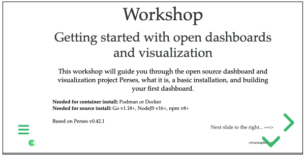
Open Dashboard and Visualization Workshop: Finalizing Perses Dashboard
source link: https://dzone.com/articles/open-dashboard-and-visualization-workshop-finalizi
Go to the source link to view the article. You can view the picture content, updated content and better typesetting reading experience. If the link is broken, please click the button below to view the snapshot at that time.

Open Dashboard and Visualization Workshop: Finalizing Perses Dashboard
Learn how to finish hands-on with the Perses project and finalize your dashboard by adding a new row, documentation, and a multi-gauge system status panel.
Back in December of 2022, I started a series taking you on a tour of the Perses project. These articles covered this fairly new open dashboard and visualization project targeting cloud-native environments. I used a getting started workshop to guide you through this series and to provide a hands-on experience for those new to visualizing observability data.
In the previous article, you expanded the visualization of data, resulting in a more advanced dashboard. I provided links to the actual online workshop content.
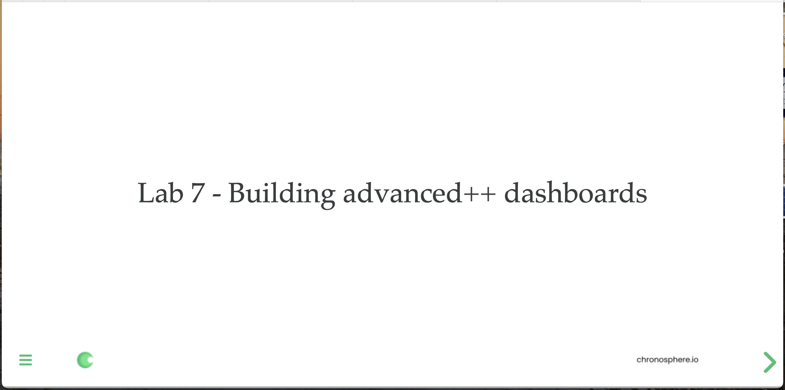
In this article, you'll finalize this advanced dashboard for your on-call teammates and end up with what we refer to as an advanced++ dashboard.
Let's finish our dashboard building, shall we?
In this lab, you're going to continue hands-on with this project, finalizing your dashboard by adding a third row for your panels, new documentation, and a multi-gauge system status overview panel. It's deep into the more advanced designing and layout tweaks you're going to learn along the way.
You can find the free workshop here online:
Now let's get after it and finalize our Perses dashboard. Note: this article is only a short summary, so please see the complete lab found online as lab 7 here to work through creating this advanced++ dashboard yourself:
The following is a short overview of what is in this specific lab of the Perses workshop.
An Advanced++ Dashboard
This lab shows you how to build and extend your advanced dashboard, sprucing it up with a few more important components until you have an advanced++ dashboard you can be proud of. It's building off of the work done in previous labs, but if you are not able to complete the previous labs, we offer a shortcut using the Perses command line tooling and API to get you started.
The first thing you'll be doing is adding a new row and adjusting the row layout. Once that's done, you should be looking at a dashboard like this:

Next up, to make this dashboard effective for your on-call teammates when they land here to triage an incident, you'll be adding a documentation panel. This is a panel that allows you to use the Markdown language to create links and pointers to the information that your teammates would need to help them on this dashboard.
It's just an example you're creating, but it will look something like this when done, with links and text formatted to help the user:

The Markdown code to create this can be added to the provided UI editor, making this a direct and easy design process:
## Troubleshooting starts here:

On this page, you'll find the help you need for this team.

Who you gonna call? [Ghostbusters direct hotline](https://chronosphere.io)

| Dashboard   | Link |
| ---------   | ---- |
| Dashboard 1 | [link](https://chronosphere.io) |
| Dashboard 2 | [link](https://chronosphere.io) |
This results in the following addition to your dashboard view and gives the user direct access to what you consider to be important documentation:

The last panel you'll be adding is going to be a big one: it's called a multi-gauge panel. It's a little different than the single gauge panels that you added previously, only in that the PromQL query gathers data from multiple sources using an average function. The results feed into a normal gauge panel but are spread over multiple gauges as needed and look like this:

The final results are impressive when you are looking at the final dashboard you've created:

This is a bit overwhelming for any of your on-call teammates to arrive at with all the panels visible and every row expanded fully. You'll fix this by learning how to modify rows to be closed or open by default so that when you land on the dashboard you get just the right amount of information for the task at hand.
The final results of your advanced++ dashboard look like this:

This brings you to the end of this open dashboard and visualization workshop, featuring your learning how to do it all with the Perses project. The goal is now that you are ready to explore more in your own organization and see where you might be able to free yourself from the proprietary vendor-controlled dashboard products. Happy visualizing!
Recommend
About Joyk
Aggregate valuable and interesting links.
Joyk means Joy of geeK