

Fun with stroke-dasharray
source link: https://yuanchuan.dev/fun-with-stroke-dasharray?ref=sidebar
Go to the source link to view the article. You can view the picture content, updated content and better typesetting reading experience. If the link is broken, please click the button below to view the snapshot at that time.

Fun with stroke-dasharray
27 September 2023
The stroke-dasharray attribute in SVG is more flexible compared to the dashed style in CSS.
While there are numerous articles and examples about its usages,
including Line animations, Pie charts, Circular progress bars, or even Hamburger menu icons, there's still something new to explore.
Unlike CSS, stroke-dasharray accepts multiple values, which will be picked cyclically according to the stroke length.
Imagine it as an infinite repeated value sequence,
the odd-numbered positions are dashes, and the even-numbered positions are gaps.
stroke-dasharray: 1 2 1;

/* which means */
stroke-dasharray: 1 2 1 1 2 1 1 2 1 ...
pathLength
The total length of a line stroke or path determines where the dashes end. To precisely control the endpoints, you may want to use the getTotalLength() method to get the exact length with JavaScript.
Manual estimation of path length is possible for relatively simple shapes. Though the actual result may differ between browsers.
- Path length ≈
2π * 5
You know what?
There's the lesser-known pathLength attribute for manually specifying the length value, browsers will handle the calculations automatically. Sometimes it's convienient to set an arbitrary value and don't rely on JavaScript at all. I first learned it from Amelia Bellamy-Royds in this comment.
svg {
  viewBox: -9 -9 18 18;
  circle {
    r: 8;
    fill: none;
    stroke: #000;
    stroke-dasharray: 1 2 1;
    pathLength: .99;
    animate {
      attributeName: pathLength;
      repeatCount: indefinite;
      values: 1;100;1;
      dur: 20s;
    }
  }
}
But still, each browser performs slightly different for pathLength and Firefox does the best.
I guess Chrome has a bug at calculation, that's why .99 was used instead of 1 in the above example.
Nevertheless, it's easy to control the dashes with customized pathLength.
Setting the pathLength to 40 in a rect and each side gets 10.
svg {
  viewBox: 0 0 50 50 p .5;
  rect {
    width, height: 50;
    fill: none;
    stroke: #000;
    pathLength: 40;
    stroke-dasharray: 2 8;
    stroke-dashoffset: 1;
  }
}
Interesting Shapes
Some interesing shapes can be made by tweaking stroke-dasharray and its related atrributes.
svg {
  viewBox: 0 0 10 10 p 10;
  rect {
    width, height: 10;
    stroke: #000;
    stroke-dasharray: 2 8;
    stroke-width: 20;
  }
}
Abstract forms.
svg {
  viewBox: 0 0 10 10 p 5;
  rect {
    width, height: 10;
    stroke: #000;
    stroke-dasharray: .079 9.9;
    stroke-width: 10;
  }
}
svg {
viewBox: 0 0 10 10 p 10;
rect {
width, height: 10;
stroke: #000;
stroke-dasharray: .1 19 .1 .5 .31 .4;
stroke-width: 20;
}
}Hearts at the corners.
svg {
  viewBox: 0 0 10 10 p 2;
  rect {
    width, height: 10;
    fill: none;
    stroke: #000;
    stroke-linecap: round;
    stroke-dasharray: 4 6;
    stroke-dashoffset: 2;
    stroke-width: 4;
  }
}
If you're using Safari, you might have noticed the top left corner has a rounded appearance. This could be a rendering bug or perhaps a feature.
Zero-sized dashes
When the dash values are set to 0
and the stroke-linecap attribute is set to either square or round,
the caps will remain visible as if the dashes are still there.
This is an unique feature which offers some creative usages.
svg {
  viewBox: 0 0 100 100 p 24.5;
  rect {
    width, height: 100;
    fill: none;
    stroke: #000;
    stroke-linecap: square;
    stroke-dasharray: 0 50 50 0;
    stroke-width: 49;
  }
}
Two half round caps will form a full circle.
svg {
  viewBox: 0 0 100 100 p 10;
  rect {
    width, height: 100;
    fill: none;
    stroke: #000;
    stroke-dasharray: 0 10 10;
    stroke-linecap: round;
    stroke-width: 10;
  }
}
svg {
viewBox: -50 -50 100 100 p 8;
circle {
r: 50;
fill: none;
stroke: #000;
pathLength: 96;
stroke-linecap: round;
stroke-dasharray: 0 6 0 6 0;
stroke-width: 16;
}
}svg {
viewBox: -50 -50 100 100 p 7;
circle {
r: 50;
fill: none;
stroke: #000;
pathLength: 96;
stroke-linecap: round;
stroke-width: 14;
stroke-dasharray:
0 6 0 6 0 6 0 0
6 0 6 0 6 0 6;
}
}Generating dots
With sufficiently long path we can generate lots of dots using
stroke-dasharray and the round caps.
svg {
  viewBox: -40 -40 80 80;
  style border: 5px solid #000;
  polyline {
    stroke: #000;
    fill: none;
    stroke-linecap: round;
    stroke-dasharray: 0 3;
    points: @m400.@Plot(
      turn: 40; r: t/3;
    );
  }
}
The dots are just caps with dashes length in 0.
They're positioned where the path leads,
so adjust the path the dots will follow.
/* ... */

points: @m199.@Plot(
  turn: 40; r: t/3;
);
At this point, I genuinely wish
SVG gradients could follow along the SVG path so that I can apply different colors to the dots.
Currently using mask is the only option to get a similar result.
svg {
  viewBox: -40 -40 80 80;
  style background: #04195a;
  style border: 6px solid #04195a;
  g {
    circle*200 {
      r, cx, cy: @r20 @r(±40) @r(±40);
      fill: @p(crimson, yellow, deepskyblue);
    }
    mask: defs mask {
      polyline {
        fill: none;
        stroke: #fff;
        stroke-linecap: round;
        stroke-dasharray: 0 3;
        points: @m200.Plot(turn: -40; r: t/3)
      }
    }
  }
}
Curvy strokes
After generating different paths using Math equations, adding dashes with stroke-dasharray
will result in some peculiar shapes.
svg {
  viewBox: -25 -25 50 50 p 1;
  polyline {
    stroke: #000;
    fill: none;
    stroke-linecap: round;
    stroke-dasharray: 0 5;
    stroke-width: 1.5;
    points: @m200.Plot(
      turn: .37;
      x: 25 * cos(180t);
      y: 25 * sin(180t);
    );
  }
}
I'm not sure if they can be anyting practical. It's just intriguing to see.
/* ... */

stroke-dasharray: 0 10;
points: @m399.Plot(
  turn: .37;
  x: 25 * cos(180t);
  y: 25 * sin(180t);
);
Ornaments
Despite its interesting aspects, I find stroke-dasharray to be very useful in some specific cases.
Here's a symmetrical shape resembling a window lattice, yet the central part seems a little dense.
svg {
  viewBox: -50 -50 100 100;
  style border: 8px solid #000;
  fill: none;
  stroke: #000;
  stroke-width: 1.4;
  g*12 {
    transform: rotate($(360/@N*@n));
    polyline {
      points: @M12.Plot(r: t^4)
    }
    polyline {
      points: @M12.Plot(r: t^4; turn: -1)
    }
  }
}
How can it be improved?
One option is to position a circle at the center.
Another approach is to modify the lines with stroke-dasharray.
/* ... */

stroke-linecap: round;
stroke-dasharray: 1.5 8.5 100;
There are many options. For example, the one below looks much like a flower in its middle.
/* ... */

stroke-linecap: round;
stroke-dasharray: 0 3 5 2 100;
Using stroke-dasharray not only prevent lines from overlapping
but also tend to change the feels based on different patterns.
svg {
viewBox: 0 0 100 100;
fill: none;
style background: #0ce5f2;
path*30 {
stroke-linecap: round;
stroke-dasharray: 0 8 5 6 3 12;
stroke: @pn(
#ff4ea5, yellow, @m4(#fff)
);
d: M 37 40
Q @Plot(r: 80) @Plot(r: 150);
}
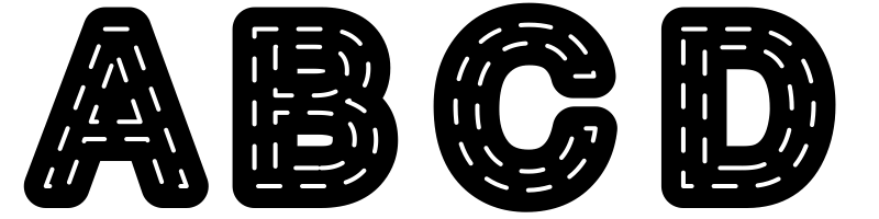
}Text strokes
It's also easy to apply a dashed stroke to the texts in SVG.
However, Safari again has a strange behavior for rendering stroke-dasharray.
Maybe that's caused by the length calculation.
The pathLength attribute is not available for text strokes so
I can't get a consistant result in every browser.
For the same stroke-dasharray value,
dashes in Safari are about 5 times more compact than Chrome and Firefox.
And when the size of SVG changes its dashes will turn into another shape.
Design with dashes
If the character is complex enough, like 䲜 or 靐, it would contain more dashes, which is something that can be utilized for design.
svg {
  viewBox: 0 0 100 100 p -15;
  style border: 8px solid #000;
  text {
    content: "龘";
    font-size: 120;
    x, y: 50, 90;
    font-family: sans-serif;
    text-anchor: middle;
    fill: none;
    stroke: #000;
    stroke-linejoin: round;
    stroke-linecap: round;
    stroke-dasharray: 0 6 20;
    stroke-width: 2;
  }
}
The original text becomes hard to recognize after adding dashes. Its meaning fades away, preserving only the shapes.
text {
  /* ... */

  content "M";
  stroke-dasharray: 0 6 0 4 20;
  transform: rotate(90);
}
Another complex character.
text {
  /* ... */

  content: "ﷺ";
  stroke-dasharray: 0 2 9;
}
There are plenteous Unicode characters and different fonts to try. But it's important to note that fonts in different platforms may not look the same. The result is highly dependant on the shape of the text.
This article describes the syntax that was used to write SVG here. All the code examples can be run at css-doodle.com/svg.
Recommend
About Joyk
Aggregate valuable and interesting links.
Joyk means Joy of geeK