

为什么 CSS flex 布局中没有 `justify-items` 和 `justify-self`? - 赵康
source link: https://www.cnblogs.com/forzhaokang/p/17756552.html
Go to the source link to view the article. You can view the picture content, updated content and better typesetting reading experience. If the link is broken, please click the button below to view the snapshot at that time.

为什么 CSS flex 布局中没有 justify-items 和 justify-self?
为什么在 CSS flex 布局中存在 align-items 和 align-self,却没有 justify-items 和 justify-self 呢?要解答这个问题,首先需要理解主轴(main axis)和交叉轴(cross axis)之间的差异。
1. 主轴和交叉轴的区别
在没有折行的情况下,一个 flex 容器(flex container)只有一个主轴,但却有 n 个交叉轴(n 代表 flex item的数量)。每个 flex item 都拥有自己独立的交叉轴。
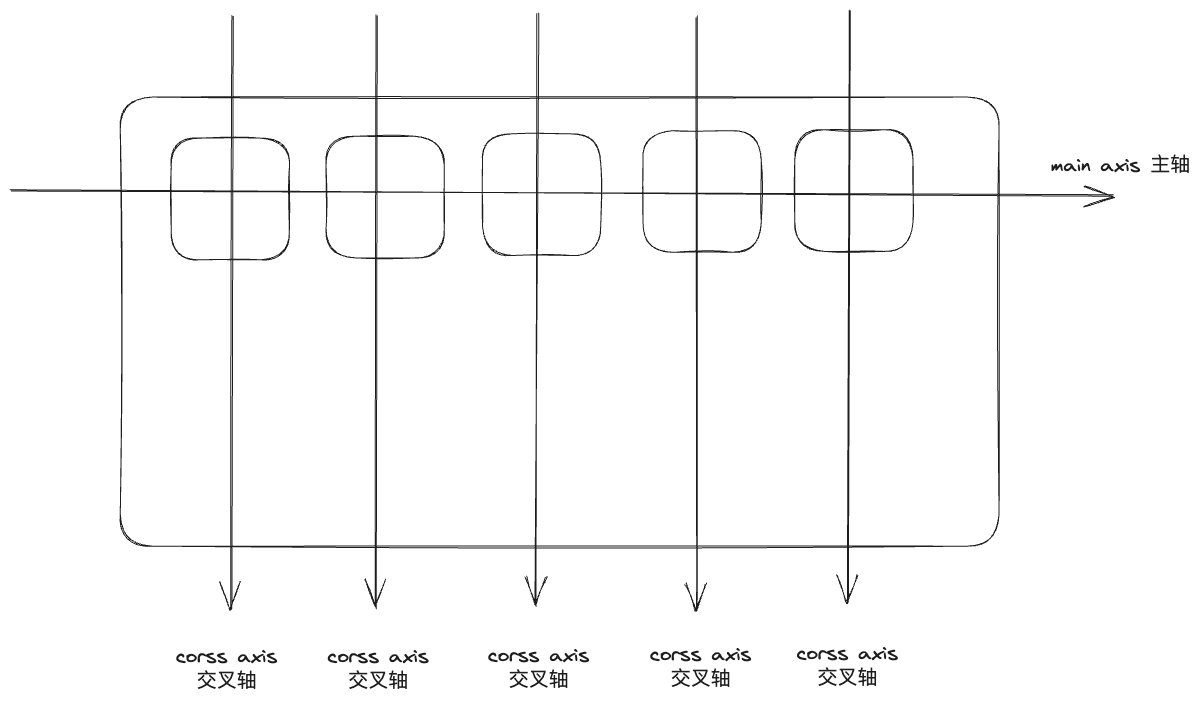
一个 flex item 在主轴上的位置会影响其他 flex item,因为它们共享相同的主轴,而交叉轴却不会引发这种相互影响。
2. CSS 属性的命名规则
2.1 align-* 和 justify-*
在 CSS flex 布局中,属性名称中的 align-* 表示这是应用于主轴上的规则,而 justify-* 表示这是应用于交叉轴上的规则。
2.2 *-items, *-content 和 *-self
*-self 表示每个 flex item 都拥有独立的轴,它们在轴上的位置不会影响其他 flex item。我们可以针对单个 item 设置它的位置。
*-items 和 *-self 在本质上相似,只不过前者是批量设置,而后者是针对单个 item 的设置。可以看作是一个语法糖。
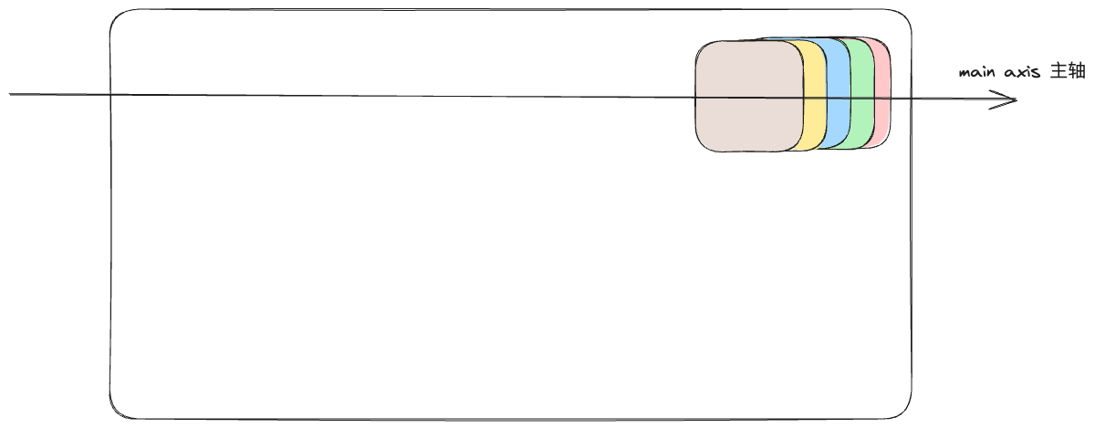
*-content 表示多个 flex item 共享一个轴,一个 flex item 在轴上的位置会影响其他 flex item。
因此,在 flex 布局中,我们不能使用 justify-items,因为多个元素共享一个轴,它们属于同一组,这会导致相互干扰。想象一下:假如我们指定了justify-items: flex-end,最终只会有一个元素抢到这个位置。
同样的道理,我们也不能使用 justify-self,因为各元素之间可能会竞争位置导致冲突。但是,我们可以采用其他解决方案,例如使用 order 属性来对它们进行更为精细的排序(和flex-start、flex-end 、center 相比)。
Recommend
About Joyk
Aggregate valuable and interesting links.
Joyk means Joy of geeK