

Where to put text so it doesn't overlap in the new X (Twitter) preview (2023)
source link: https://polypane.app/blog/where-to-put-text-so-it-doesnt-overlap-in-the-new-x-twitter-preview/
Go to the source link to view the article. You can view the picture content, updated content and better typesetting reading experience. If the link is broken, please click the button below to view the snapshot at that time.


Where to put text so it doesn't overlap in the new X (Twitter) preview (2023)
2 min read. Posted on October 9, 2023.
From the Polypane blog
X (Twitter) recently updated their link previews to hide both the title and description, and overlaying the domain on top of the image.
While this isn't great when it comes to accessibility, discoverability and the dissemination of fake news, as many have pointed out, it also means that text in your share image can be obscured.
For example, here's what the BBC's sharing images currently look like:
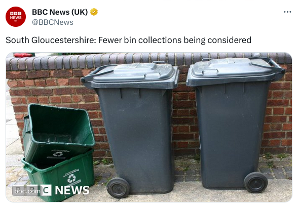
In their case, they've been putting their logo in the bottom left of the image, which is right where Twitter is now overlaying the domain. To prevent that from happening, we need to find the safe zone for text.
The new URL overlay
X's new URL overlay is positioned in the bottom left of the image, 12px from either side and is itself 20px high. The width is dependent on the length of the URL, but with a font-size of 13 pixels it's never going to be extremely wide. For example, the BBC URL in the image above is 64px wide.
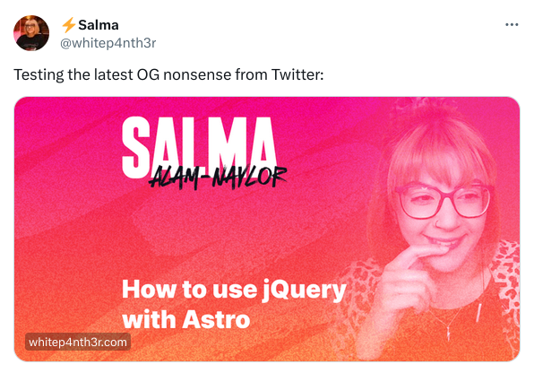
Unfortunately, that overlay is shown at the same size on top of differently sized images, so just looking at the default width and height of the image served by X (680px by 383px) and keeping the bottom 32px free isn't going to cut it. For example while this image looks fine in the Twitter web ui:
The text is overlapped by the URL when the post is shown in Tweetdeck even though the overlay is slightly less high at a total of 27px because of less spacing and a smaller font-size:
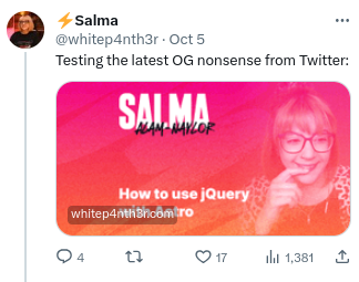
Tweetdeck seems to be the worst case, so we can use the dimension there to calculate the safe zone.
The safe zone
To find the safe zone we need to know the percentage that the url overlay takes up of the height of the image in Tweetdeck, and then extrapolate that to the full size of an image.
In Tweetdeck the image is 147px high and the URL overlay takes up 27px of that, which is 18.36% of the height. That's the height without any sort of space above the url overlay, so if you want to be safe you can increase that percentage a little to 20%, which is 29 pixels on Tweetdeck and ends up being 77px on the full size image, assuming you use 680x383px images.
If you use a different size, for example 1280px by 720px which we use on our site, or 1360px wide and 766px height which is exactly @2x you can calculate the safe zone by multiplying the height of the image by 0.2:
| dimensions | height | safe zone |
|---|---|---|
| 680x383px | 383px | 77px |
| 1280x720px | 720px | 144px |
| 1360x766px | 766px | 153px |
Template overlays
If you want to update your own social media images you can use the template overlays below to find the safe space for your images.
The overlays are transparent pngs with a 20% red fill, so you can put them on top of your images in your image editor of choice and then move your text around until it's not overlapped by the red.
680x383px
Template for 680 by 383px images:
1280x720px
Template for 1280 by 720px images:
1366x766px
template for 1366 by 766px images:
Pixel perfect preview
If you want to see exactly how your social previews will look with the new design, keep an eye out for the next release of Polypane. Polypane has pixel-perfect previews for nine different social media platforms, X included.
We immediately went to work to implement the new design as soon as X made the change:
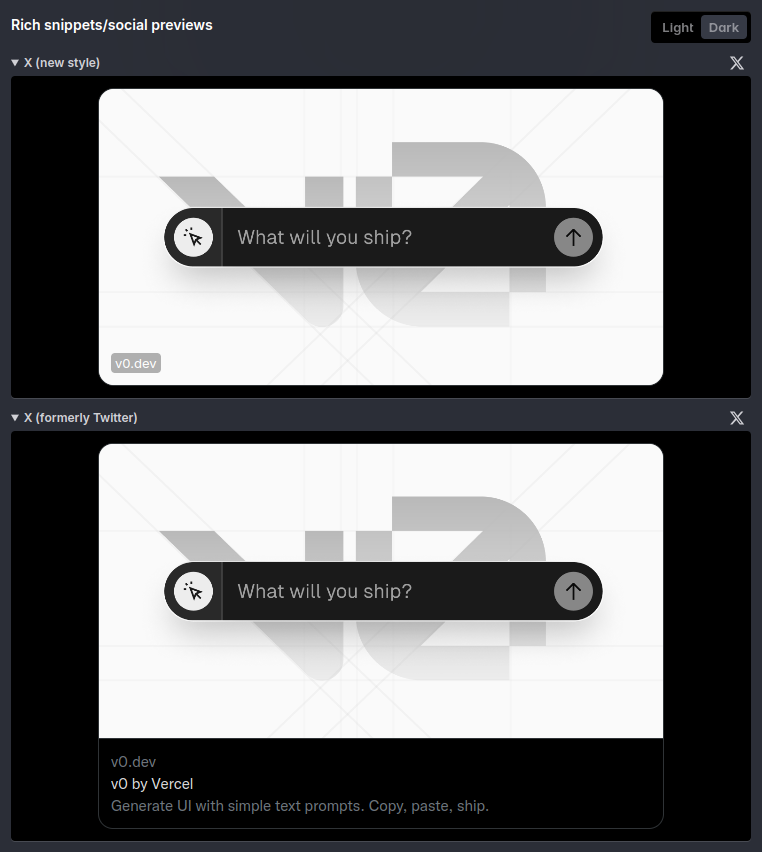
The upcoming version of Polypane includes a pixel perfect preview of the new X cards, so you can see not just how much space you should keep free vertically, but also see exactly how much space your URL will take up horizontally.
Sign up for the newsletter to be notified when the next version is released, or head over to our page on social media previews to learn more about our pixel perfect social media previews.
Recommend
About Joyk
Aggregate valuable and interesting links.
Joyk means Joy of geeK