
The Steve Madden Logo History, Colors, Font, and Meaning
source link: https://www.designyourway.net/blog/steve-madden-logo/
Go to the source link to view the article. You can view the picture content, updated content and better typesetting reading experience. If the link is broken, please click the button below to view the snapshot at that time.
The Steve Madden Logo History, Colors, Font, and Meaning
- BY Bogdan Sandu

You’re casually scrolling through your favorite online shopping site. Suddenly, a pair of killer heels catches your eye. Before you even look at the price or details, there’s one unmistakable sign that you’re onto something quality: the Steve Madden logo.
Now, I might spend my days playing with pixels and perfecting designs, but let me tell you, the Steve Madden logo? It’s more than just a name or a fancy design. It’s a statement. A symbol of trendiness and high fashion. But ever stopped to wonder about the story behind it?
Why does this matter?
Logos, especially ones from iconic brands like Steve Madden, aren’t just there for looks. They communicate a message, a brand story, a promise to their audience. It’s like the silent spokesperson of the brand.
By the time we reach the bottom of this article, you’ll have dived deep into:
- The origin and evolution of the Steve Madden logo.
- How design elements play into brand perception.
- The power of effective branding in the fashion industry.
And here’s the thing: while it might sound geeky or specialized, I promise to keep it relatable. Think of this as a fun conversation with your fashionista friend who just happens to know a thing or two about design. Whether you’re just curious, a budding designer, or someone who appreciates the blend of fashion and design – you’re in for a treat.
The Meaning Behind the Steve Madden Logo

You see it. You know it. Steve Madden’s logo. There’s something about it that grabs your attention, isn’t there? Let’s dissect that, shall we? It’s much more than just a fancy brand name slapped onto some of the trendiest shoes around.
Simplicity Speaks
Why do we connect with this logo so easily? It’s the simplicity. You’re seeing the brand’s name. Just that. No fuss, no frills. The genius is in its simplicity. The name itself is the symbol, easily recognizable, easy to remember.
The Power of Name
Steve Madden himself. The name carries a story of determination, success against odds, and creativity that just won’t quit. When you see the logo, you’re not just looking at letters, you’re witnessing a legacy.
It’s the spirit of Steve Madden embedded in each letter. A representation of his unique, boundary-pushing design ethos.
The History of the Steve Madden Logo

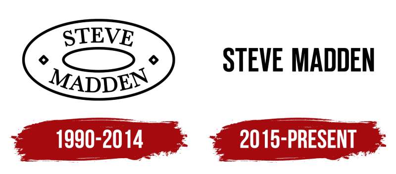
From its humble beginnings in the 1990s, the Steve Madden logo has come a long way. A logo that carries more than a tale of shoes; it’s a testament to perseverance and passion.
From Dream to Reality
In the early days, Steve Madden, the man himself, wanted his designs to speak for themselves. The logo was a mere identifier, a name. Over the years, as the brand grew, so did the weight of the logo.
Standing the Test of Time
Remarkably, the logo hasn’t seen a lot of changes since its inception. Testament to the belief that true design never goes out of style, wouldn’t you say? The brand’s enduring trust in its simplicity and identity is why the logo remains essentially unchanged.
The Colors of the Steve Madden Logo
Now, let’s dive into the colors. You might say, “Hey, it’s just black!” But, believe me, there’s a lot more to it.
The Power of Black
Black. It’s strong. It’s bold. And, most importantly, it’s timeless. It screams sophistication, elegance, and mystery. Just like Steve Madden’s shoes, huh?
Creating Contrast
Using black against light backgrounds creates a powerful contrast. It demands attention without being overly shouty. It’s a delicate balance, and Steve Madden nails it.
The Font Used in the Steve Madden Logo
The typeface. It’s another integral part of this logo.
Bold and Beautiful
The letters are clean, sharp, and strong. It’s bold but not imposing. Expresses confidence without arrogance. It has the power to lure you in and hold your gaze. Quite like a beautiful pair of Steve Madden shoes, don’t you think?
The Legacy of the Steve Madden Logo

Through all these years, the Steve Madden logo has remained a powerful symbol.
Symbol of Trend
The logo reflects the brand’s commitment to stay ahead of the trends, to dare to be different, to be unabashedly bold. When you see it, you see a commitment to fresh, inspiring design.
Trust Factor
But it’s not just about being trendy. The logo is also a symbol of trust and quality. When you see the Steve Madden logo, you know you’re getting shoes that will last, both in durability and style.
Impact of the Steve Madden Logo

Finally, we must talk about the impact. What does this logo do? How does it influence us?
Brand Recognition
First, it’s the instant recognition. See that logo, and you know immediately what you’re dealing with. Class, quality, style. You’re dealing with Steve Madden.
Inspiring Loyalty
The consistency in the Steve Madden logo has helped build a loyal customer base. People are comfortable with what they know and trust. This consistency ensures the customer that the brand they fell in love with years ago still stands strong, committed to its identity and values.
The Future of the Steve Madden Logo
What does the future hold for the Steve Madden logo?
Retaining Identity
One thing’s for sure: the logo will continue to honor its legacy of simplicity and boldness. Steve Madden knows the value of staying true to its roots, even while constantly innovating.
Adapting to Change
Yet, the brand has never shied away from embracing the new. Whether it’s tapping into the latest trends or utilizing modern branding tools, the logo might adapt to better connect with the evolving audience.
There you go, folks. From meaning to future, we’ve taken a deep dive into the world of the Steve Madden logo.
It’s more than a logo. It’s a story. It’s a commitment. It’s an identity. Simple in design, yet powerful in impact. Quite like Steve Madden himself, wouldn’t you say?
FAQ on the Steve Madden Logo
What’s the story behind the Steve Madden logo?
It’s a simple, straightforward design – just the designer’s name in a sleek, bold font. Doesn’t need any frills, really. Just like the man himself, Steve Madden, it’s all about making a statement without being overly elaborate.
Madden started the company in 1990 with $1,100, a design, and a dream. That logo? A testament to the power of simplicity and authenticity in design.
What does the Steve Madden logo symbolize?
Well, when you see the logo, it’s all about brand recognition. The minimalist, text-based logo symbolizes Madden’s commitment to simple, yet stylish designs.
When you see it, you instantly think of the brand’s legacy: fashionable footwear that’s on-trend, but accessible.
It’s not about being pretentious or over-the-top. It’s all about fashion, comfort, and style. That logo is a symbol of just that – good, honest design that doesn’t compromise on quality.
Has the logo changed over the years?
Good question! Not too much, really. Steve Madden has mostly kept it consistent. There have been subtle updates, and minor tweaks here and there. But the essence, that bold and stark typography, has remained unchanged.
This consistency has helped Steve Madden to maintain a strong brand identity in a fast-paced fashion industry. Customers see the logo and know exactly what to expect: stylish, quality shoes.
How can I tell if a Steve Madden logo is genuine?
Now, here’s the tricky bit. Counterfeit goods are everywhere, aren’t they? To verify if it’s genuine, look closely at the logo – it should be clear, and sharp, and the font should match the official logo. Any inconsistencies might be a red flag.
Also, remember, that genuine Steve Madden products are sold through authorized retailers, the brand’s website, and its physical stores. Always be mindful of where you’re buying from.
Can I use the logo for my own purposes?
Let’s be clear, the Steve Madden logo is a registered trademark. So, using it for your own purposes without explicit permission from the company is a big no-no.
Companies protect their trademarks rigorously. So, whether it’s for commercial or personal use, always make sure you’ve got the proper permission. Intellectual property is not something to mess around with.
Why is the logo just the name and not a symbol or image?
Steve Madden decided to keep it simple. No fuss, just the name. That decision ties back to the brand’s vision of simplicity and style.
A symbolic or pictorial logo could work for some, but Madden wanted his customers to connect with his name directly, creating a personal link between the designer and the wearer. It’s all about making a statement without being over-elaborate.
Is the Steve Madden logo designed by Steve Madden himself?
From what I know, Steve Madden did have a major say in the logo, but typically these designs are a collaborative effort. Brands often work with design teams or agencies to create their logos.
Madden, as the founder, surely had a pivotal role in approving the design that aligns with his vision for the brand. The final logo? It’s a team effort that embodies Madden’s vision and style.
Is the Steve Madden logo recognized worldwide?
Absolutely! Thanks to the brand’s global presence and popularity, the Steve Madden logo is well-recognized across the globe. From New York to Paris, from Beijing to Johannesburg, you’ll see those sleek, bold letters on shoes, bags, and fashion accessories.
It’s a testament to the company’s international appeal and the universal love for good, accessible fashion.
Why does the logo look like it does?
Ah, the power of simplicity! The Steve Madden logo stands out because of its minimalist design. It’s just the name, in a bold, sans-serif typeface, nothing else. No fancy images, no symbols, just straightforward typography.
It reflects the brand’s philosophy of offering style with simplicity. The idea is to make the logo as clear and as recognizable as possible. A good logo needs to make a statement, and the Steve Madden logo certainly does that.
What is the font used in the Steve Madden logo?
The font used in the Steve Madden logo is actually custom-designed. However, it resembles a bold, sans-serif font. It’s sleek, it’s modern, and it’s easy to read. The idea behind the choice of such a font is to give the logo a bold, unpretentious feel.
It’s reflective of the brand’s commitment to straightforward yet fashionable designs. No frills, just style and substance. That’s what Steve Madden is all about.
Ending Thoughts
Bold and vibrant. That’s the essence of the Steve Madden Logo. It’s like, you know, those blazing neon signs? Yeah, right there in your mind’s eye, picture them. Now strip away the excess, simmer it down to simplicity, elegance – pure symbolism.
There’s your Steve Madden Logo.
- In your face: Not in a bad way, it demands your attention.
- Straight to the point: No BS, just SM – Steve Madden.
So, you see, the Steve Madden Logo is not just about a name.
It’s about impact. It’s about a promise. It’s about the brand.
In essence, the logo acts as the brand’s fingerprint, a unique identifier. It’s the brand saying, “Hey, it’s Steve Madden here. Stand by for style.”
It’s their artistic voice, their graphic signature. Like a power chord in a rock song, you feel it. That’s what a well-designed logo like Steve Madden’s does.
In the end, it all comes down to the boldness and simplicity of design. And the Steve Madden Logo? It rocks that arena. It’s not just about the shoes, it’s about making a statement.
And boy, does it make a statement.
If you enjoyed reading this article about Steve Madden Logo, you should read these as well:
Recommend
About Joyk
Aggregate valuable and interesting links.
Joyk means Joy of geeK