

Fonts similar to Avenir that will get the job done
source link: https://www.designyourway.net/blog/fonts-similar-to-avenir/
Go to the source link to view the article. You can view the picture content, updated content and better typesetting reading experience. If the link is broken, please click the button below to view the snapshot at that time.

Fonts similar to Avenir that will get the job done
- BY Bogdan Sandu
Not many people will pay attention to pairing fonts. It seems like an unnecessary job, which could be seen as excessive, especially when we consider that designing a project or a web page implies more elements than texts. However, we must not ignore that, after all, reading is something basic that each user will do when viewing our work. Let us start with a popular font for any situation: Avenir. Now we need fonts similar to Avenir to complement our design.
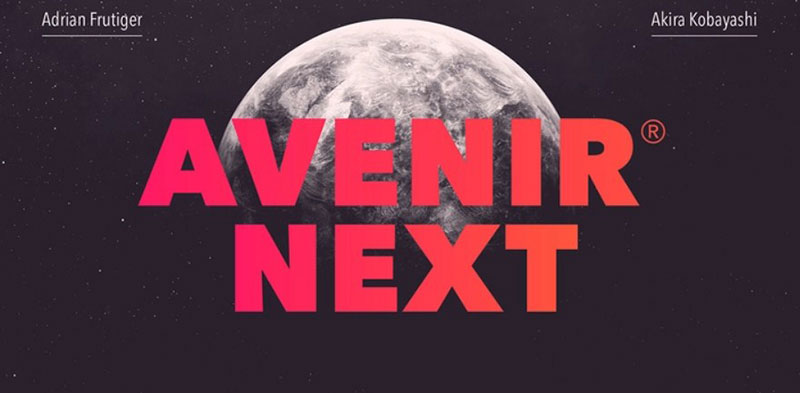
The first thing you should know is why our recommendation for the day is Avenir. It turns out that this Sans-Serif typeface is relatively modern, being created in 1988 by Adrian Frutiger, who also designed the Univers and Frutiger typefaces. However, Avenir is a special job, since it represents the future of letters with their design. Without losing the integrity of the letters, it is combined with some imperfect details that make them look more human.
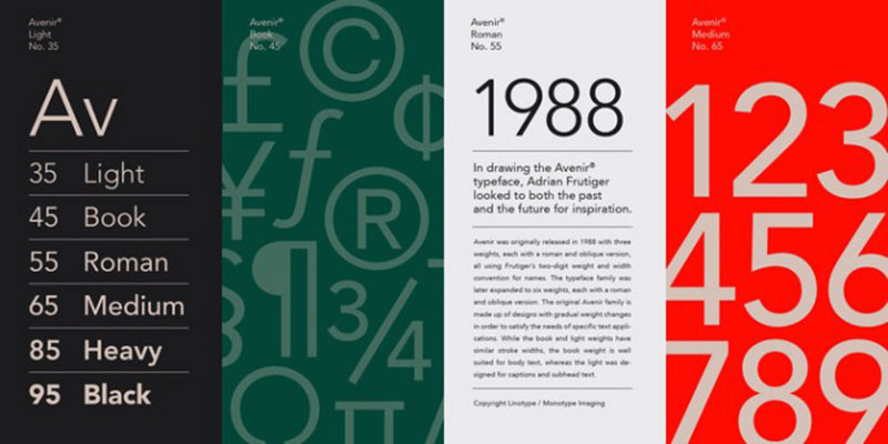
This avant-garde combination is what makes Avenir a perfect font for any situation. Commonly, we find it in popular applications like Apple Maps or Snapchat. Additionally, it has six variants, so we will not fall short of options. Now that we know it, it’s time to see fonts like Avenir that we can combine.
Fonts similar to Avenir
Noir Pro
Noir is a sans serif font family of 12 fonts with contemporary aesthetics heavily influenced by early 20th-century geometric typefaces. While having its geometric structure it carries an organic personality with a touch of warmth injected into each form.
The Noir font family ranges from light and elegant weights perfect for small text, to extremely heavy and masculine weights suited for large display sizes.
Noir has a rich arsenal of Open Type features for highly professional use and extended Latin, Cyrillic, and Greek language support.
Nunito – Let it stand out
The Nunito typeface, belonging to the Google catalog, stands out for having bold rounded ends in a traditional Sans-Serif typeface.
Originally it only had a standard version created by Vernon Adams, but thanks to Jacques Le Bailly’s expansion work, we can now get it with different thicknesses, and even with a style where they eliminate rounded ends.
For the inexperienced eye, it will be difficult to differentiate Nunito from Avenir, but these small differences are what makes them a good combination.
RNS Sanz
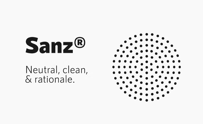
A neutral workhorse for any purpose, rational, clear, clean and functional: 7 weights, ramping from light to black, with small caps, files prepared for webfont use. Ideal use on signage systems and rational architecture.
Sofia Pro – For all languages
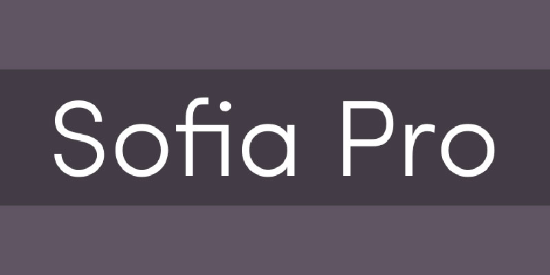
Sofia Pro is one of the fonts similar to Avenir with more options in terms of characters. The typography, originally designed in 2008, received an update in 2012, so it now has more than 500 different glyphs, including special characters.
As for design, Sofia opts for modernity and curves, being a contrasting font.
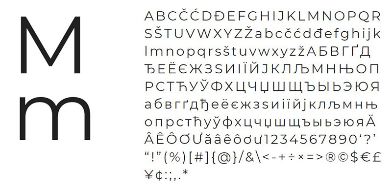
Metrisch
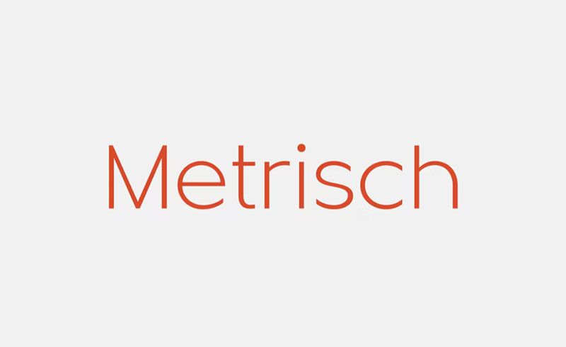
Metrisch is a new sans-serif type family that includes seven weights and seven corresponding italics in each weight. The typefaces were designed using traditional geometric construction, resulting in letters with a wider size, taller x-heights, and short descenders that are almost proportional to the basic letter shape.
The addition of small details, such as clean vertical cuts on the terminals and optimized sharp corners, gives the fonts a smooth and refined appearance that represents a blend of humanist typeface style and grotesque feels.
The weights range from extra-light to extra-bold, making them suitable for display purposes. The book and medium weights also work well for small to medium text sizes, making them perfect for use in editorial fashion magazines, solid headlines, website headings, posters, advertising, logos, signage, and more.
In addition, the Metrisch type family is fully loaded with OpenType features, including stylistic alternates, case-sensitive forms, fractions, small capitals, and other common numeral features such as super and subscript, tabular and old-style figures, numerator and denominator, as well as extended Latin diacritics characters.
Montserrat – A decent alternative
Although Montserrat is the most similar letter to Avenir in regards to form, it falls short to be the ideal complement. Since it only has two styles, it will not give us many combination possibilities, but it is good to have it as a pairing option.
Muli – Visibility on screens
Sans-Serif fonts are the best when it comes to monitors. Muli is the example that, the more minimalist the font, the better it will look on our devices.
Mriya Grotesk
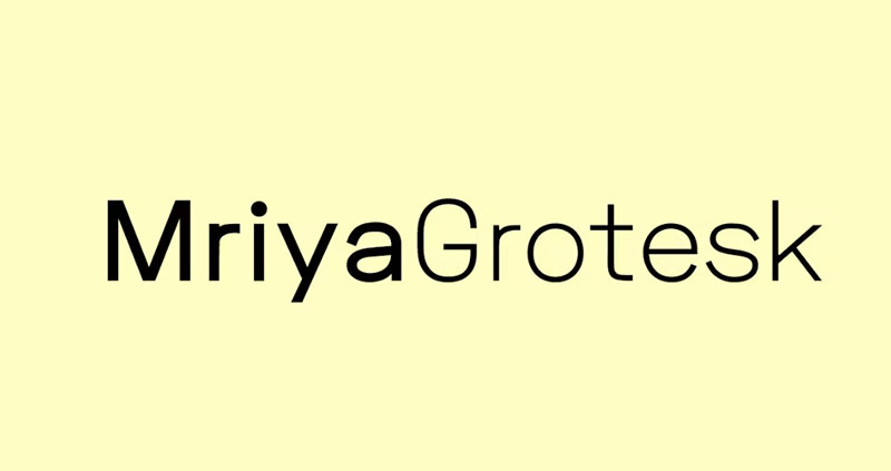
Mriya Grotesk is a Sans-Serif typeface that was designed to perfection while maintaining the highest level of premium type design aesthetics.
It is an ideal typeface for any kind of usage, whether for web or print, including body text, headlines, logotypes, branding, marketing graphics, corporate identities, and more.
To get a better idea of how the typeface can be used, you can refer to the demo images provided.
Open Sans – For internet or prints
With 897 characters, including those of the ISO Latin 1 standard, CE Latin, Cyrillic, and Greek, Open Sans is postulated as a multifaceted letter. The appearance is not as mechanical or rigid as other options, so we will constantly see open forms.
The work done by Steve Matteson has unmatched quality when it comes to adaptability since Open Sans can be used in small or large sizes, and on web pages or in prints.
Lato – A modern companion
If we talk about fonts similar to Avenir, we can’t forget to mention Lato. Although the latter was designed in 2010 (almost two decades apart with Avenir), they share many features, such as semi-rounded details and a firm but humanistic structure.
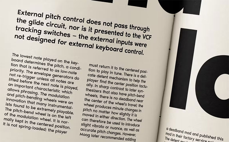
Futura PT – Avenir’s inspiration

Avenir’s design is based on Futura typography. Even the name is a reference to this since Avenir is the French word for “future”.
Futura has its origin in the Bauhaus school between the 20s and 30s, and reflects everything that the movement represents: different thicknesses of strokes, defined geometric shapes, and straight profiles.
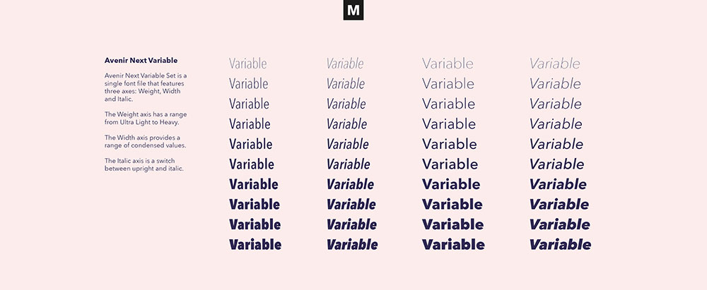
Avenir Next Pro – For those who want more
Avenir Next Pro defines itself as the redesign of a classic typeface to take it to a higher rung of the design. With this project, the standard Avenir package has been expanded by more than double, adding 32 new fonts.
As it has so many variants, we can find the one that best suits what we want, be it physical or digital documents, web pages, or user interfaces. The style of the letter makes it ideal for both headlines and text bodies, and finding another font that combines with them is an easy job.
MuseoSans – Importance in its readability

Thanks to the low contrast and thick lines of this typeface, Museo Sans is our option if we want our content to be easy to read. Additionally, thanks to its OpenType compatibility, the font can be automatically adapted to multiple actions and equations.
TT Norms Pro – A piece of art
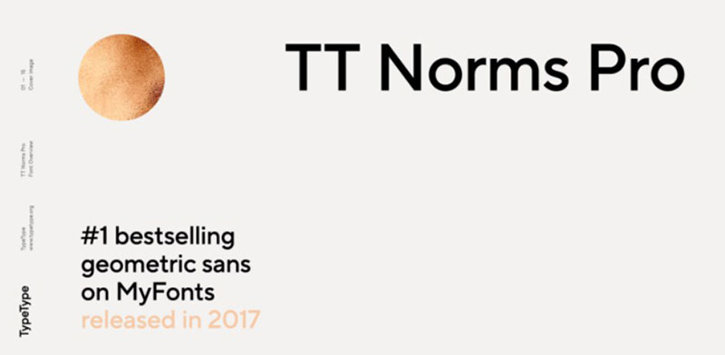
Each of the letters of TT Norms Pro has been created very carefully, so we can see how each curve follows a clear direction with the rest of the strokes.
Although it has a version where most of the aesthetic elements are removed, the true beauty of this typeface appears when we use any of the 11 alternative styles (each with its italics). Likewise, as it is compatible with OpenType, the characters can be adapted to multiple user actions.
Proxima Nova – A necessary update
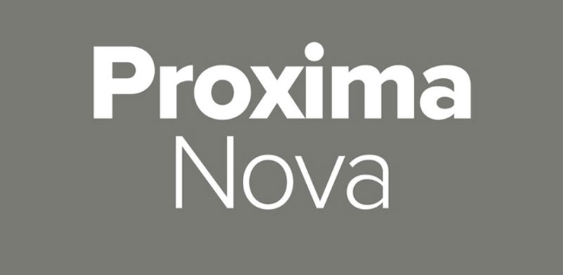
OpenType fonts are the future because of all the possibilities they offer. Proxima Nova has not been left behind, being an update of the original typography launched in 1994 under the name “Proxima Sans”.
This font similar to Avenir includes 48 variations to choose from, all retaining their characteristic appearance that blends geometric designs with careless shapes.
Gibson – 370 characters to write
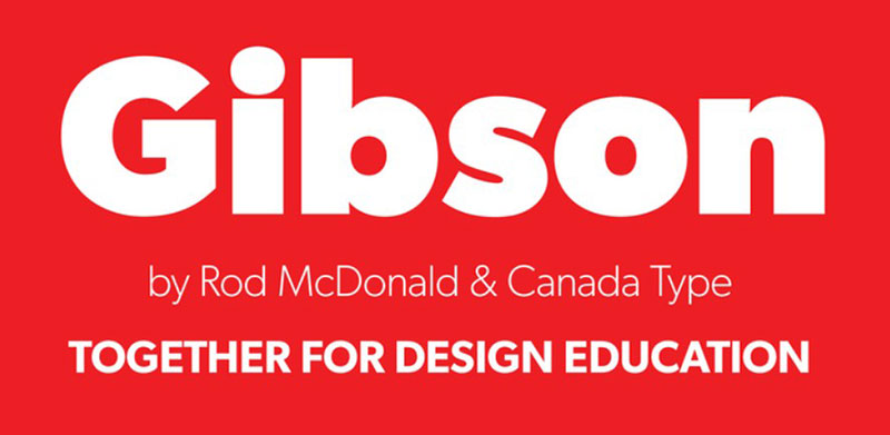
Gibson’s main attraction is in the way it has adapted the different characters based on Latin symbols to eight OpenType fonts. No matter what platform we are using, these letters will be compatible without problems.
Neuzeit – A century of changes
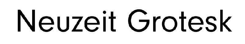
The original Neuzeit came out in 1928, and this letter at the time did not have many striking reasons to be used. However, during the century that has been present, it has received several tweaks that have made it more attractive, such as adding a double-story “a”.
Neue Helvetica – If you want something classic
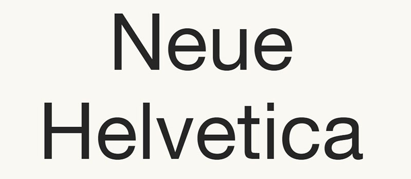
Helvetica is a standard typeface that is used in many places. Its design is at an intermediate point between seriousness and fun, so it has always been striking for people in both professional and casual jobs.
In this case, NeueHelvética is an update that includes 51 different styles for European languages, in addition to having the option to download 34 versions for Cyrillic characters, so it will combine with any letter you have in mind, including Avenir.
Sailec – Neutral Style
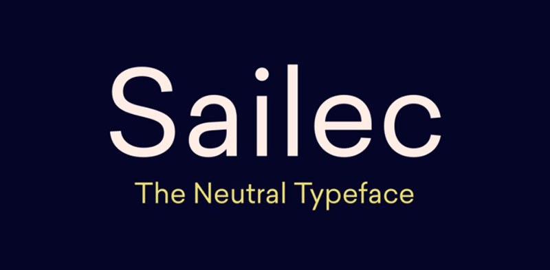
We finalize this list of fonts similar to Avenir with a “totally neutral” typeface. The Swiss team of Type Dynamic are responsible for this font that, according to them, eliminates all unnecessary detail, being neutral in style.
However, Sailec does not resemble Helvetica, so we can use it as an alternative. Also, it has seven styles, each with its corresponding italics.
FAQs about fonts similar to Avenir
1. What are some fonts similar to Avenir?
Proxima Nova, Gotham, Montserrat, Lato, Open Sans, and Nunito are just a few fonts that are comparable to Avenir. These typefaces have some similarities to Avenir, including a contemporary design, a variety of weights and styles, and adaptability to many design settings.
2. Can you recommend a font similar to Avenir that is available for free?
Avenir and the well-known free typeface Montserrat are frequently contrasted. It is a geometric sans-serif font with a contemporary and minimalistic appearance that comes in several weights and styles. Avenir can also be found for free in Raleway, Poppins, and Source Sans Pro.
3. Are there any fonts similar to Avenir that have a wider or narrower character spacing?
Some fonts that resemble Avenir do really have varying character spacing. As an illustration, Proxima Nova and Avenir have somewhat different font spacings, although Gotham has a wider character spacing. The spacing can change how a typeface looks and feels overall, thus it’s crucial to select a font that works in the particular design environment.
4. Is there a font similar to Avenir that has a bold, italic or condensed version?
True, Avenir itself has variations in bold, italic, and condensed, but so do other fonts that are identical to Avenir. Proxima Nova, for instance, offers various weights and styles, including as bold, italic, and condensed variations.
5. What is the difference between Avenir and its similar fonts, like Proxima Nova or Gotham?
While Avenir, Proxima Nova, and Gotham have some things in common, they also differ in some ways. For instance, Proxima Nova looks more angular and crisp whereas Avenir has a bit more rounded and softer appearance. In comparison to Avenir, Gotham has a more angular and industrial appearance.
6. Which font is better suited for print design, Avenir or its similar font Futura?
Both Avenir and Futura are well-liked fonts for print design, however depending on the design environment, one may be preferable to the other due to their distinct qualities. Futura has a more geometric and retro-futuristic appearance, whereas Avenir has a slightly softer and more contemporary appearance.
7. Are there any web-safe fonts that are similar to Avenir?
Both Avenir and Futura are well-liked fonts for print design, however depending on the design environment, one may be preferable to the other due to their distinct qualities. Futura has a more geometric and retro-futuristic appearance, whereas Avenir has a slightly softer and more contemporary appearance.
8. Can you suggest a Google font that is similar to Avenir?
Avenir and the well-liked Google font Montserrat are frequently contrasted. It is a sleek and contemporary typeface with a selection of weights and styles that works well in a wide range of creative applications. Avenir can be compared to other Google fonts like Lato, Nunito, and Open Sans.
9. Is there a way to download Avenir for free?
Unfortunately, Avenir cannot be lawfully downloaded for free as it is a commercial typeface. Montserrat, Raleway, and Poppins are a few examples of comparable fonts that are offered for free or at a reduced price.
10. What is the history and origin of the Avenir font family?
Adrian Frutiger created Avenir in 1988, drawing inspiration from previous geometric sans-serif designs like Futura and Erbar. A variety of weights and styles, from light to heavy and condensed to expansive, are available in the typeface family. For use in a number of design contexts, such as print and digital media, branding, and advertising, Avenir has grown to be a well-liked font.
The name of the font, which translates to “future” in French, embodies Frutiger’s intention to build a font that would be flexible and adaptable for various design situations.
Many honors have been given to Avenir, which is recognized as a timeless and significant typeface. Numerous well-known companies have adopted it, such as Apple, the City of Melbourne, and the New York Times.
If you enjoyed reading this article about fonts similar to Avenir, you should check out these articles with fonts similar to Proxima Nova, Comic Sans, Lato, Papyrus, Old English, Century Gothic, Minion Pro, Gill Sans, and Eurostile.
Recommend
About Joyk
Aggregate valuable and interesting links.
Joyk means Joy of geeK