

Air India Unveils Modern New Logo | Web Designer Depot
source link: https://www.webdesignerdepot.com/2023/08/air-india-unveils-modern-new-logo/
Go to the source link to view the article. You can view the picture content, updated content and better typesetting reading experience. If the link is broken, please click the button below to view the snapshot at that time.

Air India Unveils Modern New Logo
3 days ago
Air India just announced a colossal rebrand. The new logo is simplified, modernized, and more universal. Perhaps this is the airline’s opportunity to take flight in the global market.
Air India has been steadily declining for the best part of two decades. Increasing competition, reputational damage, and several pilot strikes have left the brand a shell of its former self.
In an attempt to restore Air India to its former glory, The Tata Group acquired the airline in January 2022, and it seems they immediately got to work on a monumental rebrand.
Air India unveiled their new look logo and livery on August 10th. The brand has long been defined by its Maharaja mascot and bold red and orange color scheme.
![]()
The previous logo (pictured above) depicts the Konark wheel, an iconic Indian symbol, nestled within a red swan. The ‘Air India’ typography is mirrored by the same phrase in Hindi.
![]()
Air India’s new logo (pictured above) removes much of the clutter, simplifies the color scheme, and removes most of the references to Indian culture. It seems the primary goal of the rebrand is to reflect India’s status as a global leader. The updated design is considerably more modern and accessible, mirroring the simplified, universal style adopted by major airline companies like Delta and American Airlines.
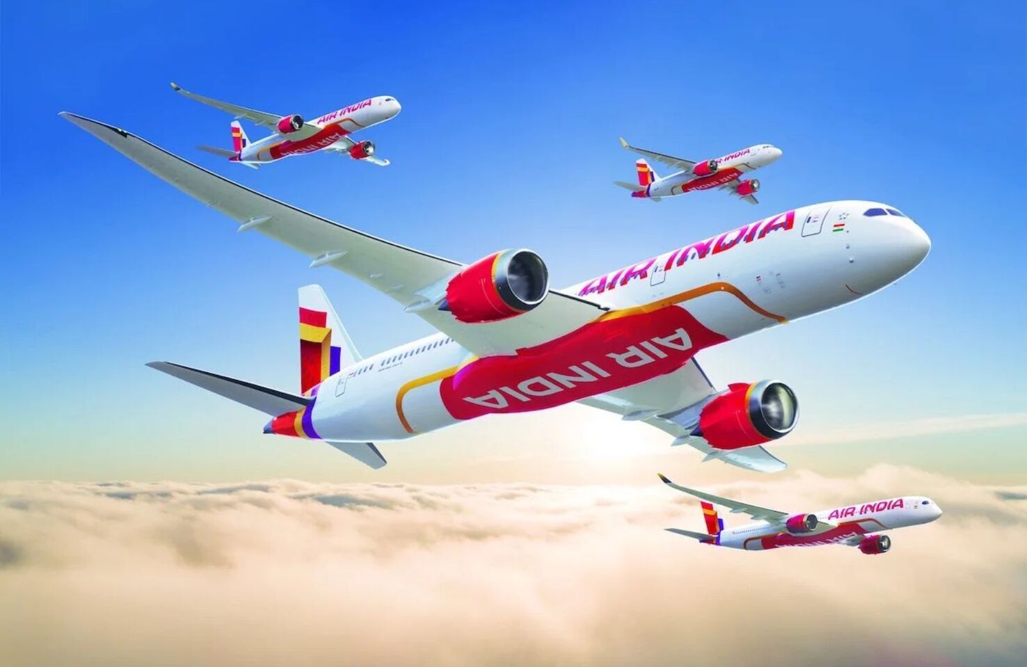
According to a Twitter post by Air India, the gold curve to the right of the logo reimagines the iconic Indian window frame and is meant to symbolize a ‘window of possibilities’. This design choice is backed by the plane’s new livery, which will now include gold window frames to match.
We’ve seen many companies update their branding to appeal to a broader audience in recent months. Dubai’s new tourism logo, for example, is an ingenious take on universal design. Whether Air India’s new look will save the brand from the brink remains to be seen, but this is an intelligent first step in the company’s ambition to become a global brand.
Robert Reeve
Robert is an experienced marketing professional with extensive experience working with brands to refine go-to-market plans, SEO campaigns, and content marketing strategies. A committed writer with a keen eye on the latest developments, Robert specialises in producing content across all things tech and marketing.
Recommend
About Joyk
Aggregate valuable and interesting links.
Joyk means Joy of geeK