

The Alfa Romeo Logo History, Colors, Font, and Meaning
source link: https://www.designyourway.net/blog/alfa-romeo-logo/
Go to the source link to view the article. You can view the picture content, updated content and better typesetting reading experience. If the link is broken, please click the button below to view the snapshot at that time.


The Alfa Romeo Logo History, Colors, Font, and Meaning
ZOOM into the world of graphic design, let’s cruise into the pit stop that is the Alfa Romeo Logo.
Here we go, pedal to the metal.
Alfa Romeo, a name that echoes the Italian spirit, and its logo? A bonafide work of art. Picture this. We’re in a gallery, and the spotlight swivels to the centerpiece.
You spot the emblem, bathed in light, its design elements intertwining with a delicacy that belies the power it stands for.
Now, hold up, whoooa.
Ever wondered how this visual masterpiece, the emblem that roars luxury, speed, and finesse, was crafted? You know, the snake and the man, the red cross on the white backdrop, the whole shebang?
Stay buckled up, as we peel back the layers, stroke by stroke, of one of the most iconic logos in the automobile industry. We’re about to take the scenic route through the curves and edges of the Alfa Romeo emblem, a journey that’s as exhilarating as the ride itself.
The Meaning Behind the Alfa Romeo Logo
Hey, let’s dive straight into the heart of the matter. The Alfa Romeo logo is not just a pretty face, it’s a story, an enigma, a drama in its own right. Let’s dissect this, shall we?
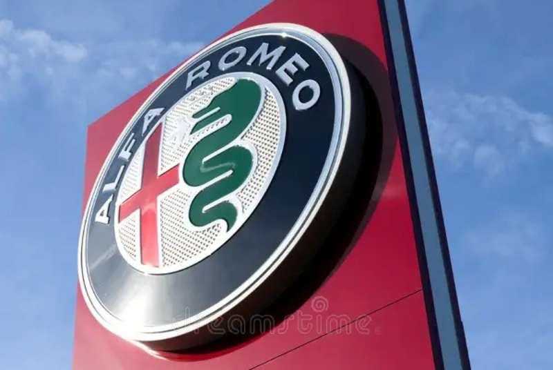
The Fierce Biscione
Here’s the deal. On the left side of the emblem, you’ll spot a big green serpent, known as Biscione. It’s not just any snake, though.
The creature is chowing down on a human, showing its fierce power. This part of the logo is a symbol of the powerful Visconti family of Milan. It’s a bold statement of the car’s Milanese roots.
The Red Cross on White
Switch to the right side of the logo, and you’ve got a bold red cross on a silver-white background. It’s not just any cross, it’s the symbol of Saint George, the patron saint of Milan. It’s a nod to the city, the birthplace of Alfa Romeo.
The History of the Alfa Romeo Logo
So, let’s take a step back in time. The Alfa Romeo logo didn’t just pop out of nowhere. It’s got a rich history that’s as intricate as the design itself.
Get 300+ freebies in your inbox!
Subscribe to our newsletter and receive 300+ design resources in your first 5 minutes as a subscriber.
The Early Beginnings
Back in 1910, Alfa Romeo wasn’t even Alfa Romeo yet. It was A.L.F.A., which stands for Anonima Lombarda Fabbrica Automobili.
The logo was created by a draftsman named Romano Cattaneo. He drew inspiration from the Visconti family coat of arms and the emblem of Milan, and voila, the iconic logo was born.
Through the Years
Over the years, the logo evolved. It saw minor tweaks here and there, but the core elements – the Biscione and the cross, remained intact. It’s a testament to the timeless design and the brand’s deep-rooted connection with its origin.
The Colors of the Alfa Romeo Logo
Let’s talk about the colors. There’s something about the combination of green, red, white, and blue that just works. It’s more than aesthetic, though. Each color carries a meaning.
The Vibrant Green
Green is the color of the Biscione. It symbolizes growth, harmony, and freshness. It’s a reminder of the brand’s constant evolution and its commitment to innovation.
Advertisement
The Bold Red
Red represents the cross, and it’s a symbol of passion, power, and love. It encapsulates the brand’s passion for speed and power.
The Soothing Blue
Blue encircles the entire logo, a symbol of depth and stability. It reflects the trust and reliability of the brand.
The Font Used in the Alfa Romeo Logo
Now, about the font. It’s clean, it’s simple, it’s bold. The all-caps, sans-serif typeface in the Alfa Romeo logo screams modernity and elegance. It’s a perfect balance to the complexity of the emblem.
The Evolution of the Alfa Romeo Logo
You know what they say, change is the only constant. The Alfa Romeo logo is no exception. While the core elements remained intact, the logo saw its fair share of tweaks and modifications.
The Shift in Design
Over the years, the logo has transitioned from a more detailed and intricate design to a sleeker and more modern look. It’s a reflection of the brand’s adaptability and its knack for staying current and relevant.
The Impact of Technological Advancements
As technology advanced, so did the design techniques. The logo started to incorporate 3D effects, gradient colors, and shadowing. This change brought a sense of depth and realism to the logo, making it more visually engaging and dynamic.
The Perception of the Alfa Romeo Logo
Last but not least, let’s talk about how the logo is perceived in the eyes of the world.
The Logo as a Status Symbol
The Alfa Romeo logo carries a certain prestige with it. It’s seen as a symbol of luxury, power, and sophistication. When you see that logo on a car, you know it’s not just any car. It’s an Alfa Romeo.
The Logo as a Connection to Heritage
The logo also serves as a connection to the brand’s rich heritage. The Biscione and the cross are constant reminders of the brand’s origin and history. It’s a logo that carries a story with it, and that’s what makes it so special.
So there you have it. The Alfa Romeo logo is more than just a pretty design. It’s a symbol of the brand’s history, its values, and its commitment to excellence. Whether you’re a car enthusiast or not, there’s no denying the power and the charm of the Alfa Romeo logo. It truly is a work of art.
FAQ on the Alfa Romeo Logo
What’s the meaning behind the Alfa Romeo logo?
Well, let’s get started. The Alfa Romeo logo is packed with history. It has two parts, right? The red cross on a white field is the emblem of Milan, Alfa Romeo’s birthplace.
The other half, the biscione, a green serpent eating a man, belongs to the Visconti family, a powerful Milanese dynasty. It’s a nod to the city’s history and an embodiment of its spirit.
Why does the Alfa Romeo logo have a snake?
Interesting question! The snake, or biscione, isn’t just any snake. It’s a heraldic symbol representing the Visconti family. The image of a serpent devouring a human may seem a little intense, but in heraldry, it signifies renewal and the cycle of life and death.
Alfa Romeo incorporated it to signify the brand’s enduring and transformative nature.
Has the Alfa Romeo logo changed over the years?
Great question. Yes, it has evolved, but subtly. The core elements – the cross and the biscione – have remained constant. The major changes have been to the outer circle that contains the brand name.
The logo has been simplified and modernized over time, with cleaner lines and different fonts. It’s about keeping up with the times while retaining the rich history.
What does “Alfa Romeo” mean?
Alfa Romeo isn’t just a cool sounding name. “ALFA” is an acronym for “Anonima Lombarda Fabbrica Automobili.” It means Lombard Automobile Factory, Public Company. As for “Romeo”, it’s not about Shakespeare’s character, but the last name of Nicola Romeo, an engineer who took over the company in the 1920s. So, Alfa Romeo is a mix of location, business, and personal history.
Is the Alfa Romeo logo unique in the automotive world?
Absolutely, it’s one of a kind. Unlike most car logos that are simple and straightforward, Alfa Romeo’s is rich with symbolism and history.
The combination of a city’s emblem and a noble family’s crest is uncommon, making it unique in the automotive industry. It’s more than a logo; it’s a direct link to the company’s roots.
What does the red cross in the Alfa Romeo logo symbolize?
The red cross on a white field is taken from the emblem of Milan, where Alfa Romeo was born. The symbol has a long history in Milan, dating back to the Crusades. It represents the city’s spirit and is a nod to Alfa Romeo’s Italian heritage. It’s about staying true to your roots.
Why does the Alfa Romeo logo include a human inside the snake?
It might be surprising, but the human figure being devoured by the snake – or biscione – is a traditional symbol representing renewal. The man being consumed is often interpreted as a Moor, referencing the Visconti family’s victories in the Crusades.
It’s all about the cycle of life and death, echoing the brand’s enduring and transformative nature.
What does the green color in the Alfa Romeo logo represent?
In the Alfa Romeo logo, the green serpent – or biscione – is a distinctive feature. Green in heraldry often symbolizes abundance and renewal.
This fits perfectly with the image of the serpent consuming a human, which also stands for rebirth and the cycle of life. So, it’s a color that resonates with the logo’s overall symbolism.
Is the Alfa Romeo logo copyrighted?
Yes, like any reputable brand, Alfa Romeo’s logo is copyrighted. It’s a crucial part of the company’s brand identity. The logo, its design, and its specific elements are all protected by copyright laws.
This means no one can use it without explicit permission from Alfa Romeo. It’s their symbol, their story, and their intellectual property.
What’s the significance of the crown in the Alfa Romeo logo?
Ah, the crown. Good eye. The crown is located above the biscione and it’s a detail often overlooked. It was added to the logo after Nicola Romeo took over the company, symbolizing the rise of Alfa Romeo to royal status in the automotive world.
It’s a subtle detail that speaks volumes about the brand’s prestige and illustrious history.
Ending thoughts on the Alfa Romeo Logo
Alfa Romeo Logo, right?
That little red cross on a white field, the snake on a blue background. It’s more than just a design, it’s a story.
Now, imagine you’re cruising down the highway, that logo in front of you.
Cool, isn’t it?
You feel the history, the passion, the art. It’s like holding an ancient coin in your hands, feeling the weight of history.
It’s a symbol, a bridge across time. Connecting us to those old Italian craftsmen who first dreamt of a machine that could fly on roads.
And what about the snake? A dragon, actually, eating a man. A symbol of purity and renewal. A nod to Milan’s coat of arms. A sign of respect for their home.
So, the Alfa Romeo Logo ain’t just a logo. It’s an emblem that carries the spirit of a century-old tradition of excellence and innovation. A testament to the brand’s enduring legacy and its future ambitions.
And that, my friends, is the end of our journey. A journey through lines, curves, and colors. A journey through history, passion, and art.
Alfa Romeo‘s logo, a masterpiece etched in metal. A legacy cast in style.
If you enjoyed reading this article about the Alfa Romeo logo, you should read these as well:
Recommend
About Joyk
Aggregate valuable and interesting links.
Joyk means Joy of geeK