

The Fiat Logo History, Colors, Font, and Meaning
source link: https://www.designyourway.net/blog/fiat-logo/
Go to the source link to view the article. You can view the picture content, updated content and better typesetting reading experience. If the link is broken, please click the button below to view the snapshot at that time.


The Fiat Logo History, Colors, Font, and Meaning
The Fiat Logo. Just whispering the name brings the image rushing in, doesn’t it? This iconic mark, a symbol that’s been on roads across the globe, a testament to decades of design evolution. It’s not just a logo, it’s a visual story, a tale told in lines and shapes.
Now, imagine a scene.
An artist at work. Sketchpad is his universe, pencil – his wand. He’s not just sketching; he’s weaving dreams into the fabric of reality. A vision of a world where sleek style meets functionality, where Fiat’s logo stands as an embodiment of dynamism and reliability.
Let’s set our stage further, shall we?
A blank canvas. That’s how every masterpiece starts, right? Just an expanse of nothingness, waiting to be filled with brilliance. The artist hovers, the pencil strikes the page, and the Fiat Logo takes form. You might think it’s just lines, curves, and text, but there’s so much more.
This isn’t just a story of a logo; it’s a journey through the essence of design itself. So, strap in for a ride as we delve into the captivating world of the logo and the power of graphic design. Buckle up, you’re in for quite a story.
The Meaning Behind the Fiat Logo
A Symbol of Italian Ingenuity
Dive into the Fiat logo and you’ll find a rich swirl of meaning, a testament to Italian genius, innovation, and resilience. It’s not just a logo. It’s a story, a declaration, a promise. It’s a symbol that resonates with the spirit of Fiat – Fabbrica Italiana Automobili Torino.
Emblem of Evolution
The logo has evolved with time, just like the company. It mirrors the brand’s journey, reflecting its growth, change, and transformation. From simple text to the legendary ‘laurel wreath’, to the ’round shield’, and finally to the ‘red shield’, every iteration signifies a new chapter in Fiat’s legacy.
The History of the Fiat Logo
The Early Years
Fiat’s journey began in 1899. The first logo was a rectangular brass plate, embossed with the company’s name ‘FIAT’ in bold. It was straightforward, representing the humble beginnings of an enterprise that would become a global giant.
The Laurel Era
In 1904, Fiat introduced the ‘laurel wreath’ logo. The laurel, a classic symbol of victory and honor, was a nod to Fiat’s rising status and ambition. The logo encapsulated Fiat’s dream of leaving a lasting impact on the world of automobiles.
The Round Shield and the Stripes
By 1925, Fiat had grown into a force to be reckoned with. The logo evolved into a circular design, with the name ‘FIAT’ presented in bold, white stripes. This design embodied Fiat’s steadfast commitment to innovation and excellence.
The Red Shield
Fiat’s most iconic symbol, the ‘red shield’ logo, arrived in 1968. This design, with its silver ‘FIAT’ text against a bold red background, is a symbol of Fiat’s strength, passion, and relentless pursuit of innovation.
The Colors of the Fiat Logo
Power of Red
The logo wears red with pride. The color symbolizes passion, energy, and determination – qualities that Fiat exemplifies. It’s a color that demands attention, just like Fiat’s groundbreaking designs and technology.
Silver’s Elegance
The silver typography on the logo stands for sophistication and modernity. It represents the brand’s commitment to creating elegant, high-quality vehicles.
Get 300+ freebies in your inbox!
Subscribe to our newsletter and receive 300+ design resources in your first 5 minutes as a subscriber.
The Font Used in the Fiat Logo
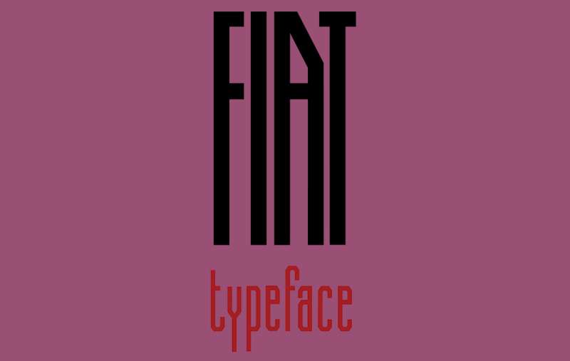
Bold and Distinctive
The font in the Fiat logo is as distinctive as the brand itself. Bold, robust, and stylishly simple, it conveys strength and reliability. It’s a typeface that stands tall, just like the legacy of Fiat.
The Impact of the Fiat Logo
A Global Icon
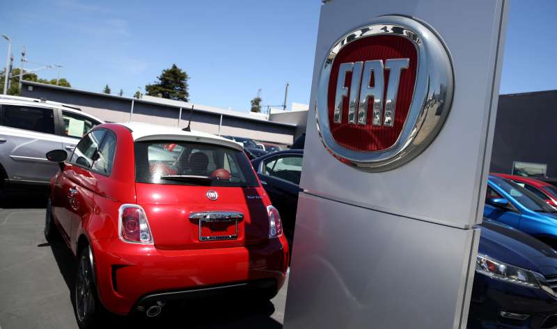
The logo isn’t just known, it’s recognized. It’s a global symbol, an emblem that carries weight and respect. It’s seen on streets, highways, and racetracks worldwide, a testament to Fiat’s international reach and impact.
Brand Identity and Recognition
The logo is at the heart of Fiat’s brand identity. It’s a visual stamp, a marker that sets Fiat vehicles apart from the rest. It’s the first thing you see on a Fiat car, and it’s the last thing you remember.
The Future of the Fiat Logo
Embracing Change
As Fiat continues to grow and innovate, the logo is bound to evolve, just as it has done throughout the company’s history. It’s a symbol that will always embrace change, reflecting Fiat’s commitment to staying ahead of the curve.
The Legacy Continues
The logo carries a legacy, a story that continues to unfold. As we look to the future, we can anticipate more transformations, more evolutions, more stories being woven into this iconic emblem.
The Influence of the Fiat Logo
Inspiration in the Industry
The logo has not only represented the brand itself but has also served as inspiration within the automotive industry. Its timeless design and ability to adapt to changing times demonstrate the importance of branding in maintaining relevance and market dominance.
Advertisement
Symbolism and Marketing
The logo underscores the power of symbolism in marketing. It reminds us that a logo is more than just an image – it’s a storytelling tool, a way to communicate a brand’s identity and values to its audience.
The Fiat Logo in Popular Culture
Presence in Media
The logo, with its bold colors and design, has found a place in various forms of media, from movies and TV shows to video games. Its recognizability has played a significant role in promoting brand awareness beyond traditional advertising platforms.
Connection with Fans
For many Fiat enthusiasts, the logo is a source of pride and a symbol of a community of like-minded individuals.
It connects fans across the world, unifying them under a shared passion for this iconic brand. From fan merchandise to car meet-ups, the Fiat logo continues to foster a strong bond among its loyal followers.
FAQ on the Fiat Logo
What’s the history behind the Fiat logo?
Ah, the Fiat logo! It’s been through quite a few changes, hasn’t it? It was first introduced in 1899, can you believe that? The original design was a rectangular brass plate with “FIAT” etched into it. But it’s evolved since then, quite dramatically in fact.
Today’s logo, the circular badge with the stylized “FIAT” letters inside, came into being in 2006. It was meant to symbolize technology and strong Italian design ethos.
Has the Fiat logo changed over time?
Oh, you bet it has! The logo is like a time capsule of design trends. From the brass plate of 1899 to the laurel-wreathed variant in 1904, from the rectangular 60s version to the ‘shield’ in 1982, it’s been a wild ride.
The current version has been around since 2006, and it’s this sleek, modern round emblem that speaks to Fiat’s commitment to staying current while respecting its heritage.
What does “Fiat” stand for?
“FIAT” isn’t just a cool sounding word. It’s actually an acronym. It stands for “Fabbrica Italiana Automobili Torino” which translates to “Italian Automobile Factory of Turin”.
Kinda neat, right? You’re not just driving a Fiat, you’re driving a piece of Italian automobile history. That’s what the logo stands for.
Why is the Fiat logo round?
The round shape of the logo is a modern design choice. In 2006, they decided to go with a circular design, a shift from the previous ‘shield’ form. This circle, with its silver finish and bold red backdrop, gives it a neat, contemporary look.
It’s symbolic of the brand’s forward-thinking approach, and it’s commitment to innovation while maintaining its rich heritage.
What do the colors in the Fiat logo mean?
Color choice in logos is never random, my friend. In the logo, the red background symbolizes passion, energy, and joy – all things that Italian culture is known for. The silver of the letters and the surrounding circle?
That’s all about sophistication, creativity, and modernity. So, when you see that Fiat logo, remember it’s more than just a pretty design. It’s a symbol of the brand’s values.
Who designed the Fiat logo?
Great question! Fiat has had multiple logos over the years, and each one was designed by a different person or team. The most recent logo, the circular one, was introduced in 2006 and was designed by Robilant Associati, an Italian branding consultancy.
They’re the ones who brought us the modern, stylish badge we recognize today.
Has Fiat ever used an animal in its logo?
Fiat’s logo design has seen quite a bit of evolution, but nope, no animals.
It’s always been focused on the name “FIAT” and design elements that highlight the brand’s Italian origins and its values. So, if you’re looking for a beast in the Fiat logo, I’m afraid you’re out of luck!
Is the Fiat logo a symbol of Italian design?
Oh, absolutely! The Fiat logo is a testament to Italian design prowess. It embodies the brand’s Italian roots and its commitment to design excellence.
The red and silver color scheme, the stylized “FIAT” letters, the sleek circular design – they all speak to a brand that values aesthetics as much as performance. It’s Italy, it’s style, it’s Fiat.
Why does the Fiat logo only use capital letters?
Capital letters, in logo design, often symbolize strength, stability, and reliability. For Fiat, the use of capitals in its logo isn’t just about making “FIAT” stand out.
It’s a bold design choice that underscores the brand’s solid reputation and its standing in the automobile industry. So, it’s not just a style thing, it’s a statement.
What’s the significance of the laurel wreath in earlier Fiat logos?
Ah, the laurel wreath! That’s a nod to ancient Rome. Laurel wreaths were symbols of victory and honor. In Fiat’s earlier logos, the wreath was a symbol of the brand’s triumphs in the automotive industry and its dedication to excellence.
It’s a great example of how a logo can tell a brand’s story. And even though the wreath isn’t part of the current logo, Fiat’s commitment to excellence remains.
Ending thoughts on the Fiat Logo
Fiat Logo, an emblem of legacy and innovation, right?
I mean, look closely. You’ll see those four letters, bold and standing proud. They carry the weight of decades, of design shifts and industry upheavals.
But hey, it’s not all about history. It’s about what’s next. The future.
Fiat’s logo ain’t static, no sir. It’s morphed over the years, adapting to each era. It’s a testament to the brand’s resilience, their ability to evolve and stay relevant.
And that’s the message, folks. The Fiat Logo ain’t just a logo. It’s a beacon of change, a promise of consistent re-imagination.
So next time you see those four letters, remember. They’re not just representing a car company. They’re echoing a legacy of design, of adaptation, of innovation.
And that’s a wrap, folks. Here’s to the logos that go beyond design, and truly embody the spirit of their brands. Fiat, you’re doing it right.
If you enjoyed reading this article about the Fiat Logo, you should read these as well:
Recommend
About Joyk
Aggregate valuable and interesting links.
Joyk means Joy of geeK