

Discovering Material3 for Android — DatePicker
source link: https://medium.com/@renaud.mathieu/discovering-material3-for-android-datepicker-78efa3ce98cf
Go to the source link to view the article. You can view the picture content, updated content and better typesetting reading experience. If the link is broken, please click the button below to view the snapshot at that time.

Discovering Material3 for Android — DatePicker
This series of articles is designed to help you explore the latest addition to Material 3 for Android. In this series, we will take a closer look at the different components and features of Material 3, and explore how they can be used to create modern and user-friendly Android apps.
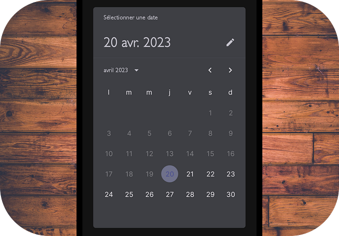
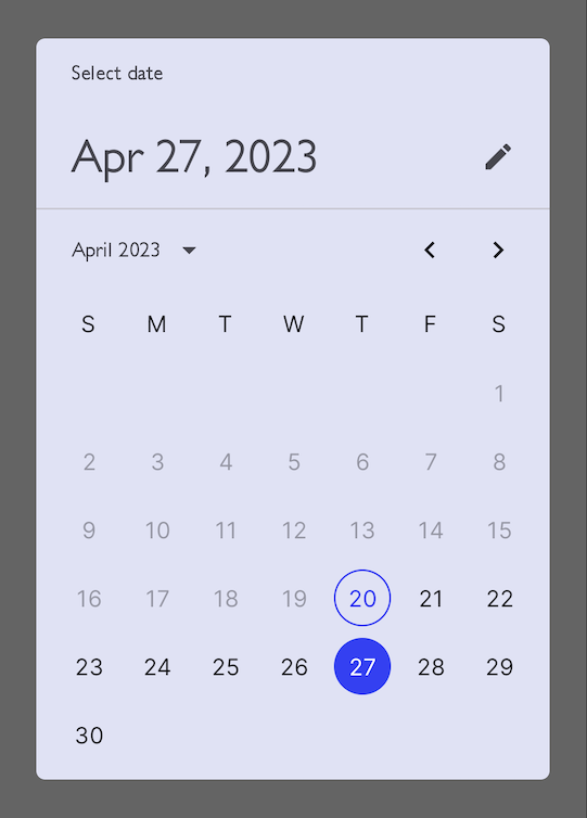
Material 3 DatePicker using Dynamic colors in action
From booking appointments to managing tasks, mobile applications are used for almost everything. Sometimes, we allow users to pick a date to specify events or to work with a specific feature in our app.
A DatePicker is a UI component that allows users to select a date from a calendar view. It is a powerful feature that makes it easy for users to enter a date and helps to ensure data consistency.
In this article, we will discuss the experimental Material 3 DatePicker in Jetpack Compose, its benefits, and how to use it.
DatePicker in Jetpack Compose
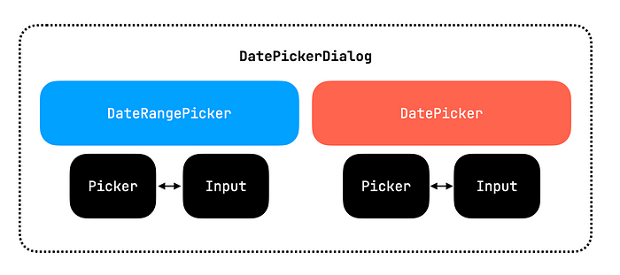
At the time of writing this article, there are only two components available:
- DatePicker allows users to choose a date
- DateRangePicker allows users to choose a period (a start date and an end date)
Both components allow you to alternate between two modes:
- Picker mode (quick selection by click)
- Input mode (a text field with IME management)
Finally, you can embed the component inside a DatePickerDialog for a modal view if you wish (like the one above).
⚠️ It is important to note that the DatePicker component in Jetpack Compose is still experimental and was recently released. This means that it may not be suitable for production use and could contain bugs or other issues.
Playing with the DatePicker Component
Using DatePicker in Jetpack Compose is quite handy. This short snippet will display a simple DatePicker
// First you need to remember a datePickerState.
// This state is where you get the user selection from
val datePickerState = rememberDatePickerState(
    initialSelectedDateMillis = Instant.now().toEpochMilli()
)

// Second, you simply have to add the DatePicker component to your layout.
DatePicker(state = datePickerState)
val selectedDate = datePickerState.selectedDateMillis?.let {
  Instant.ofEpochMilli(it).atOffset(ZoneOffset.UTC)
}

// Finally, to get the user value you could do something like this:
Text("Selected: ${selectedDate?.format(DateTimeFormatter.ISO_LOCAL_DATE) ?: "no selection"}")
You can customize the DatePicker by changing the colors, the format of the date, and the minimum and maximum dates that can be selected. Let’s go with some design tuning
// Need to use this PaddingValues at the moment
// otherwise you will have some padding issues…
// Could be public or fixed by Google
val datePickerTitlePadding = PaddingValues(
  start = 24.dp,
  end = 12.dp,
  top = 16.dp
)

// Need to use this PaddingValues at the moment
// otherwise you will have some padding issues…
// Could be public or fixed by Google
val datePickerHeadlinePadding = PaddingValues(
  start = 24.dp,
  end = 12.dp,
  bottom = 12.dp
)

DatePicker(
    modifier = Modifier.padding(16.dp),
    state = datePickerState,
    dateValidator = { timestamp ->
   // Disable all the days before today
      timestamp > Instant.now().toEpochMilli()
    },
    title = {
      Text(
          modifier = Modifier.padding(datePickerTitlePadding),
          text = "Pick a date")
    },
    headline = {
   // You need to look the datePickerState value
      Text(
          modifier = Modifier.padding(datePickerHeadlinePadding),
          text = datePickerState.displayMode.toString()
      )
    },
    showModeToggle = true, // allow input mode or picker
    colors = DatePickerDefaults.colors(
        containerColor =,
        titleContentColor =,
        headlineContentColor =,
        weekdayContentColor =,
        subheadContentColor =,
        yearContentColor =,
        currentYearContentColor =,
        selectedYearContentColor =,
        selectedYearContainerColor =,
        dayContentColor =,
        disabledDayContentColor =,
        selectedDayContentColor =,
        disabledSelectedDayContentColor =,
        selectedDayContainerColor =,
        disabledSelectedDayContainerColor =,
        todayContentColor =,
        todayDateBorderColor =,
        dayInSelectionRangeContentColor =,
        dayInSelectionRangeContainerColor =
    ), // Many colors, you can decide!
)
Playing with the DateRangePicker Component
Very similar to using DatePicker, DateRangePicker is quite easy to integrate. We can put our configuration directly into the picker state.
@Composable
@OptIn(ExperimentalMaterial3Api::class)
private fun SimpleDateRangePicker() {
 val dateRangePickerState = rememberDateRangePickerState(
    initialSelectedStartDateMillis = Instant.now().toEpochMilli(),
    initialSelectedEndDateMillis = OffsetDateTime.now().plusDays(8).toInstant().toEpochMilli(),
    yearRange = IntRange(2023, 2100), // available years
    initialDisplayMode = DisplayMode.Picker
  )

DateRangePicker(
      modifier = Modifier.padding(16.dp),
      state = dateRangePickerState,
  )
}
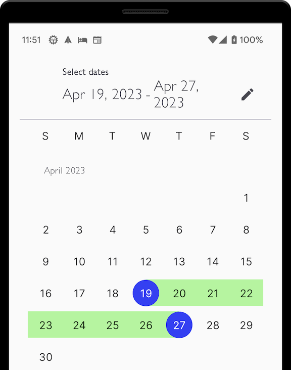
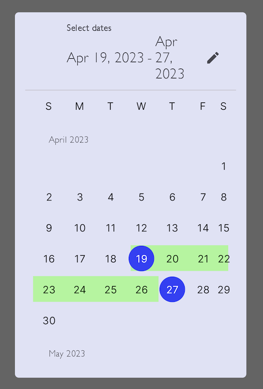
Headline seems buggy in DateRangePicker 🫤
Wrapping in DatePickerDialog
The official documentation makes no mention of any DateRangePickerDialog component. So I tried to play with it and ran into some problems. Maybe we should expect this component in a future release.
I managed to make it work by not using the confirmButton and extracting it to another TextButton:
@Composable
@OptIn(ExperimentalMaterial3Api::class)
private fun SimpleDateRangePickerInDatePickerDialog(
    openDialog: Boolean,
    onDismiss: () -> Unit
) {
  val dateRangePickerState = rememberDateRangePickerState(
      initialSelectedStartDateMillis = Instant.now().toEpochMilli(),
      initialSelectedEndDateMillis = OffsetDateTime.now().plusDays(8).toInstant().toEpochMilli(),
      yearRange = IntRange(2023, 2100),
      initialDisplayMode = DisplayMode.Picker
  )
  Column(
      modifier = Modifier.padding(vertical = 10.dp, horizontal = 0.dp),
      verticalArrangement = Arrangement.Top,
      horizontalAlignment = Alignment.End
  ) {
    DatePickerDialog(
        shape = RoundedCornerShape(6.dp),
        onDismissRequest = onDismiss,
        confirmButton = {
           // Seems broken at the moment with DateRangePicker
           // Works fine with DatePicker
        },
    ) {

DateRangePicker(
          modifier = Modifier.weight(1f), // Important to display the button
          state = dateRangePickerState,
      )

TextButton(
          onClick = {
            onDismiss()
//                val startDate = dateRangePickerState.selectedStartDateMillis)
//                val endDate = dateRangePickerState.selectedEndDateMillis
          },
          enabled = dateRangePickerState.selectedEndDateMillis != null
      ) {
        Text(text = "Validate")
      }
    }
  }
}
For a simple DatePicker in a DatePickerDialog, it’s quite easy.
@Composable
@OptIn(ExperimentalMaterial3Api::class)
private fun SimpleDatePickerInDatePickerDialog(
    openDialog: Boolean,
    onDismiss: () -> Unit
) {
  val datePickerState = rememberDatePickerState(
      initialSelectedDateMillis = Instant.now().toEpochMilli()
  )
  DatePickerDialog(
      shape = RoundedCornerShape(6.dp),
      onDismissRequest = onDismiss,
      confirmButton = {
        // Seems broken at the moment with DateRangePicker
        // Works fine with DatePicker
      },
  ) {
    DatePicker(
        state = datePickerState,
        dateValidator = { timestamp ->
          timestamp > Instant.now().toEpochMilli()
        }
    )
  }
}
Benefits of the Component
One of the benefits of the DatePicker component in Jetpack Compose is that it returns a Long value representing the epoch in milliseconds. This is a significant improvement over the old component, which returned a java.util.Date object. The Long value is much easier to work with and provides greater flexibility for developers as it’s can be easily converted into a java.util.Instant or kotlin.datetime.Instant .
DatePicker is a powerful feature that makes it easy for users to select a date in mobile applications. With Jetpack Compose, adding a DatePicker to your application is easier than ever before. The ability to customize the appearance and behavior of the DatePicker component makes it a valuable tool for developers. However, it is important to note that the component is still experimental and may not be totally suitable for production use.
Recommend
About Joyk
Aggregate valuable and interesting links.
Joyk means Joy of geeK