

The Truth About Using Carousels In UX Design
source link: https://uxplanet.org/the-truth-about-using-carousels-in-ux-design-28c8497c14bd
Go to the source link to view the article. You can view the picture content, updated content and better typesetting reading experience. If the link is broken, please click the button below to view the snapshot at that time.

The Truth About Using Carousels In UX Design
Exploring the age-old question: Are carousels bad UX?
Let’s talk about the world of carousels! Now, before you start picturing yourself riding on a merry-go-round at a carnival, let’s clarify that we’re not talking about the amusement ride. In the context of UX design, a carousel refers to a slideshow of images or content that rotates automatically or with user interaction.
Carousels have been a popular design element for websites for many years, but the question of whether they are good or bad UX is still up for debate. Some argue that carousels are a great way to showcase multiple pieces of content in a limited space, while others claim that they are ineffective and even harmful to the user experience.
In this article, we will dive into the best practices and things to avoid to help you design a carousel that provides a positive user experience for your website or application.
What are some use cases for carousels?
In the context of UX design, a carousel refers to a slideshow of images or content that rotates automatically or with user interaction. Carousels are often used to showcase multiple pieces of content within a limited space, such as on a website’s homepage or a product page.
Here are a few examples of how carousels can be used in UX design:
1. Announcements
Carousels can be used to showcase different announcements on an e-commerce site. For example, a clothing retailer may use a carousel to display their latest deals, allowing users to browse different options quickly.

2. Testimonials
Carousels can be used on landing pages to highlight client testimonials of a product or service. This can help represent the business as a trusted provider and help influence prospective clients to explore more about the product or service.

3. Onboarding
Carousels can be used to onboard users onto a new application. This can help to welcome users to the app and highlight key features within.

Are carousels effective?
The effectiveness of carousels for site visitors has been a topic of much discussion and debate among UX designers. Research studies on user behavior with carousels have shown mixed results. Some studies have found that users tend to ignore carousels and that they can be frustrating for users who are looking for specific information. Other studies have found that carousels can be effective at capturing users’ attention and encouraging engagement.
The case against carousels
One of the main arguments against carousels is that they can negatively impact the user experience by being distracting or confusing, especially if they automatically rotate or if the user cannot easily control the speed or direction of the slideshow. Additionally, research has shown that many users may not interact with the carousel beyond the first slide, meaning that some content may go unnoticed.
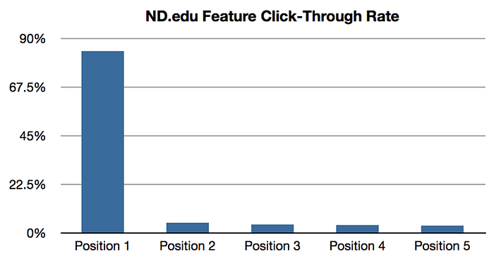
One study conducted by Notre Dame University found that only 1% of users clicked on a carousel image, while the first image in the carousel received 84% of all clicks. This suggests that users tend to ignore carousels and that they may not be the best way to highlight important content.
The case for carousels
On the other hand, carousels can be effective when used in the right context. For example, carousels have been made popular on social media by content creators who use them as an interactive format for posting short snippets of information. They can also be effective for telling a visual story, such as highlighting the different stages of a process or showcasing a series of images that tell a story.
Overall, whether or not carousels are useful for site visitors depends on the specific context and how they are designed and implemented. If used appropriately and designed well, carousels can be an effective way to engage users and showcase content. However, it’s important to keep in mind the potential drawbacks, such as low user engagement and potential accessibility issues, and to consider alternative design options that might be a better fit.
Best practices for designing carousels
Despite these concerns, there are many examples of effective and well-designed carousels that successfully engage users and promote desired actions. Designing an effective carousel requires careful consideration of various UX best practices. Here are some best practices to follow to design a carousel that engages users and improves their experience.
Prioritize content
The content in the carousel should be relevant, interesting, and visually appealing. Prioritize the most important content and use high-quality images and graphics. Avoid using too many slides in the carousel. Users may lose interest or become overwhelmed by too much content. Keep the content concise to only a few slides.

Use clear navigation
Avoid using small or unclear navigation controls, such as tiny dots, that can make it difficult for users to navigate the carousel. Instead, use clear labels or icons to represent each step and provide a more visible target to switch between steps. Make sure the labels indicate the number of images in the carousel and the current position of the user.
Include image alt text
Include alternative text that describes all images in detail so that users with vision impairments can understand what is represented in the visuals at each step. Avoid using images or content in the carousel that lack context or relevance to the user. This can cause confusion and decrease engagement.
Avoid autoplay
Avoid using an autoplay feature that automatically scrolls through the images in the carousel. This can be frustrating for users who may want to take their time to view the content. Instead, let the user navigate through the carousel at their own pace using clear navigation controls.
Ensure keyboard accessibility
Make sure that the carousel is keyboard accessible, meaning users can easily tab through it in a logical manner and access controls, including left and right arrows, step labels, and pause buttons.

Final thoughts
Carousels have gotten a bit of a bad reputation in the world of UX due to their potential to be distracting and inaccessible to users. But depending on the context of use, carousels can be a highly effective design element if they are designed with best practices and accessibility in mind. It’s important to limit the number of slides, provide clear navigation controls, and use high-quality images and captions that are relevant to the content of each slide. By doing so, designers can create impactful carousels that enhance the user experience and achieve their desired goals.
Recommend
About Joyk
Aggregate valuable and interesting links.
Joyk means Joy of geeK