

UX Case Study: Venmo. Adding a group savings feature.
source link: https://medium.muz.li/ux-case-study-adding-a-group-savings-feature-to-venmo-d5e993021c59
Go to the source link to view the article. You can view the picture content, updated content and better typesetting reading experience. If the link is broken, please click the button below to view the snapshot at that time.

UX Case Study: Venmo. Adding a group savings feature.
Adding a feature: A social savings circle for friends and family to improve their saving habits.

“Venmo me!”
Venmo is a money-transferring app that has gained immense popularity with its social media-like platform. Since their launch, they’ve added debit cards, credit cards, business and even crypto features to their app. However, they have yet to add a much-desired savings feature. This case study explores how Venmo can leverage its social media-esque platform to add a social savings circle to the app. This savings concept would enable users to save more effectively by working with friends and family to reach their goals.
Why add a group savings feature?
I think most would agree that saving money tends to be more stressful than it is fun. I initially came up with this idea when I found myself struggling to track all my savings goals and stay motivated. From past conversations with friends, I knew I wasn’t the only one. Many agreed that it was hard to track savings goals and especially easy to become unmotivated and overspend. So being presented with a problem, I decided to design a solution.
My goal as the sole UX/UI Designer was to create a savings feature that would boost users’ saving motivation and help them develop a better money-saving mindset throughsocial engagement.

Problem: Spending is easy, saving is stressful!
How might we:
Help users stay motivated to save and improve their money-saving habits?
Design Hypothesis:
Users (Problem): Have a hard time saving and lack the motivation to save. Existing savings methods provided by bank apps still aren’t motivating enough.
So users need (Solution): A tool that will boost motivation and allow users to easily save for their desired goals.
This tool will (Outcome): Help users stay motivated, simplify the saving process and make achieving goals easy.
The Design Process

🤔Research: Validating the hypothesis
Since my design solution was based on a hypothesis, it was important to ensure this savings concept would be viable and add value to the user. I conducted user surveys, secondary research, and competitive analysis to really understand the problem space.
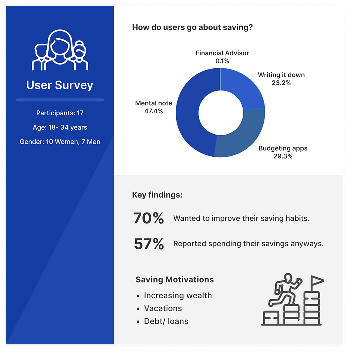
User Surveys
I started off my research by conducting user surveys with seventeen Venmo users. This is where I got to understand my user base and their money-saving habits. Unsurprisingly, most users reported their biggest problem with saving was overspending their savings anyways. With the money readily accessible in their account users naturally have a higher impulse to spend. Below is a summary of some key findings!
Secondary Research
To further validate my hypothesis, I conducted secondary research to really understand whether saving money was truly a major problem people faced.
I discovered that 50% of Americans have less than $600 in savings and 69% of Americans have less than $1000 in savings.
I also discovered that saving in groups actually increases motivation and it turns out this is not a new concept at all. Saving in groups is a method many people from countries such as Kenya, Uganda, Afghanistan, and many others have effectively used.
Studies of savings groups show that:
- The average savings balance almost doubles in a savings group.
- Saving in groups feels more rewarding and is proven to improve habit development.
- Saving in groups increases motivation, commitment, and decreases stress.
Once I felt confident that a savings group would be a viable idea, I continued my research by looking into the benefits of having multiple savings accounts. I discovered that the average person has three different accounts and financial experts actually recommend separating different savings goals.
Benefits of Separated Savings Accounts:
- Easy Tracking: Separating different savings goals makes it much easier for users to track their progress.
- Prevents Overspending: Users are less likely to make misspend their money when they know exactly what goal they are withdrawing money from.
- Better Organization: Saving is much less stressful with clear plans and goals. Having separated savings allows users to think about where they fall short and prioritize savings goals.
🧐So who are the competitors? What makes Venmo so special?
Once I got to know my user’s motivations and their problems with saving money, my next step was to begin understanding the competitors and what they had to offer. I created a checklist version of the competitive analysis to clearly identify each app’s limits and successes. Venmo remains the only app that encourages peer interactions. This is why I determined Venmo would be a great platform to utilize a social approach to saving.
A social savings feature to go alongside their social payment platform would set Venmo apart from their competitors even more.

👧🏻Who am I designing for?
Target Audience: Venmo has an average age range of 19 to 34 years old. This age range makes about $30,000 to $40,000 a year.
With my research completed, I reviewed all my research data and developed a user persona to help me gain clarity on the type user I would be designing for.
Meet Sheila, she is a college student who is getting accustomed to living alone and needs help saving and managing her finances.

🔨Building the solution
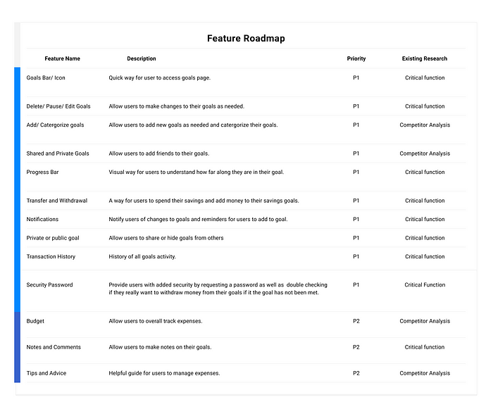
Next, I started creating the feature roadmap to begin thinking about what features I wanted to prioritize in my design. The features were organized based on importance below:
🛤️How should this feature be structured?
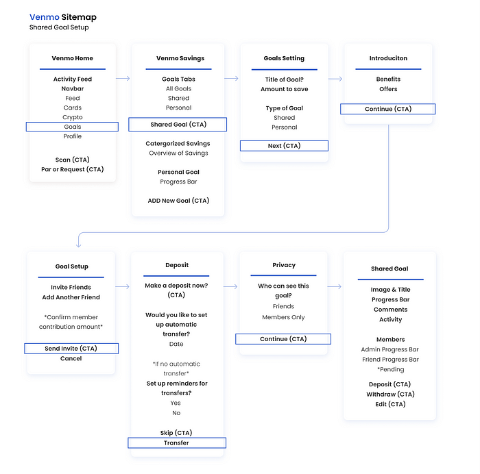
In this next phase, I started by creating a sitemap to understand the information architecture of the new feature. I wanted to understand what features and components each screen should have and how they might work with each other. The sitemap below outlines the process of adding a shared goal and a personal goal withdrawal process.

🏗️Exploring Design Options
Once I gained clarity on my sitemap and user flow, I sketched and designed low-fidelity wireframes.
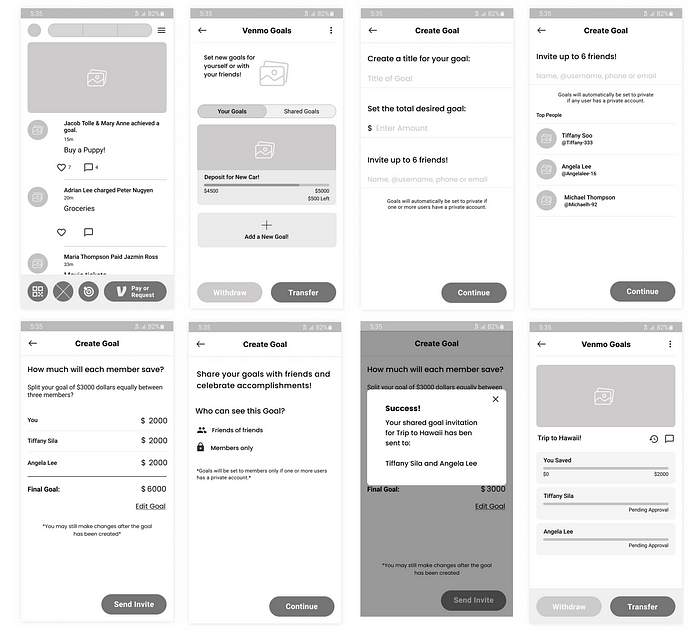
As for the design system, I knew that the feature would have to look as close to Venmo as possible. I wanted it to be integrated as seamlessly as possible.

🎭Testing low-fidelity prototype
With my wireframes ready, I tested the design with a few users to ensure I wasn’t missing any major components. This process allowed me to gain early feedback and insights from my users.
I learned that users wanted:
- 🔒Security — Users were worried about whether or not other members can withdraw their savings contributions.
- ⚙️ Convenience— Users mentioned setting up automatic transfers for their goals.
- 💬Communication — Users wanted to be able to communicate with one another.
From these findings, I was able to create a more complete design that would alleviate the users' questions and concerns. I applied these ideas to my final prototype below.
Final Prototype Overview
As I was working on this project, Venmo made some updates to their UI which I have applied to my final design.
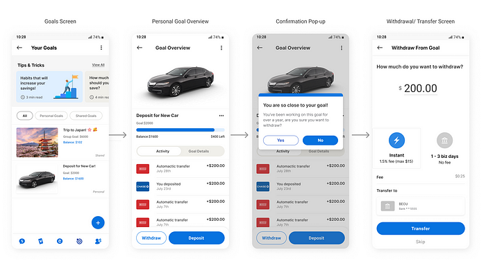
The process of adding a shared goal:

The personal goal withdrawal process:
Testing & Revisions
After conducting another round of tests, I was able to finalize my design solutions. The overall feedback was positive but I realized there were still some concerns that needed to be addressed.
Changes and additions included:
• Introduction screen — To provide details on the new feature and benefits.
• Goal selection screen — To make the goal creation process easier.
• Tips and tricks- Added to help users improve their savings habits.
• Withdrawal button — Moved downfor easier access and intuitiveness.
• Image upload- Makes goal creation more personal and motivating.


Reflection
Overall, I truly enjoyed working on this project, I learned a lot, and I can honestly say I’m pretty happy with the final result. This project helped me learn to not make assumptions about what users would want based on my own preferences. For instance, I assumed that users would prefer to personalize their goal image and title. However, users wanted something convenient and fast which resulted in the addition of a goal-selection screen. This project taught me that little details matter and to approach my design decisions more thoughtfully. Honestly, this project has come a long way but I’m grateful for all the new and improved skills I gained. As a growing UX/UI designer I was able to learn so much more from this project than I expected.
Thanks so much for reading! Don’t forget to leave a clap if you enjoyed this case study and be sure to follow me for more:)
[1] — The Secret to Saving More Money? Team up With Friends, Family or Even Complete Strangers
Recommend
About Joyk
Aggregate valuable and interesting links.
Joyk means Joy of geeK