

Mastering UI Design: A Complete Guide to Best Practices
source link: https://blog.bitsrc.io/mastering-ui-design-a-complete-guide-to-best-practices-54caec2d76d4
Go to the source link to view the article. You can view the picture content, updated content and better typesetting reading experience. If the link is broken, please click the button below to view the snapshot at that time.

Front-End Development
Mastering UI Design: A Complete Guide to Best Practices
Unlock the power of UI design with a comprehensive guide to creating intuitive, user-friendly, and engaging interfaces for web and mobile platforms.

In today’s digital age, the user interface (UI) plays a crucial role in the success of any software product.
Whether you’re developing a mobile app or a web-based platform, creating an intuitive and user-friendly interface is key to engaging users and achieving your goals. But with so many UI design best practices and design patterns to choose from, it can be challenging to know where to start.
In this article, I’ll provide a comprehensive guide to mastering UI design, covering everything from the psychology of user behavior to emerging technologies and best practices for prototyping and user testing.
Whether you’re a seasoned UI designer or just starting out, this guide will help you create interfaces that are both beautiful and functional.
Designing for Human Interaction
As a UI designer, it’s important to understand that you’re designing for human beings who have unique wants, needs, and behaviors.

Creating a UI that is intuitive and user-friendly requires an understanding of user-centered design and the principles of cognitive psychology.
The Importance of User-Centered Design
User-centered design (UCD) is an approach to UI design that focuses on the needs, wants, and limitations of the end users. By putting the user at the center of the design process, UI designers can create interfaces that are tailored to the user’s needs, preferences, and abilities.
This approach requires an understanding of user research methods, such as user interviews, surveys, and usability testing, to gather feedback on the user’s experience.

The Role of Cognitive Psychology in UI Design
Cognitive psychology is the study of mental processes, such as perception, memory, and problem-solving. By understanding these processes, UI designers can create interfaces that are optimized for human cognition.
Color palette is an important consideration for UI designers when creating interfaces that are optimized for human cognition. Studies have shown that colors can impact emotions and cognitive processes, which can influence user behavior.
For instance, using warm colors such as red, orange, and yellow can evoke emotions like excitement and urgency, while cool colors like blue, green, and purple can create a sense of calmness and relaxation. By understanding the impact of different colors on emotions, UI designers can create interfaces that are better suited to the needs of their users.

Furthermore, when selecting a color palette for a UI, it is important to consider the level of contrast between different colors. High contrast between text and background colors, for example, can improve readability and reduce eye strain, making it easier for users to process information. Conversely, low contrast can make it difficult for users to read and interact with the interface, leading to frustration and cognitive overload.
The Impact of User Behavior on UI Design
UI designers must consider that users have a limited attention span, and various factors such as interface layout, button size and placement, and information order can significantly influence their behavior. Understanding user behavior is vital for creating interfaces that cater to their needs and preferences.
For instance, strategically placing frequently used buttons in a prominent location can enhance user efficiency and satisfaction. By optimizing for human behavior, UI designers can create intuitive and user-friendly interfaces.

Behaviour Design Principles
One approach to understanding user behavior and designing interfaces that cater to their needs is the field of behavior design. Behavior design is the practice of using psychology and behavior modification techniques to influence human behavior.
Designers can create interfaces that encourage desired user behavior through the application of principles such as habit formation, feedback loops, and persuasive design. For instance, a fitness app could utilize behavior design techniques to motivate users to exercise regularly or adopt healthier eating habits.

To create user-friendly and intuitive interfaces, it’s essential for UI designers to consider human interaction. This involves understanding user behavior, cognitive psychology, and the principles of user-centered design.
Consistency and Visual Hierarchy in UI Design
Consistency and visual hierarchy are two key elements of intuitive UI design.

Consistency refers to the use of the same design elements throughout the interface, while visual hierarchy involves arranging elements in order of importance to guide the user’s attention.
The Importance of Consistency in UI Design
Consistency is essential for creating a UI that is intuitive and easy to use. When users encounter consistent design elements, such as the placement of navigation bars or the use of color schemes, they are more likely to understand how to use the interface.

On the other hand, inconsistencies can lead to confusion and frustration, making it more difficult for users to achieve their goals. Therefore, it is essential to maintain consistency in design to ensure a positive user experience and minimize the negative impact of inconsistencies.
Visual Hierarchy and its Role in UI Design
Visual hierarchy is the arrangement of design elements in a way that guides the user’s attention. This involves using different visual cues, such as size, color, and placement, to indicate the relative importance of different elements.
For example, a call-to-action button may be larger and placed more prominently than other buttons on the page, indicating to the user that it is the most important action to take.
Best Practices for Consistency and Visual Hierarchy
To create a UI with consistent design elements and effective visual hierarchy, there are several best practices to keep in mind. These include:
- Using a consistent color scheme throughout the interface.
- Keeping the layout and design of each page consistent.
- Ensuring that the size and placement of buttons and other design elements are consistent.
- Using font choices that are easy to read and consistent throughout the interface.
- Using visual cues, such as color and size, to indicate the importance of different elements.
💡 Implementing these best practices become easy with opensource tools such as Bit. Bit lets you easily share and manage reusable UI components with your team and across your project, making it easier to maintain consistency and improve development efficiency.
Learn more here:
Extracting and Reusing Pre-existing Components using bit add
Finally, you completed the task of creating a fantastic input field for the Input in your app. You are happy with the…
Consistency and hierarchy drive intuitive UI design, enabling designers to create interfaces that guide users effectively.
Best Practices for Layout and Typography in UI Design
The layout and typography of a UI are crucial in creating an interface that’s not only beautiful but also easy to read and use.

The Role of Layout in UI Design
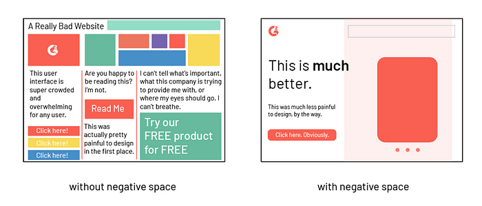
Layout design involves arranging UI elements in a way that is visually appealing and guides the user’s attention. This can involve the use of white space, alignment, and the placement of elements.
The layout of a UI should be consistent throughout the interface to provide a seamless user experience.
Best Practices for Layout Design
To create an effective layout design, there are several best practices to keep in mind, such as:
- Using a grid system to ensure consistency and alignment
- Using white space to provide visual breathing room and improve readability
- Considering the size and placement of each element to guide the user’s attention
- Designing responsive layouts that are scalable and adaptable to different screen sizes and devices

The Importance of Responsive Layouts
Designing responsive layouts is essential in UI design because it allows the interface to adapt to various screen sizes and devices, ensuring a consistent and optimal user experience.
The Importance of Typography in UI Design
Typography plays a crucial role in UI design, as it affects the readability and overall aesthetics of the interface. Choosing the right fonts, font sizes, and spacing can greatly impact the user’s experience.

Best Practices for Typography
To create effective typography in UI design, there are several best practices to consider, such as:
- Using clear and legible fonts that are easy to read
- Choosing font sizes that are appropriate for the content and device
- Using consistent typography throughout the interface
- Considering the spacing and line height to improve readability
Layout and typography are essential elements of UI design, impacting both the aesthetics and usability of the interface, and by following best practices for layout and typography, UI designers can create beautiful and readable interfaces that enhance the user experience.
Effective layout and typography practices are essential for UI design, enhancing both aesthetics and usability to create beautiful and readable interfaces that improve the user experience.
Tips for Designing Intuitive Navigation and Information Architecture
Intuitive navigation and information architecture are crucial elements of UI design, enabling users to easily find what they need and navigate the interface seamlessly.

Understanding the Importance of Navigation and Information Architecture
Navigation design involves creating a system of links and menus that enable users to move through the interface efficiently. Information architecture, on the other hand, involves organizing and structuring content in a way that is easy to understand and navigate. Both elements are essential in creating a seamless user experience.
Best Practices for Navigation Design
To create effective navigation design, consider the following best practices:
- Keeping the navigation simple and easy to understand
- Providing clear and concise labels for navigation links and menus
- Designing navigation that is consistent throughout the interface
- Using visual cues, such as icons, to aid in navigation

Best Practices for Information Architecture
Consider the following best practices when creating effective information architecture:
- Organizing content into categories and subcategories
- Grouping related content together
- Providing clear and concise headings and labels for content
- Ensuring that the most important content is easy to find
Intuitive navigation and information architecture are essential in creating a seamless user experience.

Following best practices for intuitive navigation and information architecture is crucial for UI designers to create interfaces that are easy to navigate and understand, resulting in a seamless user experience.
Designing for Feedback and Affordances in UI
As a UI designer, it’s not just about making your interface look great; you also need to create an experience that’s easy to use and understand.

One way to achieve this is by incorporating feedback and affordances into your UI design.
The Importance of Feedback in UI Design
Feedback is a crucial element of UI design that helps users understand what’s happening when they interact with an interface. Without feedback, users may be unsure if their actions are registering or if they’re doing something incorrectly. As a result, they may become frustrated and disengage from your app or website.
To provide effective feedback, designers need to consider the type of feedback that’s appropriate for each interaction, such as visual, audio, or haptic feedback.
For example, when a user submits a form, providing visual feedback like a success message or a visual cue that the form has been submitted can be helpful in letting them know that their action has been registered.

Affordances and How They Help Users Interact with Interfaces
Affordances are visual cues that suggest how an object should be used. They help users understand how to interact with an interface and make it easier to navigate. Buttons that look clickable, or a slider that indicates it can be dragged, are examples of affordances that make it clear to users how they can interact with an interface.
Designers can incorporate affordances into their UI designs by considering the purpose of each UI element and using design cues that suggest how the element can be used.
Designing with Feedback and Affordances in Mind
Creating more intuitive and user-friendly interfaces requires the incorporation of feedback and affordances in UI design.
To achieve this, it is important to consider the relevant types of feedback and affordances for each interaction and ensure the use of consistent design cues that align with the interface’s purpose.
Bear in mind that feedback and affordances are essential in driving user engagement and improving the overall usability of your UI design.
Designing for Accessibility and Inclusivity in UI
As a UI designer, it is important to create interfaces that are accessible and inclusive to all users, regardless of their abilities.

The Importance of Accessibility and Inclusivity in UI Design
Incorporating accessibility and inclusivity into UI design is not just a moral imperative, but it also has tangible benefits for businesses. Creating interfaces that are accessible to all users expands the potential audience, enhances user satisfaction, and mitigates legal and reputational risks.
Accessibility and inclusivity should be integrated into the UI design process from the very beginning, rather than being an afterthought.
Techniques for Designing for Users with Disabilities
Designing for users with disabilities requires an understanding of their unique needs and challenges. Some common disabilities that designers should consider when designing for accessibility include visual impairments, hearing impairments, motor impairments, and cognitive impairments.
To design for these disabilities, designers should consider using techniques such as providing alternative text for images, using high contrast colors, providing closed captions or transcripts for videos, and ensuring that the interface is navigable using only a keyboard.

Designing for Different Abilities: Visual, Auditory, Motor, and Cognitive
Each disability requires different design considerations, and designers should be aware of the unique challenges faced by users with different abilities.
For example, users with visual impairments may require larger font sizes or high contrast colors, while users with motor impairments may require larger buttons or alternative ways of interacting with the interface, such as voice commands.
Designers should take the time to understand the needs of users with different abilities and design interfaces that are tailored to their needs.
Best Practices for Inclusive Design
Inclusive design is not just about designing for disabilities, but also about creating interfaces that are usable by all users, regardless of their age, background, or experience level.

Some best practices for inclusive design include using clear and concise language, providing clear feedback, using familiar design patterns, and avoiding relying on color alone to convey information.
Creating usable interfaces for all users requires designing with accessibility and inclusivity in mind, catering to unique user needs and improving overall experience.
Refining UI Design through Prototyping and User Testing
As a UI designer, creating a beautiful and functional interface is only half the battle. Once you have a solid design in place, it’s crucial to refine it through prototyping and user testing.

The Benefits of Prototyping and User Testing
Prototyping and user testing are valuable tools in the UI design process because they allow you to refine your design based on real-world feedback. By creating a prototype, you can test the functionality of your interface and identify areas that need improvement.
User testing provides additional feedback by giving you insights into how users interact with your design and where they might be struggling.
Best Practices for Prototyping and User Testing
When it comes to prototyping and user testing, there are a few best practices to keep in mind:
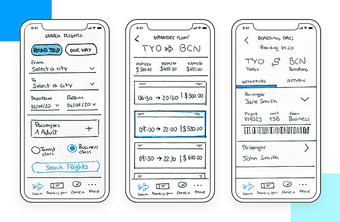
- Start with low-fidelity prototypes: Low-fidelity prototypes allow you to quickly test and iterate on your design without investing too much time or resources. This can include sketches, wireframes, or even paper prototypes.
- Focus on key interactions: When designing your prototype, focus on the key interactions that are most important for your users. This might include navigation, form submissions, or specific user tasks.
- Test early and often: The earlier you can start testing your prototype, the better. This allows you to identify issues and make changes before investing too much time or resources in the design.
- Get feedback from a diverse group of users: To ensure that your design is accessible and usable by a wide range of users, it’s important to get feedback from a diverse group of testers.
Incorporating Feedback into Your Design
Once you’ve completed your user testing, it’s time to incorporate the feedback into your design. This might involve making small tweaks or more significant changes to your design.
It’s important to keep in mind that feedback is a valuable tool for improving your design, and you should be open to making changes based on the feedback you receive.
Integrating prototyping and user testing in the UI design process enables designers to fine-tune their designs and develop an interface that genuinely caters to the user’s requirements.
Bibliography
- “Don’t Make Me Think, Revisited: A Common Sense Approach to Web Usability”, Steve Krug, 2014, New Riders.
- “Designing Interfaces: Patterns for Effective Interaction Design”, Jenifer Tidwell, 2010, O’Reilly Media.
- “The Elements of User Experience: User-Centered Design for the Web”, Jesse James Garrett, 2010, Peachpit Press.
- “Seductive Interaction Design: Creating Playful, Fun, and Effective User Experiences”, Stephen Anderson, 2011, New Riders.
- “Designing for Interaction: Creating Smart Applications and Clever Devices”, Dan Saffer, 2009, New Riders.
Build Apps with reusable components, just like Lego
Bit’s open-source tool help 250,000+ devs to build apps with components.
Turn any UI, feature, or page into a reusable component — and share it across your applications. It’s easier to collaborate and build faster.
Split apps into components to make app development easier, and enjoy the best experience for the workflows you want:
→ Micro-Frontends
→ Design System
→ Code-Sharing and reuse
→ Monorepo
Recommend
About Joyk
Aggregate valuable and interesting links.
Joyk means Joy of geeK