

Dot Plots in Tableau
source link: https://datavis.blog/2023/02/28/dot-plots-in-tableau/
Go to the source link to view the article. You can view the picture content, updated content and better typesetting reading experience. If the link is broken, please click the button below to view the snapshot at that time.

Dot Plots in Tableau

Dot plots are a space efficient way to compare values within one category split by a secondary category.
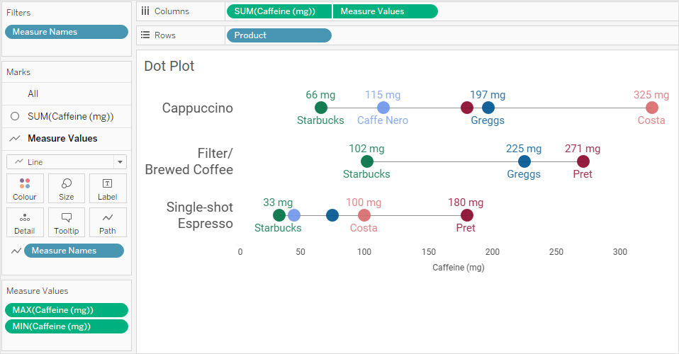
The clustered bar chart below compares levels of caffeine in cups of coffee from five different outlets (where data is available) across three different types of coffee: Cappuccino, Filtered and Single-shot Espresso.
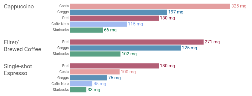
I’ve omitted the x-axis as every bar is labelled.
The bar chart does its job well. It’s easy to compare values across outlets for each category of coffee. In the Cappuccino category, Starbucks has the lowest level of caffeine and Costa has the highest (five times more, in fact!).
However, those 13 bars do bring a lot of digital ink with them.
It’s also slightly cumbersome to compare across categories. For example, what are the caffeine levels for the three Starbucks drinks or the three Greggs drinks and how do they compare? It is possible to make that comparison, of course, but I find it takes more energy, traversing over all the other bars that are ‘in the way’.
This is where a dot plot can help. It essentially overlaps all the bars within each category and then just keeps the ends of the bars:
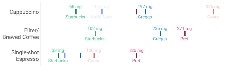
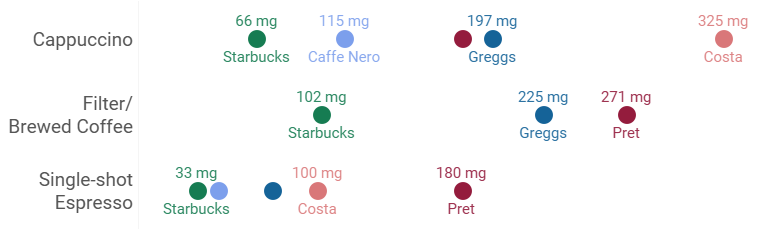
In the above form, it’s actually a strip plot. To turn it into a dot plot we change the marks from lines into dots:
Finally, to make it clear which dots are related within each category, the dots are connected with a line:
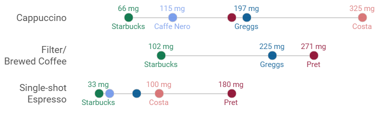
Now comparing the three Starbucks’ values across categories is easier and there’s no negative effect in comparing values across outlets within the same category. Where that second comparison could become an issue is if they have the same or very similar values, in which case, you can look at jittering the marks slightly or using some level of transparency and adding labelling. As always, it will depend on your data and use case.
Another advantage of dot plots (which isn’t relevant in the above example) is that if all your values are large, you don’t need to keep all the dots (previously bar ends) out to the right. Bars need to all have a zero baseline but dot plots do not – the axis can start from a non-zero value, so the dots can be more spaced out making the differences between them easier to discern.
For a recent #MakeoverMonday challenge, I used the above chart with some extra formatting and an image for context. I also extended the connecting line to display across the full width of the chart, mostly for aesthetic purposes. Here’s the final visual:

Workbook
You can interact with or download the workbook from my Tableau Public profile.
View Construction
The screenshot, below, shows the arrangement of pills in Tableau to create the standard dot plot shown earlier:
I’ll make a step-by-step video guide on making the above chart in Tableau soon, which I’ll add to my YouTube channel when complete.
Thanks for reading,
Marc
Latest YouTube video
This video demonstrates combining Cloudinary’s dynamic image creation service with Tableau’s new Image Role feature.
Recommend
About Joyk
Aggregate valuable and interesting links.
Joyk means Joy of geeK