

Ultimate guide to auto layout in Figma
source link: https://uxplanet.org/ultimate-guide-to-auto-layout-in-figma-3e4c226a3067
Go to the source link to view the article. You can view the picture content, updated content and better typesetting reading experience. If the link is broken, please click the button below to view the snapshot at that time.

Ultimate guide to auto layout in Figma

Interface design is one of the super important tasks in the product development lifecycle. In recent years, Figma has become immensely popular among the designers. Those who have already worked (or are working) in the industry are aware how challenging it can be to communicate with developers and ensure that their designs are implemented pixel-perfect. Figma has been consistently introducing amazing features that bridge the gap between designers and developers, and facilitate the creation of feasible designs. Auto layout is one of the many really exciting things about Figma that makes this possible. However, for designers who do not have an expertise on the technical side, it can be tricky to figure out auto layout. If you are the one who struggles with auto layout, this article is for you.
Note: Though auto layout is applicable for Android and iOS development as well, I am going to provide examples relating to web development in this article.
What is auto layout and why do we need it?
Auto layout is a feature in Figma that gives you specific tools and controls over a frame to arrange the elements inside the frame and maintain a consistent relationship between them.
To appreciate the importance of auto layout, we need to understand how interfaces are developed. Most interfaces today are developed using some frontend framework, which allows developers to define specific properties on the UI elements. For example, color, width, height, and position are just a few of the several available properties to play with.
One of the crucial aspects about interface design is how the elements are placed on the page. To make the products work across multiple devices with difference screen sizes and resolutions, developers usually assign a relative position to the UI elements. This means that the elements are positioned relative to other elements. This ensures that changes in one element do not impact the other elements of the page. For instance, if a button is placed below a textbox at a distance of 20px using relative positioning, the button will continue to remain below the textbox at a distance of 20px even if the size of the textbox changes. This relationship between the button and the textbox is dictated by the relative positioning set on them, which is applied using some specific properties or parameters. Auto layout simply translates these properties for designers so that they can use them in their designs and define the relationships between elements.
CSS properties
Cascading Style Sheets (CSS) governs how the interface looks on the web, and provides several properties that can be assigned to interface elements. Here are some of the CSS properties that are essential to understanding the auto layout.
Display
This property sets the way a parent container will arrange its child elements. Though display can take many values, we just need to understand two of them.
display: block on a parent container stacks its child elements vertically.

display: flex on a parent container stacks its child elements horizontally.

Height and width
These two properties, obviously, set the size of the elements. Depending upon how they are used, these properties can give us pretty interesting results, as CSS allows multiple values to be assigned to them.
height: 60px or width: 60px will set the height or width of the element to 60px. Any other numerical value can be assigned.

height: 100% or width: 100% will set the height or width of the element to 100% of the space available to the element. Any other percentage can be assigned. For example, if a parent element has a width of 400px, and the only child has its width set to 100%, then this child element will occupy all the space available to it, i.e., 400px. However, if this parent has two child elements with both of them having width: 100%, then each one of them will have a width of 200px.
Note: Figma equivalent of setting width or height to 100% is “fill container”.

Flex-direction
This property sets the direction in which the child elements will be stacked inside a parent container. This property is used when display is set to flex. Though flex-direction can take many values, we just need to understand two of them.
flex-direction: column on a parent container stacks its child elements vertically.
flex-direction: row on a parent container stacks its child elements horizontally.
Note: display: flex and flex-direction: column together achieve the same results as display: block alone.
This property sets the gap or spacing between the child elements inside a parent container. For example, gap: 20px set on a parent container will ensure that all child elements are spaced with a distance of 20px between them.
Note: Only a fixed numerical value can be assigned to the gap property. However, on assigning a specific value to the justify-content property, gap becomes dynamic. (discussed below in the article)
Align-items
This property governs how the child elements are aligned with respect to the parent container, perpendicular to the flex-direction.
align-items: flex-start on a parent container aligns the child elements to the beginning of the flex container (parent), depending on the flex-direction.
align-items: center on a parent container aligns the child elements to the center of the flex container (parent), depending on the flex-direction.
align-items: flex-end on a parent container aligns the child elements to the end of the flex container (parent), depending on the flex-direction.

Justify-content
This property governs the spacing between the child elements inside a parent container along the flex-direction. This property is typically useful when the parent element is bigger in size than the combined size of the child elements along with flex-direction.
justify-content: space-between on a parent container positions its child elements such that the spacing along the flex-direction between all the elements is equal, and dynamic. This means that the gap changes depending on the size of the parent container, but still remains equal between all the child elements.

There are many other values that can be assigned to this property, but for now, this is enough for us to understand auto layout in Figma.
Using auto layout in Figma
Now that we have looked at the relevant CSS properties, let us see how to use the auto layout in Figma, and understand how everything relates to the CSS properties.
By default, auto layout is not applied to any frame in Figma. To enable auto layout, select a frame, and click the plus icon corresponding to auto layout option in the right-hand toolbar.

Once auto layout is enabled, the right-hand toolbar is updated with new controls that can be used to change the properties of the auto layout.

Each control in the auto layout panel of the right-hand toolbar translates to an equivalent property in CSS.


To view how the developers will use an auto layout enabled frame and translate it into CSS code, click on the inspect tab at the top of the right-hand toolbar.

Some common auto layouts
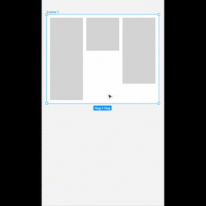
In this section, I present to you visual representations of some of the commonly used combination of properties to create auto layouts that are used frequently, along with their CSS code snippets.
display: flex;
flex-direction: row;
align-items: flex-start;
padding: 20px;
gap: 20px;

display: flex;
flex-direction: row;
align-items: center;
padding: 20px;
gap: 20px;

display: flex;
flex-direction: row;
align-items: flex-end;
padding: 20px;
gap: 20px;

display: flex;
flex-direction: column;
align-items: flex-start;
padding: 20px;
gap: 20px;

display: flex;
flex-direction: column;
align-items: center;
padding: 20px;
gap: 20px;

display: flex;
flex-direction: column;
align-items: flex-end;
padding: 20px;
gap: 20px;
Applying justify-content: space-between

display: flex;
flex-direction: row;
justify-content: space-between;
align-items: flex-start;
padding: 20px;
gap: 20px;

display: flex;
flex-direction: row;
justify-content: space-between;
align-items: center;
padding: 20px;
gap: 20px;

display: flex;
flex-direction: row;
justify-content: space-between;
align-items: flex-end;
padding: 20px;
gap: 20px;

display: flex;
flex-direction: column;
justify-content: space-between;
align-items: flex-start;
padding: 20px;
gap: 20px;

display: flex;
flex-direction: column;
justify-content: space-between;
align-items: center;
padding: 20px;
gap: 20px;

display: flex;
flex-direction: column;
justify-content: space-between;
align-items: flex-end;
padding: 20px;
gap: 20px;
Conclusion: auto layout is powerful!
With this elaborate guide, I have explained the relevant CSS concepts and related them to auto layout in Figma. Auto layout simplifies our work and gives us so much control and power over the layout. Auto layout is not complex, it just needs a little bit of familiarity before it can seem simple. And trust me, once you get a hang of it, there’s no going back!
Happy designing :)
Recommend
About Joyk
Aggregate valuable and interesting links.
Joyk means Joy of geeK