

Matplotlib 系列:手动设置时间序列折线图的刻度
source link: https://zhajiman.github.io/post/matplotlib_time_tick/
Go to the source link to view the article. You can view the picture content, updated content and better typesetting reading experience. If the link is broken, please click the button below to view the snapshot at that time.

Matplotlib 系列:手动设置时间序列折线图的刻度
Matplotlib 中画折线图用 ax.plot(x, y),当横坐标 x 是时间数组时,例如 datetime 或 np.datetime64 构成的列表,x 和 y 的组合即一条时间序列。Matplotlib 能直接画出时间序列,并自动设置刻度。下面以一条长三年的气温时间序列为例:
import numpy as np
import pandas as pd
import matplotlib.pyplot as plt

df = pd.read_csv('test.csv', index_col=0, parse_dates=True)
series = df.loc['2012':'2014', 'T']

fig, ax = plt.subplots(figsize=(10, 4))
ax.plot(series.index, series)
ax.set_ylabel('Temperature (℃)')

print(ax.xaxis.get_major_locator())
print(ax.xaxis.get_major_formatter())
<matplotlib.dates.AutoDateLocator object at 0x000001AC6BF89A00>
<matplotlib.dates.AutoDateFormatter object at 0x000001AC6BF89B20>
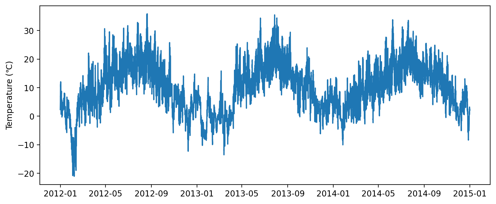
打印 x 轴的属性发现,Matplotlib 默认为时间序列设置了 AutoDateLocator 和 AutoDateFormatter,前者会自动根据 ax 的时间范围在 x 轴上选出位置、数量和间隔都比较合适的刻度,后者会自动根据主刻度的间隔,将刻度格式化为合适的样式。以上图为例,Matplotlib 自动选择了间隔 4 个月的刻度,刻度标签的字符串呈 YYYY-MM 的格式。
虽然自动刻度很方便,但如果想像上图一样调整刻度间隔,追加小刻度,并修改刻度标签格式,就需要手动设置刻度。本文的目的就是介绍手动修改时间刻度的方法,内容主要分为三点:
- 了解 Matplotlib 处理时间的机制。
- 运用
matplotlib.dates模块里提供的工具设置刻度。 - 解决 Pandas 时间序列图的问题。
本文基于 Matplotlib 3.6.2 和 Pandas 1.5.1。
Matplotlib 处理时间的机制
matplotlib.dates(后简称 mdates)模块里有两个函数:date2num 和 num2date。前者能将一个 datetime 或 np.datetime64 对象转换成该对象离 1970-01-01T00:00:00 以来的天数(注意不是秒数),后者则是反过来转换。当 ax.plot 接受时间类型的 x 时,会在内部创建一个 mdates.DateConverter 对象,对 x 的每个元素调用 date2num,将其转换成表示天数的浮点型一维数组。Matplotlib 在内部便是以这种浮点数的形式存储时间的。下面验证一下这点:
x0, x1 = ax.get_xlim()
origin = '1970-01-01 00:00'
t0 = pd.to_datetime(x0, unit='D', origin=origin)
t1 = pd.to_datetime(x1, unit='D', origin=origin)
print(x0, t0)
print(x1, t1)
15285.200347222222 2011-11-07 04:48:30
16490.792708333334 2015-02-24 19:01:30
其中 pd.to_datetime 可以直接换成 num2date。所以后续在 ax 上画新线条时,使用时间类型或浮点类型的 x 都可以。
此外,在脚本开头 import pandas 时,Pandas 会将一些额外的 Converter 注入到 Matplotlib 中,使之能够识别 pandas.Timestamp 和 pandas.DatetimeIndex 等类型的 x。
使用 matplotlib.dates 提供的工具
除引言里提到的 AutoDateLocator 和 AutoDateFormatter 外,mdates 还提供其它规则的 Locator 和 Formatter。以设置月份刻度的 MonthLocator 为例:
dates.MonthLocator(bymonth=None, bymonthday=1, interval=1, tz=None)
其中 bymonth 参数可以是表示月份的整数,或整数构成的列表,默认值是 1 - 12 月。MonthLocator 会在 ax 的 x 轴显示范围间生成一系列间隔为 interval 个月的 datetime 对象,它们的日由 bymonthday 指定,时分秒都为 0。从中挑选出月份跟 bymonth 匹配的对象,调用 date2num 函数作为最后的刻度值。因为内部实现用的是 dateutil.rrule.rrule,所以参数也是与之同名的。例如 MonthLocator() 的效果就是在每年每月 1 号 00:00:00 的位置设置一个刻度,那么一年就会有 12 个刻度。MonthLocator(bymonth=[1, 4, 7, 10]) 就是在每年 1、4、7 和 10 月设置刻度。
除此之外 mdates 里还有 YearLocator、DayLocator、WeekDayLocator、HourLocator 等,原理和参数跟 MonthLocator 类似,就不多介绍了。
接着以 DateFormatter 为例:
class matplotlib.dates.DateFormatter(fmt, tz=None, *, usetex=None)
原理非常简单,就是对刻度值 x 调用 num2date(x).strftime(fmt),得到刻度标签。例如取 DateFormatter(fmt='%Y-%m'),就能让刻度标签呈 YYYY-MM 的格式。
此外我们知道,如果直接向 ax.xaxis.get_major_formatter 传入一个参数为 x 和 pos 的函数,就相当于用这个函数构造了一个 FuncFormatter。所以可以简单自制一个只在每年 1 月标出年份的 Formatter:
def format_func(x, pos=None):
    x = mdates.num2date(x)
    if x.month == 1:
        fmt = '%m\n%Y'
    else:
        fmt = '%m'
    label = x.strftime(fmt)

    return label
所以引言里的效果可以用下面的代码实现:
import matplotlib.dates as mdates

ax.xaxis.set_major_locator(mdates.MonthLocator([1, 4, 7, 10]))
ax.xaxis.set_minor_locator(mdates.MonthLocator())
ax.xaxis.set_major_formatter(format_func)
Pandas 时间序列图
Pandas 的 Series 和 DataFrame 对象自带 plot 方法,默认以 Matplotlib 为后端画图。以气温时间序列的第一年为例:
subset = series.loc['2012-01':'2012-12']
ax = subset.plot(figsize=(10, 4), xlabel='')

print(ax.xaxis.get_major_locator())
print(ax.xaxis.get_major_formatter())
<pandas.plotting._matplotlib.converter.TimeSeries_DateLocator object at 0x000002639E7AD970>
<pandas.plotting._matplotlib.converter.TimeSeries_DateFormatter object at 0x000002639E793CD0>
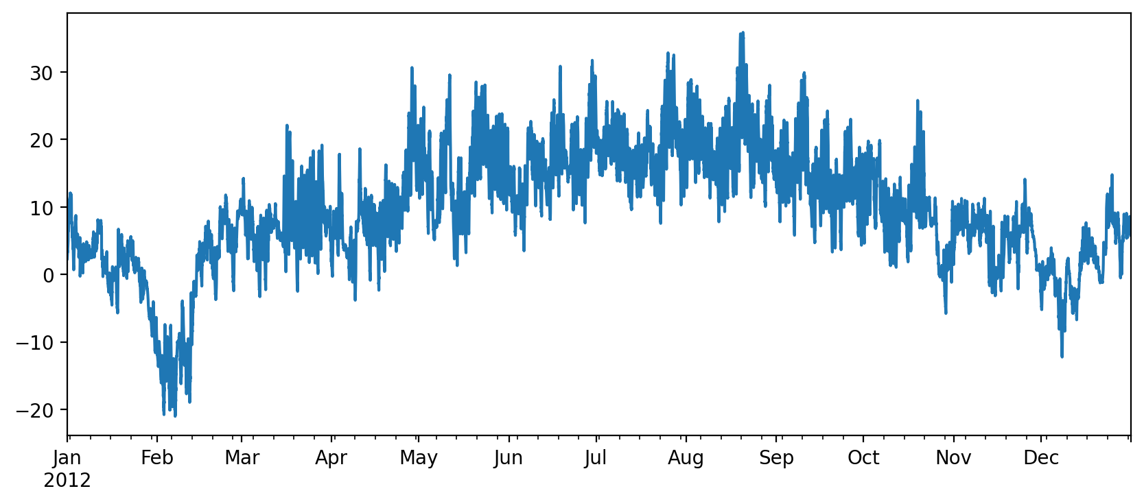
跟用 ax.plot 来画的一个区别是,Pandas 默认给 x 轴设置了自己实现的 TimeSeries_DateLocator 和 TimeSeries_DateFormatter。效果如上图所示,自动选取逐月刻度,以英文缩写标注月份,并且只在一月标注年份。但再仔细看,小刻度咋像乱标的。因此尝试修改 Locator 和 Formatter:
ax.xaxis.set_major_locator(mdates.MonthLocator())
ax.xaxis.set_minor_locator(mticker.NullLocator())
ax.xaxis.set_major_formatter(mdates.DateFormatter('%M'))
结果是……刻度全部消失了。检查一下浮点数范围:
x0, x1 = ax.get_xlim()
print(x0, mdates.num2date(x0))
print(x1, mdates.num2date(x1))
ValueError: Date ordinal 22089600.0 converts to 62449-04-09T00:00:00.000000 (using epoch 1970-01-01T00:00:00), but Matplotlib dates must be between year 0001 and 9999.
喜提 ValueError,说浮点数作为时间来说出界了。随后检查发现,x 轴坐标的单位是距 1970-01-01T00:00:00 的分钟数,无怪乎 mdates 里的 Locator 和 Formatter 都失效了。猜测原因是 Pandas 的 plot 虽然也会将时间转换成浮点数,但单位会根据时间的频率(即 freq)发生变化,所以 Pandas 也为其准备了特制的 Locator 和 Formatter。解决方法也很简单,如果你不满意 Pandas 自动刻度的效果,就直接用 ax.plot 来画,再使用 mdates 里的工具。具体代码见上一节。
Matplotlib 用天数的浮点数表示时间,方便内部数值计算。需要按逐月等规则设置刻度时,再在浮点数和时间对象之间来回转换。matplotlib.dates 中提供了定位和修饰时间刻度的工具,配合 Pandas 使用时可能会有冲突。
Recommend
About Joyk
Aggregate valuable and interesting links.
Joyk means Joy of geeK