

Unlimited Guide to Dynamic Island
source link: https://uxplanet.org/unlimited-guide-to-dynamic-island-48700ecc094f
Go to the source link to view the article. You can view the picture content, updated content and better typesetting reading experience. If the link is broken, please click the button below to view the snapshot at that time.

Unlimited Guide to Dynamic Island
Learn to Use Dynamic Island as a UI/UX Design

Recently, I got a project from a client. It was a cloud storage app for iOS. He is kind of techy, so he asked me to create a design where he wanted to show the user the file upload size, file name, and percentage inside Dynamic Island.
To be honest, I didn’t even know how to design one, so I started learning about it, and this is the summary of what I learned about Dynamic Island.
I hope this article has helped you learn more about dynamic islands and, eventually, how to create your own.
What is Dynamic Island?
If you’re not that techy, let me explain it to you. It’s a replacement for the iPhone Notch. It makes the dull notch look sexy.
Watch this video to Learn MoreUses of Dynamic Island
Apple has implemented Dynamic Island well for many stock apps. The important thing is that Apple also provides a Dynamic Island API, which allows normal people, and developers to create an app that supports Dynamic Island.
To learn more read the article by Niels Boey (Linked Below)
Some of the uses I have found recently trending on the internet.
- Air Pods connection and battery status
- iPhone charging status
- Low battery alert
- Incoming calls
- Ongoing call durations
- Media playback for music and podcasts
- Active timers
- Screen Recording
- Voice Memo Recordings
- Directions from Apple Maps
- Personal Hotspot connections
- Live Activity Sports scores
We'll talk about some of them at the end, so stay tuned.

Why Should You Try It as a UX/UI Designer?
Firstly, it’s from Apple, so it’s a big deal. Apple is an industry leader. Some small smartphone companies follow it blindly; others have to follow it to compete with the market.
The signs are there; Realme is also launching its Realme Islandfor Android, and it can be a big thing in a year or two. Learning it might help.
Secondly, it makes your portfolio look good in the eyes of clients, they might not know if Dynamic Island is good to use or not for them, but seeing a design with Dynamic Island in your portfolio will impress them.
Thirdly, the under-display camera technology is still in progress. So, I think DI (Dynamic Island) will stay here for a long time. So it’s better to learn it.
Learn to Design
I started learning about Dynamic Island from Apple’s Human Interface Guidelines, and there I learned some tips for designing and using it, as well as dimensions you should know when designing.
I also watched some YouTube videos where I learned about prototyping. Let’s take them one by one.
A) Types of Dynamic Island
B) Sizes and Dimensions
C) Tips to Design Dynamic Island Better
Types of Dynamic Island
As the name suggests, Dynamic Island is dynamic, which means it has various states. Dynamic Island comes in various types; for one app, it’s compact; for two or more apps, it’s minimal; and to show you more information, it can also expand and show other content in it.
Let’s see them in detail and understand their function briefly.
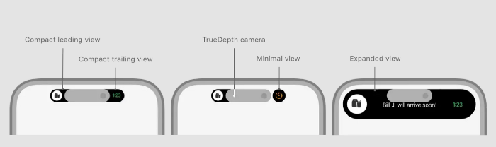
Compact Island
As the name suggests, this dynamic island is compact and has two sides to show content. The first side is known as "leading," and the second as "trailing."

The important thing is that they both don’t show different apps’ content, but both of them work together to show the content of the same app. For example, when using Apple Music, if you swipe up, the dynamic island will show the album’s image and sound waves, both of which show the content of one app.
Minimal Island

What if you’re using two apps that are DI-compatible? This is where the Minimal Dynamic Island comes into play; by using it, you can see two currently running apps in the Dynamic Island. The primary app will be shown in the first, bigger section, and the secondary app will be shown in the circle.
If you open the third app, you can see it by double tapping on the secondary app’s icon in the dynamic bar. It's a little complicated, but it's simple to learn.
Expanded View
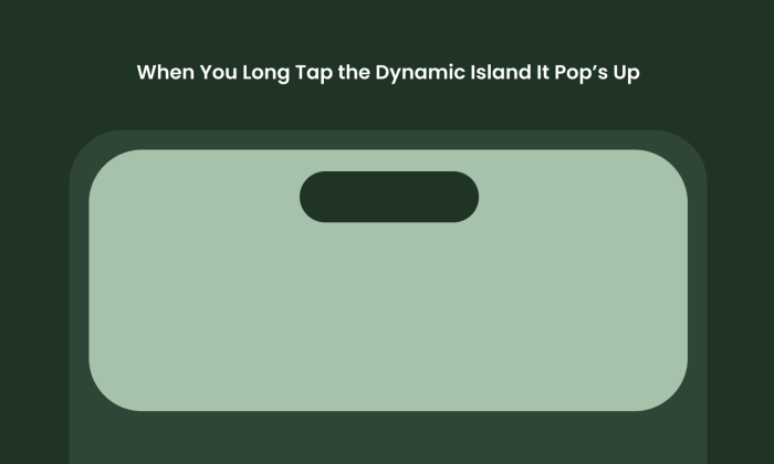
When you long-press Dynamic Island, you’ll see the app open up or expand to a bigger box, where you can see buttons, more information about the task, buttons, etc.
It’ll make your work easy.
Size Guidelines
Let's talk numbers: in order to design Dynamic Island, you must first understand its sizes and dimensions.
I researched some of the sizes for you to make this easy for your designers.
iPhone 14 Pro and iPhone 14 Pro Max
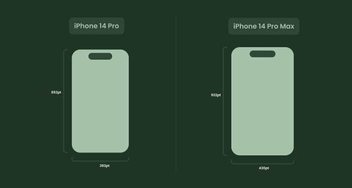
Currently, Dynamic Island is available in 2 screen sizes, and we are talking about the iPhone 14 Pro and 14 Pro Max. The screen size of both is shown above.
Compact Island Dimensions

Compact Island leading and trailing for the iPhone 14 Pro have 52 point (52.33 point) width and 37 point (36.64point) height, and iPhone 14 Pro Max has 62point (62.33point) width and 37point (36.64point) height.
Minimal Island Dimensions

There is no trailing in minimalism, only leading. The size for leading is the same as above. The main difference is in the circle alongside. The circle's diameter is 37 pt for both Pro and Pro max. The width of the circle can go up to 45pt.
Expanded View

Expanded view for the iPhone 14 Pro comes in two sizes: small with 84pt height and 371pt(width) and large with 160–192pt(height) and 371pt width.
And for the iPhone 14 Pro Max, it’s the same, but the difference is in the width, as the small one is 84pt(height) and 471pt(width), while the Large one is 160–192pt(height) and 371pt(width). That’s it.
Icons/Text Sizes

The inside of Dynamic Island is also important to know, the height size for the icons and images is good at 24pt with a Bounding Box that can be 2–4pt extra(depending on the icon or image).
For text, it’s best to stay at 14–15pt(font size)and with a line height of 22pt for better visibility. To learn more about the dimensions read the apple official guidelines on Dynamic Island
Tips to Design a Better Dynamic Island
There are many things about a small piece of software that I can’t teach you in this article, but I am trying to do my best, and I think these tips will help you understand and design Dynamic Island better.
#1 Be Inside the Safe Area

Why did Apple shift from Notch to Dynamic Island? Why not remove all the holes, notch, islands, etc.? The reason for it is their face scanning technology. There are many sensors and modules at the back of the screen, and they needed to be there to perform necessary scanning, which is why Apple can’t remove the notch. Therefore, they decided to make it powerful instead by using Dynamic Island.

Because there is no screen in the center of Dynamic Island, instead there are sensors, design with this in mind and leave some space from the center-top.
#2 Make Icons/Images Round

Making icons and images rounded will make things look better and smoother. It doesn’t hurt to have a square-shaped image, but having a circle-shaped icon or image mixes well with the rounded-shaped Dynamic Island.
#3 Avoid if Not Necessary

Use it with caution. Apple should have said it during their launch because Dynamic Island is not in a very good spot. Many people prefer using their smartphones with one hand, so it’s hard to go to the top of the screen to click, pause, or tap on Dynamic Island.
This is one of the reasons why many UX designers said it was bad UX by Apple, so I suggest you avoid it if you don’t really need it. If your app doesn’t require something like it, avoid it and don’t go with the trend unnecessarily.
Figma UI Kits
For all Figma users, I have great news: you can just download these UI kits and easily copy the dynamic island, which removes the hustle of drawing it from scratch. So let’s see some of the best Figma UI kits from the Community.
#1 Dynamic Island by Alejandro Ausejo
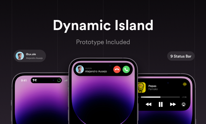
One of the best UI kits, with a pre-designed Dynamic Island that you can simply copy and paste and use; it's simple and easy to use, with a clear arrangement and a prototype included. Must Try.
Download:https://www.figma.com/community/file/1185284212197565174
#2 Dark and Light Mode Dynamic Island by Amirhosein Panahi

Simple UI Kit with Dark Mode and Light Mode Design, Try it, and if you find it better to use, stick with it. One good alternative kit.
Download:https://www.figma.com/community/file/1185284212197565174
Dynamic Island Variants by Artistic

UI Kit with 32+ variants of Dynamic Island, a must-try kit for designers to learn the uses of Dynamic Island in different cases.
Download:https://www.figma.com/community/file/1185284212197565174
Inspiration
At last, let’s see some cool inspirations I’ve found that show what the potential of Dynamic Island is and how this could be the next big thing.
#1 Zomato Food Delivery Notification by Chitransh Jain

Food delivery apps like Zomato can use Dynamic Island to show the timing for the order with an indication of arrival. As a regular Zomato user, I can say it’s so good. One of my favorite examples of Dynamic Island.
#2 Live Match Score with Dynamic Island by Happy Tri Milliarta

Cricket or football fans can not see who’s winning at the top of their screen without scrolling or opening the app. good for fans like me.
#3 Train Boarding Concept by Pontus Wellgraf

If you’re onboarding the train but don’t know the platform or the exact location of your seat, don’t worry; Dynamic Island is here. Of course, opening the real app is beneficial because you can see things in greater detail. But if the iPhone is locked and you want to see the quickly dynamic island, it's great to use.
#4 Lyft (Ride Notification)
Similar to the Delivery app, Lyft and Uber use Dynamic Island to display the estimated arrival time even when the iPhone is locked or the user is using another app. I personally love it.
#5 OffScreen (Time Tracking)

Time tracking like Pomodoro is easy with Dynamic Island, and more and more apps are enhancing the power of Dynamic Island. Offscreen(Real app)
#6 Hit the Island(Game)

Hit the Island (the real game) is an incredible use of the island in an enjoyable and entertaining way. It’s a good and enjoyable game that you must try if you have the iPhone 14 Pro or Pro Max. If not, don’t worry; focus on designing, and you’ll definitely have one by this year.
Stay Motivated.
Thanks for Reading
Thanks a lot for reading my detailed guide. I have put all my efforts into learning and writing this article over the past few days. I wanted to give you the best experience and opportunity to learn.
If you learned something about Dynamic Island from this article, don’t go without clapping. God is seeing you ;)
Subscribe here to get new articles delivered right to your inbox!
Follow me on Twitter for quick and insightful design tweets.
I'll see you soon. Keep Designing.
Recommend
About Joyk
Aggregate valuable and interesting links.
Joyk means Joy of geeK