

How to change Background Color of Button in SwiftUI
source link: https://sarunw.com/posts/swiftui-button-background-color/
Go to the source link to view the article. You can view the picture content, updated content and better typesetting reading experience. If the link is broken, please click the button below to view the snapshot at that time.

In this article, I will show you two ways to change the background color of a button based on how you create a button.
Button with Button Style
If you support iOS 15 and use
- Bordered (
.bordered) or - Bordered Prominent (
.borderedProminent) built-in style
You can easily change its background color by applying tint(_:) modifier.
In the following example, we set the tint color to pink.
Button("Button Label") {

}
.buttonStyle(.bordered)
.tint(.pink)

Button("Button Label") {

}
.buttonStyle(.borderedProminent)
.tint(.pink)
A Bordered button style uses the tint color for the text and the tint color with opacity for the background.
A Bordered Prominent button style automatically uses a tint color for its background color.
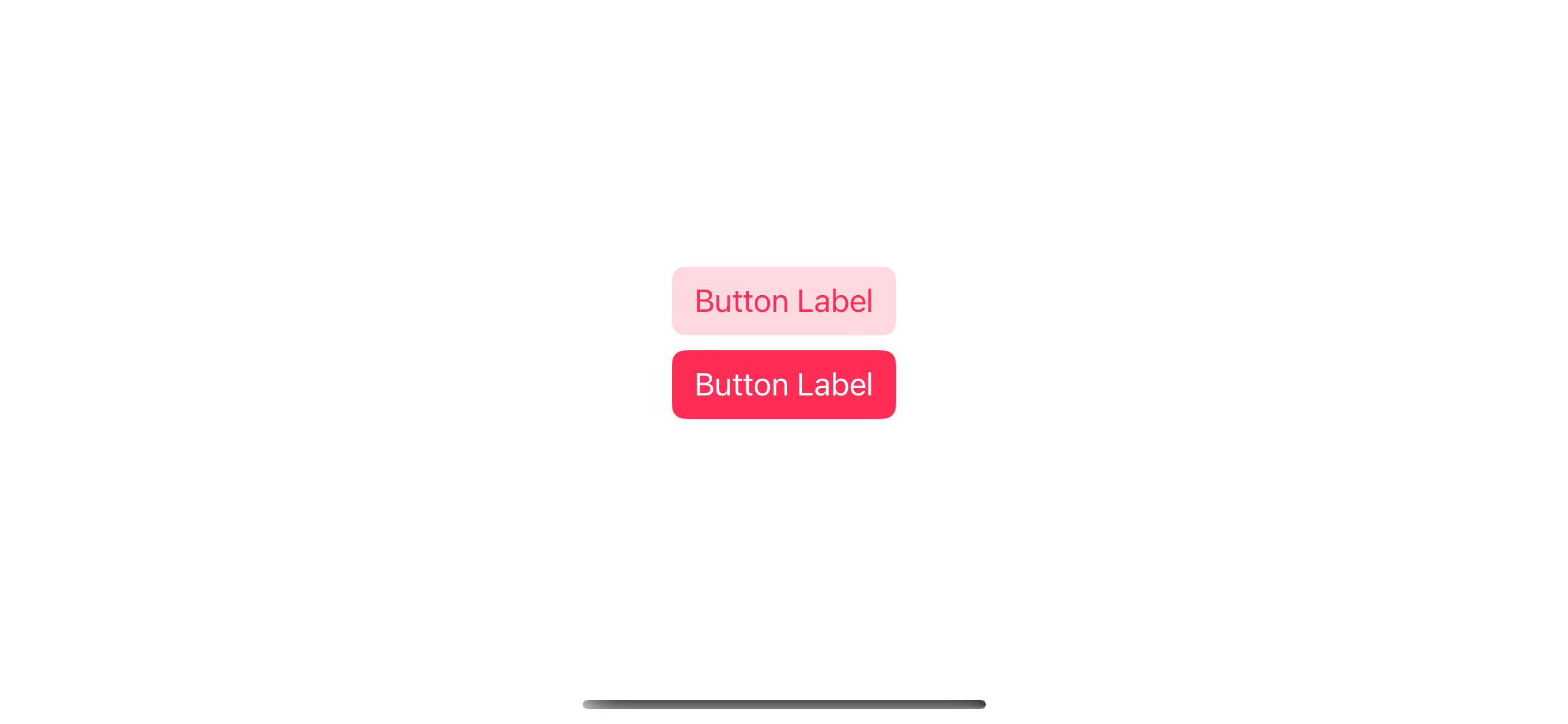
Use the tint modifier to change the background color for buttons with bordered or bordered prominent button styles.
Button with Custom Label view
If you have a button with a custom view for your label, you can set the background color using .background modifier.
Here is an example where I tried to replicate a bordered prominent style with my custom label.
Button(action: { }) {
    // 1
    Text("Button Label")
        .padding()
}
.foregroundColor(.white) // 2
.background(.pink) // 3
.cornerRadius(10) // 4
1 I use a simple text view as a label
2 Set text color to white with .foregroundColor(.white).
3 Set background color to pink with .background(.pink).
4 Set corner radius with .cornerRadius(10).
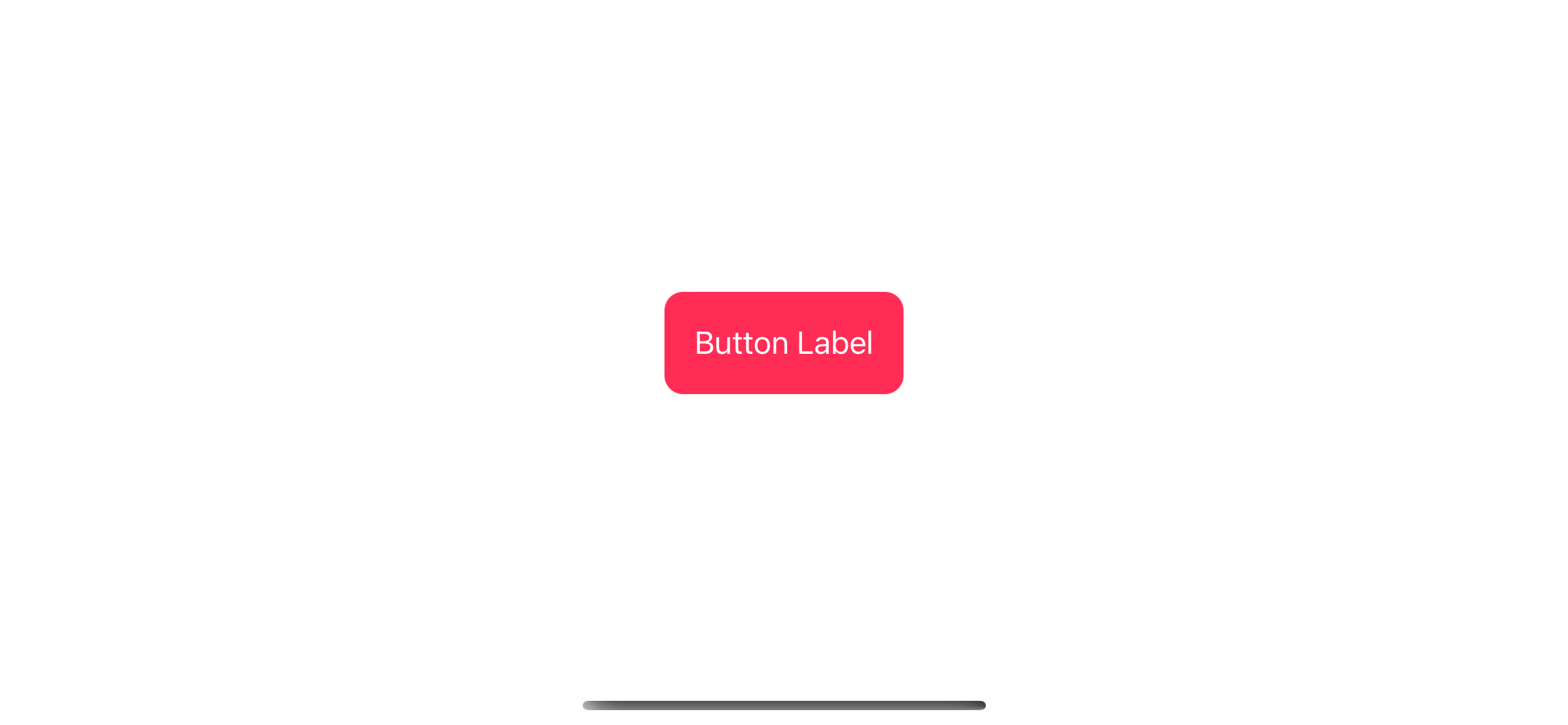
Use the background modifier to change the button's background color.
Caveat
The important thing you need to know when creating a custom button is a clickable area is the size of a button content.
In this case, it is Text("Button Label").padding(). So, the clickable area is as wide as the text and padding.
If you move the .padding() modifier outside the button label, your clickable area will be as small as the text.
Here is an example where I compare the two. I also add a blue border to show a clickable area.
VStack {
    Button(action: { }) {
        Text("Button Label")
            .padding()
            .border(.blue)
    }
    .foregroundColor(.white)
    .background(.pink)
    .cornerRadius(10)

Button(action: { }) {
        Text("Button Label")
            .border(.blue)
    }
    .padding()
    .foregroundColor(.white)
    .background(.pink)
    .cornerRadius(10)
}
As you can see, we can only click the second button when we click on the text.
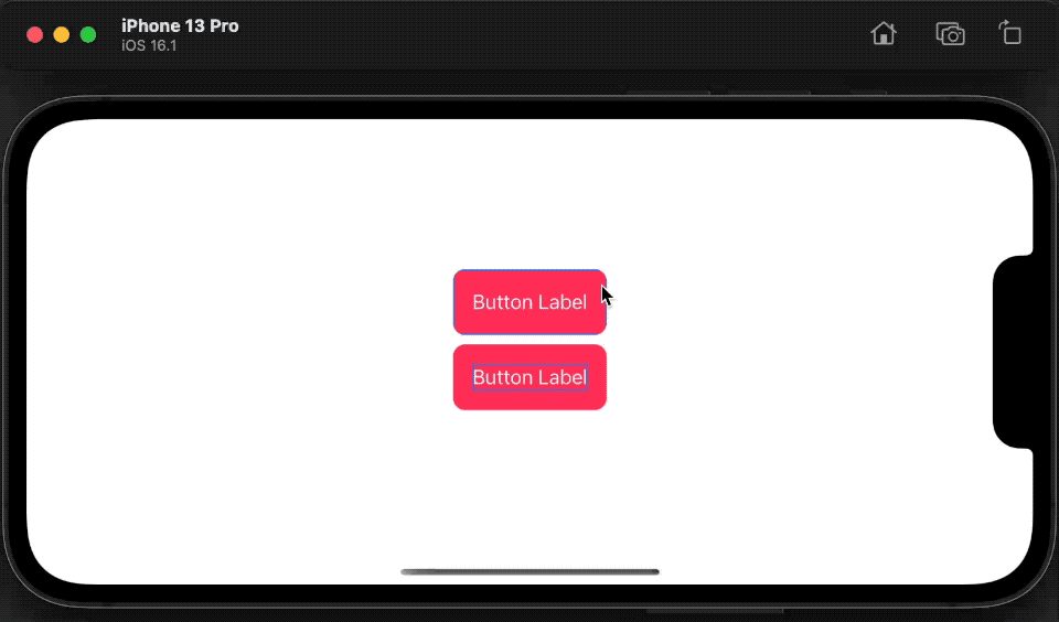
The clickable area of a button is as large as its content.
Recommend
About Joyk
Aggregate valuable and interesting links.
Joyk means Joy of geeK