

JS Animated Radar Chart With TypeScript and NodeJS
source link: https://dzone.com/articles/javascript-animated-radar-chart
Go to the source link to view the article. You can view the picture content, updated content and better typesetting reading experience. If the link is broken, please click the button below to view the snapshot at that time.

Today, I came back writing a short but helpful tutorial on how to create an animated JavaScript radar chart. This chart is also known as a web or spider chart. We will create the chart using TypeScript, NodeJS, and LightningChart JS library (lcjs).
What Is a Radar Chart?
This is a graphical method of displaying multivariate data as a two-dimensional chart with three or more quantitative variables presented on axes. Data lengths of spokes are proportional to the magnitude of the variable for each data point versus the maximum magnitude for the variable across all data points.
Generally, radar charts assist in decision-making by guiding us to the most trending properties. However, within a radar chart, we can have many properties that together form an observation object.
On a single chart, multiple polygons can be displayed by plotting multiple observations—for example, the abilities of an athlete: speed, strength, agility, etc.
The property with the lower tendency or value will help us to consider which athlete's ability should be improved in order to have a more balanced spectrum.
Animation in a Radar Chart
If you're looking for an exciting way to visualize data, you can't go wrong with additional JavaScript animation for the radar chart.
Radar charts are created by plotting multiple data points on a two-dimensional grid. The grid is then overlaid with a web of lines, with each line representing a different data point. This makes it easy to see how the different data sets relate to each other.
When you add animation to the mix, you can really bring your data to life. For example, animated radar charts can be used to show changes over time or to compare different data sets side by side.
These charts are also great for showing relationships between different variables. So if you're looking for an engaging way to visualize data, an animated radar chart is definitely worth considering.
Lets' now begin with our project.
Setting Up Our Template
1. To follow the tutorial, please download the .ZIP project from LightningChart's website.
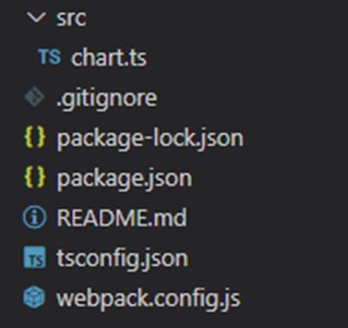
2. Once you have opened the project in Visual Studio, you will see a file tree like this:
3. Now, open up a new terminal
4. Run the npm install command, which is necessary for all NodeJS projects.
This concludes our initial setup. Let's code.
CHART.ts
Our chart, animations, and data formatting logic will be contained in this file.
1. Initially, we will have to declare the constant lcjs that will refer to our @arction/lcjs library, where we will pull the charts library from.
// Import LightningChartJS
const lcjs = require('@arction/lcjs')
2. Now you will need to extract the following (required) classes from the lcjs library:
const {
    lightningChart,
    SpiderWebMode,
    Themes
} = lcjs
3. Now, we create the CHART object.
const chart = lightningChart().Spider({
    theme: Themes.darkGold,
})
    .setTitle('Animated Radar Chart')
    .setAxisInterval(100)
    // Configure spider to be circular (like a traditional Radar Chart).
    .setWebMode(SpiderWebMode.Circle)
Parameters:
- setTitle: defines the text label that will display as the title of the chart.
- setAxisInterval: defines the interval between each of the axes within the chart.
- Theme: by default, a collection of color themes can be accessed within the library. Notice that the color themes must be declared when the chart is created and cannot be changed afterward, as this would destroy the visualization and will require rebuilding the component.
- setWebMode: it sets the mode of the SpiderCharts web and its background.
const series = chart.addSeries()4. Create the LineSeries object.
This is a method for adding a new LineSeries to the chart. This series type visualizes a list of Points (pair of X and Y coordinates) with a continuous stroke.
Notice: the LineSeries component is optimized for handling massive amounts of data. A static dataset in the tens of millions range is rendered in a matter of seconds. When streaming data, even millions of data points can be streamed every second while retaining an interactive document.
For instance, when measuring three different line series performances on a high-end device (Ryzen 9 5900X, 64 GB, RTX 3080):
- Static line charts are capable to render more than 500 million data points.
- A threshold of 100 million data points loads up in 6.5 seconds.
- Refreshing line charts can handle more than two million data points at a refresh date of 10 Hz, overall using only 31% of CPU resources.
- Appending line charts may present up to 20 different live-streaming data channels. Totaling more than four million data points processed in real time. The FPS rate is 128 at an average CPU usage of 50%.
5. Adding properties to the series.
const categories = ['Category A', 'Category B', 'Category C', 'Category D', 'Category E']
series.addPoints(
    { axis: categories[0], value: 100 },
    { axis: categories[1], value: 100 },
    { axis: categories[2], value: 100 },
    { axis: categories[3], value: 100 },
    { axis: categories[4], value: 100 }
)
Here is where you enter the data. Each series will need the axis name and its value. You can store all these values in an array and just map all the members.
6. Updating values randomly.
Here is where we create the animated effect. To build the animated web effect, we need to update the values of each value. For instance, you can create a function that loads a JSON file with the source data and map that file.
In this case, we have a function that creates random numbers for each of the categories. To update the default value of each category, we need to use the function [addPoints].
Setup randomization of series values at regular intervals:
const randomizePoints = () => {
    for (const category of categories) {
        const value = Math.random() * 100
        series.addPoints({ axis: category, value })
    }
}
In this example, the [randomizePoints] function will be executed every two seconds by the [setInterval] function.
With the [setInterval] function, we are defining the axis scale interval. The first value will correspond to the series, and the second to the refresh time measured in milliseconds.
Running the Application
As usual, we will have to run the npm start command, which will provide the local host URL.
Follow the link and open the final application in your browser. Here is the final JS animated radar chart application.:
Need further help?
In case you need assistance with your code, send me a message. I'll be happy to help.
Recommend
About Joyk
Aggregate valuable and interesting links.
Joyk means Joy of geeK