

Monitor Power BI Premium Gen2 capacities with the Gen2 metrics app. - Power BI
source link: https://learn.microsoft.com/en-us/power-bi/enterprise/service-premium-gen2-metrics-app
Go to the source link to view the article. You can view the picture content, updated content and better typesetting reading experience. If the link is broken, please click the button below to view the snapshot at that time.

Use the Gen2 metrics app
- Article
- 12/12/2022
- 19 minutes to read
In this article
The Power BI Premium utilization and metrics app is designed to provide monitoring capabilities for Power BI Gen2 Premium capacities. Monitoring your capacities is essential for making informed decisions on how to best use your Premium capacity resources. For example, the app can help identify when to scale up your capacity or when to turn on autoscale.
When turning on autoscale, make sure there are no Azure policies preventing autoscale from working.
The app is updated often with new features and functionalities and provides the most in-depth information into how your capacities are performing.
To install the Gen2 metrics app, you must be a capacity admin. Once installed, anyone in the organization with the right permissions can view the app.
The Gen2 metrics app has six pages:
Overview
This page provides an overview of the capacity performance. It's divided into the three sections listed below.
At the top of each page, the CapacityID field allows you to select the capacity the app shows results for.
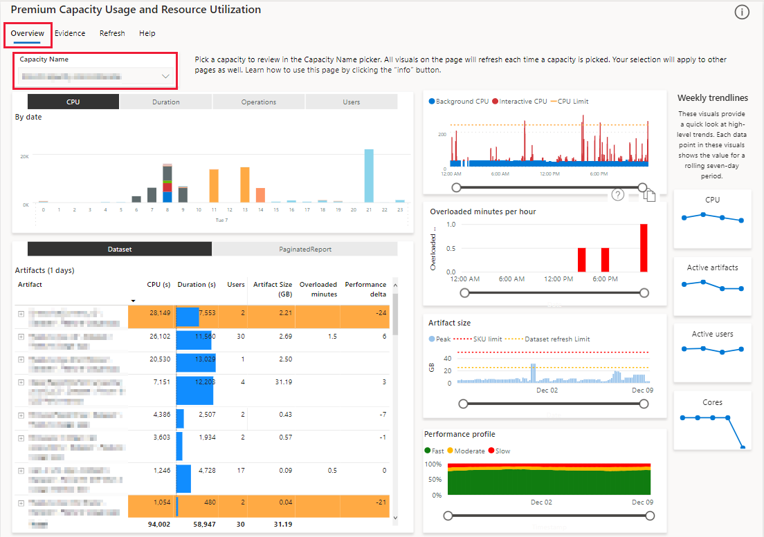
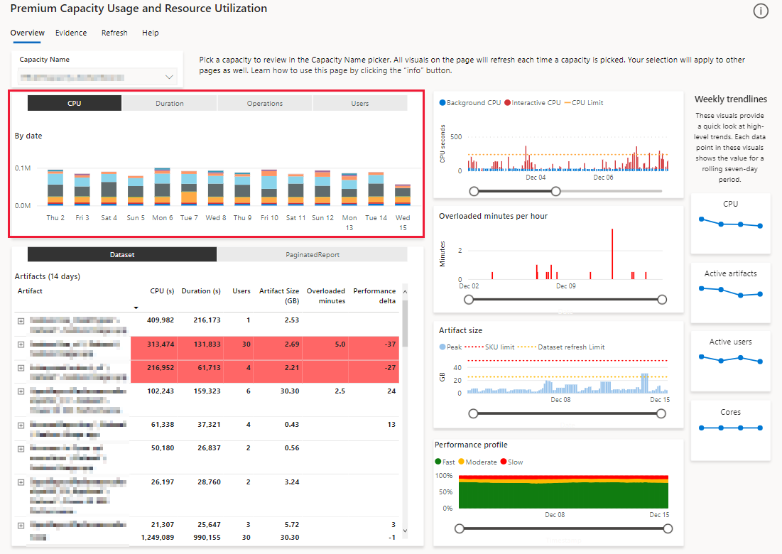
Artifacts
The artifacts section is made up of two visuals, one on top of the other, in the left side of the page. The top visual is a stacked column table, and below it is a matrix table.
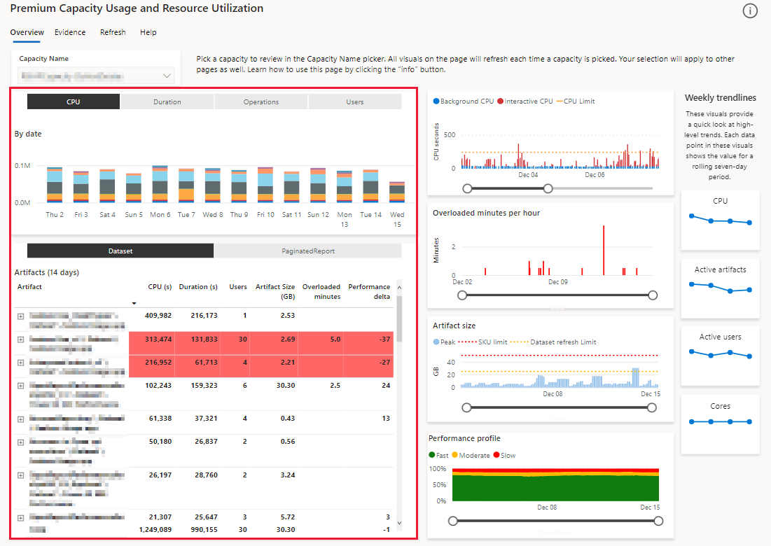
Multi metric column chart
A stacked column table that provides an hourly view of your capacity's usage. Drill down to a specific day to identify daily patterns. Selecting each stacked column will filter the main matrix and the other visuals according to your selection.
The Multi metric column chart displays the four values listed below. It shows the top results for these values per Power BI item during the past two weeks.
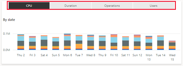
CPU - CPU processing time in seconds.
Duration - Processing time in seconds.
Operations - The number of Power BI operations that took place.
Users - The number of users that performed operations.
Matrix by artifact and operation
A matrix table that displays metrics for each Power BI item on the capacity.
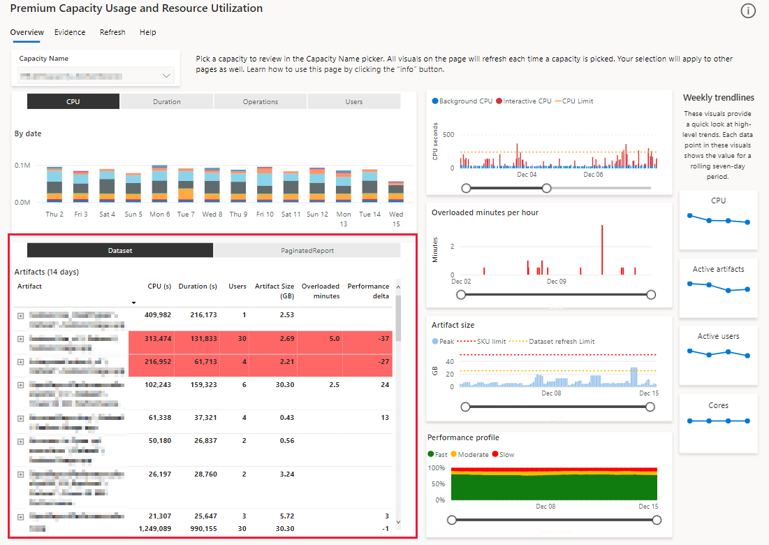
To gain a better understanding of your capacity's performance, you can sort this table according to the parameters listed below. The colors in the table represent your performance delta.
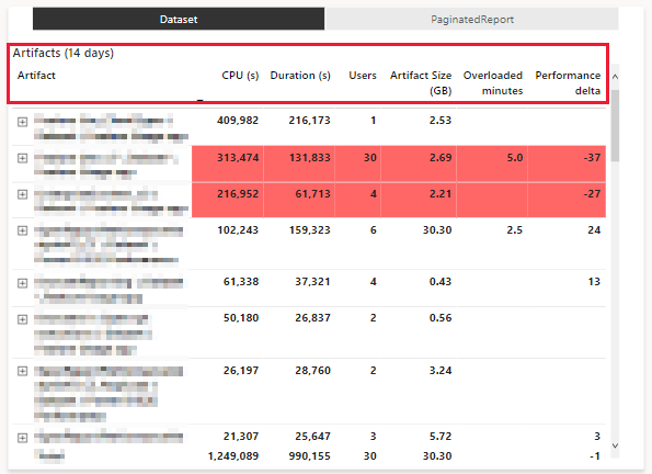
Artifacts - A list of Power BI items active during the selected period of time. The item name is a string with the syntax:
item name \ item type \ workspace name. You can expand each entry to show the various operations (such as queries and refreshes) the item performed.CPU (s) - CPU processing time in seconds. Sort to view the top CPUs that consumed Power BI items over the past two weeks.
Duration (s) - Processing time in seconds. Sort to view the Power BI items that needed the longest processing time during the past two weeks.
Users - The number of users that used the Power BI item.
Artifact Size - The amount of memory a Power BI item needs. Sort to view the Power BI items that have the largest memory footprint.
Overloaded minutes - Displays a sum of 30 seconds increments where overloading occurred at least once. Sort to view the Power BI items that were affected the most due to overload penalty.
Performance delta - Displays the performance effect on Power BI items. The number represents the percent of change from seven days ago. For example, 20 suggests that there's a 20% improvement today, compared with the same metric taken a week ago.
The colors in the matrix represent your performance delta:
- No color - A value higher than -10
- Orange - A value between -10 and -25
- Red - A value lower than -25
To create the performance delta Power BI calculates an hourly average for all the fast operations that take under 200 milliseconds to complete. The hourly value is used as a slow moving average over the last seven days (168 hours). The slow moving average is then compared to the average between the most recent data point, and a data point from seven days ago. The performance delta indicates the difference between these two averages.
You can use the performance delta value to assess whether the average performance of your Power BI items improved or worsened over the past week. The higher the value is, the better the performance is likely to be. A value close to zero indicates that not much has changed, and a negative value suggests that the average performance of your Power BI items got worse over the past week.
Sorting the matrix by the performance delta column helps identify datasets that have had the biggest change in their performance. During your investigation, don't forget to consider the CPU (s) and number of Users. The performance delta value is a good indicator when it comes to Power BI items that have a high CPU utilization because they're heavily used or run many operations. However, small datasets with little CPU activity may not reflect a true picture, as they can easily show large positive or negative values.
Performance
The performance section is made up of four visuals, one on top of the other, in the middle of the page.
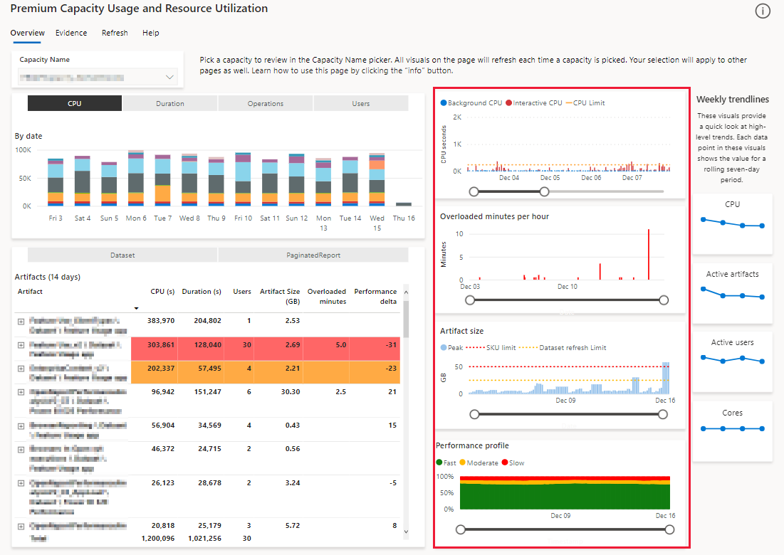
CPU over time
Displays the CPU usage of the selected capacity over time. Filters applied to the page in the Multi metric column chart, affect this chart's display as follows:
No filters applied - Columns display the peak timepoint per hour.
Filters are applied - The visuals displays every 30 second timepoint.
Peak is calculated as the highest number of seconds from both interactive and background operations.
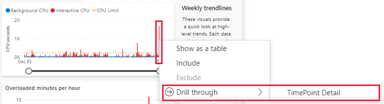
To access the Timepoint page from this visual, right-click an overloaded timepoint, select Drill through and then select TimePoint Detail.
The CPU over time chart displays the following elements:
Interactive CPU - Red columns represent the number of CPU seconds used during interactive operations in a 30 second period.
Interactive operations cover a wide range of resources triggered by Power BI users. These operations are associated with interactive page loads.
Background - Blue columns represent the number of CPU seconds used during background operations in a 30 second period.
Background operations cover Power BI backend processes that are not directly triggered by users, such as data refreshes.
CPU Limit - A yellow dotted line that shows the threshold of the allowed number of CPU seconds for the selected capacity. Columns that stretch above this line, represent timepoints where the capacity is overloaded.
Overloaded minutes per hour
Displays a score that represents the severity that overload had on the performance of a Power BI item. If no item is filtered, this chart shows the maximum value seen from all items at each load evaluation interval (30 seconds) in the past two weeks.
Artifact size
Displays the memory footprint recorded for Power BI items over time. If no item is filtered this chart shows the maximum value seen from all items at each ten minute time sample in the past two weeks.
Performance profile
Displays an aggregate of report performance across three operation categories:
Fast - The moving average of fast operations as a percentage of all the operations over time. A fast operation takes less than 100 milliseconds.
Moderate - The moving average of moderate operations as a percentage of all the operations over time. A moderate operation takes between 100 milliseconds to two seconds.
Slow - The moving average of slow operations as a percentage of all the operations over time. A slow operation takes over two seconds.
The aggregate is taken from the total number of operations performed on a Power BI item, over the past two weeks. If no item is filtered, this chart shows the performance profile for datasets on the entire capacity.
Weekly trendlines
The weekly trendlines section is made up of four visuals, one on top of the other, in the right side of the report. These visuals summarize the capacity's behavior over the past four weeks. This section is designed to provide a snapshot of your capacity, highlighting trends for the past four weeks.
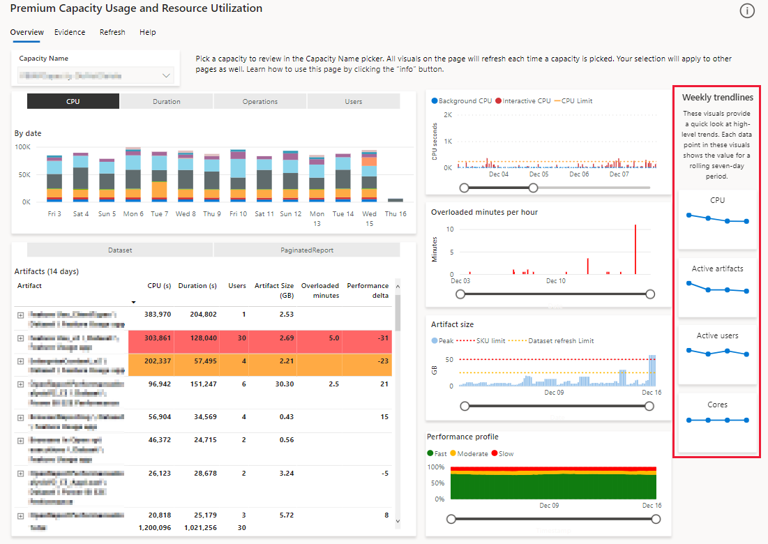
Displays the total CPU power your capacity consumed over the past four weeks. Each data point is the aggregated sum of CPU used for the past seven days.
Active Artifacts
Displays the number of Power BI items (such as reports, dashboards, and datasets) that used CPU during the past four weeks.
Active Users
Displays the number of users that used the capacity during the past four weeks.
Cores
Displays the number of cores used by the capacity in the past four weeks. Each data point is the maximum capacity size reported during that week. If your capacity used autoscaling or scaled up to a bigger size, the visual will show the increase.
Evidence
This page provides information about overloads in your capacity. You can use it to establish which Power BI items (such as reports, dashboards, and datasets) cause overload, and which items are affected by this overload.
This page only displays data when the capacity is overloaded.
When you detect a Power BI item that causes overload, you can either optimize that item to reduce its impact on the capacity, or you can scale up the capacity.
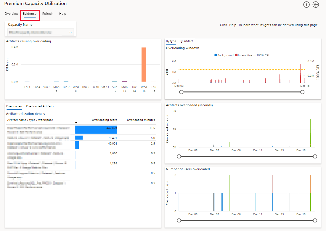
Artifacts causing overloading
You can visually identify the different Power BI items that cause overload, by using the timeline. Each day in the timeline displays items causing overload. Drill down to see an hourly timeline. The value shown is an aggregate of the CPU power consumed by artifacts when they overloaded the capacity.
Overloaders
Use this visual to identify the Power BI items that generate impactful overload events. This is shown as an Overloading score when you select the Overloaders pivot. The overloading score for an artifact is derived from the severity of an overload event, and how frequently the overload event occurred over the past 14 days. This score has no physical property.
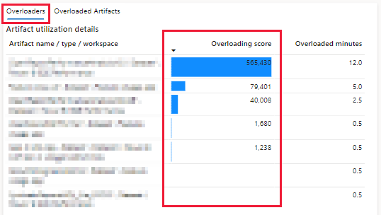
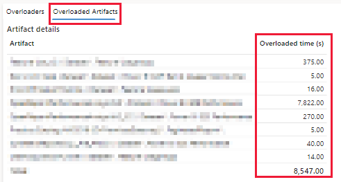
Switch to the Overloaded artifacts pivot to identify the items most affected by overload over the past 14 days. The overloading impact can affect either the item that's causing the overload, or other items that are hosted in the same capacity.
The Overloaded time (s) value is the amount of processing time that was impacted by an overload penalty. This value is shown for each affected item, over the past 14 days.
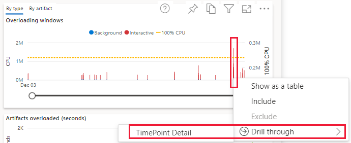
Overloading windows
Use this visual to understand whether overload or autoscale events happen due to a single Power BI item, or many items. Each Power BI item is given a different color.
Each column represents a 30 second window where CPU usage for the capacity exceeded allowance. The height of the column represents the amount of CPU used.
The 30 second CPU allowance is determined by the number of v-cores your capacity has. When autoscale is turned on, each added autoscale CPU adds 15 seconds to the allowance. When autoscale isn't turned on, or if autoscale is fully utilized, penalties are applied to interactive operations in the next 30 second window. You can see a visualization of these penalties in the Artifacts overloaded (seconds) chart.
To access the Timepoint page from this visual, right-click an overloaded timepoint, select Drill through and then select TimePoint Detail.
Artifacts overloaded (seconds)
Use this visual to understand whether overloading Power BI items impacts their own performance, or whether they produce a noisy neighbor problem by impacting the performance of other items. Each item is given a different color.
The column height represents the duration of operations subject to overload penalties, which occur when autoscale isn't turned on or used to its maximum.
Number of users overloaded
Use this visual to understand how widespread the impact of overload is. The visual will help you determine whether a single user is impacted by an overload event, or whether the overload event impacts multiple users.
The column height represents the number of distinct users affected when overload occurs.
Refresh
This page is designed to help you identify aspects concerning refresh performance such as refresh CPU consumption power.
You can get to a version of this page, dedicated to a specific Power BI item, using the drill through feature in one of the visuals that displays individual items. The visuals in the drill through version of the page are identical to the ones listed below. However, they only display information for the item you're drilling into.
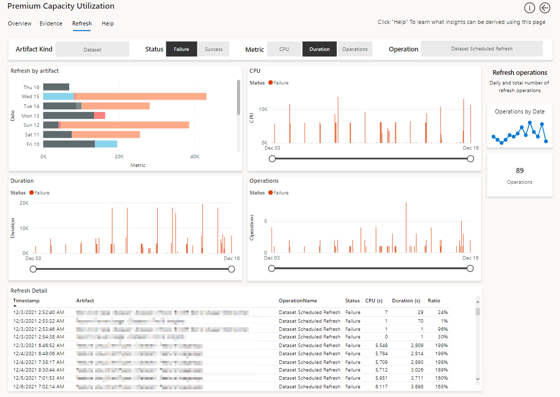
At the top of the page there's a multi-selection pivot allowing you to focus on refreshing the page according to the filters listed below. Each of these pivots filters all the visuals in the refresh page.

Artifact Kind - Filter the page by Power BI item type, such as report, dataset and dashboard.
Status - Filter the page by failed or successful operations.
Metric - Filter the page by one of the following:
CPU - CPU consumption
Duration - Operation processing time
Operations - Number of operations
Operation - Filter according to the type of operation selected.
Refresh by artifact
Displays the breakdown of the metric selected in the pivot at the top, in the past 14 days. These breakdowns can indicate which refresh optimization is more likely to reduce the capacity footprint or the data source load.
When you select CPU, you can identify whether to reduce the capacity footprint.
When you select Duration, you can identify which data source load to reduce.
Duration
Each column represents the number of seconds it took to compete a single operation per hour, over a 14 day period.
Each column represents the number of CPU seconds used to compete a single operation per hour, over a 14 day period.
Operations
Each column represents the number of seconds it took to compete a single operation per hour, over a 14 day period.
Refresh detail
A matrix table that describes all the metadata for each individual refresh operation that took place. Selecting a cell in the visual will filter the matrix to show specific events.
Scheduled and manual refresh workflows can trigger multiple internal operations in the backend service. For example, refreshes sometimes perform automatic retries if a temporary error occurred. These operations might be recorded in the app using different activity IDs. Each activity ID is represented as a row in the table. When reviewing the table, take into consideration that several rows may indicate an operation of a single activity.
The table has a Ratio column describing the ratio between CPU time and processing time. A low ratio suggests data source inefficiencies, where Power BI service is spending more time waiting for the data source, and less time processing the refresh.
Refresh operations
On the right side of the refresh page, there are two visuals designed to help you identify patterns.
Timeline - Displays the number of operations per day, for the past 14 days.
Score card - Displays the total number of performed operations.
Timepoint
All the activities in the capacity are ranked according to their compute impact. The timepoint page shows the top 100,000 impactful activities in the capacity. Use this page to understand which interactive and background operations contributed the most to CPU usage.
Start and end times may occur before or after the displayed time period, due to background smoothing operations.
Important
You can only get to this page by using the drill through feature in an overloaded timepoint in one of these visuals:
CPU over time in the Overview page
Overloading windows in the Evidence page
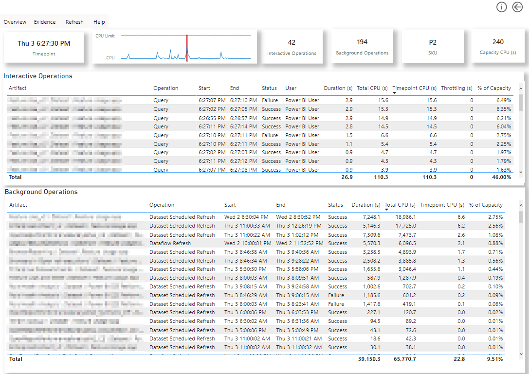
When the total combined CPU for interactive and background operations exceeds the 30 second timepoint allowance, the capacity is overloaded and depending on whether autoscale is enabled or not, throttling is applied.
Autoscale is enabled - If the capacity has autoscale enabled, a new v-core will get added for the next 24 hours and will be shown as an increased value in the CPU Limit line in the CPU over time chart.
When autoscale is enabled, if the capacity reaches the maximum number of v-cores allowed by the autoscale operation, throttling is applied.
Autoscale isn't enabled - If autoscale isn't enabled, throttling gets applied to every interactive operation in the subsequent timepoint.
Top row visuals
This section describes the operations of the visuals in the top row of the timepoint page.
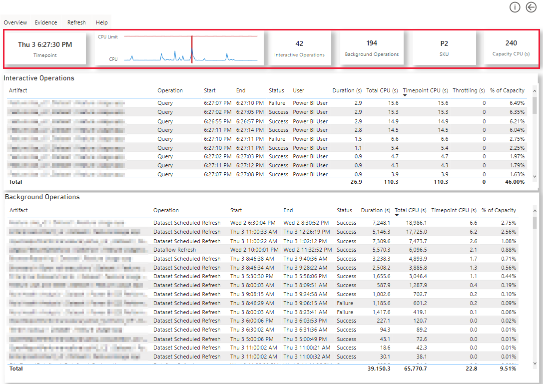
Top left card - Displays the timepoint used to drill through to this page.
Heartbeat line chart - Shows a 60 minute window of CPU activity. Use this visual to establish the duration of peaks and troughs.
Vertical red line - The timepoint you currently drilled to view. The visual shows the 30 minutes of CPU activity leading to the selected timepoint, as well as the 30 minutes of CPU activity after the selected timepoint.
Blue line - Total CPUs.
Yellow line - The capacity allowance.
If the blue line is above the yellow line the capacity is overloaded.
Interactive operations card - Displays the total number of interactive operations that contributed to the CPU's activity during this timepoint.
Background operations card - Displays the total number of background operations that contributed to the CPU's activity during this timepoint.
SKU card - Displays the current SKU.
Capacity CPU card - Displays the total number of CPU seconds allowed for this capacity, for a given 30 second timepoint window.
Interactive Operations
A table showing every interactive operation that contributed CPU usage in the timepoint used to drill through to this page. Once an interactive operation completes, all of the CPU seconds used by it get attributed to the timepoint window.
Artifact - The name of the Power BI item, its type, and its workspace details.
Operation - The type of interactive operation.
Start - The time the interactive operation began.
End - The time the interactive operation finished.
Status - An indication showing if the operation succeeded or failed.
CPU usage for failed operations is counted when determining if the capacity is in overload.
User - The name of the user that triggered the interactive operation.
Duration - The number of seconds the interactive operation took to complete.
Total CPU - The number of CPU seconds used by the interactive operation. This metric contributes to determine if the capacity exceeds the total number of CPU seconds allowed for the capacity.
Timepoint CPU - The number of CPU seconds assigned to the interactive operation in the current timepoint.
Throttling - The number of seconds of throttling applied to this interactive operation because of the capacity being overloaded in the previous timepoint.
% Of Capacity - Interactive CPU operations as a proportion of the overall capacity allowance.
Background Operations
A table showing every background operation that contributed CPU usage to the timepoint window used to drill through to this page. Every background operation that completed in the prior 24 hours (defined as a 2,880 x 30 second timepoint window), contributes a small portion of its total usage to the CPU value. This means that a background operation that completed the previous day can contribute some CPU activity to determine if the capacity is in overload. For more information see performance smoothing.
All the columns in the background operations table are similar to the ones in the interactive operations table. However, the background operations table doesn't have a users column.
Artifact Detail
This page provides useful information about a specific Power BI item.
Important
You can only get to this page by using the drill through feature in one of the visuals that displays individual Power BI items.
Some of the visuals in the Artifact Detail page may not display information. A visual will not show anything when it's designed to display an event that hasn't occurred.
You can tell which Power BI item you're reviewing, by looking at the card at the top left side of the report, highlighted below. This syntax of this card is workspace \ Power BI item type \ Power BI item name.
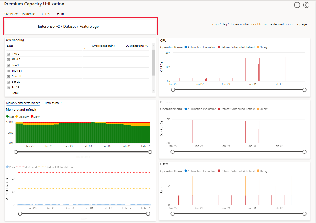
Overloading
The overloading visual displays time slots where overloading occurred involving the Power BI item you're drilling into.
The overloading visual has the following columns:
Date - The date the item was in overload.
Overloaded mins - Summed 30 second windows where at least one overload event took place.
Overload time % - The proportion of the total operation run time spent in a throttled state. The smaller this value, the better.
Performance
Displays the percentage of fast, moderate, and slow operations from the total number of operations performed by the Power BI item you're drilling into, over the past two weeks.
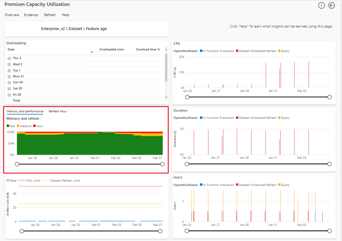
Fast - The moving average of fast operations as a percentage of all the operations over time. A fast operation takes less than 100 milliseconds.
Moderate - The moving average of moderate operations as a percentage of all the operations over time. A moderate operation takes between 100 milliseconds to two seconds.
Slow - The moving average of slow operations as a percentage of all the operations over time. A slow operation takes over two seconds.
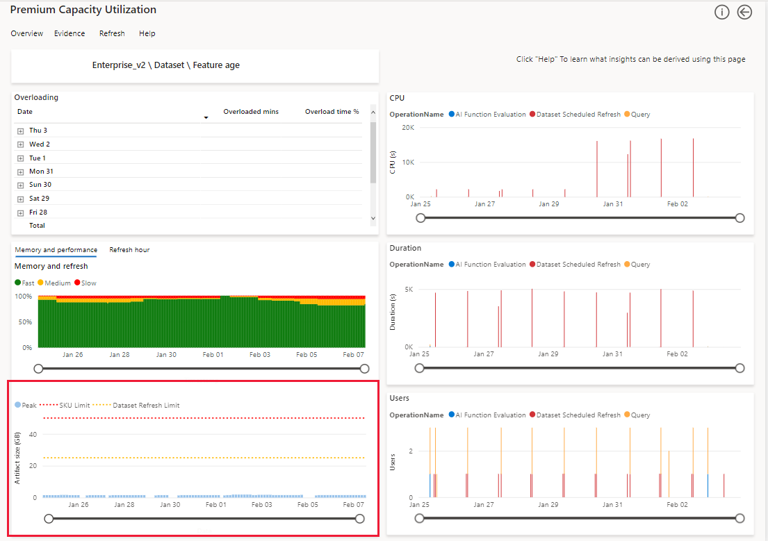
Artifact size
This visual displays the peak amount of memory detected in any three hour window, over a 14 day period, for the item you're drilling into. You can cross filter this visual from the matrix by artifact and operation visual, to show a peak memory profile for an individual day.
CPU duration and users
Use these visuals to review CPU consumption, operation duration and number of users for the item you're drilling into. In these visuals, each column represents a single hour over a 14 day period.
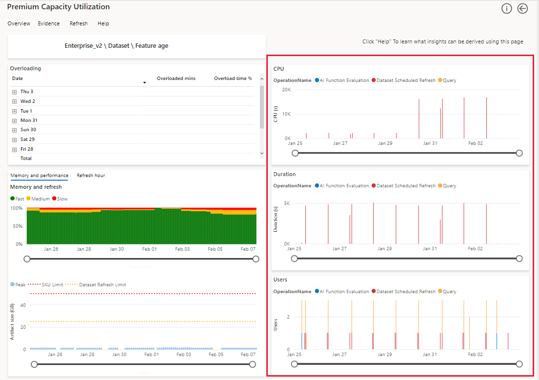
CPU - Each column displays the number of CPU seconds used to complete each operation per hour.
Duration - Each column displays the number of seconds used to complete each operation per hour.
Users - Each column displays the number of active users per hour.
Considerations and limitations
The app displays results for the last 14 or 28 days, depending on the visual.
The app only displays memory measurements and performance breakdown for datasets.
The app only supports monitoring datasets that use import mode. To monitor Power BI service live connections use Azure Analysis Services.
The Users column in the visuals displays the number of distinct users that performed operations against the dataset. These operations may be performed by the users themselves, or by Power BI on behalf of the users. When reviewing the visuals in the app, take into consideration that background operations performed by Power BI, may inflate the count of unique users.
Operations triggered by users - Interactive operations that include opening a report or clicking a slicer.
Operations triggered by Power BI - Background operations that include system operations such as dataset or dataflow refreshes. Sometimes these operations are performed by Power BI on behalf of a user. For example, a refresh operation may execute background queries to cache tile results for users who viewed these tiles recently. The tile refresh cache queries provide a much faster performance for users, when they next view the dashboard.
Email subscriptions will be sent with the app's default filter and slicer states.
Next steps
Recommend
About Joyk
Aggregate valuable and interesting links.
Joyk means Joy of geeK