

How to keep proportions when swapping different size icons in Figma | UX Planet
source link: https://uxplanet.org/icons-in-figma-978fcd8feaf8
Go to the source link to view the article. You can view the picture content, updated content and better typesetting reading experience. If the link is broken, please click the button below to view the snapshot at that time.

How do you keep proportions when swapping different-size icons in Figma?
Create resizable icons in Figma that keep the right proportions with this simple guide

Whenever a product designer needs to design a user interface for digital products in Figma, aside from creating the logic of the app to help the user complete their task, there is always this question:
How can I work faster on Figma to dedicate more time to designing user experiences instead of dealing with Figma technical issues?
Whether you work in a small company where you are the only designer or a big company where you have a large design team, the organization of the UI kit in Figma needs to be precise so you can work fast and fluidly.
When it comes to icons, a technical question I often see designers discuss is:
“I have a Figma file with a kit with icons in 24px, and whenever I swap an icon into another component of 16px size, the proportion of the icon changes.”
Because of that, in this article, I would like to show you how to create icons correctly for your icon library in Figma. This way, you and your design team can swap icons within components while preserving their proportions.
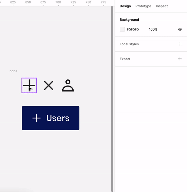
Replace the 16px icon with the 24px icon and adjust its size to 16px automatically
How do you design icons correctly?
Before I explain how to swap icons and keep the proportions, I want to mention that you first need to know how to design icons correctly.
Here, I’m not talking about creating an icon creatively or about the icon’s style. I’m talking about making the icon technically correct according to clear guidelines for your icon set.
There are two ways to create an icon system: static and variable.
Variable icons
Variable icons are a system of icons based on typography. The icon size change depending on the size and width of the typography. According to the information I read, Apple and Google (in Material Design 3) use this technique.
If you want to read more about it, please look at the Google Material 3 or Apple website. Also, you can use the Figma plugin for Google icons to understand it better.
Static icons
In static icons, the icons are not connected to the typography system; they remain the same regardless of the topography size and stroke width. This is the technique Google uses in Google Material Design 2.
I am not getting into details on how to make an icon using this technique. Still, generally, to make a static icon set, the designer needs to set a grid (normally 24 pixels), padding, line width, and some basic shapes to balance the icon dimensions and consistency with the other icons in the set.
This is the technique Google uses in Google Material Design 2 ,and if you want to read more about it, here are some helpful articles explaining it in detail.
Although I believe that variable icons can produce a more accurate design, for example, the icon can be the same size and width as the typography; my article discusses static icons. The reason for this is that design system UI kits commonly use it.
The steps to make a scalable icon
After creating the icons based on your design system guidelines, you should work on them and set the correct parameters so they can scale in proportion.
I explain it for an icon with one shape inside, but you can follow the process for icons with more than one shape.
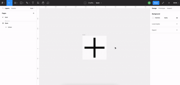
1. Outline the shape
Select the layer and outline the stroke. It will ensure that the line will scale in purporting and not based on the line width.

Outline the shape
2. Combine shapes
In the case of icons with two lines, such as an arrow or plus icon, you should combine the shapes to create a single shape. To do so, select the shapes and click on “Union selection” at the top of the Figma interface.

Combine shapes
3. Flatten shapes
Now select the shape, click the right button, and click on Flatten. It will combine all the layers of the shape into one layer.
Flatten shapes
4. Set shape to scale
Select the shape and set width and height to scale in the constrain section on the right menu.

Set shape to scale
5. Mark the constrained proportion
Select the Frame and set the constrained proportion to ON.

Mark the constrained proportion
6. Give the layer a name
This step is not about proportion but about keeping the icon’s color after swapping it. If you want to read more about it, please look at my article.

Give the layer a name
7. Give the icon a name
Also, this step is not about the icon scale but the icon name in your design system so the designers can find and swap it easily in different components.

Give the icon a name
8. Test
Test the icon to ensure it keeps its proportion after swapping it.

Test
To summary
With this guide, I wanted to explain how you can create icons to swap them inside components and keep their proportions.
In this way, you can save time and improve your UI kit’s organization, so you can focus on designing user experiences.
Here is a summary of the eight steps:
- Outline the shape.
- Combine shapes.
- Flatten the shapes.
- Set the shape to scale.
- Mark the constrained proportion.
- Give the layer a name.
- Give the icon a name.
- Test.
More links
Below are some great links you can use to learn more about icon design:
Recommend
About Joyk
Aggregate valuable and interesting links.
Joyk means Joy of geeK