

用Python做了一个广东疫情新增病例动态视频
source link: https://www.pkslow.com/archives/python-covid-19-guangdong
Go to the source link to view the article. You can view the picture content, updated content and better typesetting reading experience. If the link is broken, please click the button below to view the snapshot at that time.

最近广东疫情实在是太严重了,特别是广州。作为南大门,人口流动太大,又毗邻港澳,防疫任务太重。从11月以来,就发展极其迅猛。疫情也给大家的生活带来了诸多不便,我有许多同事和朋友都居家隔离了。
时代的尘埃落在个体身上,都是灾难。
为了对疫情了解更多,我用Python写了个小程序,来生成一个新增病例的变化视频,且记录一下这个无聊的过程吧。
2 数据准备
为了获得准确的第一手数据,我是关注了健康广东这个公众号,每天早上可以看到最新的数据。同时在广东省卫健委的网站也可以获取。
接着会把数据记录在Excel表格里,方面查看。11月以来数据如下:
注:新增 = 新增确诊 + 新增无症状
| 日期 | 广东确诊 | 广州确诊 | 广东无症状 | 广州无症状 | 广东新增 | 广州新增 |
|---|---|---|---|---|---|---|
| 11月1日 | 239 | 190 | 458 | 289 | 697 | 479 |
| 11月2日 | 106 | 73 | 298 | 253 | 404 | 326 |
| 11月3日 | 69 | 50 | 356 | 323 | 425 | 373 |
| 11月4日 | 187 | 142 | 470 | 430 | 657 | 572 |
| 11月5日 | 160 | 111 | 669 | 635 | 829 | 746 |
| 11月6日 | 133 | 66 | 1330 | 1259 | 1463 | 1325 |
| 11月7日 | 185 | 122 | 1882 | 1813 | 2067 | 1935 |
| 11月8日 | 198 | 114 | 2330 | 2263 | 2528 | 2377 |
| 11月9日 | 197 | 91 | 2611 | 2546 | 2808 | 2637 |
| 11月10日 | 200 | 125 | 2507 | 2430 | 2707 | 2555 |
| 11月11日 | 289 | 225 | 2461 | 2358 | 2750 | 2583 |
| 11月12日 | 323 | 259 | 2996 | 2921 | 3319 | 3180 |
| 11月13日 | 247 | 189 | 3541 | 3464 | 3788 | 3653 |
| 11月14日 | 219 | 189 | 3941 | 3876 | 4160 | 4065 |
| 11月15日 | 173 | 147 | 5047 | 4977 | 5220 | 5124 |
| 11月16日 | 195 | 158 | 6215 | 6138 | 6410 | 6296 |
| 11月17日 | 307 | 275 | 8576 | 8486 | 8883 | 8761 |
| 11月18日 | 321 | 255 | 9110 | 8989 | 9431 | 9244 |
| 11月19日 | 355 | 269 | 8535 | 8444 | 8890 | 8713 |
| 11月20日 | 281 | 200 | 8381 | 8234 | 8662 | 8434 |
| 11月21日 | 384 | 296 | 8101 | 7885 | 8485 | 8181 |
| 11月22日 | 347 | 253 | 8241 | 7957 | 8588 | 8210 |
| 11月23日 | 353 | 235 | 7951 | 7735 | 8304 | 7970 |
| 11月24日 | 549 | 428 | 7505 | 7192 | 8054 | 7620 |
| 11月25日 | 395 | 257 | 7584 | 7267 | 7979 | 7524 |
3 读取数据
因为要用Python展示,即做数据可视化(数据可视化的工具很多,不一定要用Python),所以需要用Python读取Excel中的数据。我使用的是库pyexcel。代码如下:
def load_data():
    records = p.get_records(file_name="covid-19.xlsx")
    print(records)
    data_x = []
    data_y1 = []
    data_y2 = []
    for record in records[1:]:
        dt = excel_to_datatime(record['-1'])
        data_x.append(dt)
        data_y1.append(record['-6'])
        data_y2.append(record['-7'])
    return data_x, data_y1, data_y2
其中covid-19.xlsx就是Excel文件名。而-1, -6, -7分别是对应的日期,和最后两列,Debug的时候定位的,暂时没空深究。
3.1 Excel日期的问题
Excel日期是用一个数字来表示的,所以需要把这个数值转化成Python的日期类型,具体代码如下:
def excel_to_datatime(excel_date):
    dt = datetime.fromordinal(datetime(1900, 1, 1).toordinal() + excel_date - 2)
    return dt
同时为了格式化输出日期,新增了个函数,没啥特别的:
def datetime_to_str(dt, pattern):
    return pattern.format(dt.month, dt.day)
4 Python数据可视化
Python做数据可视化的库可太多了,我选择的是matplotlib,一方面是因为它用的多,资料也多;另一方面是我大学用过Matlab,两者很像,省去一些学习时间成本。
为了简便,打算就画个曲线变化图就行了,所以横轴为日期,纵轴为新增数。画个简单的图代码如下:
# plot
fig, ax = plt.subplots(figsize=(4, 3), dpi=120)
ax.plot(data_x, data_y1, linewidth=2.0, color='red')
ax.plot(data_x, data_y2, linewidth=2.0, color='blue')
plt.show()
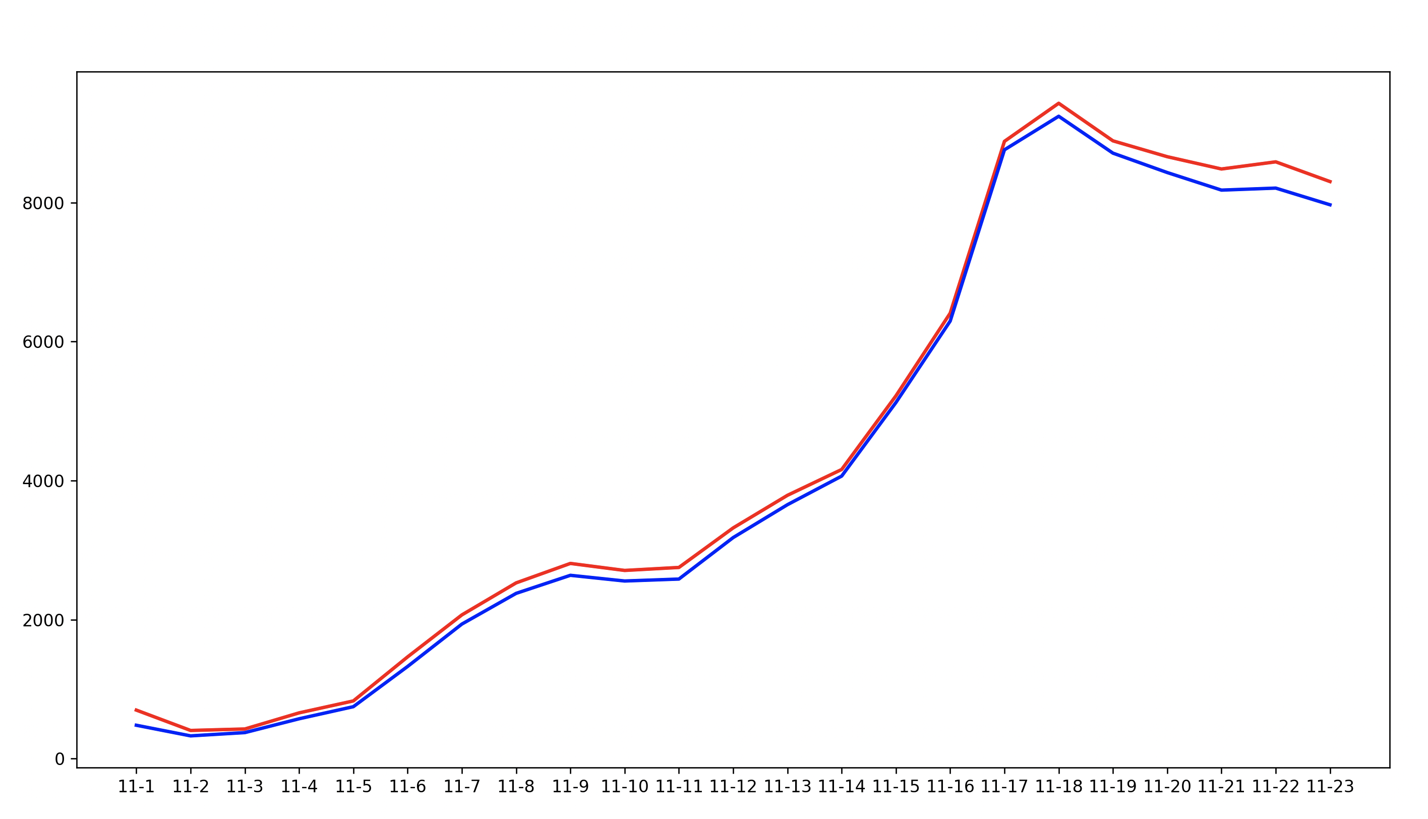
红色是广东新增,蓝色是广州新增:
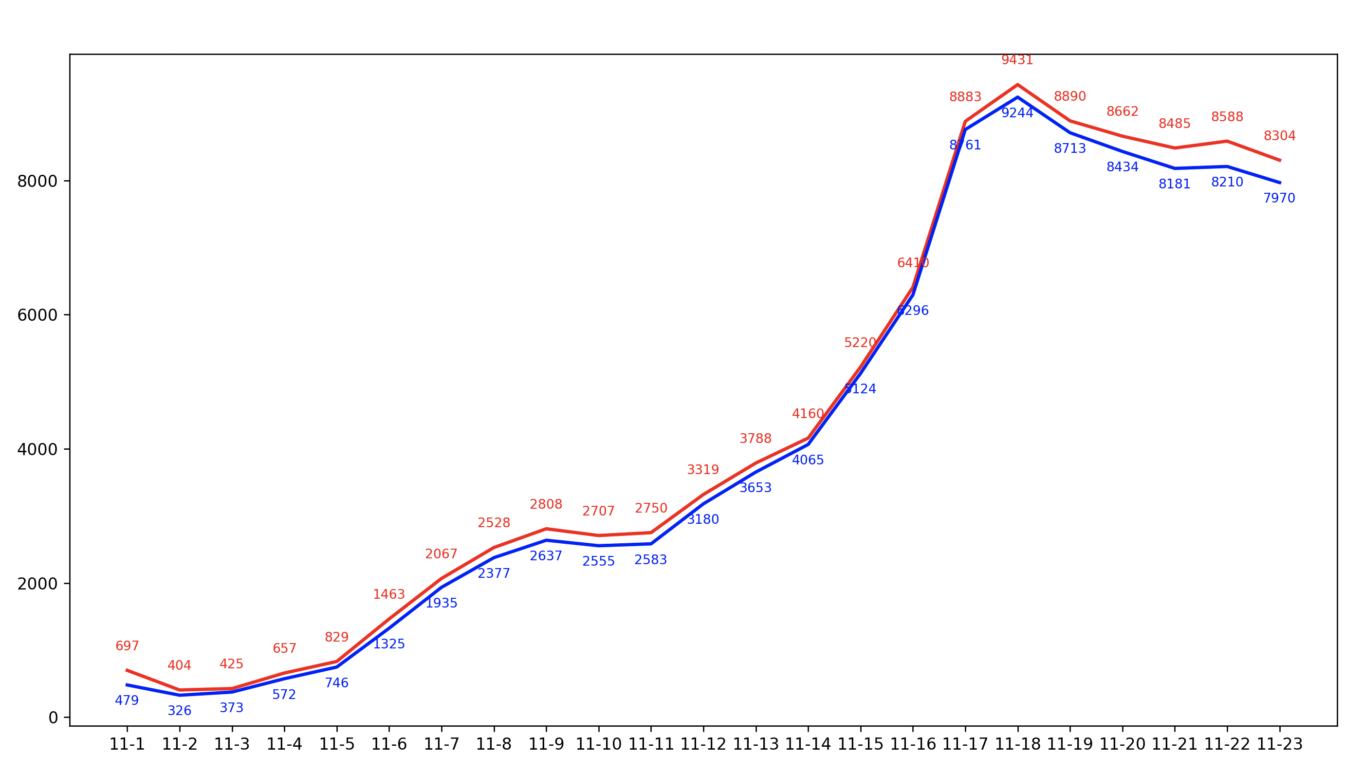
把数据标在曲线上:
for i, v in enumerate(data_y1):
    ax.text(data_x[i], v + 300, v, ha='center', color='red', fontsize=8)

for i, v in enumerate(data_y2):
    ax.text(data_x[i], v - 300, v, ha='center', color='blue', fontsize=8)
可以看到,3000到6000,再到8000的变化是极快的:
后面还有许多细节优化,就不一一讲解了。
5 转化视频
首先要明白,视频的本质还是图片,只是把图片放快了而已。所以,可以画图,就有办法做视频。好在matplotlib也提供了制作动画的函数,直接调用即可。需要调用的是animation.FuncAnimation这个方法。我们要提供初始化函数,还有如何制作每一帧画面的函数,就可以制作视频了。
初始化就直接给个空就行:
def init():
    line1.set_data([], [])
    line2.set_data([], [])
    return line1, line2, text1, text2, text_gd, text_gz, text_date
每一帧的函数如下:
def animate(i):
    print('Processing {} for {}'.format(i, data_x[i]))
    x = range(i + 2)
    x = x[1:]
    line1.set_data(x, data_y1[:i + 1])
    line2.set_data(x, data_y2[:i + 1])
    text1 = ax.text(i + 1, data_y1[i] + 150, data_y1[i], ha='center', color='red', fontsize=8)
    text2 = ax.text(i + 1, data_y2[i] - 150, data_y2[i], ha='center', color='blue', fontsize=8)
    text_gd.set_text('广东新增:' + str(data_y1[i]))
    text_gz.set_text('广州新增:' + str(data_y2[i]))
    text_date.set_text(datetime_to_str(data_x[i], '2022年{}月{}日'))
    plt.scatter(x, data_y1[:i + 1], color='bisque')
    plt.scatter(x, data_y2[:i + 1], color='cyan')
    return line1, line2, text1, text2, text_gd, text_gz, text_date
核心是的两条曲线:line1, line2,每次动态的改变它的数据,就会重画;
text1, text2是新增数,标在曲线上的;
scatter函数是标点,显眼一点;
text_gd, text_gz, text_date在左上角动态显示变化的日期和数据。
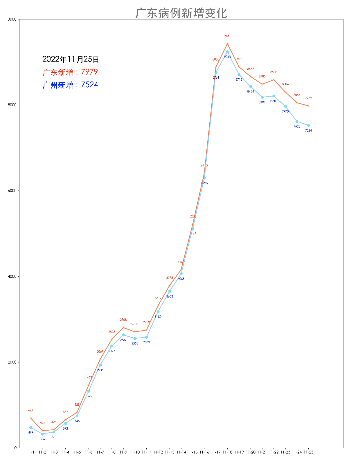
图片大体效果如下:
最后,我们要将一帧一帧整合成视频,使用以下函数:
plt.rcParams['animation.ffmpeg_path'] = '/Users/larry/Software/ffmpeg/ffmpeg'
anim.save('covid-19-Guangdong.mp4', fps=1, extra_args=['-vcodec', 'libx264'])
注意:这里需要用到软件ffmpeg,要指定你所安装的位置。这个软件可以直接从这里下载:https://evermeet.cx/ffmpeg/
最终视频效果如下:
愿大家健康快乐!
代码请看GitHub: https://github.com/LarryDpk/pkslow-samples/tree/master/python/src/main/python/covid-19-Guangdong
References:
How to Animate Line Plots Using Matplotlib in Python
https://towardsdatascience.com/animations-with-matplotlib-d96375c5442c
Excel Date:
https://www.geeksforgeeks.org/python-convert-excel-serial-date-to-datetime/
https://www.geeksforgeeks.org/how-to-convert-a-python-datetime-datetime-to-excel-serial-date-number/
Example and Turorial:
Top 50 matplotlib Visualizations – The Master Plots (with full python code)
Colors:
https://matplotlib.org/stable/gallery/color/named_colors.html
Code for all: GitHub
欢迎关注微信公众号<南瓜慢说>,将持续为你更新...

Recommendations:
Cloud Native
Terraform
Container: Docker/Kubernetes
Spring Boot / Spring Cloud
Https
如何制定切实可行的计划并好好执行
Recommend
About Joyk
Aggregate valuable and interesting links.
Joyk means Joy of geeK