
2

疫情可视化(后续) - 曦12
source link: https://www.cnblogs.com/xi12/p/16864419.html
Go to the source link to view the article. You can view the picture content, updated content and better typesetting reading experience. If the link is broken, please click the button below to view the snapshot at that time.

这是疫情可视化最开始的文章,有需要了解的可前往查看:https://www.cnblogs.com/xi12/p/16690119.html。 本来说有时间就把这个项目完结了的,结果后面一直有事拖着,直到现在十一月份了才搞完。老样子,先看成果。
修改与添加
后面可能审美疲劳了,越看越丑,就干脆直接用dataV(这可不是阿里的那个dataV)修饰页面了。这是项目改动后的样子:


主要做了如下改动:
- 添加首页的3d粒子球体。
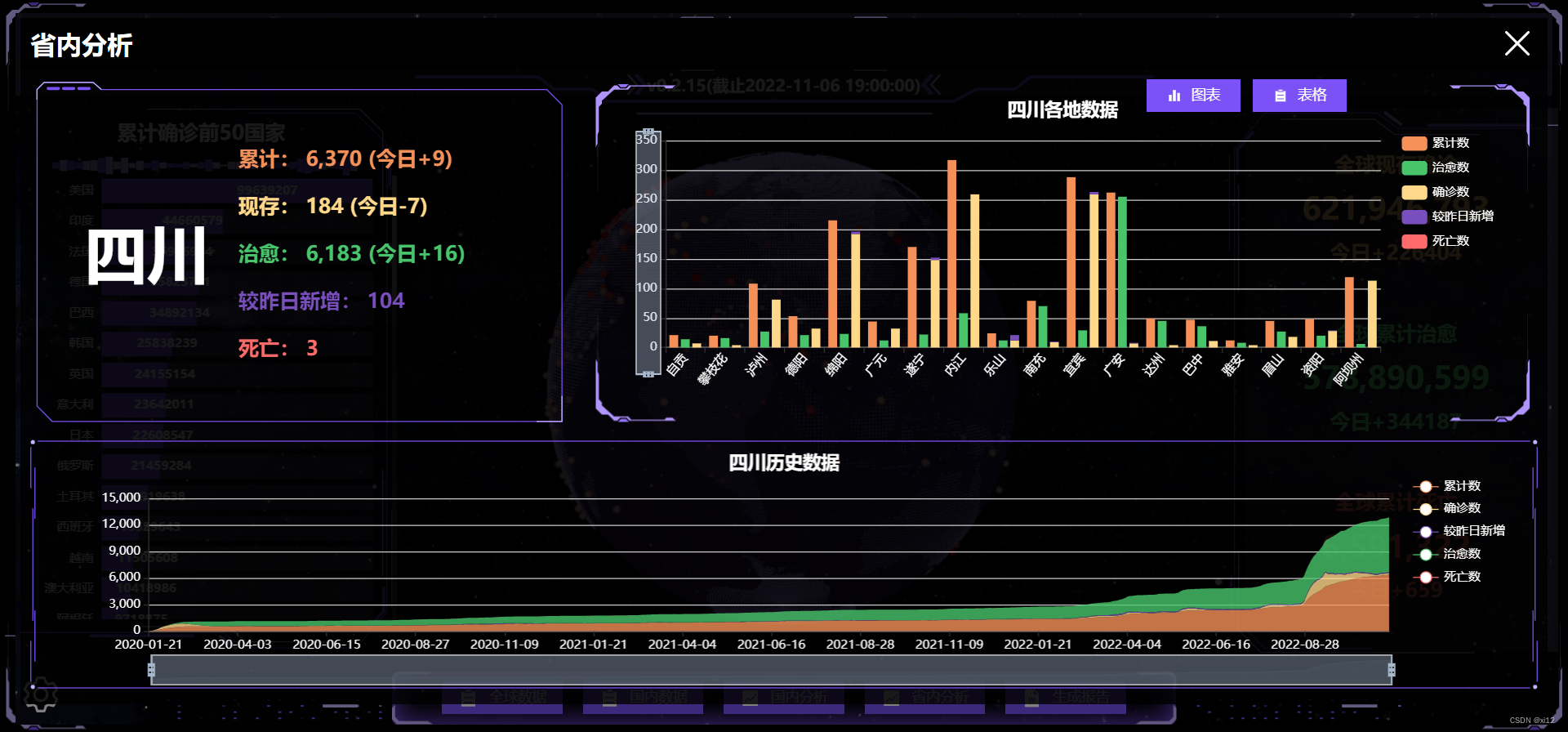
- 完成“省内分析”模块。
- 完成当地疫情报告生成与下载。
- 使用dataV修饰页面。
粒子球体也是用three.js完成的,放大仔细看会发现其实是有三层构成的:内层透明球体,中间点状球体,外层病毒球体。

具体实现过程是这样的:
- 先绘制一个内层透明球体,记得将球体材质的transparent设为true,然后设置不透明度opacity值。
//创建斑点球体async function createSpotSphere() { let globeBufferGeometry = new THREE.SphereGeometry(earthSize - 1, 50, 50);//球体几何体 let globeInnerMaterial = new THREE.MeshBasicMaterial({ color: new THREE.Color(dvColor[0]),//颜色 // blending: THREE.AdditiveBlending,//纹理融合的叠加方式 // side: THREE.FrontSide,//前面显示 transparent: true,//透明 // depthWrite: false,//深度写入 // depthTest: false,//黑洞效果 opacity: .3,//不透明度 }); let globeInnerMesh = new THREE.Mesh( globeBufferGeometry, globeInnerMaterial ); earthGroup.add(globeInnerMesh); //将网格放入地球组 cre
- 创建点状球体。这里需要使用一张黑白的世界地图。
let img = new Image();img.src = earthGrayscale; //黑白地图
将图片使用onload加载到项目中后,利用canvas绘制一遍该图,再使用getImageData获取到像素点数据canData。
let canvas = document.createElement("canvas"); canvas.width = img.width; //使得canvas尺寸与图片尺寸相同 canvas.height = img.height; (canvas.getContext("2d") as any).drawImage(img, 0, 0, img.width, img.height);//canvas绘制图片 let canData = (canvas.getContext("2d") as any).getImageData(0, 0, canvas.width, canvas.height);//获取画布像素数据
利用canData .data中的rgba信息生成缓冲几何顶点数组globeCloudVerticesArray。
let globeCloudBufferGeometry = new THREE.BufferGeometry(); //设置缓冲几何体 let globeCloudVerticesArray = []; //地球云缓冲几何体顶点 let o = null; //数组处理时的计数 for (o = 0; o < canData.data.length; o += 4) { let r = (o / 4) % canvas.width, i = (o / 4 - r) / canvas.width; if ((o / 4) % 2 == 1 && i % 2 == 1) if (0 === canData.data[o]) { let n = r, longitude = (i / (canvas.height / 180) - 90) / -1, //经度 latitude = n / (canvas.width / 360) - 180; //维度 let s = latLongToVector3(longitude, latitude, earthSize, .1); //经纬度变换 globeCloudVerticesArray.push(s); //将变换后的顶点放入数组 } }
然后再使用three中的BufferAttribute生成属性position与color。
let l = new Float32Array(3 * globeCloudVerticesArray.length); //创建顶点数组长度 for (o = 0; o < globeCloudVerticesArray.length; o++) { l[3 * o] = globeCloudVerticesArray[o].x;//设置顶点数组数据 l[3 * o + 1] = globeCloudVerticesArray[o].y; l[3 * o + 2] = globeCloudVerticesArray[o].z; } let positionVal = new THREE.BufferAttribute(l, 3); //设置缓冲区属性值 globeCloudBufferGeometry.setAttribute("position", positionVal); //给缓冲几何体添加位置属性 let globeCloudMaterial = new THREE.PointsMaterial({ color: new THREE.Color(dvColor[1]),//颜色 fog: true, size: 1, });//球面斑点材质 let d = new Float32Array(3 * globeCloudVerticesArray.length), c = []; for (o = 0; o < globeCloudVerticesArray.length; o++) { c[o] = new THREE.Color(dvColor[1]);//球面斑点颜色 d[3 * o] = c[o].r;//设置地球云数组rgb颜色 d[3 * o + 1] = c[o].g; d[3 * o + 2] = c[o].b; } let color_val = new THREE.BufferAttribute(d, 3); globeCloudBufferGeometry.setAttribute("color", color_val);//给缓冲几何体添加颜色属性,修改颜色直接修改globeCloudBufferGeometry的setAttribute
最后再使用THREE.Points创建球面的点,将position与color属性添加到点的几何体BufferGeometry中。
let globeCloud = new THREE.Points(//球面的象素点 globeCloudBufferGeometry, globeCloudMaterial );
这是需要用到的坐标转换方法:
//经纬度坐标变换(传入e:纬度、a经度、t球半径、o球额外距离)function latLongToVector3(e: any, a: any, t: any, o: any) { var r = (e * Math.PI) / 180, i = ((a - 180) * Math.PI) / 180, n = -(t + o) * Math.cos(r) * Math.cos(i), s = (t + o) * Math.sin(r), l = (t + o) * Math.cos(r) * Math.sin(i); return new THREE.Vector3(n, s, l); //计算三维向量};
- 创建最外层的病毒球体。每一个病毒都是一个THREE.Sprite,材质是THREE.SpriteMaterial,利用Sprite.position.set设置具体坐标位置,最后将Sprite添加到球体组中。病毒的颜色是由当前点确诊值决定的,颜色值在colors数组中取出。
//创建病毒function createVirus(data: any, earthSize: any) { let colors = [ new THREE.Color(0xf9b8b8), new THREE.Color(0xfe4242), new THREE.Color(0xff0000), ]; //病毒颜色列表 let virSize = 4; //病毒大小 let list = JSON.parse(JSON.stringify(data)); list.forEach((e: { value: number; color: any; position: any[]; }) => { e.value >= 10000000 && (e.color = colors[2]); //根据病毒数赋予不同颜色 e.value >= 500000 && e.value < 10000000 && (e.color = colors[1]); e.value < 500000 && (e.color = colors[0]); if (e.position) { let virusMaterial = new THREE.SpriteMaterial({ color: e.color, map: new THREE.TextureLoader().load(virusImg), side: THREE.FrontSide, //只显示前面 }); //病毒材质 let Sprite = new THREE.Sprite(virusMaterial); //点精灵材质 Sprite.scale.set(virSize, virSize, 1); //点大小 let lat = e.position[1]; //纬度 let lon = e.position[0]; //经度 let s = latLongToVector3(lat, lon, earthSize, 1); //坐标转换 Sprite.position.set(s.x, s.y, s.z); //设置点的位置 Sprite.dotData = e; //将点的数据添加到dotData属性中 Sprite.name = "病毒"; earthGroup.add(Sprite); //将病毒添加进球体组中 } });};
- 省内数据概况。该数值在加载时是有增加动画的,是利用vue响应式原理完成的,在上一篇文章中有提到。

- 省内各地疫情柱状图。这是具体的echart配置:
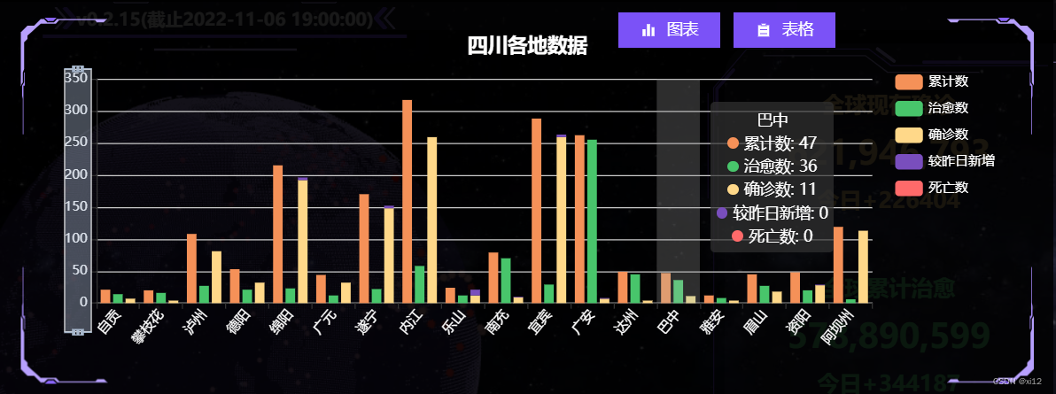
let option = { title: { text: provinceBaseData.value.province + "各地数据", left: "center", top: '5%', textStyle: { color: "#fff", }, }, tooltip: { trigger: 'axis', axisPointer: { type: 'shadow' } }, dataZoom: [ { type: 'inside', }, { show: true, yAxisIndex: 0, filterMode: 'empty', width: 25, height: '70%', showDataShadow: false, left: '3%', top: "center" } ], legend: { data: ['累计数', '治愈数', '确诊数', '较昨日新增', '死亡数'], orient: "vertical", top: "15%", right: "2%", textStyle: { color: "#fff" }, }, grid: { left: '3%', right: '15%', bottom: '10%', containLabel: true }, xAxis: { type: 'category', data: echartData.cityName, axisLabel: { interval: 0, rotate: 50, color: "#fff" }, }, yAxis: { type: 'value', axisLabel: { color: "#fff", }, }, series: [ { name: '累计数', type: 'bar', emphasis: { focus: 'series' }, itemStyle: { color: '#f59158' }, data: echartData.conNum }, { name: '治愈数', type: 'bar', emphasis: { focus: 'series' }, itemStyle: { color: '#48c56b' }, data: echartData.cureNum }, { name: '确诊数', type: 'bar', stack: 'total', emphasis: { focus: 'series' }, itemStyle: { color: '#ffd889' }, data: echartData.econNum }, { name: '较昨日新增', type: 'bar', stack: 'total', emphasis: { focus: 'series' }, itemStyle: { color: '#794ebd' }, data: echartData.asymptomNum }, { name: '死亡数', type: 'bar', stack: 'total', emphasis: { focus: 'series' }, itemStyle: { color: '#ff6a6a' }, data: echartData.deathNum }, ] };
- 省份历史疫情数据图表。这是该图表配置:
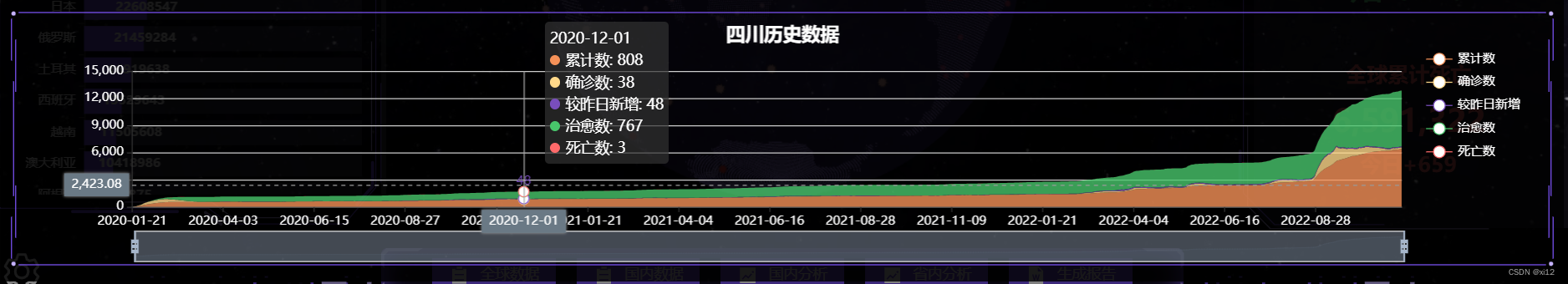
let option = { title: { text: provinceBaseData.value.province + "历史数据", left: "center", top: '5%', textStyle: { color: "#fff", }, }, tooltip: { trigger: 'axis', axisPointer: { type: 'cross', label: { backgroundColor: '#6a7985' } } }, legend: { data: ['累计数', '确诊数', '较昨日新增', '治愈数', '死亡数'], orient: "vertical", top: "15%", right: "2%", textStyle: { color: "#fff" }, }, grid: { left: '8%', }, xAxis: [ { type: 'category', boundaryGap: false, axisLabel: { color: "#fff", }, data: echatrData.time } ], yAxis: [ { type: 'value', axisLabel: { color: "#fff", }, } ], dataZoom: [ { startValue: '' }, { type: 'inside' } ], series: [ { name: '累计数', type: 'line', stack: 'Total', smooth: true, lineStyle: { width: 0 }, showSymbol: false, areaStyle: { opacity: 0.8, color: "#f59158" }, emphasis: { focus: 'series' }, itemStyle: { color: '#f59158' }, data: echatrData.conNum }, { name: '确诊数', type: 'line', stack: 'Total', smooth: true, lineStyle: { width: 0 }, showSymbol: false, areaStyle: { opacity: 0.8, color: "#ffd889" }, itemStyle: { color: '#ffd889' }, emphasis: { focus: 'series' }, data: echatrData.econNum }, { name: '较昨日新增', type: 'line', stack: 'Total', smooth: true, lineStyle: { width: 0 }, showSymbol: false, label: { show: true, position: 'top' }, areaStyle: { opacity: 0.8, color: "#794ebd" }, itemStyle: { color: '#794ebd' }, emphasis: { focus: 'series' }, data: echatrData.asymptomNum }, { name: '治愈数', type: 'line', stack: 'Total', smooth: true, lineStyle: { width: 0 }, showSymbol: false, areaStyle: { opacity: 0.8, color: "#48c56b" }, itemStyle: { color: '#48c56b' }, emphasis: { focus: 'series' }, data: echatrData.cureNum }, { name: '死亡数', type: 'line', stack: 'Total', smooth: true, lineStyle: { width: 0 }, showSymbol: false, areaStyle: { opacity: 0.8, color: "#ff6a6a" }, itemStyle: { color: '#ff6a6a' }, emphasis: { focus: 'series' }, data: echatrData.deathNum }, ] };
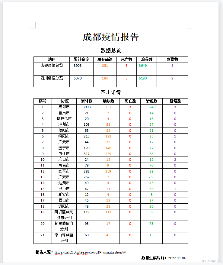
报告生成与下载
报告生成利用的是docxtemplater,这是前端生成word比较方便的一个插件,具体使用方法可以看这里:https://www.cnblogs.com/xi12/p/16863383.html。
- 这是生成的word报告示例:
dataV修饰
- dataV是一个大屏可视化组件库,这是使用文档:http://datav.jiaminghi.com/guide/。
- dataV是vue2开始的,vue3使用的话会报错,需要做一点修改,具体看这里:https://www.cnblogs.com/xi12/p/16859415.html。
- 我只用了dataV中的一些边框与装饰,你在页面中看到的紫色线框和一些动画的装饰就是dataV的,还是蛮漂亮的。
- 最后我发现人的审美真的变化太快了。
- 项目刚搞完:嗯不错!真漂亮!
- 过去一周后:什么玩意!丑得一批!
- 如果还有后续的话,我可能就要考虑添加自定义主题配色了。
Recommend
About Joyk
Aggregate valuable and interesting links.
Joyk means Joy of geeK