2

Confirmshaming: How to get users to hate your product?
source link: https://www.uxness.in/2022/10/confirmshaming-how-to-get-users-to-hate.html
Go to the source link to view the article. You can view the picture content, updated content and better typesetting reading experience. If the link is broken, please click the button below to view the snapshot at that time.

UX Design, Usability Articles, Course, Books, EventsSkip to content
Dark patterns are design elements used in online interfaces that are intended to force or trick people into acting in ways they would not normally under normal conditions. These strategies, which are based on considerable behavioral psychology research, are unethical. Since legislation to ban the use of dark patterns has recently been introduced, they may soon also be prohibited. It benefits UX designers and marketers to recognize them and steer clear of them.
As a designer or a product manager, in order to avoid deceptive patterns, first you need to
be aware of them. Let’s discuss one of the most common deceptive patterns we probably
see almost every day, if not more: confirmshaming.
Confirmshaming, often referred to as a negative opt-out, is a passive-aggressive marketing strategy that implies that you are a loser just because you do not want a particular product.
You have probably encountered this situation: you’re browsing a website, a donation banner pops up asking if you want to help starving children in Africa. You want to close the banner but there is no close button (or simply an X icon). You have no way out but to answer the question. And the questions and answers sound like this:
Do you want to help starving children?
Yes, I’m donating now.
No, I don’t care about children.
Sounds familiar? Probably yes. According to them, you are an ignorant person letting
children starve to death. Does it make you feel bad about yourself? Most likely, yes. Well, it
shouldn’t; they are designed to make you feel inadequate, and probably are fake too.
But this is not the only kind of confirmshaming. Let’s look at some examples and analyze
what is unethical about them.
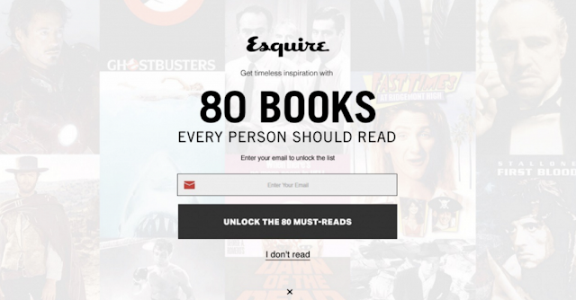
It seems like an innocent one. If you don’t read, then you wouldn’t need 80 books. But
should you feel lazy about rejecting the offer? You definitely shouldn’t!
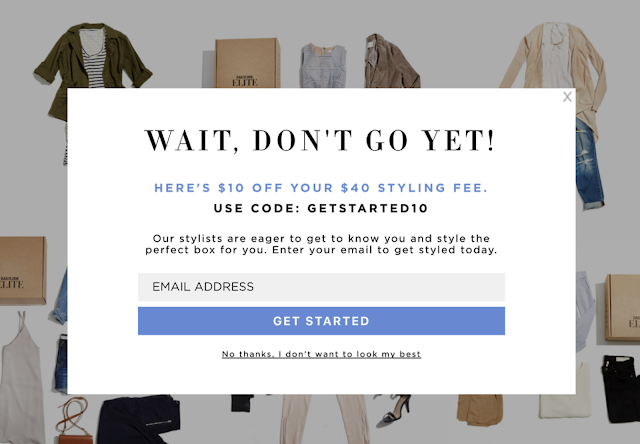
There must be some other ways to look your best, isn’t there? Even if you don’t want to
look good, who are they to judge?
Isn’t it true that no one enjoys ads? Especially the ones that pop up while playing a game.
But you don’t have to pay for each game or website to avoid seeing ads. So which one
should you tap? None? So you see.
Avoiding deceptive patterns in the product can make a huge difference in the user’s
experience and the brand’s reputation. Life is not a piece of cake anyway, so why not make
the world a better place to live as much as we can?
About Author,
Zarina Majidova
UI/UX designer
Chillchat, Bangkok, Thailand
I am a UI/UX designer, design thinker, UX researcher, and human-loving introvert. I really love what I do.
Recommend
About Joyk
Aggregate valuable and interesting links.
Joyk means Joy of geeK


