

机器学习之旅--逻辑回归
source link: http://blog.linrty.com/2022/10/07/%E6%9C%BA%E5%99%A8%E5%AD%A6%E4%B9%A0%E4%B9%8B%E6%97%85--%E9%80%BB%E8%BE%91%E5%9B%9E%E5%BD%92/
Go to the source link to view the article. You can view the picture content, updated content and better typesetting reading experience. If the link is broken, please click the button below to view the snapshot at that time.

通过吴恩达机器学习作业二熟悉逻辑回归的使用
建立一个逻辑回归模型来预测一个学生是否能进入大学。假设你是一所大学的行政管理人员,你想根据两门考试的结果,来决定每个申请人是否被录取。你有以前申请人的历史数据,可以将其用作逻辑回归训练集。对于每一个训练样本,你有申请人两次测评的分数以及录取的结果。为了完成这个预测任务,我们准备构建一个可以基于两次测试评分来评估录取可能性的分类模型。
数据集文件:ex2data1.txt
Logistic regression
我们先将数据加载进来,并通过散点图观察一下数据
# 读取数据
path = './code/ex2/ex2data1.txt'
data = pd.read_csv(path, names=['exam1', 'exam2', 'admitted'])
我们预先将数据分成两组,一组是允许被录取的,一组是不被录取的
# 1
positive = data[data.admitted.isin([1])]
# 0
negative = data[data.admitted.isin([0])]

假设(hypothesis)函数
通过预览出的散点图,我们可以大概知道通过一条直线来区分两类散点,那么接下来就的假设函数就与我们的线性回归是一样的了,但是这远远不够,因为我们希望我们的假设函数能够直观的输出结果是0或者1,也就是说我们向假设函数输入两门成绩,那么这个函数应该只会输出0或者1告诉我们这个同学是否可以被录取。
接下来我们引入一个sigmod函数,这个函数就很好的解决了我们当下的问题,sigmod函数的公式为
通过公式我们没有办法直观的了解这个函数,所以我们通过python画一下这个函数的图看一看究竟
x1 = np.arange(-10, 10, 0.1)
plt.plot(x1, sigmod(x1), c='r')
plt.show()

通过图片我们可以很直观的看到,在这个函数输入为正时是靠近1的,而输入为负时则靠近0,因此我们可以将假设函数的输出作为这个函数的输入再进行一次运算,并且将结果大于等于0.5当作预测为1(因为比起0,结果大于0.5的更靠近1,也就相当于概率为1更高),同样的结果小于0.5当作预测为0,所以我们真正的假设函数所需要做的就是预测合格的同学输出则为正数,不合格的同学输出为负数即可
代价函数(cost function)
对于此模型的假设函数通过sigmodsigmod函数处理过后,我们可以借用到loglog函数的特性来进行处理
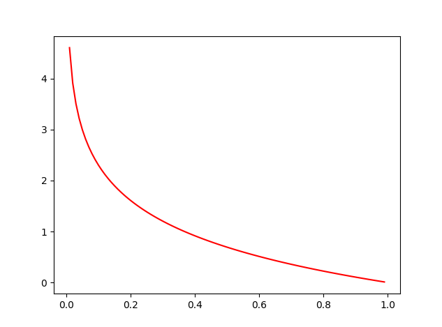
我们先来看看−logx−logx的函数图,通过这个图很容易发现当输入越趋近11结果越趋近00,越趋近00结果就越趋近无穷大,符合我们来定义真实结果为11部分的代价函数
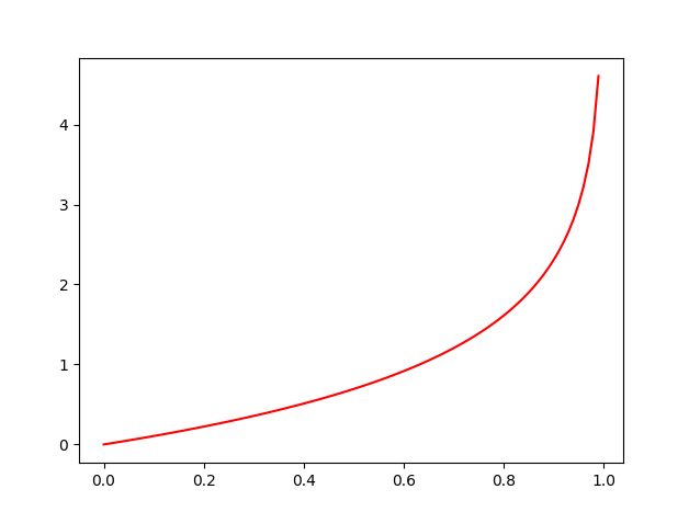
再来看看−log(1−x)−log(1−x)的函数图,通过这个图我们容易发现,当结果越趋近00结果趋近00,越趋近11结果就趋近无穷的大,符合我们来定义真实结果为00部分的代价函数
因此我们可以将代价函数定义如下:
对于这个函数真实结果如果为11我们就不计算假设函数结果到00的距离也就是(1−y(i))log(1−hθ(x(i)))(1−y(i))log(1−hθ(x(i))),反之亦然
代码实现:
def cost(theta, x, y):
    theta = np.reshape(theta, (x.shape[1], 1))
    num1 = (-y) @ np.log(sigmod(np.dot(x, theta)))
    num2 = (1 - y) @ np.log(1 - sigmod(x @ theta))
    return np.mean(num1 - num2)
梯度下降(Gradient Descent)
也就是让代价函数最小
推导过程:

代码实现:
def gradient(theta, x, y):
    return (x.T @ (sigmod(x @ theta) - y)) / len(x)
之前我们都是通过自己编写代码迭代进行训练模型,这次我们使用函数进行训练,好处是,它帮助我们做了一些优化,首先需要借助到python对应的库
import scipy.optimize as opt
使用fimin_tnc或者minimize方法来拟合,minimize中method可以选择不同的算法来计算,其中包括TNC
res = opt.fmin_tnc(func=cost, x0=theta, fprime=gradient, args=(x, y))
计算精确度
根据之前sigmodsigmod函数我们判定输出结果大于等于0.5时预测为1,否则预测为0
因此我们通过训练好的θθ进行预测并计算一下精确度,代码如下:
final_theta = res[0]
predict_result = predict(final_theta, x)
correct = np.zeros(len(x))
for i in range(len(x)):
    if y[i] == predict_result[i]:
        correct[i] = 1
    else:
        correct[i] = 0
# 预测的准确度
accuracy = sum(correct) / len(correct)
print(accuracy)  #0.89
x1 = np.arange(120, step=0.1)
x2 = -(final_theta[0] + x1 * final_theta[1]) / final_theta[2]
fig, ax = plt.subplots(figsize=(6, 5))
ax.scatter(positive['exam1'], positive['exam2'], c='b', label='Admitted')
ax.scatter(negative['exam1'], negative['exam2'], c='r', label='No Admitted')
ax.plot(x1, x2)
box = ax.get_position()
ax.set_position([box.x0, box.y0,  box.width, box.height * 0.8])
ax.legend(loc='center left', bbox_to_anchor=(0.2, 1.12), ncol=3)
ax.set_xlabel('Exam1')
ax.set_ylabel('Exam2')
plt.show()

Regularized logistic regression
与之前的线性回归分类不同,这次我们再次画作业二中的散点图会发现,这次我们没有办法使用直线来进行拟合边界了
path2 = './code/ex2/ex2data2.txt'
data2 = pd.read_csv(path2, names=['test1', 'test2', 'accepted'])
negative2 = data2[data2['accepted'].isin([0])]
positive2 = data2[data2['accepted'].isin([1])]
fig2, ax2 = plt.subplots(figsize=(6, 5))
ax2.scatter(positive2['test1'], positive2['test2'], c='b', label='Accepted')
ax2.scatter(negative2['test1'], negative2['test2'], c='r', label='Not Accepted')
box = ax2.get_position()
ax2.set_position([box.x0, box.y0,  box.width, box.height * 0.8])
ax2.legend(loc='center left', bbox_to_anchor=(0.2, 1.12), ncol=3)
ax2.set_xlabel('test1')
ax2.set_ylabel('test2')
plt.show()
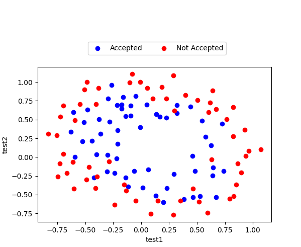
通过散点图我们可以发现,使用直线拟合边界时不可能的了,所以我们需要增加一些输入参数使得边界能够曲折,比如xp1xq2x1px2q,其中p和q时我们需要的一些幂
因此我们需要提前计算一些数据并保存在矩阵中
def feature_mapping(x1, x2, power):
    data2 = {}
    for i in np.arange(power + 1):
        for p in np.arange(i + 1):
            data2["f{}{}".format(i - p, p)] = np.power(x1, (i - p)) * np.power(x2, p)
    return pd.DataFrame(data2)
在这个模型中我们计算power为6
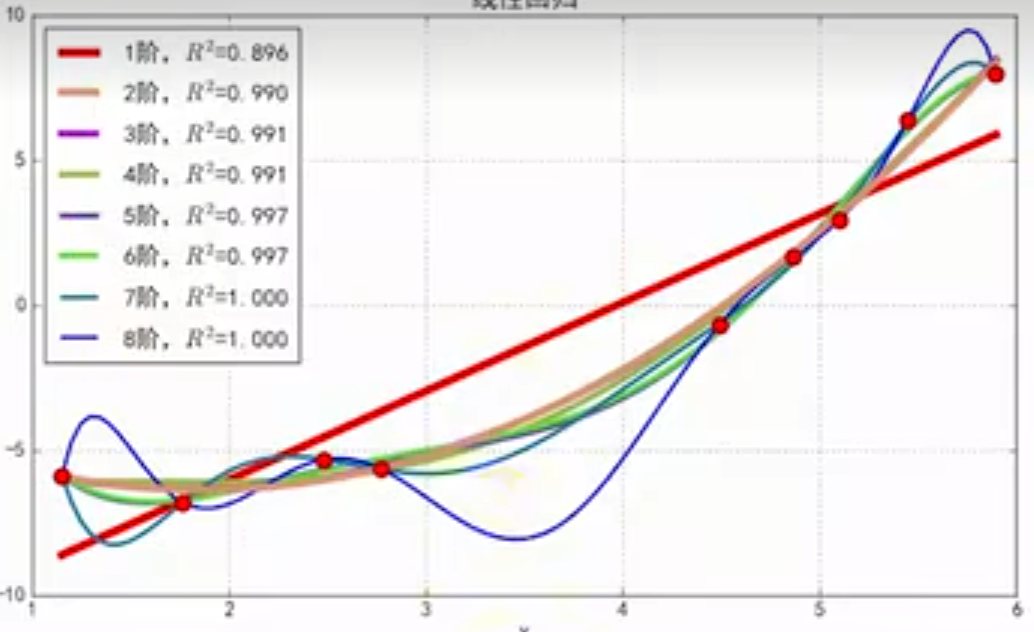
在设计代价函数之前,我们先介绍一个概念——过拟合,这种现象主要时因为我们输入的参数过于多,考虑的因素过于多而导致我们训练出来的模型仅仅只针对训练集有很好的准确率,而对于从未进入过训练的数据出现偏差过大,通过这张图你应该能够理解,针对蓝色8阶虽然能够很好的拟合所有的训练集中的数据,但是我们很清楚的知道并不适合使用这条线作为我们的结果
因此我们为了防止过拟合,我们引入了正则化项,而其余与之前我们的代价函数一致
这里需要注意的是,我们不惩罚第0项,在之前的代价函数基础之上加入惩罚项即可
def cost_reg(theta, x, y, l=1):
    # 不惩罚第一项
    theta_2 = theta[1:]
    # 惩罚项目
    reg = (l / (2 * len(x))) * (theta_2 @ theta_2)
    return cost(theta, x, y) + reg
与之前的梯度一样,也是只需要在之前的基础上添加惩罚项即可
def gradient_reg(theta, x, y, l=1):
    reg = (l / len(x)) * theta
    reg[0] = 0
    return gradient(theta, x, y) + reg
result2 = opt.fmin_tnc(func=cost_reg, x0=theta2, fprime=gradient_reg, args=(X2, Y, 2))
计算精确度
final_theta2 = result2[0]
predictions = predict(final_theta2, X2)
correct2 = [1 if a==b else 0 for (a,b) in zip(predictions,Y)]
accuracy2 = sum(correct2) / len(correct2)
print(accuracy2)  #0.8305084745762712
x = np.linspace(-1, 1.5, 250)
y = np.linspace(-1, 1.5, 250)
xx, yy = np.meshgrid(x, y)
z = feature_mapping(xx.ravel(), yy.ravel(), 6)
z = z @ final_theta2
z = z.values.reshape(xx.shape)

fig2, ax2 = plt.subplots(figsize=(6, 5))
ax2.scatter(positive2['test1'], positive2['test2'], c='b', label='Accepted')
ax2.scatter(negative2['test1'], negative2['test2'], c='r', label='Not Accepted')
box = ax2.get_position()
ax2.set_position([box.x0, box.y0,  box.width, box.height * 0.8])
ax2.legend(loc='center left', bbox_to_anchor=(0.2, 1.12), ncol=3)
ax2.set_xlabel('test1')
ax2.set_ylabel('test2')
plt.contour(xx, yy, z, 0)
plt.ylim(-.8, 1.2)
plt.show()

本文链接: http://blog.linrty.com/2022/10/07/%E6%9C%BA%E5%99%A8%E5%AD%A6%E4%B9%A0%E4%B9%8B%E6%97%85--%E9%80%BB%E8%BE%91%E5%9B%9E%E5%BD%92/
版权声明: 本作品采用 知识共享署名-非商业性使用-相同方式共享 4.0 国际许可协议 进行许可。转载请注明出处!
Recommend
About Joyk
Aggregate valuable and interesting links.
Joyk means Joy of geeK