
16

Full customizable Tabs for MAUI
source link: https://www.sharpnado.com/full-customizable-tabs-for-maui/
Go to the source link to view the article. You can view the picture content, updated content and better typesetting reading experience. If the link is broken, please click the button below to view the snapshot at that time.

Full customizable Tabs for MAUI
Jean-Marie Alfonsi
Oct 4, 2022
• 2 min read
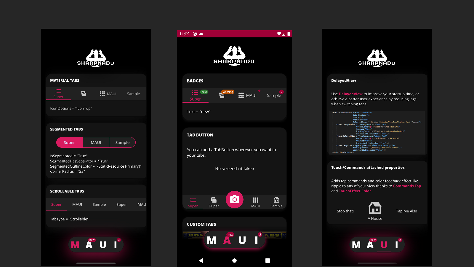
Here it is! Sharpnado.Tabs is now migrated to dotnet MAUI \o/
 |
https://github.com/roubachof/Sharpnado.Tabs |
 |
You will find all your beloved features including:
- Fully customizable
- Underlined tabs, bottom tabs, Segmented control, scrollable tabs
- Vertical tabs
- Lazy and Delayed views
- Material tabs specs full implementation
- SVG support thanks to GeometryIcon
- Badge on tabs
- Component oriented architecture
- Layout your tabs and ViewSwitcher as you want
- Shadows included in TabHost
- Bindable
Installation
- In Core project, in
MauiProgram.cs:
public static MauiApp CreateMauiApp()
{
    var builder = MauiApp.CreateBuilder();
    builder
        .UseMauiApp()
        .UseSharpnadoTabs(loggerEnabled: false);
}
Usage
First create a TabHostView which will contains all your tabs:
<tabs:TabHostView WidthRequest="250"
HeightRequest="60"
Padding="20,0"
HorizontalOptions="Center"
BackgroundColor="{StaticResource Gray900}"
CornerRadius="30"
IsSegmented="True"
Orientation="Horizontal"
SegmentedOutlineColor="{StaticResource Gray950}"
SelectedIndex="{Binding Source={x:Reference Switcher},
Path=SelectedIndex, Mode=TwoWay}"
TabType="Fixed">
<tabs:TabHostView.Shadow>
<Shadow Brush="{StaticResource Primary}"
Opacity="0.7"
Radius="30"
Offset="0,10" />
</tabs:TabHostView.Shadow>
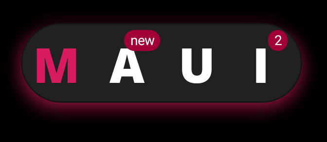
<tabs:BottomTabItem Style="{StaticResource BottomTab}" Label="M" />
<tabs:BottomTabItem Style="{StaticResource BottomTab}" Label="A">
<tabs:BottomTabItem.Badge>
<tabs:BadgeView BackgroundColor="{StaticResource Tertiary}"
Text="new" />
</tabs:BottomTabItem.Badge>
</tabs:BottomTabItem>
<tabs:UnderlinedTabItem FontFamily="OpenSansExtraBold"
Label="U"
LabelSize="36"
SelectedTabColor="{StaticResource Primary}"
UnselectedLabelColor="{StaticResource White}" />
<tabs:BottomTabItem Style="{StaticResource BottomTab}"
Padding="0,0,10,0"
Label="I">
<tabs:BottomTabItem.Badge>
<tabs:BadgeView BackgroundColor="{StaticResource Tertiary}"
Text="2" />
</tabs:BottomTabItem.Badge>
</tabs:BottomTabItem>
</tabs:TabHostView>
Then bind the SelectedIndex with a ViewSwitcher that will accordingly select your views.
<tabs:ViewSwitcher x:Name="Switcher"
                           Grid.RowSpan="3"
                           Margin="0"
                           Animate="True"
                           SelectedIndex="{Binding SelectedViewModelIndex,
                                                   Mode=TwoWay}">
    <tabs:DelayedView x:TypeArguments="views:TabM"
                        AccentColor="{StaticResource Primary}"
                        Animate="True"
                        BindingContext="{Binding HomePageViewModel}"
                        UseActivityIndicator="True" />
    <tabs:DelayedView x:TypeArguments="views:TabA"
                        AccentColor="{StaticResource Primary}"
                        Animate="True"
                        UseActivityIndicator="True" />
    <tabs:DelayedView x:TypeArguments="views:TabU"
                        AccentColor="{StaticResource Primary}"
                        Animate="True"
                        UseActivityIndicator="True" />
    <tabs:LazyView x:TypeArguments="views:TabI" Animate="True" />
</tabs:ViewSwitcher>
Find all docs and features details on github
Please go to the github repo where you will find:
- A sample app showcasing all the feature (MAUISample folder)
- Numerous screenshots and gifs
- All the possible docs you want
 GitHubroubachof
Recommend
About Joyk
Aggregate valuable and interesting links.
Joyk means Joy of geeK