
CSS box-sizing Explained
source link: https://blog.bitsrc.io/explaining-box-sizing-e5b0d86fe1ff
Go to the source link to view the article. You can view the picture content, updated content and better typesetting reading experience. If the link is broken, please click the button below to view the snapshot at that time.

CSS box-sizing Explained
What is box-sizing in CSS and how does it work

Couple years ago, I was having an interview and one of the questions asked was: What is box-sizing in CSS?
And I was unable to guess! The reason is that It’s not something I’m using much. And a big part of my learning in frontend development was more on the programming part than on the design part.
So after the interview, I went to have a look and it’s now time to talk about it.
In simple terms, box-sizing defines how the content, padding, and border add up (or not) to the width and height of the HTML element.
If your component is 200px big and has a padding of 50px, border-box will set the width back to 100px as the padding will eat some of the width (50px on each side)
Examples
Let’s have a square div with a width and height of 200px and a box-sizing of content-box(the default value):

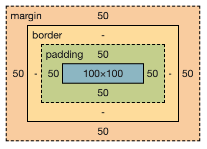
You should have a very ugly green square. What interests us though, are its dimensions:

As you can see, we have a width/height of 200px AND padding of 50px per side.
content-box will separate the padding from the width/height and if you add some more padding to your component, the component is going to grow in size.
Now let’s change our box-sizing to border-box
You should see that all of the sudden, your HTML element got smaller! And there is a reason why:

The reason is that withborder-box , the width and height determine the total size of your element. By adding some padding, the content of your HTML element will shrink instead of expanding the element’s total size.
By setting a width of 200px and a padding of 50px on each side, the effective width of your component will only be 100px (200px — (50 x 2)), and the more you increase your padding and less width/height you’ll have.
The same rule applies to borders. Let’s add a small border of 1px to our component by adding: border: 1px solid black to our CSS class. You should now have the following dimensions:

Once again, the border takes 1px on each side (So 2px on the width and 2px on the height) which with the padding, brings us to 98px wide! And the bigger your borders will be, the small your effective content will be (the width/height).
Wrapping up
Box sizing is quite an interesting CSS rule. It can be useful in cases where you’d like your component to have limited dimensions while also needing to add some padding to it without much of a hassle.
I hope you liked this article! If you did, don’t hesitate to leave a clap or follow!
Some more stories you might be interested in:
Go composable: Build apps faster like Lego
Bit is an open-source tool for building apps in a modular and collaborative way. Go composable to ship faster, more consistently, and easily scale.
Build apps, pages, user-experiences and UIs as standalone components. Use them to compose new apps and experiences faster. Bring any framework and tool into your workflow. Share, reuse, and collaborate to build together.
Help your team with:
Recommend
About Joyk
Aggregate valuable and interesting links.
Joyk means Joy of geeK
