

iOS 16 notifications: How to change the new design - 9to5Mac
source link: https://9to5mac.com/2022/09/15/ios-16-notifications-bottom/
Go to the source link to view the article. You can view the picture content, updated content and better typesetting reading experience. If the link is broken, please click the button below to view the snapshot at that time.

To coincide with the new Lock Screen widgets, Apple has also redesigned the notification system in iOS 16. Starting this year, notifications now appear at the bottom of your Lock Screen rather than at the top below the clock. This change is proving to be controversial for many iPhone users, but there are a few settings you can tweak that might improve the experience for you…
iOS 16 notification changes
Apple says that the new bottom-up design for iOS 16 notifications is meant to reduce the clutter on your Lock Screen. The idea is that by moving notifications to the bottom, you can see more of your wallpaper. This is especially important for iOS 16, which adds a slew of new Lock Screen personalization options such as widgets, depth effect wallpapers, live wallpapers, and more.
What this means is that when you update your iPhone to iOS 16, your notification will automatically start appearing at the bottom of your Lock Screen. You can swipe up these notifications to view more of them and easily delete them, tap on them, and manage notifications on a per-app basis.
But along with these changes, Apple also added some new customization options for iOS 16 notifications. If you head to the Settings app and tap on “Notifications,” you’ll see three different options. Each of these options are for customizing the appearance of notifications at the bottom of your Lock Screen.
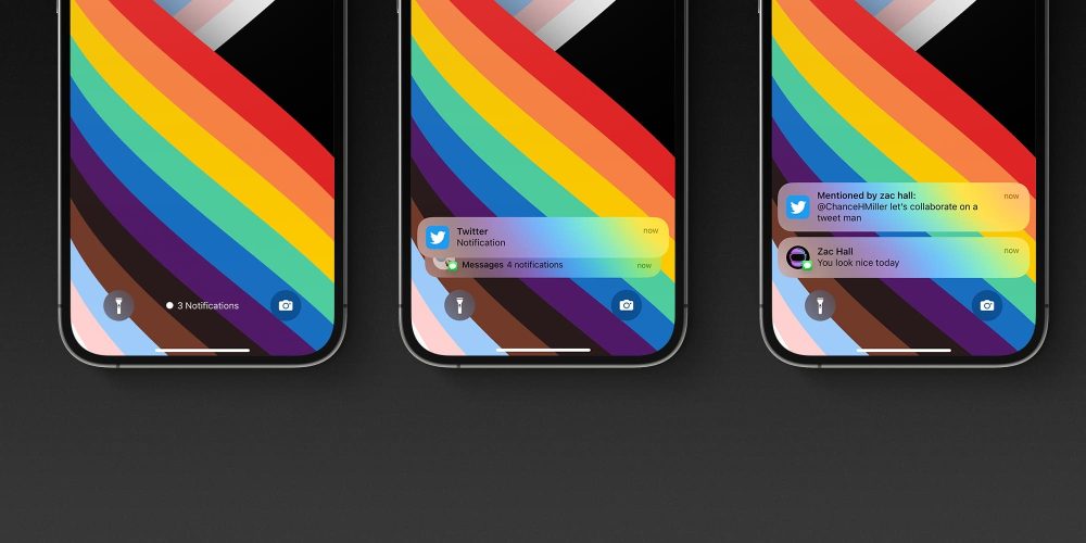
- Count: This replaces notifications on the Lock Screen with a simple piece of text that tells you how many unread notifications you have. You can swipe up to view a full list of your notifications.
- Stack: This option takes all of the notifications from each individual app and “stacks” them up. So you have individual groups of notifications for each app on your Lock Screen and in the Notification Center.
- List: This is the traditional iOS system for notifications from previous years. You’ll simply see a list of all your notifications that you can expand by swiping up from the bottom of the Lock Screen.
An interesting tidbit that I discovered from the MacStories review of iOS 16 is that you can also temporarily enable “Count” at any time by simply dragging downwards on notifications that are on your Lock Screen; this will minimize and only show the number of notifications.
Unfortunately, what you can’t change is the placement of the notifications. There’s no option to revert back to the “classic” notifications design in iOS 16. This makes sense because of the new widgets on the Lock Screen, but based on early sentiment on social media, it seems like there would definitely be a market for a “classic” Lock Screen option.
What do you think of these new designs for notifications on the iOS 16 Lock Screen? Have you gotten used to the new bottom-up design, or are you hoping for a way to revert? Let us know down in the comments.

Recommend
About Joyk
Aggregate valuable and interesting links.
Joyk means Joy of geeK