

I Love NY? It’s way more than that.
source link: https://uxdesign.cc/i-love-ny-its-way-more-than-that-e474c6de0de1
Go to the source link to view the article. You can view the picture content, updated content and better typesetting reading experience. If the link is broken, please click the button below to view the snapshot at that time.

I Love NY? It’s way more than that.
There’s actually so, so much to learn about Milton Glaser’s iconic logo.
My Creative Monologue this time takes us back to the 70’s, where the design of I❤️NY makes its debut. It’s for a cause, but how did that fare so far? Let’s see.
ONE OF NEW YORK’S most iconic visuals can arguably be its tourism logo “I❤️NY.” Comprising just four glyphs, it is very recognisable in one look and easily imitated by other cash-grab merchandisers.
You may have heard its origin story: a designer working on the logo got the idea while riding in a taxi. He draws out the characters on an envelope with a red crayon, and the rest is history.
That’s a nice little story to tell, but it’s a really, really brief summary of what happened. It beckons questions: Why did the designer have a crayon with him on a taxi? Why was a major advertising campaign so seemingly rushed? How did he convince government officials that his mere scribble will work? And what can we learn from this logo?
Of course, this abbreviated story has more to it than that, and I’m here to find out. And to find out all that I can know about this logo, so you can know too.

A recreation of Milton Glaser’s studio. With his colleague, George Leavitt modifying the American Typewriter typeface, the finalised logo was made to great fanfare later on in time.
Who Designed It?
Milton Glaser (the said man of crayon scribbler) was already a well-established graphic designer with his design firm when the New York State Department of Commerce contacted him in 1977. Working alongside them and advertising agency Wells Rich Greene (WRG) (more on that later!), Glaser was tasked to design a logo as part of an effort to draw people from out-of-state to come to New York. Why? The state was in disarray and barely getting itself away from bankruptcy. A series of unfortunate events, including violence and homelessness, has turned a once-bustling city into a potential slum.
It is interesting to note that Glaser was raised as a Bronx-residing New Yorker back in the 1930s. His family and the neighbourhood helped shape him to be a more open-minded individual, including impartiality towards race and choices of career, and he liked that. This likely played a major role in how he approached the job of making the now-iconic logo.
Having been a co-founder of local design studio Push Pin in 1954, his departure to go solo in 1975 can be further seen as taking a risk. It’s in the middle of hard times for New Yorkers, and starting a business from scratch wouldn’t seem ideal.
On choosing to remain as the director of Push Pin, Seymour Chwast says: “Milton was more secure with his reputation. I am less secure. I felt that I needed some help, and the name Push Pin came with a reputation.” Glaser was in a good place in his career. From all his commissions, having presidency at New York Magazine, and Push Pin’s success, Glaser was confident in his craft and wanted to preserve that. Moving on from Push Pin was part of his development as a designer.
Glaser of course isn’t oblivious to the fact he’s making this privileged choice while his hometown is slowly falling apart. Remember how he was fond of his life as a Bronxite? He stuck by New York and didn’t give up on it. It’s of no surprise then that he’d willingly help out with boosting tourism in his state when given the opportunity. He offered to design the tourism logo pro bono and even agreed to have the logo not copyrighted upon the request of the Commerce Department. He accepted a one-time fee of $2,000 to cover part of his production costs. It is a rather small sum in comparison to the multi-million dollar earnings after its huge popularity and later licensed by the Empire State Development (ESD).
Jane Maas, then the creative director of WRG, said a different story. There was only a fee of $1,000 offered to him. Jim Kelly from Bloomberg further pointed out the fee was used to obtain the rights of the logo from Glaser.
Any monetary intentions from him, however, can be dispelled when we consider his revisitation of the logo, in wake of the September 11 attacks in 2001. Proclaiming his and the state’s love for New York “More Than Ever,’’ Glaser freely shared the designed poster with those whom he knew. No cents were made, but a lot of exposure was done as the design was tacked all over the city and the Daily News. Charities also received his prints for free to help in fundraising efforts.

Milton Glaser’s doodle of “I Love New York” in rebus form, while seated at the back of a taxi. That was his “eureka” moment.
Was It More Than a Scribble?
The crayon scribble wasn’t even the first idea that got approved, and the logo we see today almost didn’t go public. Neither was the phrase “I love New York” likely first in Glaser’s hand. According to John Dyson, the Commissioner of Commerce, his assistant William (Bill) Doyle was bouncing around ideas with someone else. “…It’s a Heck of a State” was thankfully not approved. Thereafter, ‘Love’ came into the picture, one of the words Doyle believes matters in advertising, other than ‘New,’ amongst others. “I Love New York” was the outcome, and Dyson agreed to it.*
*The phrase “I Love New York” is still up to debate whether Wells Rich Greene or the Commissioners thought of it first. WRG has been known to incorporate themes of love into their advertisements before they were hired to take on the task of promoting New York tourism.
When Milton Glaser got tasked later by Doyle to do the logo, he had already gotten another earlier design approved by them, ready to be published. The said logo was the same phrase, with a couple of words each enclosed in lozenge shapes. (See more information about the shape below) Glaser further commented that such designs in that time are “much like all the logos you’d see around every day of your life.”
But satisfied, Glaser was not. That’s when said magic comes. On a whim, in a taxi, he pulls out a piece of envelope paper coincidentally in his pocket. He starts making a little doodle on it with a red crayon. Glaser reduced the phrase into a condensed, yet comprehensible “puzzle.” That is, to combine a word, icon, and initial. As a result, the short phrase is now even shorter. “I❤️NY” was born.
So why does he have a crayon in a taxi? Let it be known to you that Milton Glaser does not stick to one medium, and he hates image manipulation to generate ideas. Illustrations are the next best thing for him to produce what he envisioned. Glaser usually drafts using pencils and pastels, thus making it unsurprising for him to possess one at any given moment, should he ever need to draw something he suddenly thinks of.
It’s now up to him to convince Bill Doyle and the others of his newfound improved work. But of course, not just with a scribble.

NY Deputy Commissioner Bill Doyle, along with his wife, wore his self-printed I❤️NY tees to a beach in Barbados to test-market the design. It was successful.
The Typeface and The Test
Now that the logo has become a rebus, Glaser’s intention for its informality is one step closer. The next step? Using a typeface that everyone is accustomed to seeing in that era: American Typewriter. Spanning more than a century, typewriters have been a common tool for people to print letters and documents. With a distinct monospaced serif appearance, American Typewriter (by Joel Kaden and Tony Stan) took inspiration from it and altered the look to be more proportionate in width.
Being released in 1974 under International Typeface Corporation (ITC), it was just in time for Glaser to see and utilise it in the logo.* More tweaks on the typeface were done by his colleague, George Leavitt, for it to fit better with the heart symbol, including a slight weight increase and the reduction of the serifs’ “cupping.” Presentation boards were created, a plea for a second meeting was called (to Bill Doyle’s initial reluctance), and things still didn’t go well. Those in the meeting room didn’t think that the “puzzle” could be easily decipherable.
*Milton Glaser admitted that he might have been influenced subliminally by Robert Indiana’s LOVE sculpture (which was featured in New York in 1970), moving him to split and realign the rebus into the two-row logo we see today. LOVE also utilises a serif typeface. Serifs are more favoured to be used in vertically-aligned type treatment. This is because the widths of each capital alphabet are closer to each other than a sans serif, or any other typeface genre.
Doyle begged to differ and decided to do a little test. He had the design printed on two T-shirts to be worn out on the beach with his partner. (Now you know who had the first I❤️NY merch!) In search of public reactions to Glaser’s work, Doyle gathered numerous inquiries from beach-goers on where to buy his shirt. Doyle thereafter endorsed the design wholeheartedly, and up to the adverts, it went.

A Ramble About the “Lozenges”
There are hardly any visuals in regards to this previous “I Love New York” logo that Glaser talked about, with only one found source resembling the shapes of pills.* Glaser also did mention the shapes being ovals. However, I am still not very sure whether the mentioned lozenge shape refers to the pill shape or another kind of oval.
*Milton Glaser sure does enjoy pills in his art, though. In his portfolio Art is Work, Glaser spoke about his commission by the Heckscher Museum of Art to design a time capsule. A tongue-in-cheek approach led him to purchase fifty kinds of over-the-counter medicines to be encased in transparent tubes, all held within a clear box. “A capsule of capsules,” he thought, could be a way for people to learn “the nature of a culture by the nature of its sicknesses.” But I digress.
There are indeed logos that encompass shapes of pills and ovals back in the ’70s. Ford, Nikon, and Warner Communications are just some of the notable companies that adorn them. The 1976 Olympics in Montreal, Canada also fuses pill shapes onto the Olympic rings in its logo.
Silhouettes resembling part of pill shapes are also common during this era. Ted Butler’s Supergraphic painting kit is one prime example of the common rounded rainbow-like wall motifs that households and public spaces in the ’70s would have.
Pill shapes have interestingly made a comeback in interior and graphic design (here are some nice specimens of that). The revamp of the system rail map of Singapore’s Mass Rapid Transit (MRT) in 2013 involves modifying train number codes to be in shapes similar to a pill. They are otherwise known as Station Caplets. Maybe Glaser was up to something that he knew was too ahead of its time.
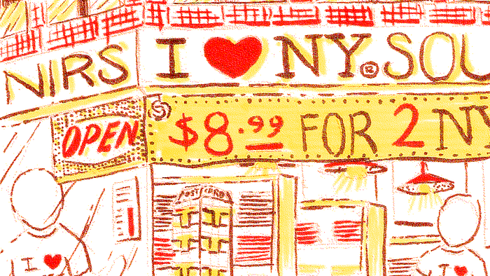
There are many gift shops in New York City selling merchandises with the iconic logo on it.
Just How Impactful Was the Logo?
Words needn’t be said about how prevalent I❤️NY has become in its native state. It’s now a multimillion-dollar investment from all the merchandise sold with that artwork on them. New York is still a hot tourist spot, and more buildings scrape the skies than ever over there. But this little big logo has also proven a harrowing point. As Glaser puts it: “Whatever you believe turns out to be what you perceive as real.” While he means it with good intentions, to manifest positivity starting from our minds, that positive feeling can also obscure the harsh truth underneath. New York is still dealing with poverty and inequalities to this day.
To be fair, the I❤️NY campaign has mainly been to pull in more money from tourism (and Glaser thought the design would only last a short period of time). Helping the less privileged doesn’t seem to be on the top of the list. In the long run, it could in turn have exacerbated income inequality. Consider how all these New York’s foreigner-attracting skyscrapers are rich people’s investments. And that threatens the opportunity for lower-wage workers to afford a home to stay in. The COVID-19 pandemic has also made more evident racial inequalities still existing in New York City.
You can also see this issue being raised when Milton Glaser freely released the “More Than Ever” poster back in 2001. The ESD owned the rights to the logo by then, and was attempting to sue Glaser for misusing his design, because “we don’t want to show a damaged heart.” It seems that saving their image of New York was more important than addressing the problem at hand, that of supporting those affected by the attacks.
Conclusion
Milton Glaser’s “last-minute” change of the crayon scribble is a skill cultivated throughout his life, even before he became a designer. If he hadn’t been raised in a city of diverse people filled with grit, acquired a critical eye and mind for exceptional work, learned to draft using pastels, or made that trip to Italy and rejected one-dimensional collage work, I❤️NY probably wouldn’t have existed.
But his love for New York was not translated well when it got into other people’s hands, for better and for worse. A designer can only do that much to exude change by themselves. Whether their narrative remains or continues to be upbuilding, that’s not fully up to their control.
Designers are not superheroes, but they sure can make a statement that lasts so long.
Recommend
About Joyk
Aggregate valuable and interesting links.
Joyk means Joy of geeK