

A data visualization recovery from failed color deficiency tests
source link: https://uxdesign.cc/a-data-visualization-recovery-from-failed-color-deficiency-tests-4ce55f78ff98
Go to the source link to view the article. You can view the picture content, updated content and better typesetting reading experience. If the link is broken, please click the button below to view the snapshot at that time.

A data visualization recovery from failed color deficiency tests

Testing for color deficiency is an important part of the process of colorizing a data visualization. The results from color blindness simulators can also produce color combination surprises. In this writing, I highlight a color scheme I resurrected from failed color deficiency checks. The revived color scheme, TritaLightRB-2, was then applied in my data visualization practice. Let’s get started by exploring some basics of color deficiency and the use of color blindness simulators.
Addressing Color Deficiencies:
In humans, there are three types of photoreceptors or cones where each is sensitive to different parts of the visual spectrum of light to facilitate rich color vision. If one or more of the set of cones does not perform properly, a color deficiency results. A red cone deficiency is classified as Protanopia. A green cone deficiency is classified as Deuteranopia. A blue cone deficiency is classified as Tritanopia. Software is available that simulates color deficiencies. The Color Blindness Simulator (Coblis) tool is a freely available online app that serves this purpose. Let’s look at an example from my prior writing on “Complements that Diverge: Using a complementary color harmony to build a diverging color scheme for data visualization”.

Successful Color Deficiency Checks for a Horizontal Bar Chart Data Visualization with a Magenta-Yellow Green Color Scheme.
The sample data visualization was a horizontal bar chart that depicts preferences as Strongly Agree, Agree, Neutral, Disagree and Strongly Disagree. Such a rating is commonly used in studies or usability tests. I decided to use a Magenta — Yellow-Green color combination as the basis of a five step diverging color scheme for this data visualization. A diverging color scheme supports quantitative data that progresses outward from a central neutral midpoint to two different color extremes. The color scheme is formed by fusing two different color sequences together with a neutral midpoint.
The Magenta colors represented Strongly Agree and Agree while the Yellow-Green colors represented Disagree and Strongly Disagree. The Neutral mid-range data was represented by White. Notice that I added a Light Gray background to the Bar Chart Visualization so that the White Neutral data could be easily distinguished. The Coblis results indicated that individuals with Protanopia, Deuteranopia or Tritanopia would not see the Magenta and Yellow-Green color scheme but could distinguish between the different color elements in the data visualizations. The diverging color scheme concept was maintained. The visualization passed color deficiency tests.
Exploring the Tritanopia Light Red and Light Blue Color Scheme:
After examining the Light Red and Light Blue Color Scheme from the Tritanopia color deficiency test, I decided to explore using it as a potential five step diverging color scheme for data visualization. As a result, I imported an image of the Tritanopia color deficiency check into Adobe Color. Adobe Color is a color suggestion tool that extracts five colors from an image, defines the five colors as a Color Theme (or Scheme), and determines their corresponding color Hex codes. For those unfamiliar with the concept, a color Hex code is a hexadecimal way to represent a color in RGB format by combining amounts of Red, Green, and Blue to note that specific color. The Tritanopia image imported into Adobe Color for color extraction is shown below.

The Tritanopia Color Deficiency image imported into Adobe Color for Color Extraction.
Once the Tritanopia image was imported into Adobe Color, I repositioned the five color sensors to map to the original Tritanopia Light Red and Light Blue combination. I named this potential five step diverging color scheme “TritaLightRB-5”. These results are shown below with the corresponding color Hex codes highlighted.

Determining the Color Scheme and corresponding Color Hex Codes for the Tritanopia Color Deficiency image.
Adobe Color also provides “Color Blindness” accessibility checks for evaluating their color schemes. If the five-color combination does not pass color deficiency checks, the colors in the scheme can be repositioned to pass the checks. I used these functions on TritaLightRB-5 for a preliminary assessment of Protanopia and Deuteranopia color deficiencies. To find the “Color Blindness” checks, I selected the “Accessibility” option and located the “Color Blind Safe” function. These results are shown below.
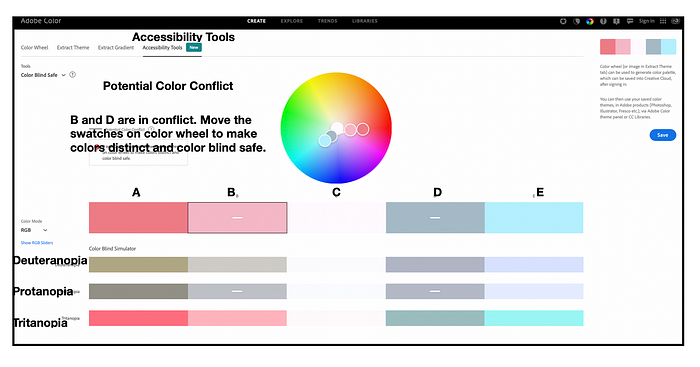
Using Adobe Color’s Accessibility Tools for Preliminary Color Deficiency checks of TritaLightRB-5 color scheme. TritaLightRB-5 fails Protanopia and Deuteranopia tests.
Unfortunately, TritaLightRB-5 did not pass all the color deficiency checks. According to the simulations, the colors positioned as B (Lighter Red) and D (Lighter Blue) were not easily differentiated from one another by individuals with Protanopia and Deuteranopia. The proposed five color combination would not be acceptable when used as a five-step diverging color scheme that supports universal access.
However, I looked more carefully at the colors positioned on the far ends of the color scheme, A — Light Red and E — Light Blue. These two colors positioned together appeared to pass color deficiency checks. Individuals with Protanopia, Deuteranopia and Tritanopia could distinguish between the A — Light Red and E — Light Blue colors. If I had a data visualization that required only two colors, I could use the Light Red and Light Blue color scheme. This combination with corresponding color deficiency checks is shown below.

Detail of Adobe Color’s Color Deficiency checks (Deuteranopia, Protanopia and Tritanopia) for colors A and E in the TritaLightRB-5 color theme. Note that individuals with these color deficiencies can distinguish between the color elements of A and E.
My next step was to return to the “Color Wheel” display screen in Adobe Color so that I could determine the color Hex codes for the colors A and E. This allowed me to establish a color scheme with two colors to use in potential data visualizations. I named the color scheme TritaLightRB-2. I show these results below.

Using Adobe Color to Build the Color Scheme, TritaLightRB-2, composed of Light Red — #ED7D87 and Light Blue — #B7ECFF.
Using my Five Stage Colorization Process to Apply TritaLightRB-2 to a Bubble Chart:
I decided to try to use TritaLightRB-2 in a two-color Bubble Chart visualization. I used my previously noted five stage colorization process to apply TritaLightRB-2 to the Bubble Chart. These five phases, depicted in the circular diagram below, are: (1) Establish data classes and key colors for visualization; (2) Select color rule, color harmony per criteria of your data: (3) Build color scheme. A color suggestion tool might be helpful. (4) Check and revise due to color deficiency, contrasts, or any pre-existing conditions and (5) Apply color scheme to data visualization. Some modifications might result.

My Five Step Process for Colorizing a Data Visualization.
Let’s examine the specifics I went through to apply TritaLightRB-2 to a Bubble Chart visualization.
(1) Establish data classes and key colors for visualization:
This sample data set included sales data for the months May and June. For the Bubble Chart visualization, there were two classes of data (May and June). The key colors are the Light Red — #ED7D87 and Light Blue — #B7ECFF that form TritaLightRB-2. The data and key colors are shown below.

Data and Key Colors for the Bubble Chart Visualization.
(2) Select color rule, color harmony per criteria of your data:
As noted earlier, my color scheme was derived from the Tritanopia color deficiency tests of a Magenta and Yellow-Green color scheme.
(3) Build color scheme. A color suggestion tool might be helpful.
I used Adobe Color to build and create the resulting TritaLightRB-2 color scheme.
(4) Check and revise due to color deficiency, contrasts, or any pre-existing conditions.
Previously, TritaLightRB-2 was successfully evaluated for color deficiency using the Adobe Color Accessibility tools.
(5) Apply color scheme to data visualization. Some modifications might result.
Below, I show the results of applying the TritaLightRB-2 color scheme to the sample Bubble Chart visualization.

Applyg TritaLightRB-2, composed of Light Red — #ED7D87 and Light Blue — #B7ECFF to the Bubble Chart Visualization.
To be extra careful, I used Coblis for a color deficiency check of the TritaLightRB-2 Bubble Chart visualization. I show these results below.

Using the Color Blindness Simulator, Coblis, for a color deficiency check of the TritaLightRB-2 Bubble Chart. The TritaLightRB-2 Bubble Chart passes the tests.
Happily, the Coblis checks indicate that individuals with Protanopia — Loss of Red Cone and Deuteranopia — Loss of Green Cone can distinguish between the two data classes although they will not view the original TritaLightRB-2 color scheme. As expected, individuals with Tritanopia– Loss of Blue Cone will view the TritaLightRB-2 color scheme in a similar way to someone with Normal Color Vision.
Concluding Remarks:
In this writing, I have discussed my journey to build a successful color scheme out of the results of failed color deficiency tests. I began with the successful color deficiency checks from a Magenta –Yellow Green data visualization. The positive results of the Tritanopia — Loss of Blue Cone color deficiency simulations inspired me to try to build a five-stage diverging color scheme of Light Red and Light Blue.
I was able to import the original Tritanopia color deficiency image into Adobe Color for color extraction. Adobe Color provided me with the corresponding Hex codes for the proposed five-step diverging color scheme of two Light Reds and two Light Blues with a White midpoint. I named this color scheme TritaLightRB-5. I then used Adobe Color’s Accessibility Tools for preliminary color deficiency checks of the five-step color scheme. Unfortunately, TritaLightRB-5 failed Protanopia and Deuteranopia tests. The proposed five color combination would not be acceptable as a five-step diverging color scheme.
However, I looked more carefully at the colors positioned on the far ends of TritaLightRB-5 color scheme, A — Light Red and E — Light Blue. As shown in Adobe Color, these two colors positioned together appeared to pass color deficiency checks. Individuals with Protanopia, Deuteranopia and Tritanopia could distinguish between the A — Light Red and E — Light Blue colors. If I had a data visualization that required only two colors, I could use the Light Red and Light Blue color scheme. I named this color scheme TritaLightRB-2 and applied it to a Bubble Chart example that needed only two colors. I performed a Coblis color deficiency check on the TritaLightRB-2 bubble chart. To my delight, TritaLightRB-2 bubble chart passed Protanopia and Deuteranopia color deficiency checks. As expected, individuals with Tritanopia will view the TritaLightRB-2 color scheme in a similar way to someone with Normal Color Vision.

Summary Flow for aResurrectedColor Scheme from Failed Color Deficiency Checks. The Result is a Bubble Chart Visualization that Passes Color Deficiency Checks.
The process of colorizing data visualizations is an adventure that can yield unexpected results. When I started this specific colorization journey, I did not expect TritaLightRB-5 would fail color deficiency tests and be unacceptable as a five-stage diverging color scheme. It was a relief to salvage a two color TritaLightRB-2combination that worked for the case of a Bubble Chart visualization and passed color deficiency checks. You will likely make your own unique discoveries while building color schemes for your projects. For additional discussions on my other colorization efforts, please see my prior articles for UX Collective and Nightingale as well as my 2016 book on “Applying Color Theory to Digital Media and Visualization” published by CRC Press.
About the Author:
Theresa-Marie Rhyne is a Visualization Consultant with extensive experience in producing and colorizing digital media and visualizations. She has consulted with the Stanford University Visualization Group on a Color Suggestion Prototype System, the Center for Visualization at the University of California at Davis and the Scientific Computing and Imaging Institute at the University of Utah on applying color theory to Ensemble Data Visualization. Prior to her consulting work, she founded two visualization centers: (a) the United States Environmental Protection Agency’s Scientific Visualization Center and (b) the Center for Visualization and Analytics at North Carolina State University.
Recommend
About Joyk
Aggregate valuable and interesting links.
Joyk means Joy of geeK