

你不应该依赖CSS 100vh,这就是原因!
source link: https://www.51cto.com/article/716985.html
Go to the source link to view the article. You can view the picture content, updated content and better typesetting reading experience. If the link is broken, please click the button below to view the snapshot at that time.

你不应该依赖CSS 100vh,这就是原因!
如果有一个文本和一个按钮,我们想让文本粘在上面,而按钮粘在下面!使用CSS Flex 似乎很容易做到。
// HTML
<div className="layout">
  <p>Lorem ipsum dolor sit amet...</p>
  <button>Sign Up</button>
</div>

// CSS
.layout {
  display: flex;
  flex-direction: column;
  justify-content: space-between;
  min-height: 100vh;
}
在真机检查一下效果:
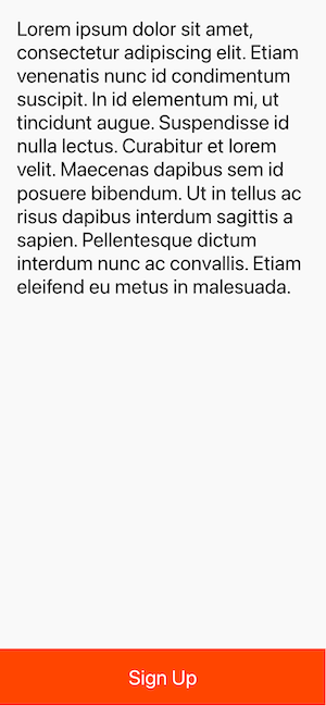
酷! Git add, git commit, git push, oh yeah!
这有什么问题吗?
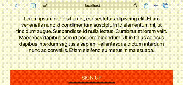
当然,是有的! 要看到这个问题,你需要在真实的手机或模拟器上查看你的应用程序。在本文中使用的 iPhone 13(iOS 15.2)进行测试,下面是结果:
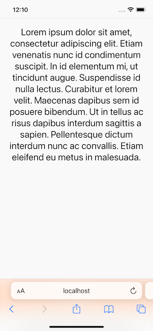
啥,底部按钮跑哪里去了?
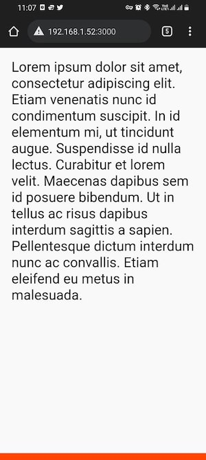
顺便说一下,它在安卓手机上甚至不能按预期工作。
为什么100vh问题会发生在移动设备上?
我对这个问题进行了一番调查,发现了其中的原因。简短的答案是,浏览器的工具栏高度没有被考虑在内。如果你想深入了解为什么会发生这种情况,Stack Overflow的这个帖子很有帮助。
如何修复移动设备上的100vh问题?
第一个建议是尽量少用 vh。例如,在上面的代码中,你可以使用一个 sticky 按钮,避免使用vh单位。
// HTML
<div className="layout">
  <p>Lorem ipsum dolor sit amet...</p>
  <button>Sign Up</button>
</div>

// CSS
.layout {
  display: flex;
  flex-direction: column;
  justify-content: space-between;
  min-height: 100vh;
}
.layout button {
  position: sticky;
  bottom: 0;
}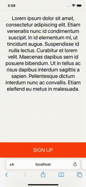
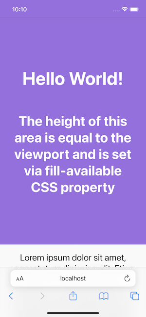
它在横向模式下也很好:
说实话,结果是好的,但你不能总是用 sticky 元素来解决 100vh 的问题。
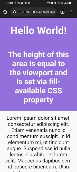
仅使用 CSS 在移动设备上修复 100VH 问题
时,使用 vh 的目的是为了简单地创建与视口高度相等的部分。例如,当你在建立登陆页面时,这很常见。在这些情况下,position sticky不会有帮助,这里介绍一下 fill-available属性。它用起来很简单,只要记住使用前缀和回退值就可以了。
.layout {
  min-height: 100vh;            /* fall-back */
  min-height: -moz-available;
  min-height: -webkit-fill-available;
  min-height: fill-available;
}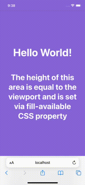
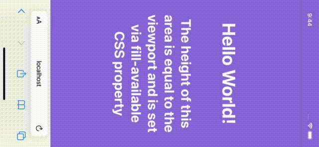
而且,当你旋转设备时,它还会更新高度,太棒了!
用 fill-available 修复 100vh 的问题确实很直接,但在调查这个解决方案时,也遇到过一些问题。
1. HTML类型声明问题
页面上有 <!DOCTYPE html> 声明,会使 fill-available 在 Chrome 浏览器上无法正常工作。
甚至不能在安卓浏览器上工作:
因此,为了解决这个问题,必须从页面中删除 doctype 声明。
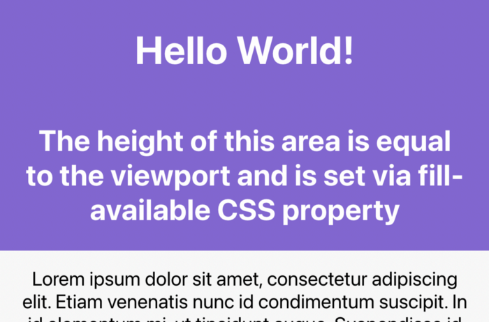
2. Safari上的垂直 padding 问题
在 min-height(或 height)为 fill-available的元素上添加垂直 padding (bottom 和 top),Safari浏览器上会导致问题,高度不会正确。
要解决这个问题,只需将你的内容包在另一个 div 元素内,就可以了:
// HTML
<div class="screen">
  <div class="content">
    ...
  </div>
</div>

// CSS
.screen {
  background-color: mediumpurple;
  min-height: 100vh;
  min-height: -moz-available;
  min-height: -webkit-fill-available;
  min-height: fill-available;
}
.content {
  color: #fff;
  display: flex;
  flex-direction: column;
  justify-content: center;
  height: 100%;
  padding: 30px;
}
3. fill-available 不能与 calc() 一起使用
需要注意的一件事是,不能在 fill-available 属性下使用 calc()。所以,下面的CSS规则就不会生效:
min-height: calc(-webkit-fill-available / 2);例如,如果需要在元素上有一半的可用高度,必须使用JavaScript。
使用JavaScript修复移动设备上的100vh问题
可以使用 window 的 innerHeight 属性,将元素 height (或minHeight)设置为window.innerHeight,如下所示:
<!DOCTYPE html>
<html lang="en">
<head>
  <style>
    ...
  </style>
</head>
<body>
<div id="intro">
  <h1>Hello World!</h1>
  <h2>The height of this area is equal to...</h2>
</div>
...
<script>
  (function () {
    const el = document.getElementById('intro');
    el.style.minHeight = window.innerHeight + 'px';
  })();
</script>
</body>
</html>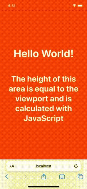
接着,再介绍一种花销的方式。一些开发者喜欢根据窗口的内部高度定义一个CSS变量,并使用该变量来设计他们所需的元素。代码如下:
// 以像素为单位计算1vh值
// 基于窗口的内部高度
var vh = window.innerHeight * 0.01;

//  将CSS变量设置为根元素
// 相当于1vh
document.documentElement.style.setProperty('--vh', vh + 'px');
在 CSS 中:
min-height: calc(var(--vh) * 100);最后一件事是当窗口被调整大小或设备方向改变时,重新计算这个值:
function calculateVh() {
  var vh = window.innerHeight * 0.01;
  document.documentElement.style.setProperty('--vh', vh + 'px');
}

// 初始计算
calculateVh();

// 调整大小时重新计算
window.addEventListener('resize', calculateVh);

// 在设备方向改变时重新计算
window.addEventListener('orientationchange', calculateVh);
在我看来,你应该先用CSS的解决方案。
作者:Mehdi Namvar
译者:前端小智
来源:mediun
原文:https://ilxanlar.mdium.com/you-shouldnt-relyon-css-100vh-and-here-s-why-1b4721e74487
Recommend
About Joyk
Aggregate valuable and interesting links.
Joyk means Joy of geeK