

Introduction to Unity UI – Part 1 [FREE]
source link: https://www.raywenderlich.com/34347684-introduction-to-unity-ui-part-1
Go to the source link to view the article. You can view the picture content, updated content and better typesetting reading experience. If the link is broken, please click the button below to view the snapshot at that time.

Introduction to Unity UI
A user interfaces is a crucial part of any video game. While you may think of video games as interactive stories full of gameplay and adventure, technically they’re just like any other software package. All games require inputs from the user — even the most basic games ask the user to at least navigate a main menu to start the game.
One of Unity’s strengths is its ability to publish multiplatform with little-to-no changes between platforms. But for that, you need to have a UI that’s capable of adapting to different screens without becoming a burden to the user.
In this tutorial, you’ll learn about the most common components developers use to build user interfaces in Unity. You’ll also learn about the canvas system and how to anchor your UI to adapt to different screen layouts. And you’ll do it all while listening to some sweet sliding blues music. :]
Getting Started
Download the starter project by clicking the Download Materials button at the top or bottom of the tutorial.
Open the starter project in the latest Unity 2021 LTS version. You can use the Unity Hub to download and install the latest version.
Once you’re set up, open the starter project in Unity and open the JukeboxHero scene in the Assets / Scenes folder. Press Play, and you’ll see a quaint bar scene with a jukebox playing in the corner. Your task is to set up some UI to let the player come in and change what’s playing.

A basic understanding of the Unity editor is all you need to get started in this tutorial. No scripting knowledge is required here, but you’ll use Unity Events to interact with the code. If you’re new to Unity, check out the Introduction to Unity tutorial.
Introducing the Unity Canvas
Just like any artist’s workflow, painting a user interface starts with a canvas. In Unity, the Canvas component controls where and how the UI is drawn to the screen. The main way it does this is through its Render Mode options.
To create a Canvas component in the scene, right-click in the hierarchy and select UI ▸ Canvas. Or, go to the top menu and select GameObject ▸ UI ▸ Canvas. Name your canvas WorldCanvas.

Next, select your new WorldCanvas and take a look at it in the Inspector window. You’ll see that the new object comes with a set of components.
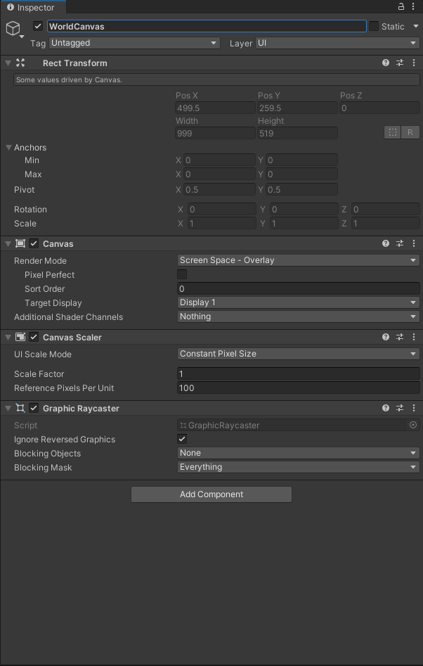
- RectTransform: All GameObjects in Unity have a Transform component, but for UI objects this is replaced with a RectTransform that gives you more control over how to position it in relation to the canvas or any other parent object. By the end of this tutorial, you’ll be very familiar with this component.
- Canvas: This component is the main behavior you’re about to explore.
- Canvas Scaler: This component helps your UI adapt its scale to fit the target screen.
- Graphic Raycaster: Without this, none of your buttons will work with the input system.
Using Render Modes
You’ll focus first on the Canvas component. You can see here it has a few different settings, but the one of most interest is the Render Mode. By default this will be set to Screen Space – Overlay, but there’s also Screen Space – Camera and World Space.

-
Screen Space – Overlay: This is the most common setting for the canvas. It means that the UI is drawn to the screen on top of everything else you have to render. If the screen is resized or changes resolution, your UI will change to match it.

-
Screen Space – Camera: Similarly, Screen Space – Camera will adapt to changes in screen size or resolution — but it will also adapt to the view frustum of the camera that’s set in the Render Camera field. This canvas mode can be used to render 2D menus that appear like they’re 3D, perhaps at an angle to the screen.

-
World Space: The final canvas mode allows you to place your 2D UI into the 3D world space. This is how you would set up indicators over a character’s head in a VR game, for example. Your UI is still just on a 2D plane, though, so you need to consider how the player will view it in the world. Does it need to rotate (billboard) to the user at all times? Or do they need to walk up to it from a certain direction to interact with it?

Understanding the Canvas Scaler
As you may have noticed in the screenshots above, the RectTransform component is grayed out when the canvas is set to either of the screen space render modes. That’s because a combination of the actual device screen, the camera frustum in Screen Space – Camera mode, and the Canvas Scaler control the size of the canvas.
The canvas scaler has three different modes to control how your UI is scaled to fit the screen.
-
Constant Pixel Size: In this mode, parts of the UI retain the pixel size, no matter the resolution of the screen the game is running on. This mode can be useful if you’d like the player to have control over how large the UI appears in the game, as adjusting the Scale Factor in the canvas scaler can scale the UI up or down.

-
Scale with Screen Size: This is the mode to use when you want your UI to adapt to different screen layouts from a single design. In this mode, you provide a Reference Resolution before setting a Screen Match Mode to determine how your UI will adapt to different screens.

- Reference Resolution: set this to the resolution your design was made for. For example, 1920 x 1080 for a PC game.
-
Screen Match Mode – How the UI should adapt if the device screen aspect ratio doesn’t match the reference resolution.
- Match Width or Height: This mode gives a slider to set whether the UI should maintain its width, height or somewhere in between.
- Expand: Expands the canvas area in either width or height so the size of the canvas is never smaller than the reference.
-
Shrink: Crops the canvas in either direction so the size of the canvas is never larger than the reference.
Note: Expand and Shrink are similar to how your television has different modes, and how it presents a cinema-format film on a 16:9 screen.
-
Constant Physical Size: Use this mode to keep your UI elements at the same physical size, no matter the resolution of the screen. This can be great for on-screen controls such as those in the PlayStation Remote Play app. However, the mode relies on the device reporting its DPI (or a fallback default) to correctly work out the size. In this mode you can choose different types of Units to control the size including centimeters, inches and points.
 Note: For more tips on building your UI for different resolutions, check out the Unity documentation.
Now that you know all about the canvas and its different modes, it’s time to put this knowledge to practice! It’s time to become a jukebox hero. :]
Building a World UI
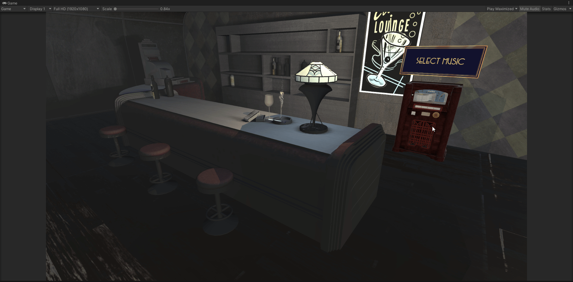
For this project, you’re going to build a UI that lets the user change the music playing on the jukebox through a 2D menu. But first, to access the menu, the player will need to click on a button that’s hovering just above the jukebox in the scene. This is where your first canvas will come in.
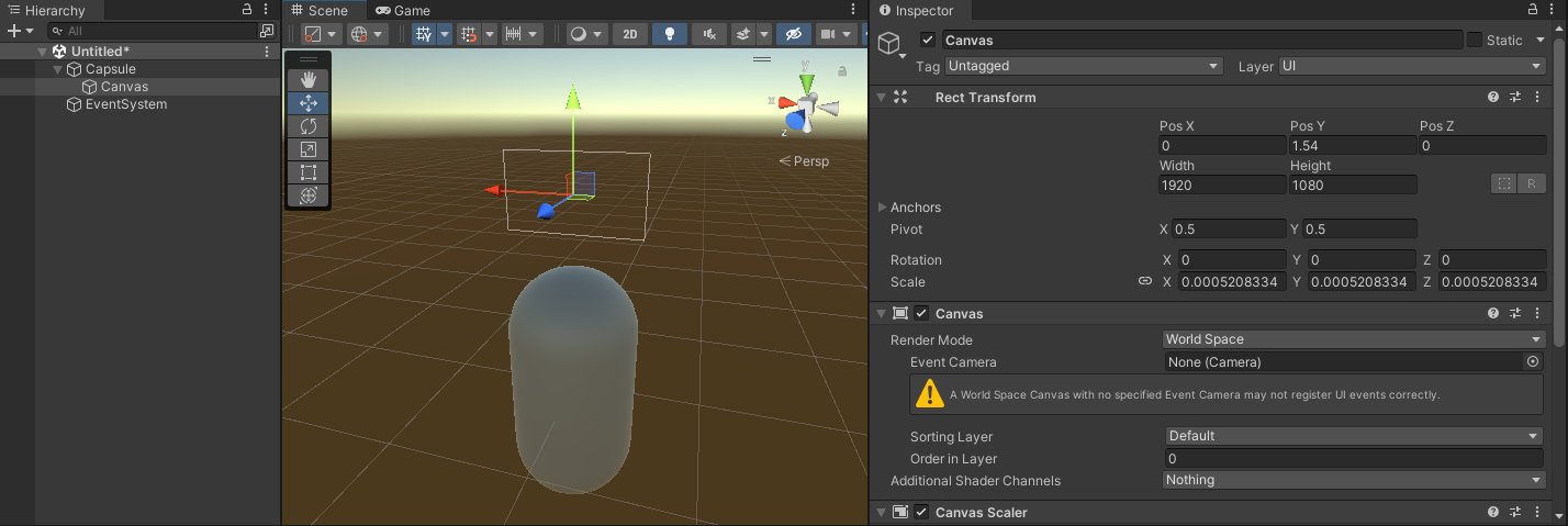
Back in Unity, select the WorldCanvas you made earlier in the Hierarchy. In the Canvas component, make sure the Render Mode is set to World Space. You’ll see the RectTransform is now no longer grayed out, and the Canvas Scaler is forced to the World scale mode.
World Space UI needs to be accurately placed and sized to where in the 3D scene you want it to be. But, you still want to be able to size your UI components in a way that makes sense. Fortunately, there’s an easy trick to achieve this!
In the RectTransform, you want the width and height to match the reference resolution that you’d put into the Canvas Scaler if this were a 2D UI. Then, you need to work out the physical size of the UI within the scene. Once you know that, set the Scale of the canvas to be physical size / width in all three axes.
Consider this scenario: you want to have name indicators above NPCs in your world. The canvas is 1920 x 1080. Your NPCs are the size of the standard Unity Capsule module, which are 1 unit wide.
To make sure that the width of the canvas matches to world units, take the amount of world units you need (1 in this case) and divide it by the width of pixels in your canvas (1920 in this case). Set that value as the scale on all axes of the Rect Transform. The resulting canvas would have scale of (X:0.0005208334, Y:0.0005208334, Z:0.0005208334). To make the calculation easier, Unity also lets you input simple math equations into value fields, so you would set the scale as (X:1/1920, Y:1/1920, Z:1/1920). :]
In this scenario, the canvas would sit perfectly above the capsule, ready to be filled with UI elements!
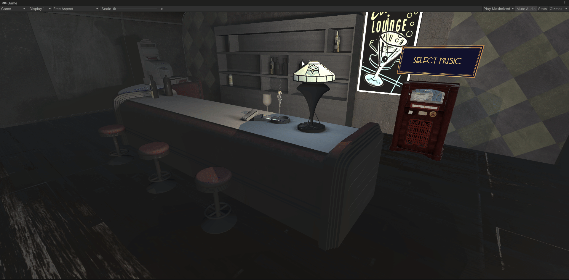
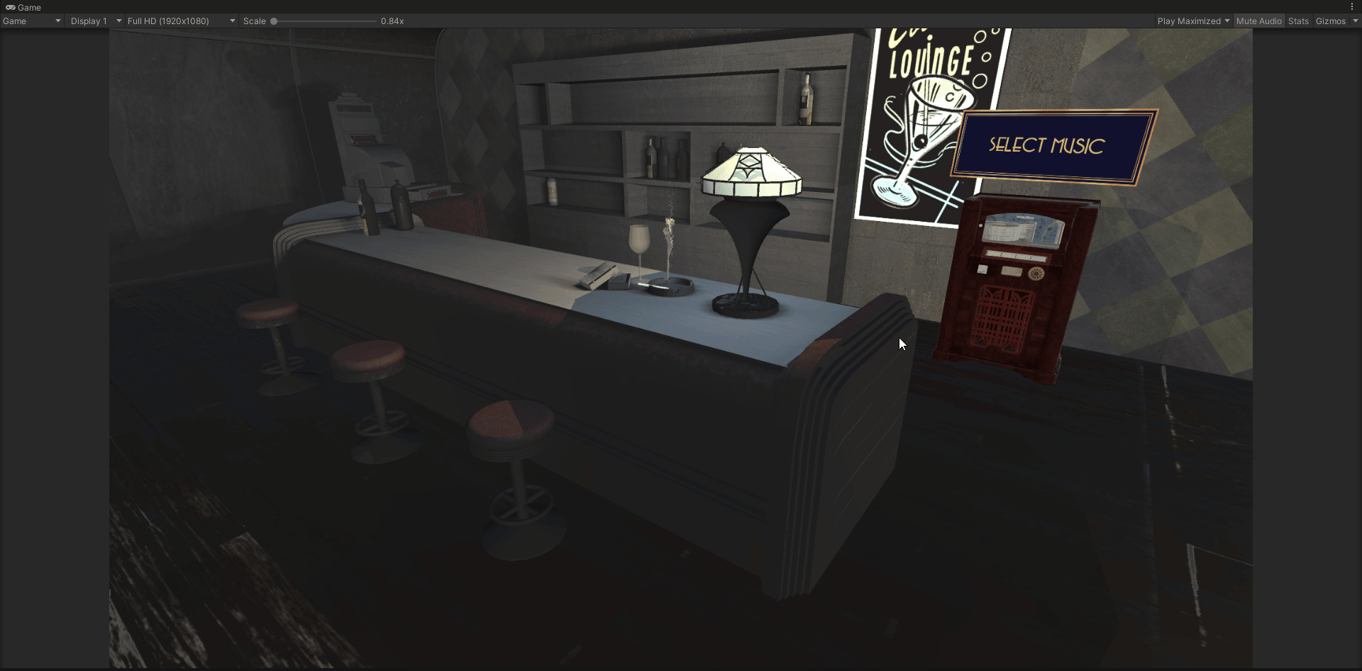
Now, back to your canvas. It’s going to house just a single button, so set the canvas to be the size of that button: 900 x 375 pixels. It’s going to sit above the jukebox in the scene, which you can find under Scene / jukebox in the Hierarchy. If you select it, you’ll see its scale is (X:10, Y:10, Z:10). So, you need to make the Scale of your world canvas 10/900 or 0.01111111.
To position the canvas above the jukebox, set the Position to be (X:-42.25, Y:14.5, Z:-2). You need the Z-axis (blue arrow of the gizmo) to be facing the correct direction in order for the player to see the UI. You can also add a little tilt to it to make it look more interesting in the scene, so set the Rotation to be (X:8, Y:180, Z:-0.3). The final product will look like this:

The only thing left for this World UI is to add a button and hook it up to some premade functionality. Fortunately for you, there’s also a premade button sitting in Assets / Prefabs! Simply drag this out as a child of the WorldCanvas.

Next, click the RectTransform Anchor Presets button (the crosshair-looking box in the top-left of the component). When the dialogue opens, hold down Shift and Alt before clicking on the option in the bottom right. This will stretch the button out so that it fills the entire canvas.

Finally, it’s time to make this button do something! Find the OnClick event on the Button component in the Inspector. Click the + button to add two events. Then, add the following two actions:
- Drag Main Camera to the first slot, and select CameraTween ▸ MoveToMenu from the drop-down.
- Drag WorldCanvas to the second slot, and select GameObject ▸ SetActive from the drop-down. Make sure the checkbox is off.

That’s it! You’ve set up your World UI. Save your scene, press Play and click your button in the scene. See how the camera moves over to the jukebox and your button disappears?
Up next, you’ll make a 2D menu appear in its place.
Setting up a Screen Space UI
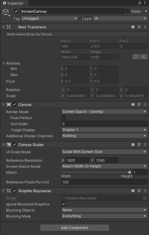
Create another Canvas by selecting GameObject ▸ UI ▸ Canvas. Name this one ScreenCanvas. Leave the Canvas Render Mode as Screen Space – Overlay this time, but change the UI Scale Mode in the Canvas Scaler to Scale with Screen Size.
Set the Reference Resolution to 1920 x 1080, and move the Match slider all the way to Height, so it the shows the value 1.
Now that you’ve set the reference resolution for your panel, set the aspect ratio of the Game view camera to the same size. This will make sure all of your UI elements will conform to that aspect ratio as well and won’t change as you resize your game view either intentionally or unintentionally.

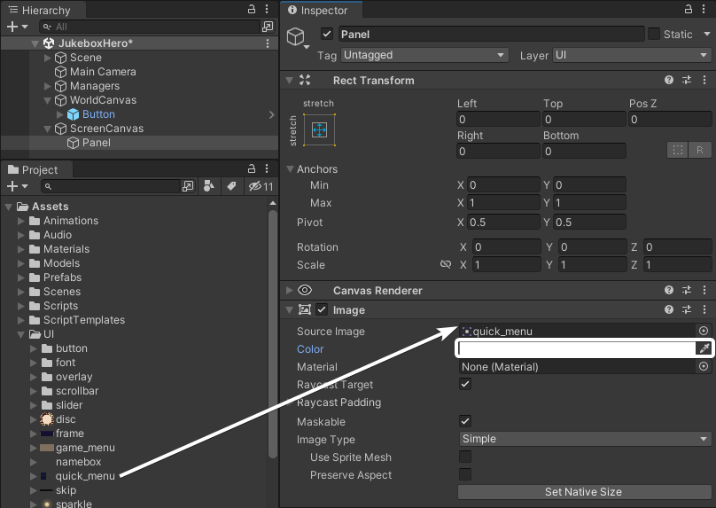
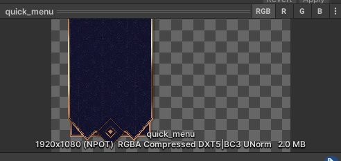
Next, add a Panel as a child to the canvas by right-clicking on ScreenCanvas in the Hierarchy and selecting UI ▸ Panel. By default, a panel stretches to fill the entire canvas. Using Panels is a great way to organize your UI. They also come with an Image component that provides a semitransparent background. Change the image used on this component to Assets / UI / quick_menu, and remove the transparency by setting the Color value to either (R:255, G:Y255, B:255, A:255} (if your color picker is in RGB 0-255) or (R:1, G:1, B:1, A:1) (if your color picker is in RGB 0-1.0).
Jump over to the Game View and you’ll see there’s now a nice menu style panel to the left side of the screen.
There’s just one final thing to set up on the panel. The World Space UI disappears when the camera transitions, so it would be good to have the Screen Space UI only appear once the transition is done. Do the following:
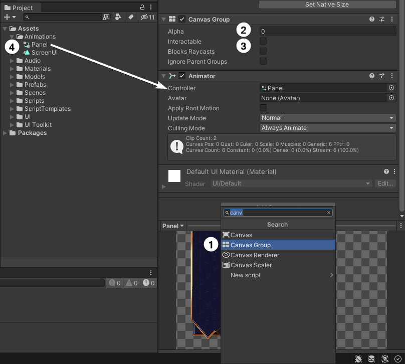
- Add a Canvas Group component to the Panel.
- Set the Alpha to 0.
- Uncheck all the boxes.
- Drag the Panel Animation controller from Assets / Animations onto the Panel. This will add an Animator component automatically, with the controller already attached.
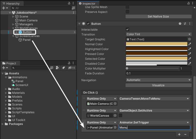
Now go back to the button in the WorldCanvas and add another call to the On Click event. Drag the Panel from the ScreenCanvas into the slot, and select Animator ▸ SetTrigger (string) from the drop-down. Type Menu into the field.
This animator is already set to change the alpha value of the canvas group and toggle the checkboxes back on again. Save the scene and press Play to test it out!
Time to add some functionality to the menu. :]
UI Anchors
You may remember the Panel covered the full size of the canvas, yet the image is only visible on part of the screen. If you take a look at the image used (Assets / UI / quick_menu), you can see that’s just how this image is set up. It’s a 1920×1080 image with the banner graphic, and everywhere else is transparent.
To be able to lay out the UI on top of this, you’ll need to set up an empty GameObject over the top of the banner so the rest of the UI stays within the banner graphic. Stop the game, then right-click the Panel and select Create Empty. Name this new child GameObject Menu. To make it easy, set the Alpha on the Canvas Group of the Panel back to 1 for the time being.
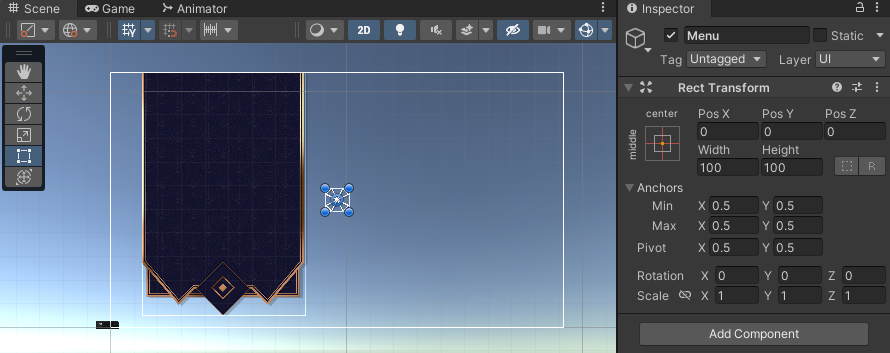
When you add a new GameObject, it’s automatically centered to its parent with a width and height of 100. Select the Rect tool option from the Tool menu in the Scene Window in order to see the corners of the RectTransform of the Menu GameObject.
You first need to resize this object so that it covers the actual banner part of the UI. You can do this by dragging each corner into position.
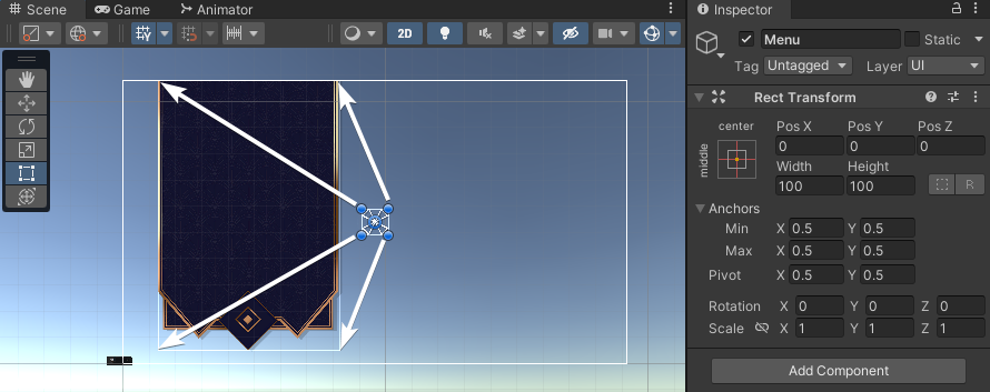
If you drag the corners into position, you’ll likely have RectTransform values of about (X:-480, Y:24, width:692, height:1032). This will let the object fit over the banner perfectly fine for the current screen ratio, but because the RectTransform is still anchored to the center of the screen, if the resolution changes the object may move out of alignment.
To fix this, you need to adjust the Anchors values so the RectTransform values all end up back at 0.
Look back in the Scene view once more. You’ll see a little group of triangles still sitting in the middle of the canvas space. These show the anchor positions. You can drag them into position just like you dragged the corners of the RectTransform.
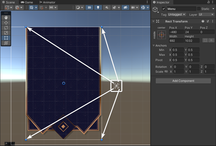
The UI you’re going to build is height-dependent (that’s why you set the Canvas Scaler Match value to Height), so you also need to make this object be height-dependent. The top anchors will already be at the top of the canvas space, but make the bottom anchors be at the bottom of the canvas instead of the bottom of the graphic. This way, the graphic can expand itself to fill more room on a taller screen. And you always know what the distance will be from the bottom of the screen to the bottom of the UI.
With it all set up, the RectTransform of the Menu GameObject should have the following values:
- Left, Top, Pos Z, Right all set to 0.
- Bottom set to 48.
- Anchors: Min (X:0.07, Y:0) Max (X:0.43, Y:1).
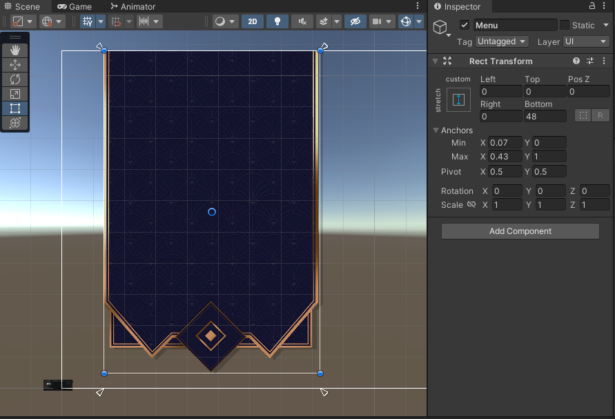
This layout is a little unusual, and it may be more complex than some. But it’s important to learn the power of Anchors and how they can help you lay out your UI across multiple devices without worrying how it will look later.
Now that the Menu object is set up, it’s time to fill it with some actual UI!
Adding Core UI Elements
Unity has many UI elements that come as part of the system. These allow you to rapidly build a UI without having to worry about the trivial stuff like click detection and hover states. There’s just time to look at one of them here, but in Part 2 of this tutorial, you’ll learn about a lot more of them.
UI Button
The most common element — the UI Button — is something you previously brought into the world canvas. You added some functionality to be called from its OnClick method. But there are some other details to look at, too.
The UI Button, like most of the UI components, inherits from the Selectable class. This class adds the color transition that you can see on the button. The prefab you used before already had colors set up, and the Text component of the button as the target of that transition. When you press play in Unity and hover the mouse over that button, you see that the text changes color. That’s the Selectable at work.
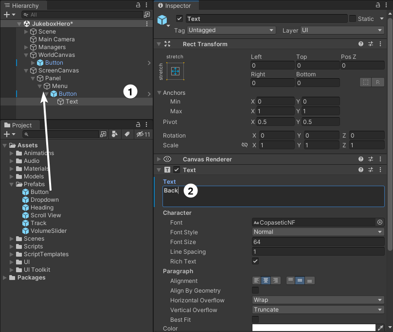
Time to add another button to the scene — but this time add it to the Screen Space UI. You can use the same prefab as before. Drag the Button prefab from Assets / Prefabs into the Hierarchy as a child of the Menu object. Don’t worry about its position for now, but do the following steps:
- Rename the GameObject to Button Back.
- Change the text of the button to Back.
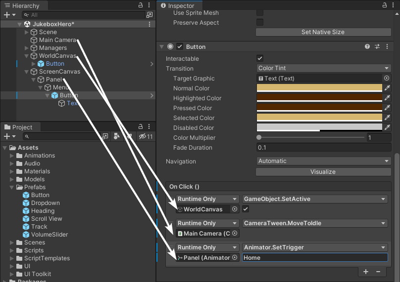
This button performs the opposite action as the World Space button, so set up the following events to be called from OnClick:
-
World Canvas:
GameObject.SetActivewith the checkbox checked. -
Main Camera:
CameraTween.MoveToIdle. -
Panel:
Animator.SetTriggerwith the value Home.
Quickly set the Alpha on the Canvas Group of the Panel back to 0 and test your work. Save the scene. Press Play, then click the World Space button. Your 2D menu will appear, and clicking on the new Back button will take you back to the original view.
Where to Go From Here
Download the completed project files by clicking the Download Materials button at the top or bottom of the tutorial.
In this first part of the Unity UI tutorial, you learned all about the different canvas systems and how to scale your UI for different screens. You built a basic World UI and the beginning of a Screen Space UI using the Button component, the most common of the UI components.
In the next part of this tutorial, you’ll learn about some of the different UI components that come included in Unity’s UI system. And, you’ll use these to finish building the Screen Space UI to let players change what’s playing on the jukebox.
We hope you enjoyed this tutorial. If you have any questions or comments, please join the forum discussion below!
raywenderlich.com Weekly
The raywenderlich.com newsletter is the easiest way to stay up-to-date on everything you need to know as a mobile developer.
Recommend
About Joyk
Aggregate valuable and interesting links.
Joyk means Joy of geeK