
4

用 Python 绘制几张有趣的可视化图表
source link: https://www.51cto.com/article/716938.html
Go to the source link to view the article. You can view the picture content, updated content and better typesetting reading experience. If the link is broken, please click the button below to view the snapshot at that time.

用 Python 绘制几张有趣的可视化图表
作者:俊欣 2022-08-23 12:32:37
今天小编就来为大家介绍两个用于绘制流程图的模块,我们先来看第一个。

流程图存在于我们生活的方方面面,对于我们追踪项目的进展,做出各种事情的决策都有着巨大的帮助,而对于万能的Python而言呢,绘制流程图也是十分轻松的,今天小编就来为大家介绍两个用于绘制流程图的模块,我们先来看第一个。
SchemDraw
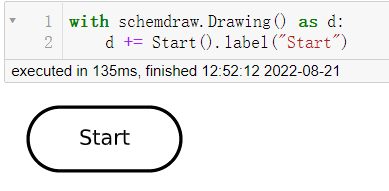
那么在SchemDraw模块当中呢,有六个元素用来代表流程图的主要节点的,椭圆形代表的是决策的开始和结束,代码如下:
import schemdraw
from schemdraw.flow import *
with schemdraw.Drawing() as d:
   d += Start().label("Start")
output
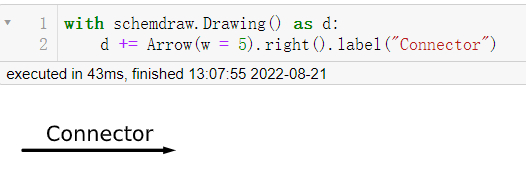
箭头表示的是决策的走向,用来连接各个节点的,代码如下:
with schemdraw.Drawing() as d:
   d += Arrow(w = 5).right().label("Connector")
output
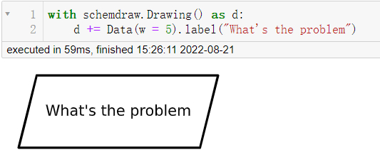
平行四边形代表的是你所要去处理和解决的问题,而长方形所代表的是你所要为此做出的努力或者说是过程,代码如下:
with schemdraw.Drawing() as d:
   d += Data(w = 5).label("What's the problem")
output
with schemdraw.Drawing() as d:
   d += Process(w = 5).label("Processing")
output

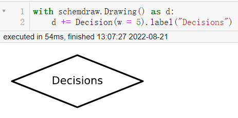
而菱形代表的则是决策的具体情况,代码如下:
with schemdraw.Drawing() as d:
   d += Decision(w = 5).label("Decisions")
output
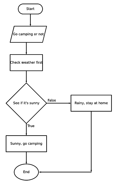
我们来绘制一个简单的流程图,假如周末的时候我们想着要不要出去露营(Camping),那既然要去露营的话,我们肯定是需要查看一下天气,看一下是否是晴天(Sunny),如果是下雨天(Rainy)的话,就不去,按照这种逻辑,我们来绘制一下流程图,代码如下:
import schemdraw
from schemdraw.flow import *
with schemdraw.Drawing() as d:
   d+= Start().label("Start")
   d+= Arrow().down(d.unit/2)
   # 具体是啥问题嘞
   d+= Data(w = 4).label("Go camping or not")
   d+= Arrow().down(d.unit/2)
   # 第一步 查看天气
   d+= Box(w = 4).label("Check weather first")
   d+= Arrow().down(d.unit/2)
   # 是否是晴天
   d+= (decision := Decision(w = 5, h= 5,
                      S = "True",
                       E = "False").label("See if it's sunny"))
   # 如果是真的话
   d+= Arrow().length(d.unit/2)
   d+= (true := Box(w = 5).label("Sunny, go camping"))
   d+= Arrow().length(d.unit/2)
   # 结束
   d+= (end := Ellipse().label("End"))
   # 如果不是晴天的话
   d+= Arrow().right(d.unit).at(decision.E)
   # 那如果是下雨天的话,就不能去露营咯
   d+= (false := Box(w = 5).label("Rainy, stay at home"))
   # 决策的走向
   d+= Arrow().down(d.unit*2.5).at(false.S)
   # 决策的走向
   d+= Arrow().left(d.unit*2.15)
   d.save("palindrome flowchart.jpeg", dpi = 300)
output
Networkx
Networkx模块用来创建和处理复杂的图网络结构,生成多种随机网络和经典网络,分析网络结构和建立网络模型,例如在绘制人脉关系网的案例当中就可以用到networkx模块,
而例如一个公司的组织架构图,也可以用到该模块,来简单直观的绘制公司的整体架构,代码如下:
import networkx as nx
import matplotlib.pyplot as plt
import numpy as np
G = nx.DiGraph()
nodes = np.arange(0, 8).tolist()
G.add_nodes_from(nodes)
# 节点连接的信息,哪些节点的是相连接的
G.add_edges_from([(0,1), (0,2),
(1,3), (1, 4),
(2, 5), (2, 6), (2,7)])
# 节点的位置
pos = {0:(10, 10),
1:(7.5, 7.5), 2:(12.5, 7.5),
3:(6, 6), 4:(9, 6),
5:(11, 6), 6:(14, 6), 7:(17, 6)}
# 节点的标记
labels = {0:"CEO",
         1: "Team A Lead",
         2: "Team B Lead",
         3: "Staff A",
         4: "Staff B",
         5: "Staff C",
         6: "Staff D",
         7: "Staff E"}
nx.draw_networkx(G, pos = pos, labels = labels, arrows = True,
                node_shape = "s", node_color = "white")
plt.title("Company Structure")
plt.show()
output

看到这里,大家可能会觉得会指出来的结果有点简单,想要添加上去些许颜色,代码如下:
nx.draw_networkx(G, pos = pos, labels = labels,
                bbox = dict(facecolor = "skyblue",
                boxstyle = "round", ec = "silver", pad = 0.3),
                edge_color = "gray"
               )
plt.title("Company Structure")
plt.show()
output

责任编辑:庞桂玉
来源:
AI科技大本营
Recommend
About Joyk
Aggregate valuable and interesting links.
Joyk means Joy of geeK