

UX Case Study: Feature Improvement for Niagahoster Checkout Page
source link: https://uxplanet.org/ux-case-study-feature-improvement-for-niagahoster-checkout-page-7c062a5379e7
Go to the source link to view the article. You can view the picture content, updated content and better typesetting reading experience. If the link is broken, please click the button below to view the snapshot at that time.
💎 Introduction
Hi there, welcome. My name is Fajar Shiddiq, I’m a UI/UX Design enthusiast. In this case study, I want to explain my process when designing feature improvements for the Niagahoster checkout page. This project is a final project from Niagahoster UI/UX Designer Virtual Internship Experience program that I joined in July 2022. This is also the second case study that I’ve published on Medium, you can read my previous one here.
🌐 Project Information
Company/Project type: Web App Final Project for Niagahoster UI/UX Designer Virtual Internship Experience
Project date: July 2022
👨🏻🎨 My Role
I was an end-to-end UI/UX Designer throughout the project from project planning, deepening the problem statement, ideating solutions, building wireframes, hi-fi design, prototyping, and conducting usability testing. Since the data was already gathered, I just continued defining the problem and ideating the solution.
🌐 About This Project
Niagahoster’s checkout page has already been confusing enough especially for novice customers, this is due to the customer doesn’t understand most of the product and feature definitions. To increase the percentage of customers completing the transaction, I decided to take this final project from Niagahoster UI/UX Designer Virtual Internship Experience program and redesign the checkout page to provide a better and easier experience for customers.
🌐 The Challenge
Niagahoster has an unmet target for the number of hosting service customers. The results of the research state that some users are confused when choosing a service option on the checkout page. Those users took a long time to make their choice. The root of the problem is that users are faced with too many choices and do not understand the definition of each option offered.
The key results of this project are increasing the percentage of users who complete purchases on the checkout page by creating a design solution that makes it easier for users to complete transactions on the checkout page.
With this new redesign, the provided solution will make it easier to complete transactions for Niagahoster customers which consist of people in the 18–35 age range and also mostly business owners who want to digitalise their business.
🌐 Solution
The design process method that I used on this project is Design Thinking, which consists of the following steps:

I used this Design Thinking method because it’s the flexible-but-effective framework I needed to ideate the best solution for this project’s problem. Also, since this project timeline is relatively strict (this final project is available only on the last week of the internship program and the original timeline is just a week), I don’t have much time to explore another design process and decided to proceed with Design Thinking because I have experienced using this framework.
🙌🏻 Empathise
The first stage of Design Thinking is Empathise. I use this stage to deepen the problem and gain more insight into what is users struggle with the current design of the Niagahoster checkout page. Since the research result data has already been provided in the project instruction, I just need to analyse the problem and define the objective for this project.

About Niagahoster
Niagahoster is a web hosting company founded in Yogyakarta in 2013. The services provided by Niagahoster are in the form of various hosting services such as Unlimited Hosting, WordPress Hosting, Cloud Hosting, Domains, and others.
Problem Statement
Niagahoster has an unmet target for the number of hosting service customers. The results of the research state that some users are confused when choosing a service option on the checkout page. Those users took a long time to make their choice. The root of the problem is that users are faced with too many choices and do not understand the definition of each option offered.
Objective
Make it easier for users to make transactions to purchase Niagahoster services.
Key Results
- Increase the percentage of users who complete a purchase on the checkout page.
- Create design solutions that make it easier for users to complete transactions on the checkout page.
Information Architecture
I used information architecture to analyse the currently available information on the Niagahoster checkout page.

Header bar with icon and a login button.
Information on ongoing transactions in the form of a scrollable invoice that displays the current position of users (stepper), type of service selected (with info-circle icon), and transaction details along with the total price.

Step transaction instructions and descriptions.
3 swipeable cards display three different service package options that users can choose from. Each card contains information about the features and services included in the associated package.
Prev and Next buttons with numbers that match the number of cards.

Step transaction instructions and descriptions.
3 swipeable cards display three different service package duration options that users can choose from. Each card contains information on the price of the package per year and per month along with the total discount that applies in the related duration.
Prev and Next buttons with numbers that match the number of cards.

Step transaction instructions and descriptions.
Options buttons to create a new domain or connect an existing one.
If you choose to use a new domain, there will be an input field along with a description that directs users to write down the domain name of their choice. It also displays a list of free domains available with the selected service plan.
Domain availability check button.
Overall, in this empathise stage, I state the problem along with the objective and analyse the current design so I can define it clearly for the next stage. As I mentioned above, the research results data has already been provided in the task instruction so I decided to use the available data and not conduct a new UX research.
🎯 Define
In this Define stage, I try to understand what users feel by defining user persona, customer journey map, user pain points, and how-might-we.
Persona
To make the best solution for the problem, I had to first define who is going to use my solution and who is the Niagahoster customer generally. After taking some time to explore the Niagahoster website, here is the Niagahoster customer persona, generally.

Most of the Niagahoster customers are in the 18–35 age range. Most are small to big-scale business owners who want to expand their businesses through a website. Their goals are to digitalise their business and get all the things needed to build a website. However, most Niagahoster customers, especially small business owners, often don’t have any technical knowledge about a website requirement and don’t understand the information shown when about to buy hosting for a website. That’s why they often feel overwhelmed by all the information shown and don’t complete their transaction.
Customer Journey Map
After defining Niagahoster’s customer persona, I continued to define their journey by creating a customer journey map. This journey map shows how the customer journey is from the start when they have the idea to build a website to successfully buy Niagahoster’s hosting package. This map also shows what the customer does in every stage they are in and opportunities that can be used as ideas to build a better experience for customers.

The PDF version can be accessed here. For the Customer Thoughts & Feeling part, I used Indonesian since Niagahoster’s based customers are Indonesian.
So, as stated in the customer persona, most customers feel excited that they are going to expand their business into a website, but later, they feel overwhelmed with all the technical features they don’t understand.
By knowing this, we can provide opportunities to solve the problem. For example, when customers are overwhelmed with all the hosting packages that are displayed with technical words they don’t understand, there are opportunities such as redesigning the layout and making it simple, also to add new features like a short description that help customers to easily understand what is this feature means.
Pain Points
From the customer journey map, we know most of the customer problems and at what stage the problem occurs, we also get some ideas to solve that problem from the opportunities section. With this, now it’s time to write all the pain points that the customer had.

As shown above, there are four pain points that customers feel and struggle with, which are confusion with the definition of available features, too many choices while customers don’t understand product details, need more time to decide which package to buy, and lack of information about service details so that customers don’t complete their transactions.
How-Might-We
The best way to ideate solutions from user pain points is using the how-might-we method, like this one.

Once defined the how-might-we, now it’s time to ideate solutions in the Ideate stage.
💡 Ideate
In this Ideate stage, I try to generate the best solution from the how-might-we stage and process it using idea prioritization, doing a crazy 8’s session, and making a storyboard and user flow.
Ideation
The how-might-we stage defines all the problems that happen and need to be solved. Now, in this ideation stage, I try to generate as many solution ideas as I can that are related to the pain points and have the potential to be implemented.

Here are the solutions that I generated in this ideation stage. I have already made an affinity diagram that contains six types/categories of solutions:
- Short description: The current user interface of the Niagahoster checkout page lacks much short information that of course, makes customers who didn’t read the main page confused about what all these features mean. My solution here is to add a short description in the form of an info-circle icon that customers can click and get the information about the specific feature. Another thing is adding that short description under every package name about what needs this package fits into.
- Banner: Since many novice customers didn’t understand hosting features and other technical stuff, I want to add a promo-like banner that is shown on the upper side of the checkout page. There will be several banners that will contain some tutorials and help information that can help customers to learn more about the product before buying it. Banners will be swipeable and stand out enough so customers who are confused will know where to go to learn more.
- Quick Ask: Based on the research result data, many customers don’t continue the transaction because they are confused and don’t understand the definition of product features. This makes me think that many people tend to cancel the transaction instead of finding out more about the feature. Therefore, I tried to add a Quick Ask feature that can be used by customers to ask any question and get the answer directly and quickly. Similar to FAQs.
- Packages Comparison: Many customers are confused because they don’t know which hosting package they are going to buy. That’s why I want to add this Package Comparison feature that will direct customers to the page where they can easily compare all the available packages. This comparison section is already present on the current Niagahoster page, but it’s on the main page. I want to add a button that looks like a forgot password button so customers know where to go when they are confused to choose a package.
- Redesign UI: The current UI is simple and user-friendly enough, I say. But with the new features that I will add next, the UI surely need some redesign.
- Personalization Quiz: The solutions that I provided before are good enough to inform customers about which package they should buy. But with this personalization Quiz, I think it can be nice to add since customers can fill a quiz form and get the best package suggestion based on their answers, added personalise effect. This Personalization Quiz will be featured on the new banner feature.
Those are solutions that I generated from the ideation stage, not much but I think that’s enough since I don’t want to confuse customers with so many new features.
Idea Prioritization
My generated solutions are not many, just six, but it still needs prioritization so I can focus on the right solution based on the value it will bring to customers. I prioritise ideas into four kinds of prioritizing which are; do now, do next, do last, and do later. The prioritization is based on the value to customers and the effort to the developer.
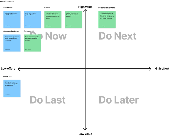
After prioritizing ideas, I decided to place the short description, banner, packages comparison, and redesign UI solution into the do now part. This is because they are the most visible solutions that will bring high value to customers with relatively low effort for development.
I placed the personalization quiz solution on the do next part because I think the effort to make a personalised feature is high enough so, yeah, do next then. Finally, I placed the quick ask solution in the do last part because I know that Niagahoster already have many FAQ and customer service on the other page, so it doesn’t necessary to add more, at least for now.
Crazy 8's
Since the ideas have already been prioritized, now it’s time to sketch up and see what it will look like later in the final implementation. Here is my sketch from the Crazy 8’s session:

Well, this is the rough sketch. That is the sketch of my generated solutions which is the short description, banner, package comparison, personalization quiz, and redesign UI overall.
Storyboard
All the solution that I will provide in my design has been generated, then now is the time to make the storyboard. This storyboard will portray what will customers experience from their background and what will they do to fulfil their needs.

This storyboard is simple but it shows how the customer’s story from their background as a business owner who wants to digitalise their business to the time when they are finally able to fulfil their needs which is buying a hosting package for their business website. The process is made easier with the new improvement from this project.
User Flow
Since the sketch has already been made in the Crazy 8’s session, now it’s time to make the user flow to define what is the flow that customers will take to complete the transaction and what screens I needed to make for the wireframe session later.

The PDF version can be accessed here. All of my generated solutions are about adding new features that will be visible on the checkout page. For solutions that require the user to go to the new page, then I added that new page in the user flow, now it can branch to the new pages.
The main flow here is to complete the transaction, it goes directly from the main page to the checkout page, then to the payment page, and finally to the invoice page and success page. New features that require a new page like the banner feature can branch the flow to another page so users can explore that page first and go back to continue their transaction.
There will be three new pages added, they are the tutorial page, the personalization quiz page, and the packages comparison page.
Overall, this Ideate stage has generated ideas that I think will be the best solution for user pain points. Next, it’s time to implement it in the Prototype stage.
📲 Prototype
After the Ideate stage is completed, now it’s time to make the prototype. Started with making a wireframe (as a wireflow), then making the high-fidelity design, and making the final clickable prototype.
Wireflow
Wireflow is a wireframe structure as a flow. Making a wireflow is useful because I’ll know which screen is placed after which. It also makes it easier for the high-fidelity and prototyping stage.

The PDF version can be accessed here. So, I turn the user flow into a wireframe and then arrange it as a wireflow. I have made a total of 14 screens and overlays as a low-fidelity wireframe, you can see the full design on this link.
Making the wireframe is easy enough because it doesn’t require many design assets but it’s indeed the most important step to do. When designing a wireframe, that means that we designed a skeleton of the final design we’re going to make. Making a wireframe is also crucial because we had to choose the final placement of the feature we’re going to add, and yeah, this is the decisive step although I already make the rough sketch from previous the Crazy 8’s session.
High-Fidelity Design
Making a complete wireframe does make it easier for this hi-fi design stage, but there is one other thing that is a must and also makes it even easier. That is making a design system.
For me, making a design system such as text style, colours style, logo, icons, buttons style, input fields, etc. And make all the assets into components is a must. Since I already have the wireframe for all screens with complete elements like icons and buttons, I just need to adjust it for the design system. Here is my complete design system.

The PDF version can be accessed here. For the device system like the status bar and navigation components, I used elements from Material Design 3, this is the latest design system from Google and is freely available for anyone who wants to design using Google or the Android system. Oh yeah, I do use the Android Large screen size for this design and it matches perfectly with the Material Design 3 elements.
For other elements like logo, colours, typography, input fields, and button style, I try to match it with the current Niagahoster design system as possible so it brings a natural and consistent feel to users. I don’t want to change it with a new style anyway because yeah, as I mentioned above, this current Niagahoster design is good and simple enough.
Since the wireframe and design system are done, it’s time to design the high-fidelity.
Aside from the 14 screens and overlays wireframe that I made, in this hi-fi design, I added one extra screen. Well, it’s not exactly a screen, it is a frame that contains all the overlay for the info-circle icon. So, yeah, here is my final hi-fi design.

All hi-fi screens (with overlays design) are available in the PDF version here. Those are all the hi-fi designs that I made, click here to view the full design. In this stage, I have designed all the screens and overlays that needed to be prototyped along with the swipeable elements placed in position. I also designed the main page as a start page that users will try on the prototype. Here are the new features that I added:

Banner
Here is the banner feature, just like a regular promotional banner on other apps, this banner is swipeable but there is also a left and right button. Why I placed the banner feature on the checkout page because the content I want to highlight itself is the tutorial and tips content, and placing that on the upside of the checkout page can make customers know where to go when they need to read some tutorial or information.
There are already two banners here, one that directs customers to the tutorial page and another one for the personalization quiz. The design itself is simple, some information about what banner it is, where it will go if clicked, a supporting image, and a button visualised there. Though you can click the whole banner, a button will make it more visible.

Tutorial Page
When customers don’t know what to do with the checkout page or don’t understand all the information there, they can always click that one banner that will direct them to this page, the tutorial page. This tutorial page contains all the information customers need to do or buy anything on the Niagahoster site. Please noted that all these features shown on the tutorial page are the real feature that is also available on the real Niagahoster site, so I just make the shortcut for it with this page. Some of the features available from the tutorial page are Knowledge Base, Niagahoster Course, etc.
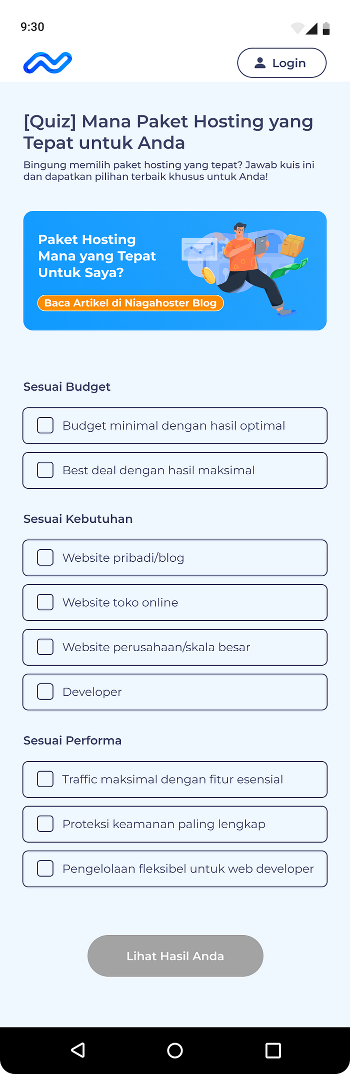
Personalization Quiz
Since I already make the tutorial page banner, then for the next one I added this personalization quiz banner. This banner will direct customers to the quiz page where they can fill out a questionnaire-like quiz regarding what is the best hosting package for them and get the suggested result instantly. I added this feature to reduce customers’ overwhelming feeling when they can’t decide which one should they buy. I also added a single banner on this quiz page that will direct customers to the blog post that gives tips about how to choose the right package to buy.

Short Description
On every package card, I added a short description below every package’s name. It’s a one-line text that tells customers about what is the best suitable use of this package. I also added the info-circle feature that when clicked, will show short information about the specific feature on the package.

Packages Comparison
Under the package cards, I added this packages comparison button that looks like a forgot password button. Why I make it like that is because I need to make a simple button that won’t confuse customers with too many buttons, so yeah, I make it simple, just a bolded text that stands out. When clicked, it will direct customers to the packages comparison page where customers can compare the features available on each package. This package comparison section is already present on the current Niagahoster site, I just make the shortcut to access it from the checkout page so customers who still don’t know which package they should buy can compare it first, easily.
Those are the main hi-fi design of the solutions that I ideated from the previous stage. Overall, this hi-fi design is just the continuity from the wireframe and yeah, here those are. Next is the prototyping stage.
Prototype
All the high-fidelity designs are done along with the elements that need to be placed with the prototype. I started by organizing every screen by their page vertically and then starting to connect it all. Here is the final clickable prototype. Also can be accessed from this link.
When prototyping all the screens, many elements need to be connected from page to page, adding pop-ups and overlays, button linking, and scrollable and swipeable elements. And as you can try the prototype, some buttons haven’t functioned yet like the left and right buttons for the banner, I have struggled to prototype it so I just give an alternative way to make it interactive.
For the prototype stage itself, what I mostly do is design and yeah, it’s finished with the prototype available to try. The next stage is the Test stage, where I will validate my ideated solution.
💻 Test
To test my prototype, I used the usability testing method with several testing tools and using the System Usability Scale (SUS) method to validate my solution. I also make a feedback grid based on the question that I asked testers about the prototype. And finally, I evaluate my solution and list what’s worked well and what needs to be improved next. Here we go.
Usability Testing
For usability testing, I’ve been instructed to have at least two testers test the prototype. And because I really struggling to find more voluntary testers, I just have two people to join my testing session and validate my solution.
I decided to conduct the testing session online using these tools.
- Maze: I conducted my usability testing through Maze. I used Maze because I want to try many new tools in the UI/UX design field and yeah, this is the first time I using Maze. Maze also has a complete feature that supports the usability testing session, I can get the result report too.
- Zoom: I asked testers to join the Zoom room and share their screen while doing the session on Maze. Zoom also makes the communication between me and testers easier.
- Microsoft Word: After testers finished the Maze session, I will have several questions to ask testers. I wrote all the questions and testers’ answers on the Microsoft Word document. Here are the questions that I asked testers during the sessions.

4. Google Form: After done asking questions for testers. I asked them to fill out the System Usability Scale form on the Google Form link. By using Google Form, I can then analyse the result data later.
For the Maze session, I asked testers to perform four tasks which are:
- Completing purchase transactions
- Access the tutorial page
- Access and fill out the quiz page
- Access the compare packages page
Since those tasks are testing the new solution, then I can validate and analyse how easy it is for customers to use the new features.
Things that I will analyse from this usability testing session include testing those four tasks and also how testers think about the new provided solution elements such as the banner feature, info-circle icon, short description, and prototype swipe-ability and interaction.
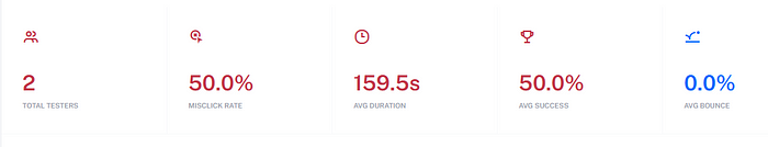
Yeah, so, those are the testing plan. Now here it’s the testing results. The first one is the Maze report. Providing results about how many testers tested the prototype, the misclick rate they do, average completion duration, average success, and average bounce.
Task 1: Completing purchase transactions
Task 2: Access the tutorial page

Task 3: Access and fill out the quiz page

Task 4: Access the compare packages page

Those are the general report result from the Maze session. Below is the individual result of every tester:

From the result above we can see that both of the testers can finish all the tasks. While the duration of the completion is different, both of them said that the difficulty level of the task is easy.
The next one is the testers’ answers from the question session.

The PDF version can be accessed here. From the results above, we can find that the new design on the prototype is easy-to-use, user-friendly, nice and consistent, and the solutions are very helpful. The minus points here are some testers got confused the first time they used the prototype but manage to get used to it. Another tester said that the short description feature has poor UX writing and needs improvement for the copy.
System Usability Scale (SUS)
After the questions answers session, I asked testers to fill out the System Usability Scale (SUS) form and here are the results.

Using the SUS method, my prototype got an overall score of 92 which is equal to an A or excellent grade.
The results from SUS are indeed excellent, added with the question answers results and Maze results, I can say that my prototype has provided a solution to the problem that is faced. But disclaimer here, since my testers are just two people, then the conclusion here is of course, based on that validation result.
Feedback Grid
I gather the feedback data from the testing session into this feedback grid below.
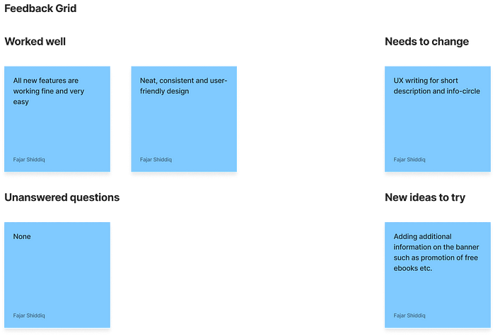
The design proved to have worked well, some improvements that will need to be added to the next development are improving the UX writing for the short descriptions and adding more content to the banner feature. Overall, it’s all good.
Evaluation
So, this is the last section of my design process. After doing this project and going through all the stages, I feel grateful that I’m able to finish the project in the given timeline. What went well on this project is my plan, of course, I was planning to finish this project as soon as possible and finally, I’ve done it. The design process itself also went well because I know what I’m going to do and what is the next step.
What didn’t go well, actually just one thing, is that I can find more people to become testers for the testing session. I still need to practice more to ask people to join my project more. Another thing is fine I guess, there is no problem with the design process, it went well.
What could be improved for later development or my next project is improving project planning and time management, improving my UX research skills along with the UX writing, and of course, trying to get more participants to join the testing session later.
Overall, this project has been so much fun and great, I feel grateful to invest my time in finishing this project. This will be another step for me to practice more and keep advancing as a UI/UX Designer.
📝 Results
This project success metric which is about how my generated solutions can bring impact to real users has been achieved since testers said they feel that this new version of the Niagahoster checkout page is better than the current one. It does feel great to know that this project can bring impact even though that is just for the testers.
From this project, I had a valuable experience of bringing solutions from the real problem and testing it with actual users in the actual environment Niagahoster is designed to be used.I hope that the next development of this project or my other new projects can also bring more impacts and solutions for users.
💎 Outro
Working on this project was a great experience. I learn so many new things and knowledge in every stage of the process. Working with a real company problem also made me realise that many problems needed to be solved and one of the ways to solve them is by designing a solution. Overall, it was a nice experience, thank you Niagahoster for the opportunity to join the Virtual Internship Experience program, and thank you to anyone who take their the to read this, thank you so much.
This case study still has many shortcomings and needs improvement, feel free to reach me for any suggestions you have or also if you want to connect with me, find me from the link below.
Connect with me: https://znap.link/thefajars
All my deliverables can be accessed here.
Thank you.
Recommend
About Joyk
Aggregate valuable and interesting links.
Joyk means Joy of geeK